
















Social and campaign design · United Arab Emirates, 2020
Ureed.com
Ureed.com is a marketplace: businesses on one side, certified freelancers and translators on the other. Which makes the feed an awkward place, because it has to sell to both at once — a company looking to buy a blog post and a translator looking for work do not want to read the same thing.
So the year’s output runs on two voices in one system. To the buyer it is short, specific and priced. To the freelancer it is a guide: how to start, what to charge, which tools, how not to burn out. The brand’s blue and its cut-paper confetti hold both together, and a second mark — FastContent, the content arm — gets the same system in its own colours.
All of it 2020, which is in the work whether it means to be: a Mother’s Day guide to working from home under quarantine, and a platform that spent the year telling people it had just been rebuilt.
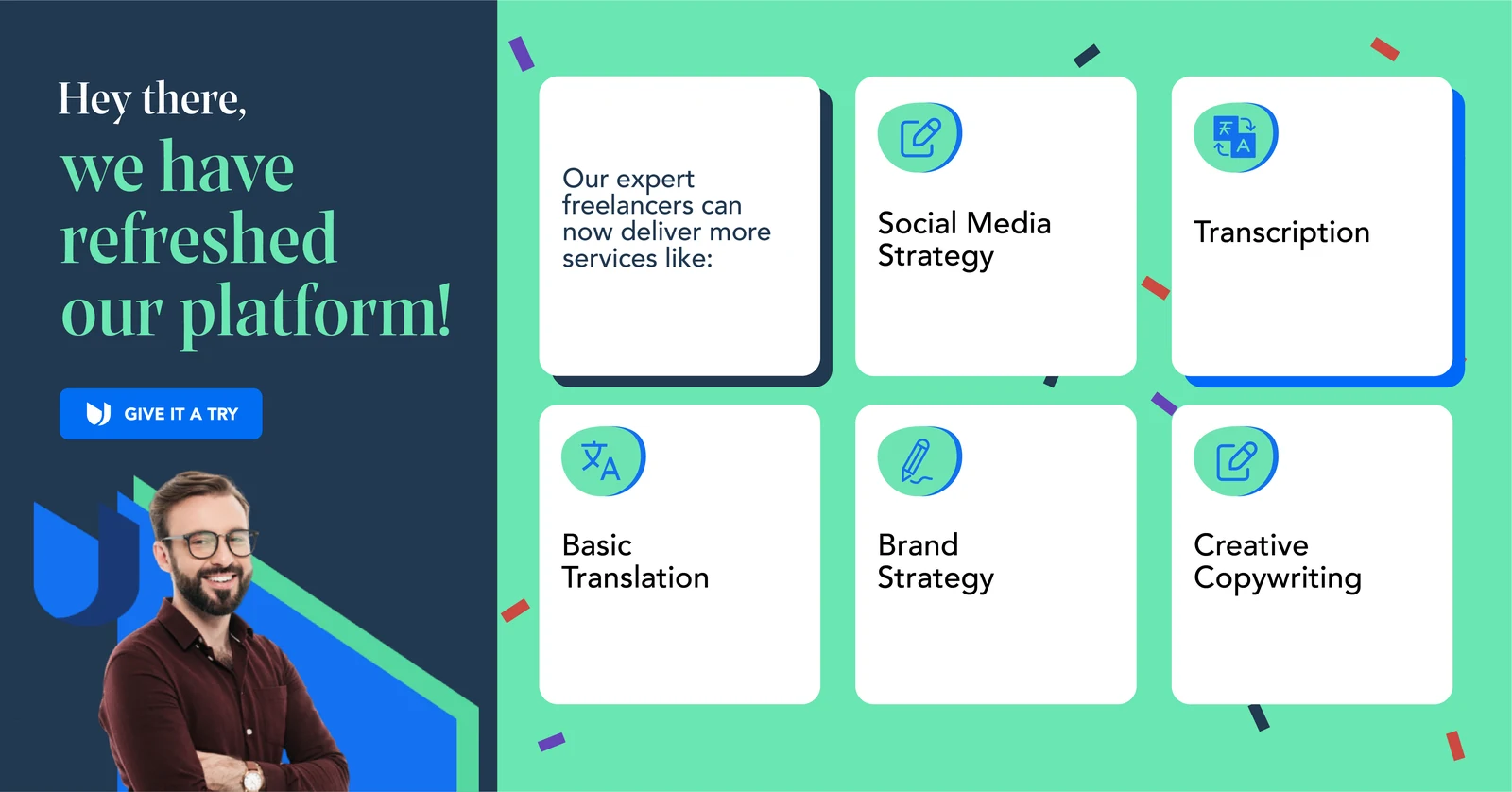
The year opens on the relaunch. One wide frame, the proposition on the left and the service tiles on the right — translation, social, transcription, copywriting — so the thing being announced is visible rather than described.

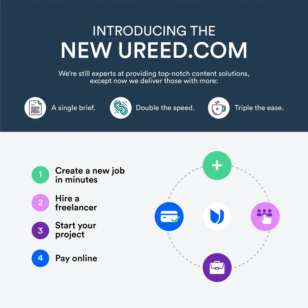


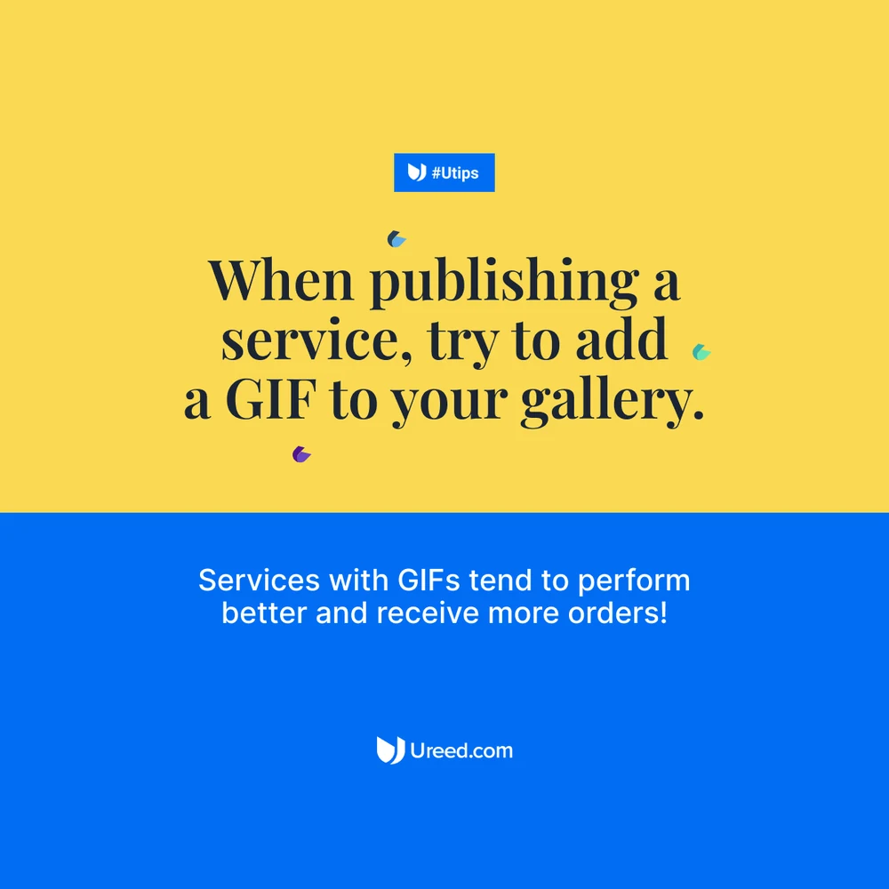
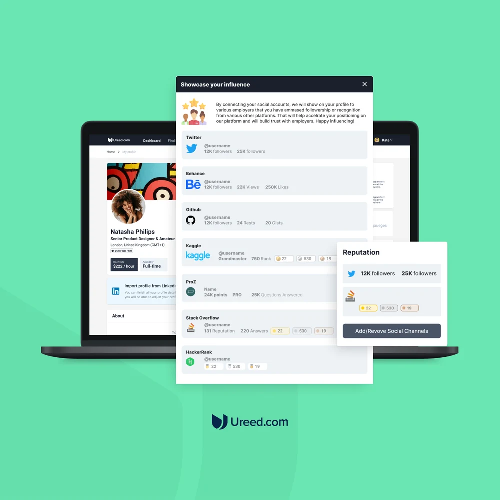
And the posts that carried it: the new site, the four-step explanation of what the site now does, the messenger app, voice chat in the platform, and — the most useful post a marketplace can make — a tip about selling better on it.
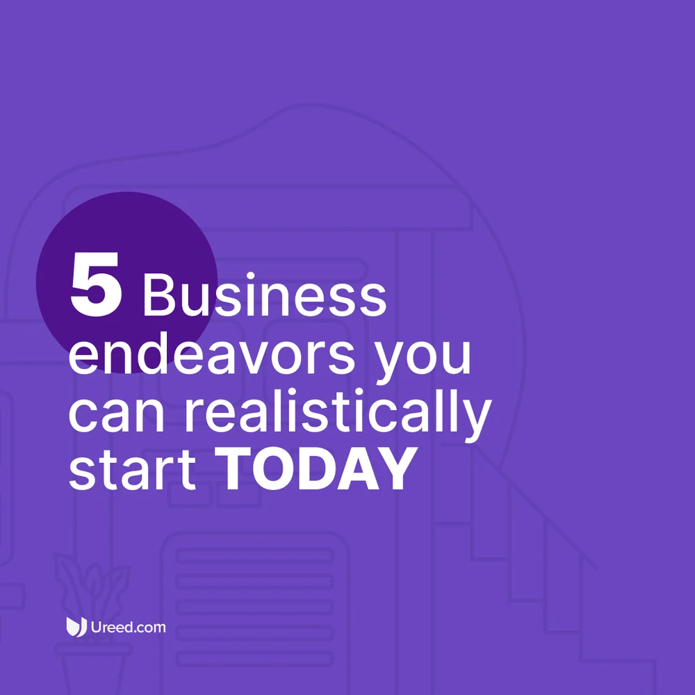
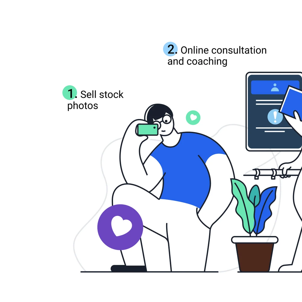
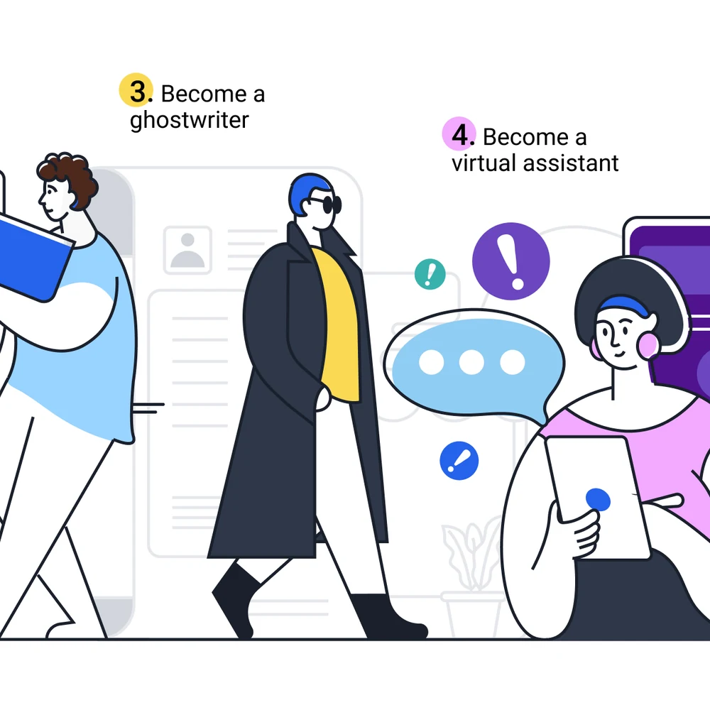
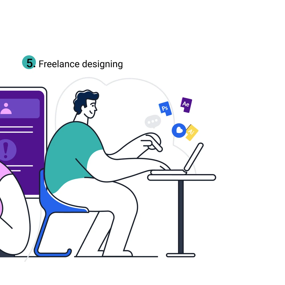
For the freelancer side, the carousel does the work a blog post used to. Five business endeavours you can realistically start today — a cover, then one drawn scene per idea, the figures working in the brand’s own flat illustration rather than in stock.

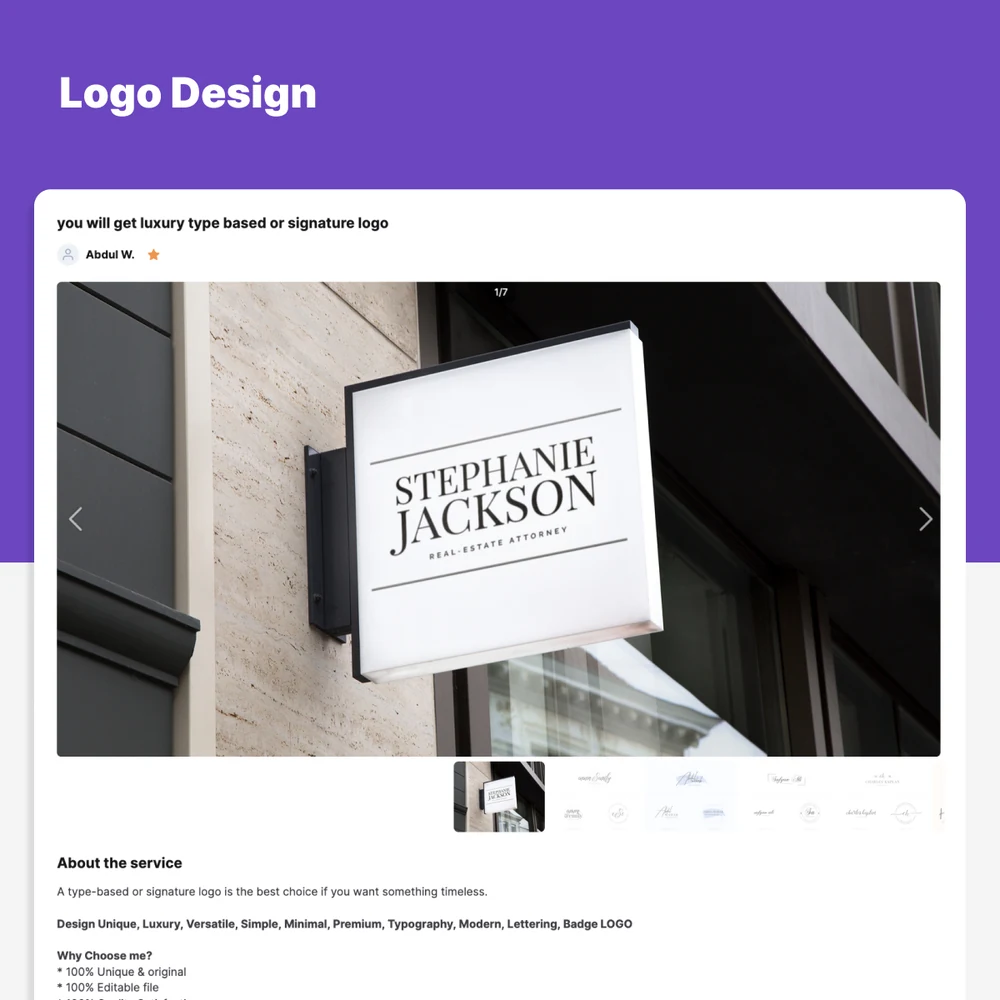
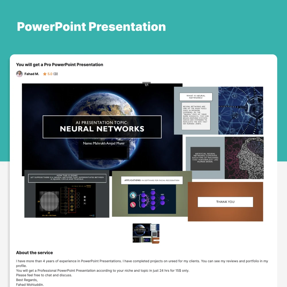
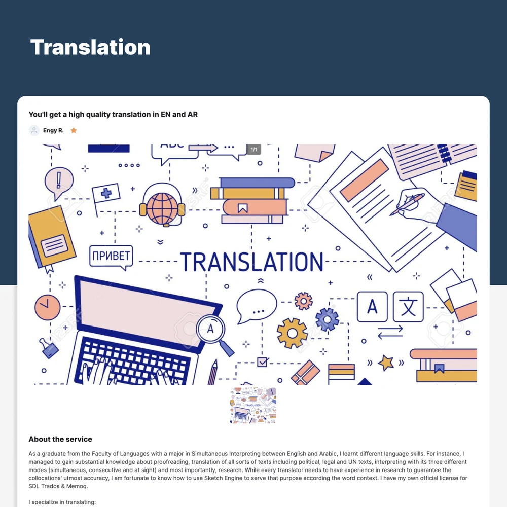
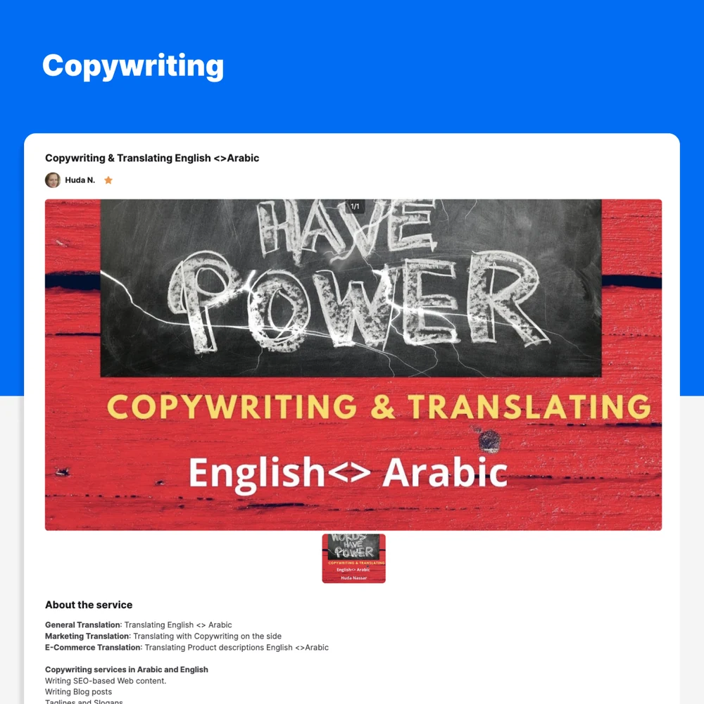
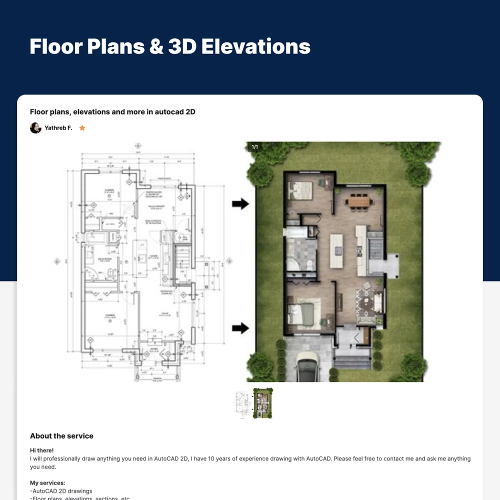
The same shape pointed the other way, at the buyer. Five services you can order now, each slide a coloured band over a real listing from the site — the actual gallery, the actual price, the actual seller — because a marketplace that mocks up its own inventory has nothing to sell.
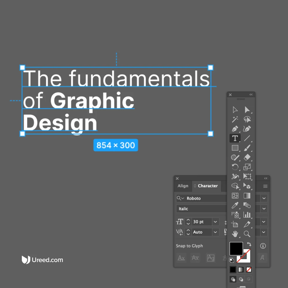
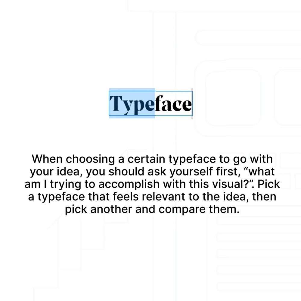
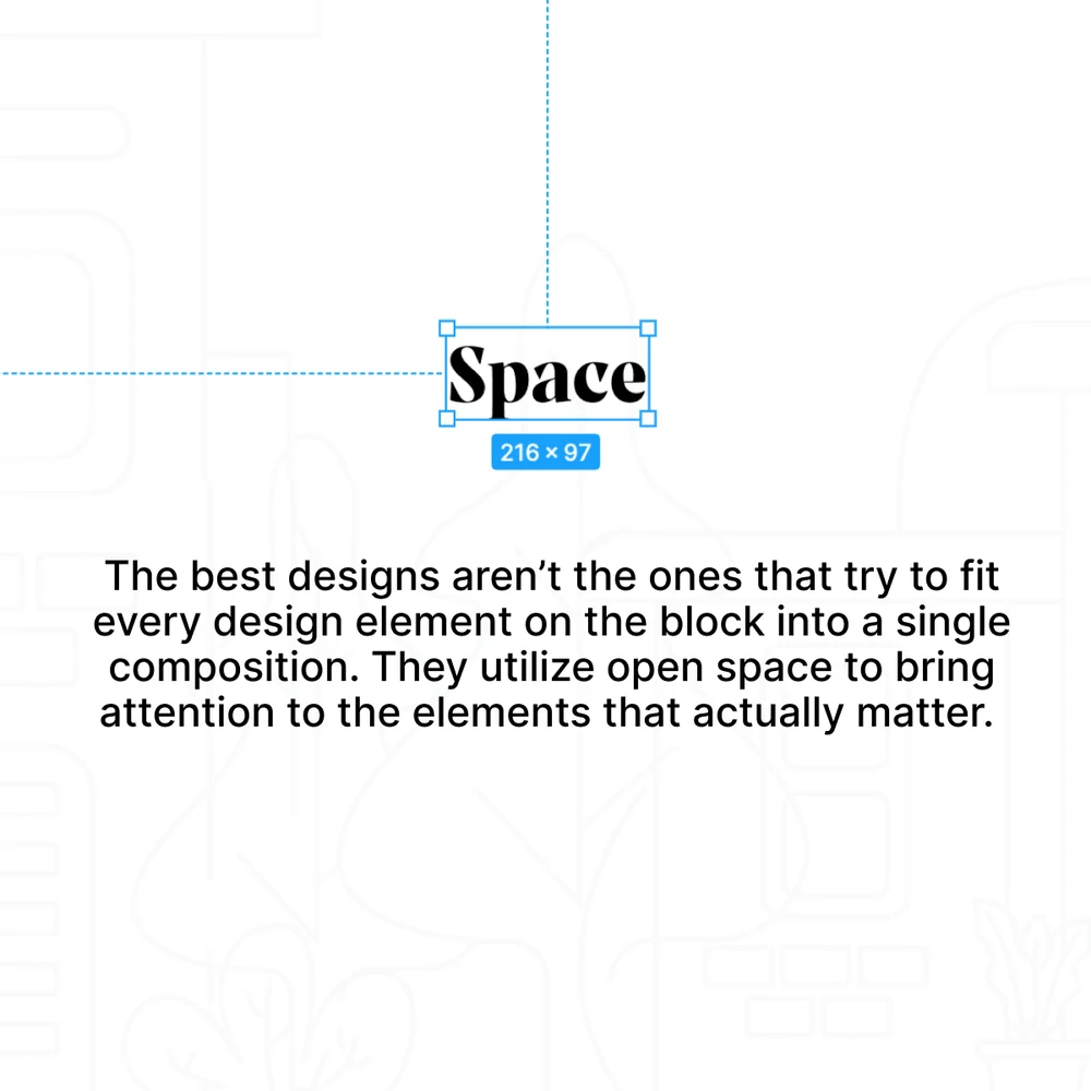
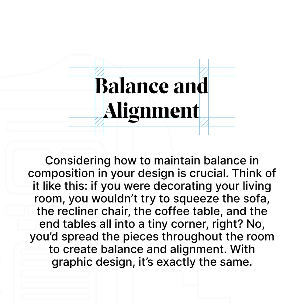
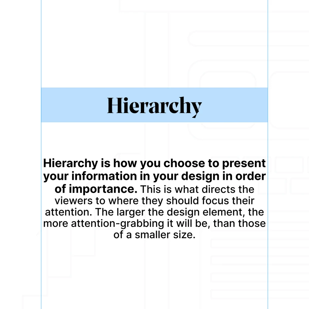
My favourite of the run, because it is the only one that has to practise what it says. Four principles of graphic design, and each slide is set in the principle it describes — typeface in a selection box, space given almost nothing but space, balance centred, hierarchy sized.
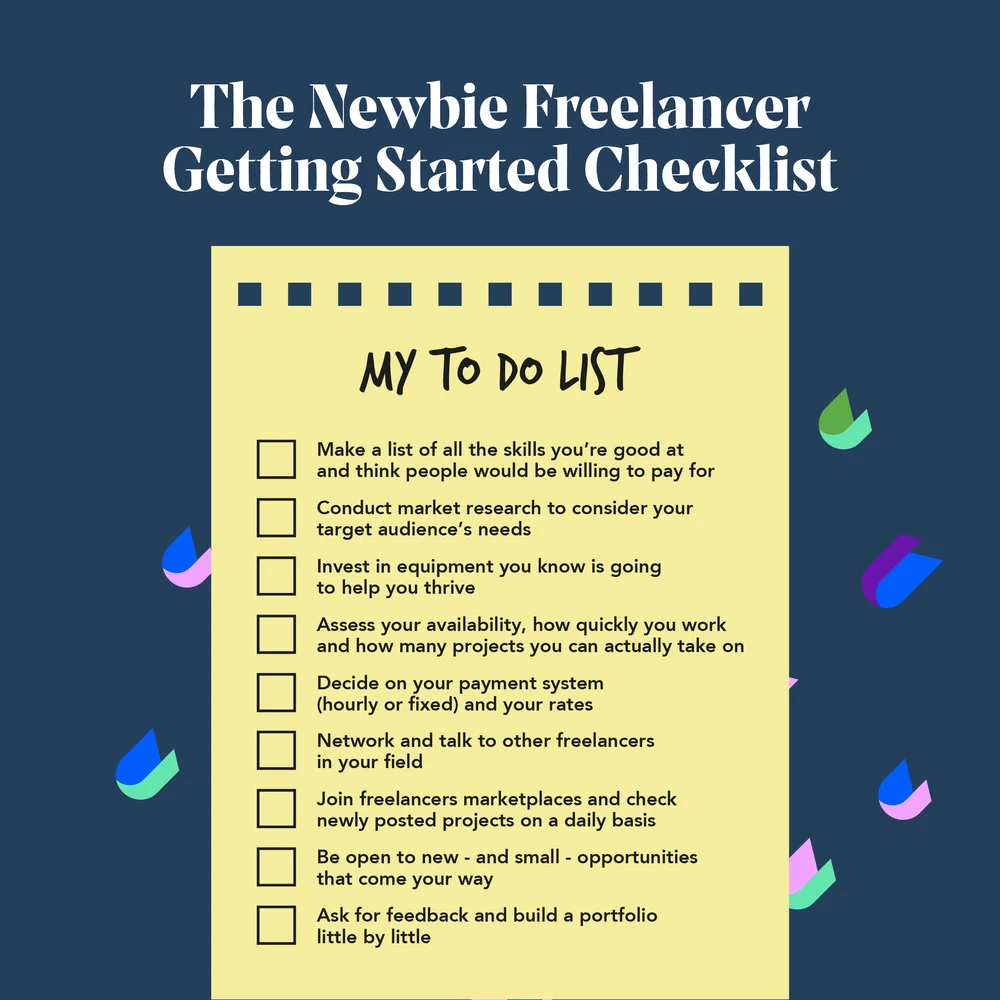
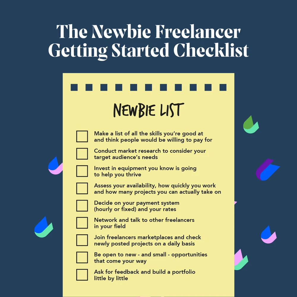
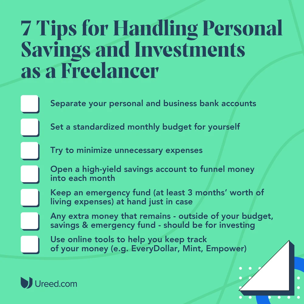
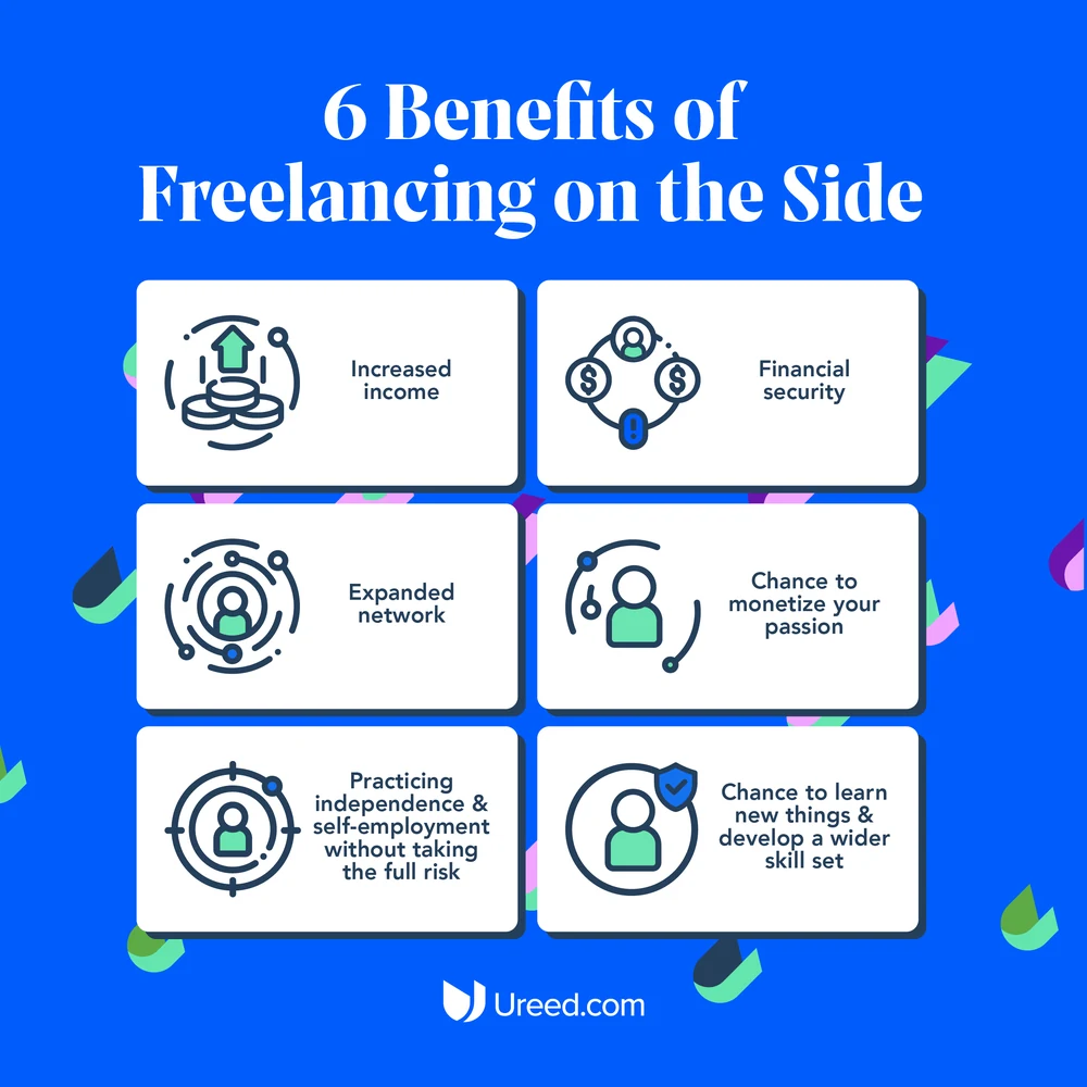
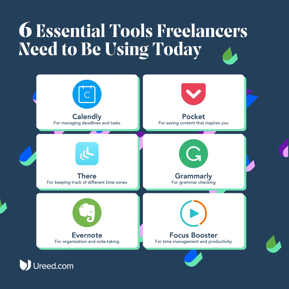
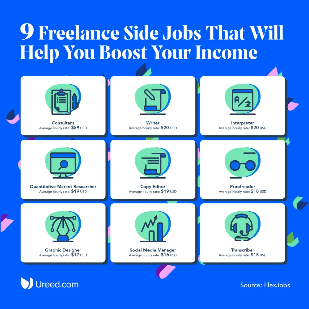
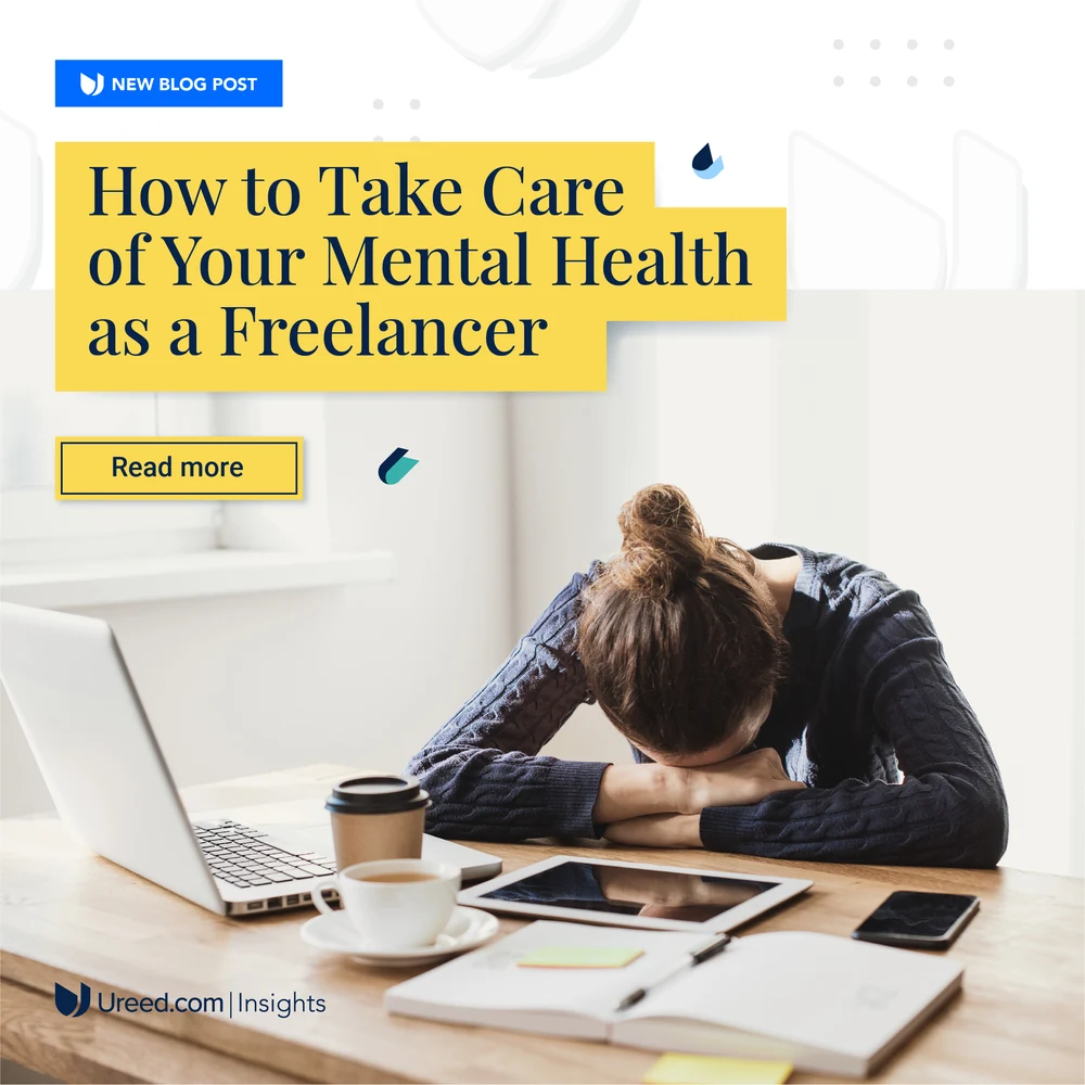
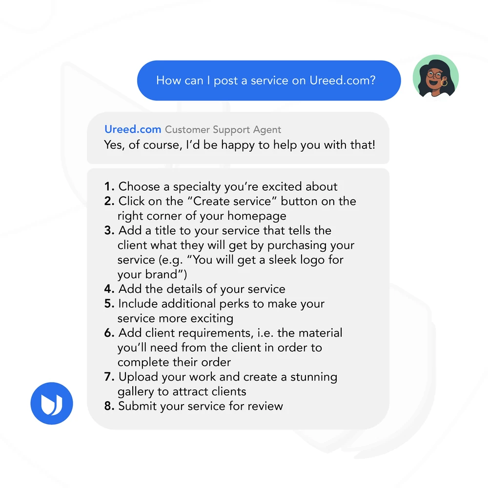
Then the long tail of being useful: a getting-started checklist in two drafts, seven tips on savings, six benefits, six tools, nine side jobs, a piece on mental health, and a support reply shown as a support reply. None of it sells anything, which is why the freelancers stayed.
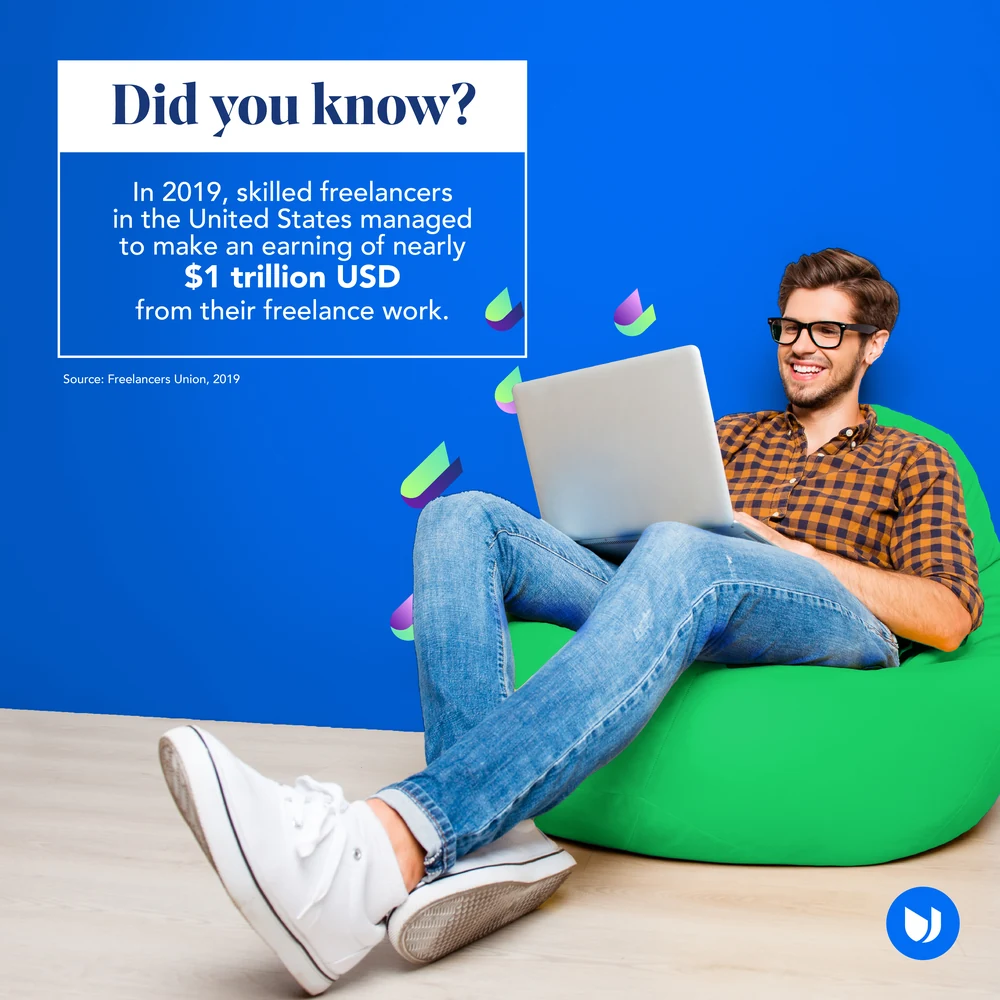
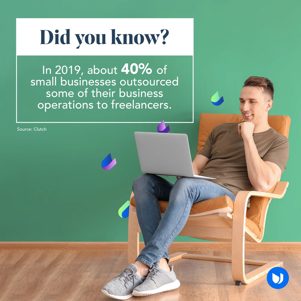
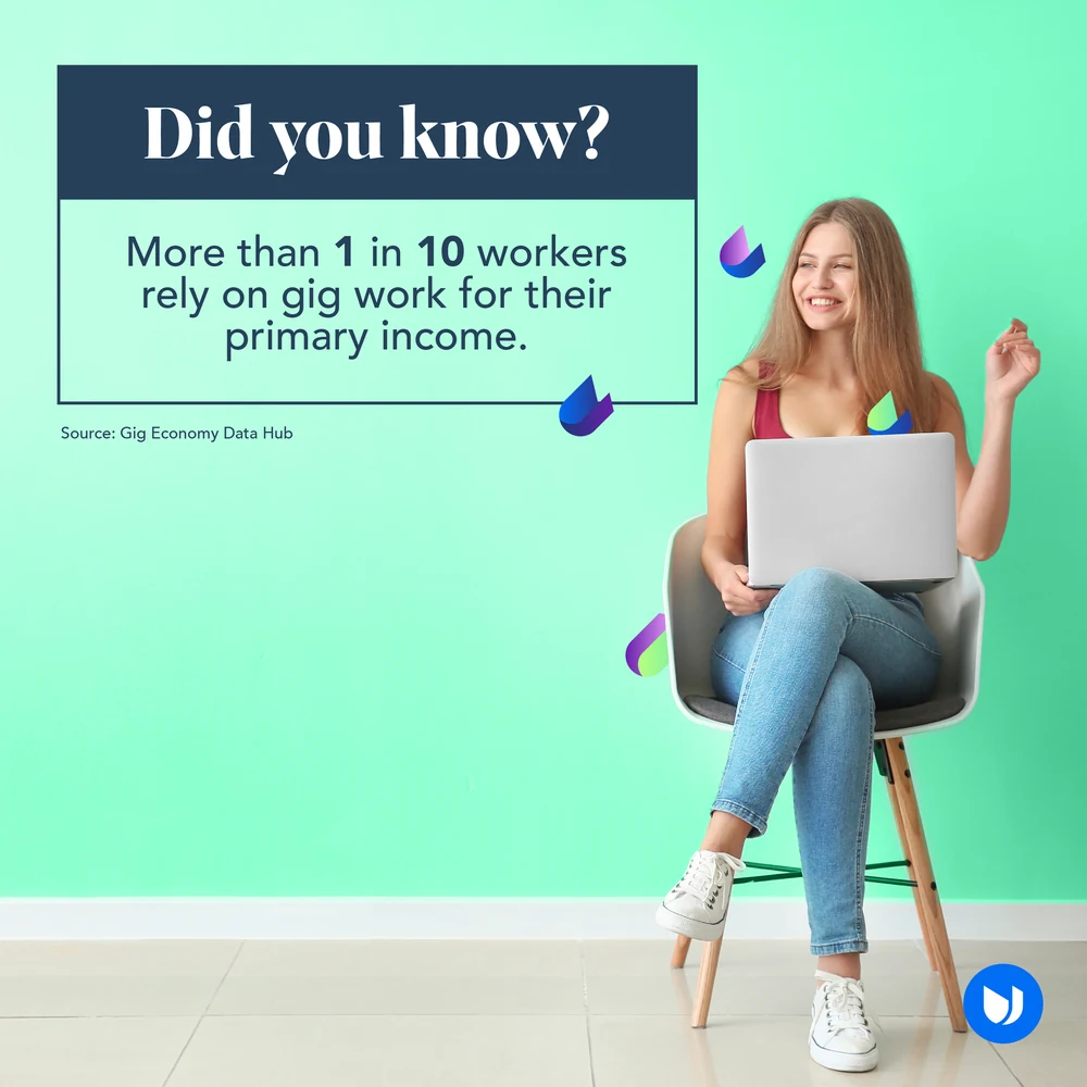
The evidence posts, which run photographic rather than drawn: someone actually working, a white card with one number on it, and the source printed small underneath. A trillion dollars of freelance earnings, forty per cent of small businesses outsourcing, one in ten workers on gig income.
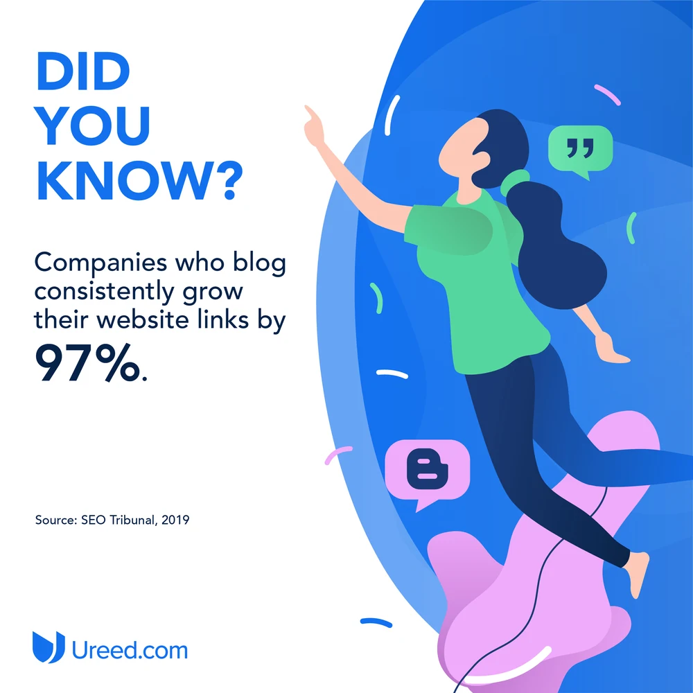
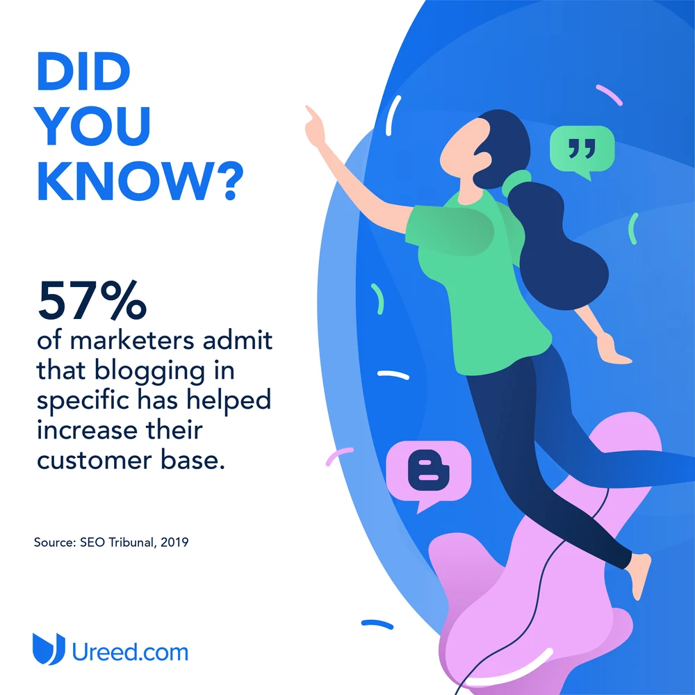
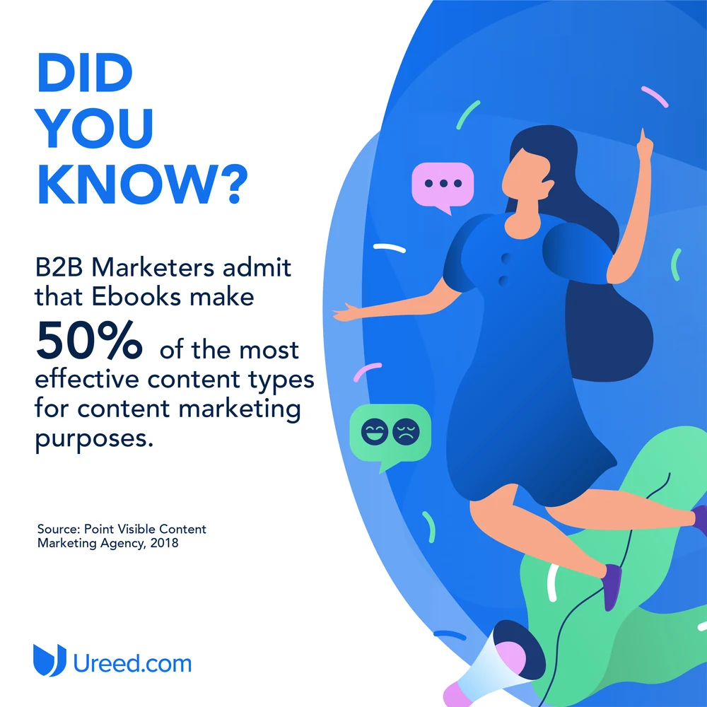
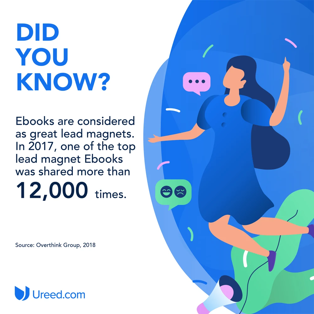
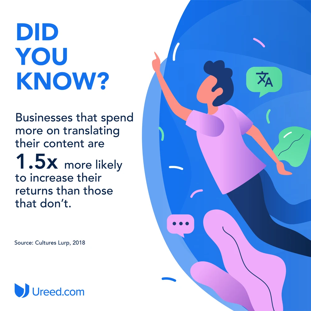
And the drawn version of the same job, for the content side of the business: one figure mid-air, one statistic, one source. Blogging, ebooks, translation — three reasons to commission writing, made to read in a thumb-scroll.
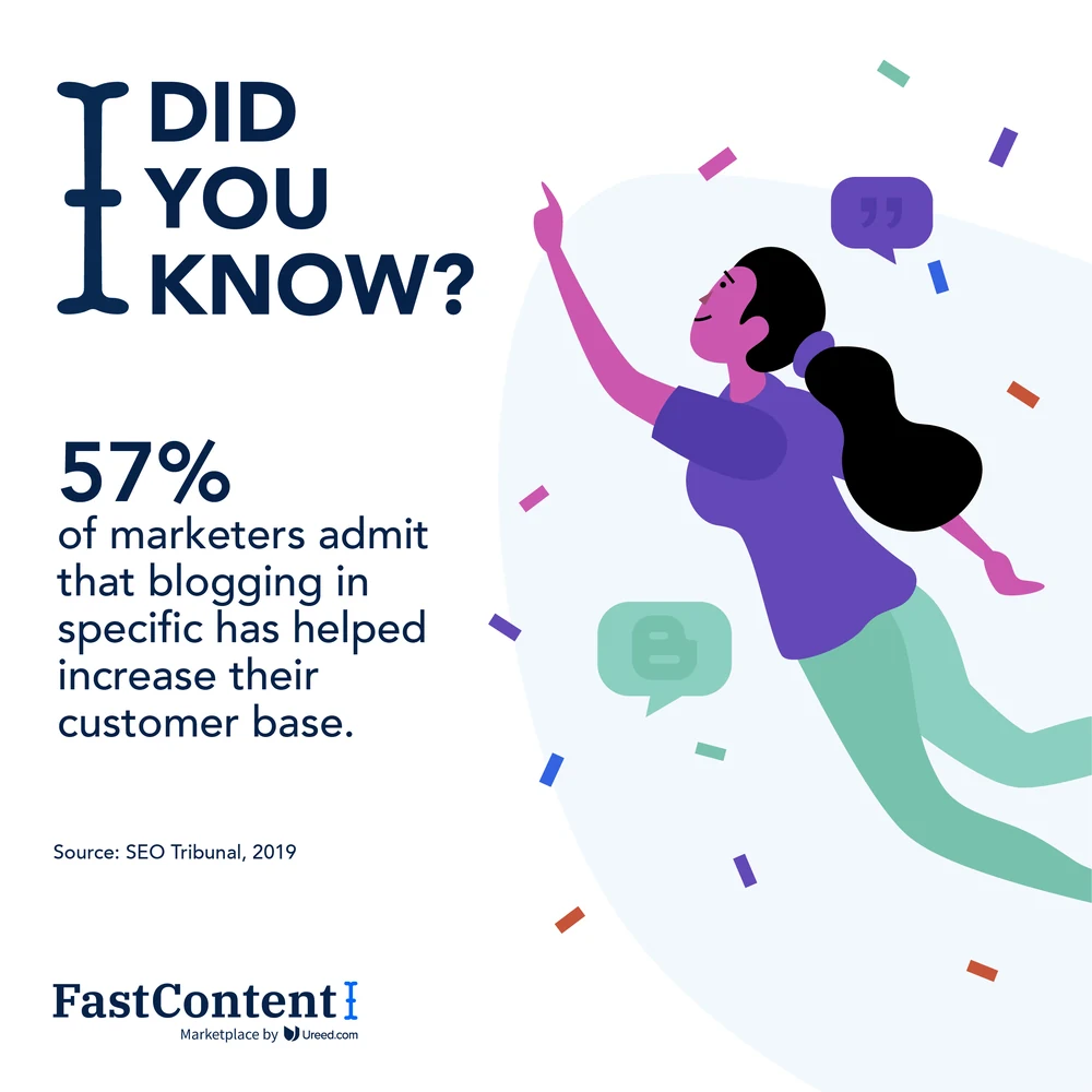
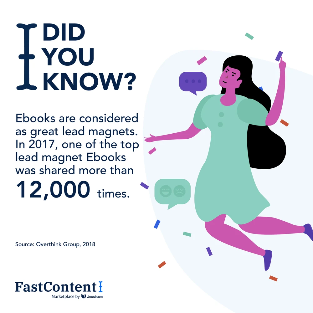
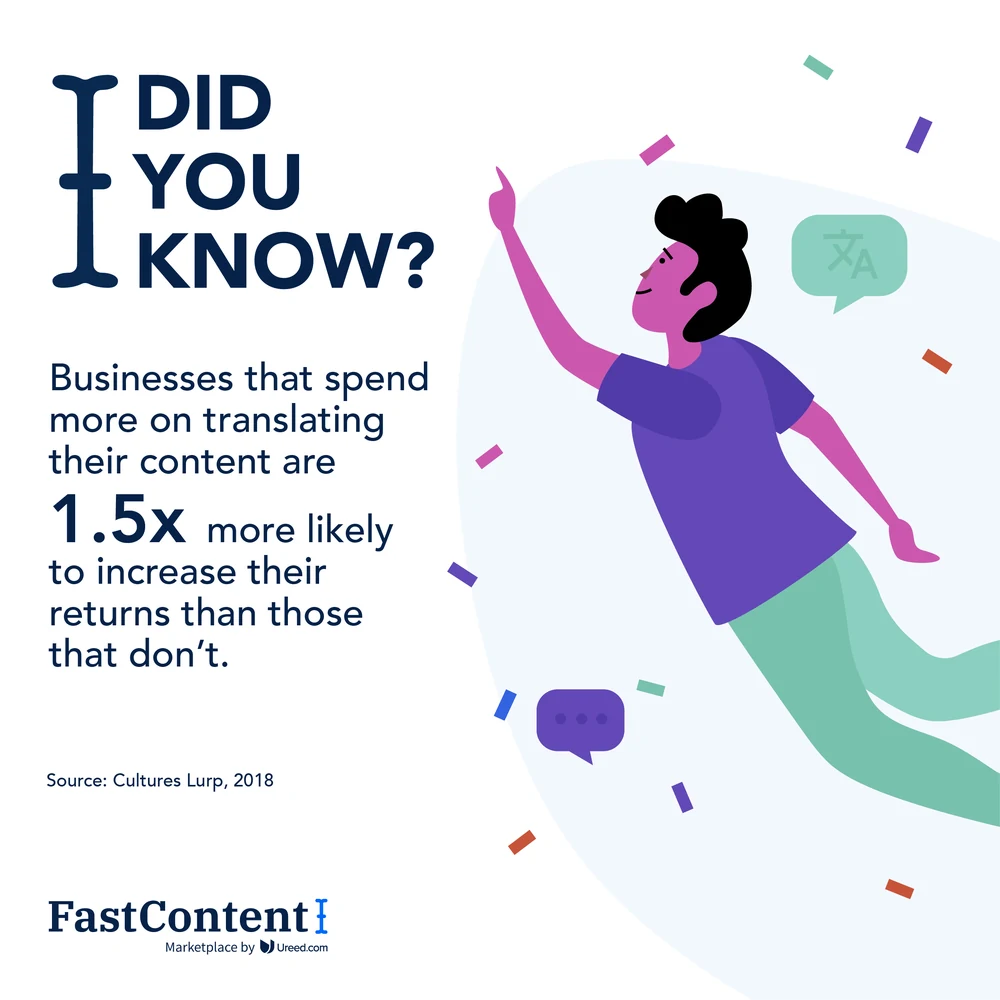
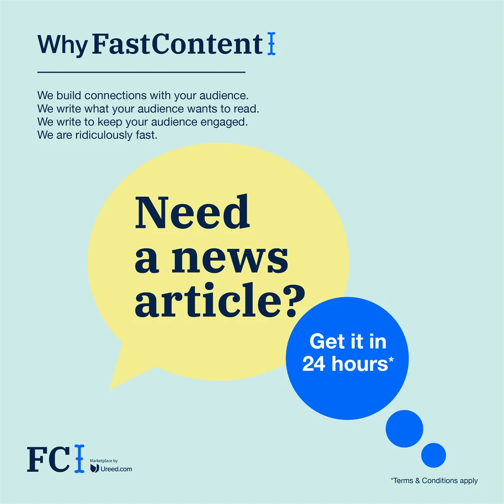
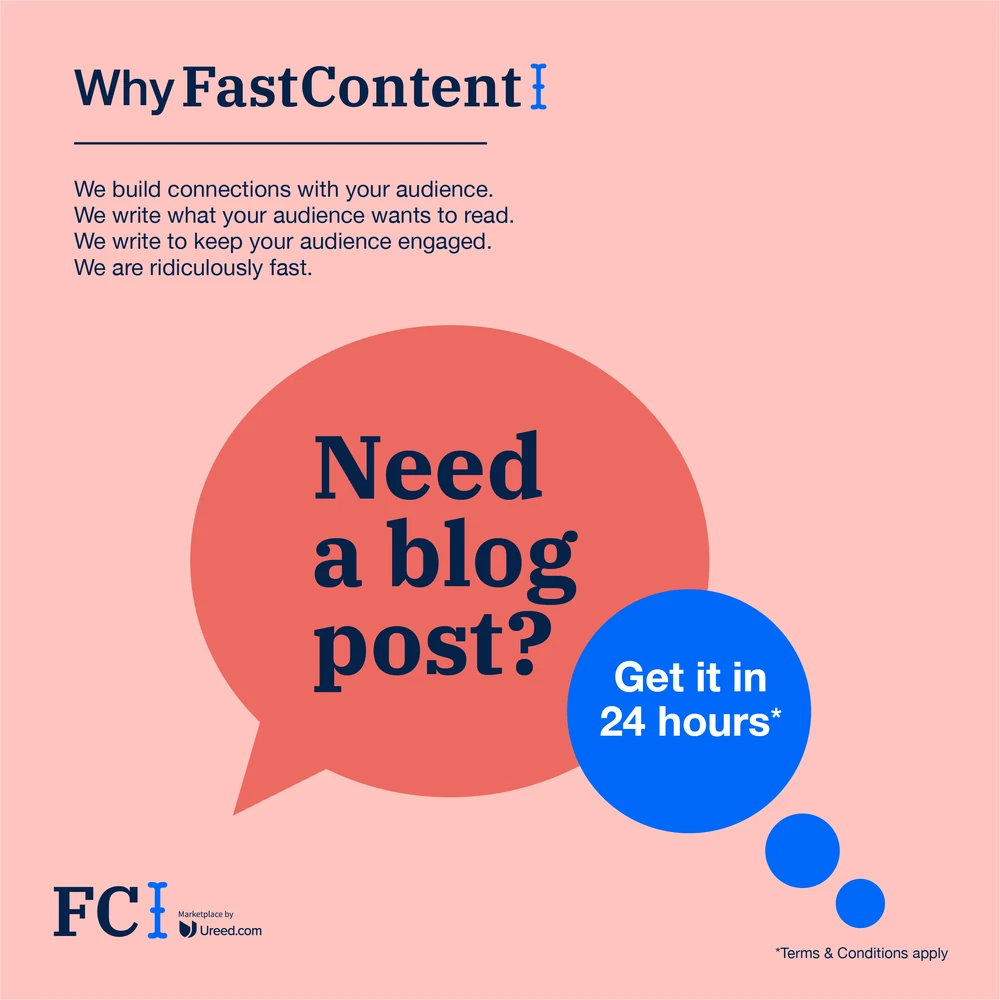
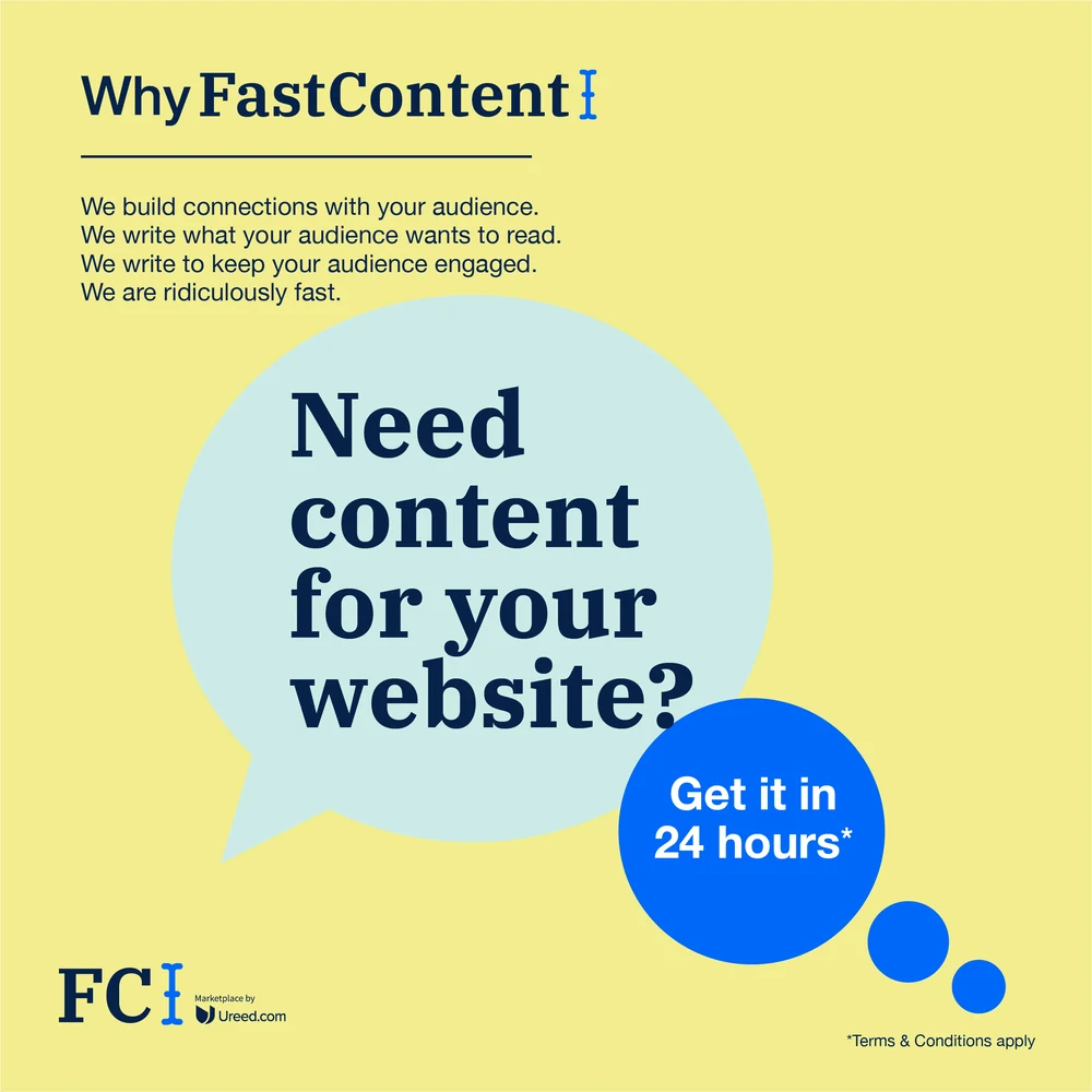
The same system under the second mark. FastContent is the content arm, so it takes the identical statistic posts in its own lockup and then asks for the order outright — a speech bubble, a question, and the only promise that matters to someone buying copy: get it in 24 hours.


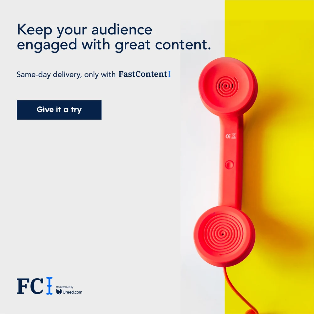
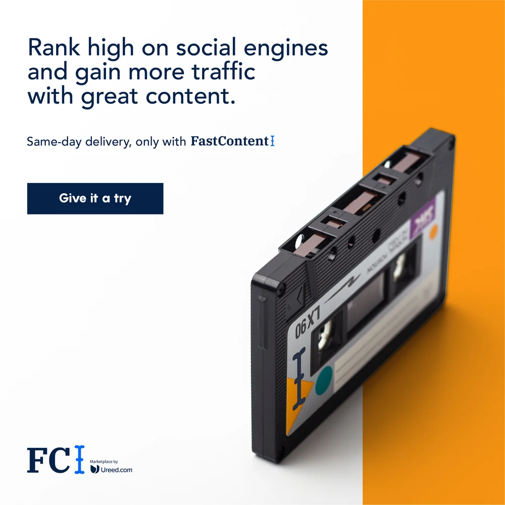

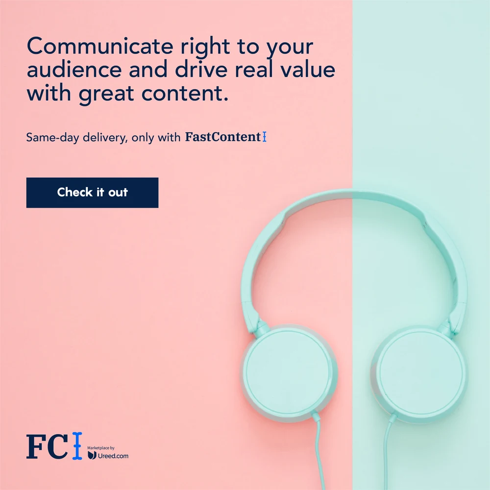
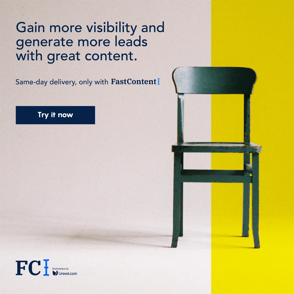
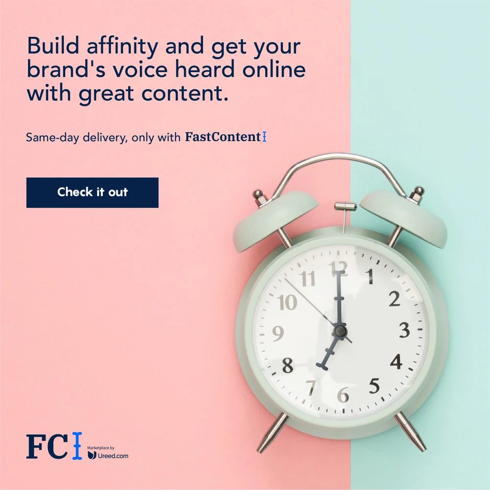
FastContent’s country campaign, and the one place the whole year lets go of illustration. A single object photographed on a colour field, the field split against a second colour, one benefit line and one button — run across the UAE, Saudi Arabia, Kuwait and Bahrain. The chair, the alarm clock, the red telephone, the cassette, the paper boat.
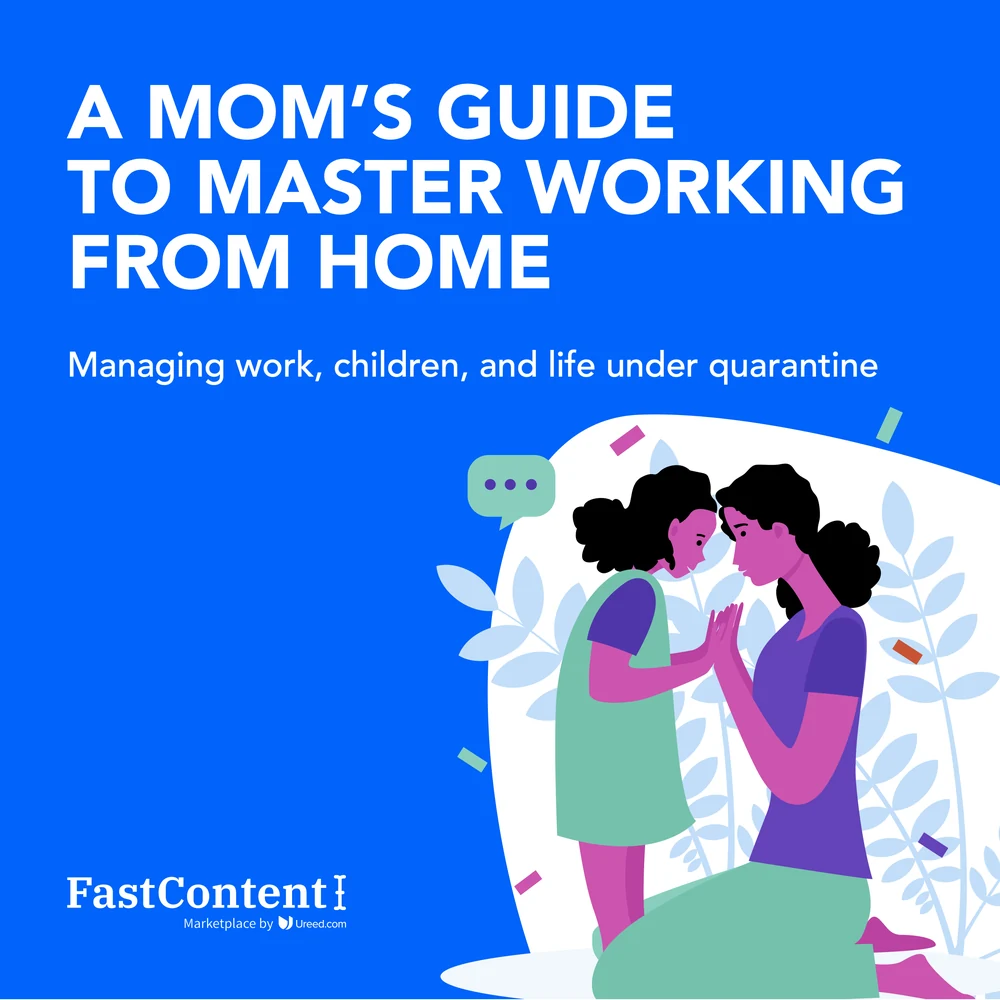
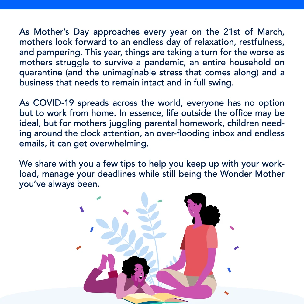
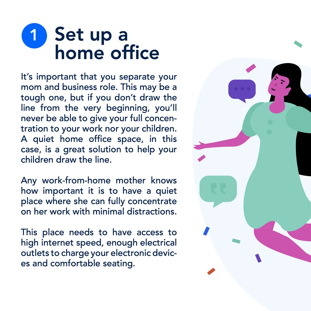
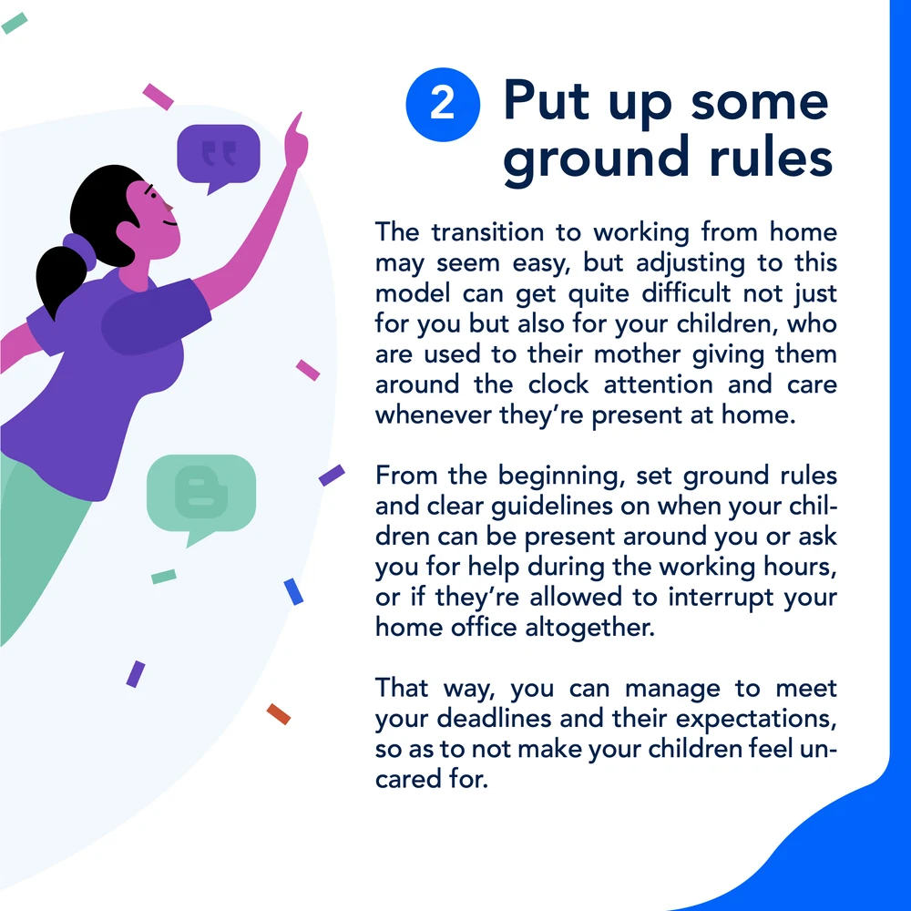
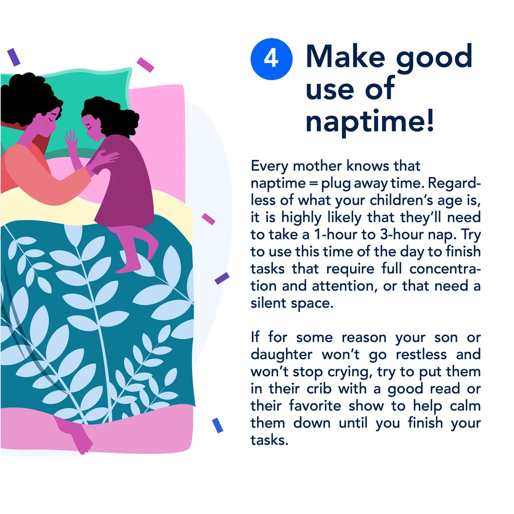
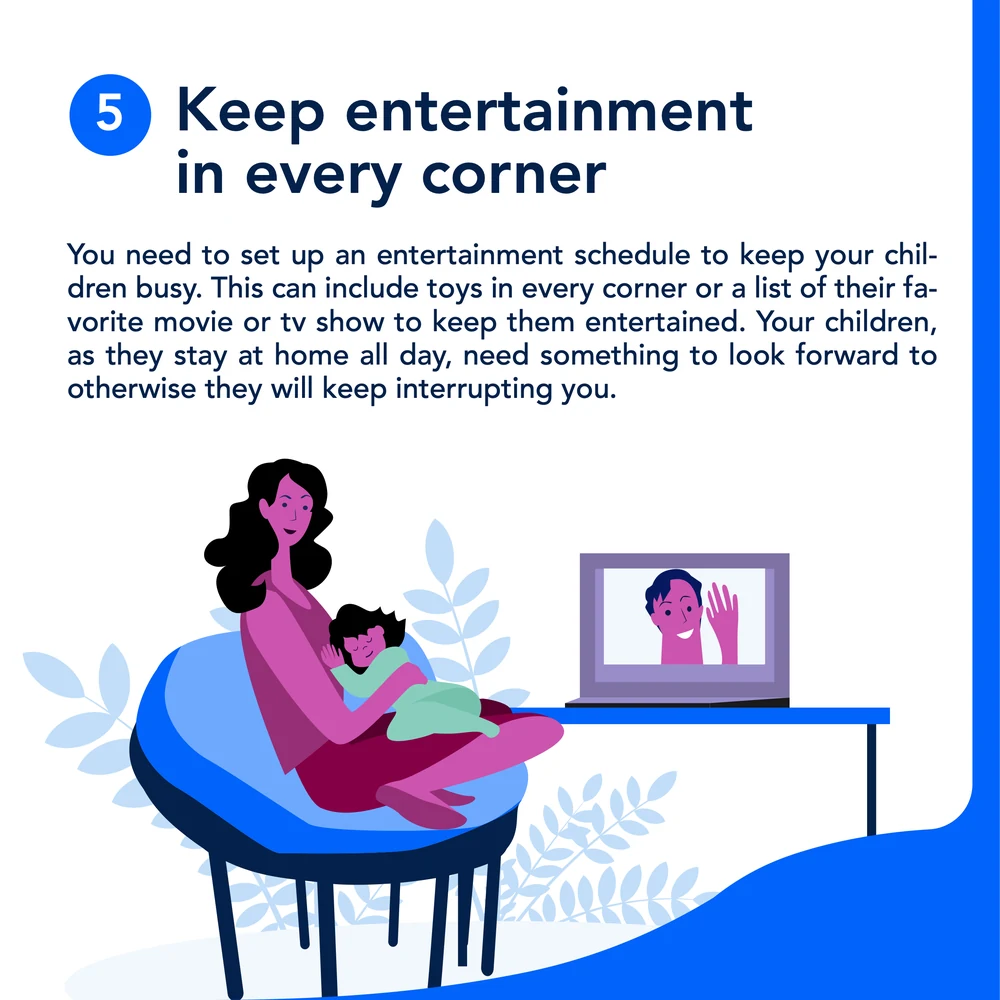
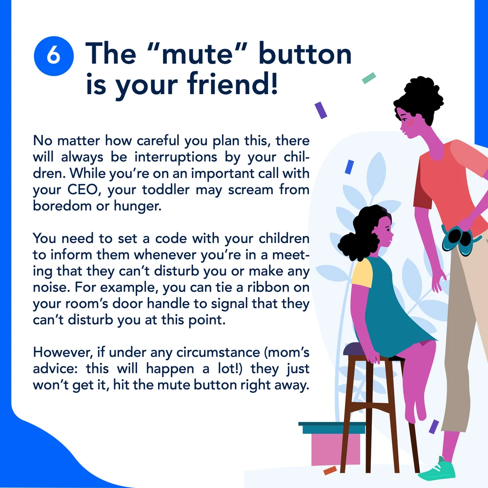
And the piece that dates the year exactly. A nine-slide Mother’s Day guide to working from home, written in the spring of 2020 for mothers running a job, a household and a lockdown at once — a home office, ground rules, a schedule, naptime, entertainment, and the mute button.
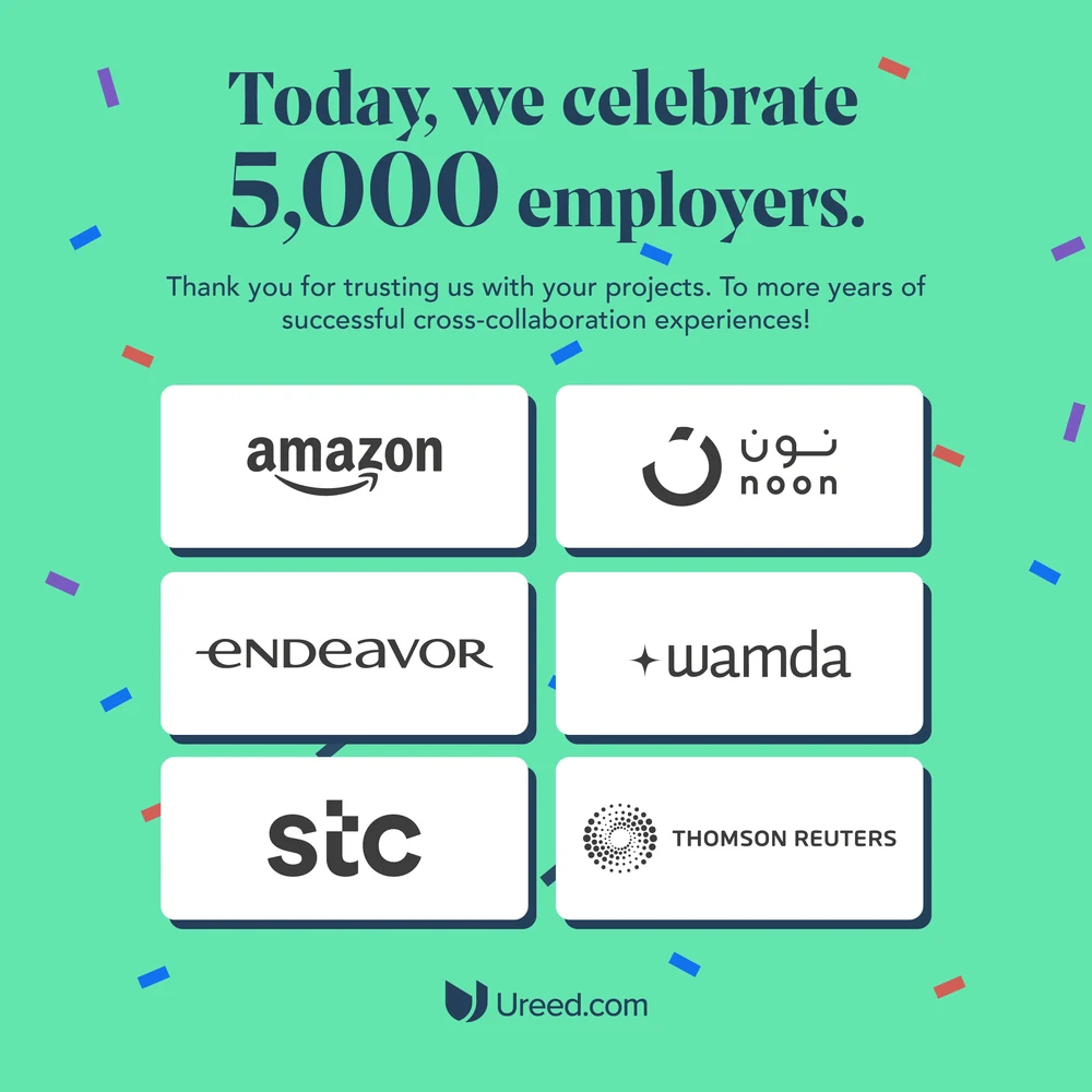
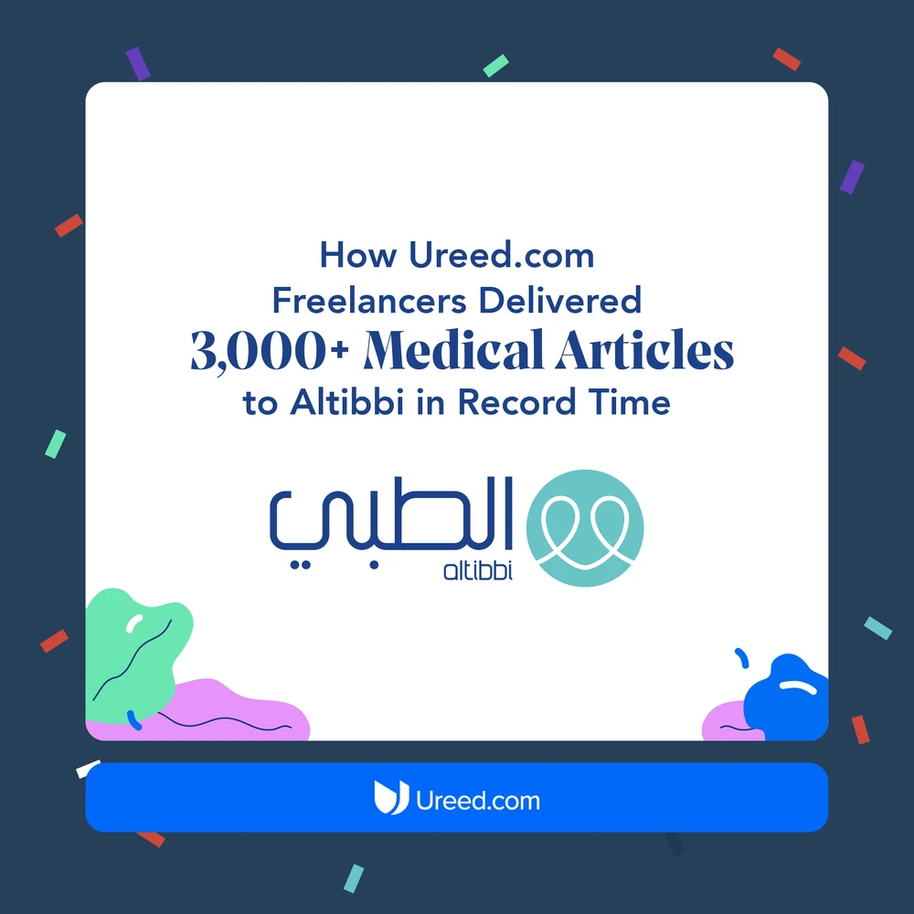
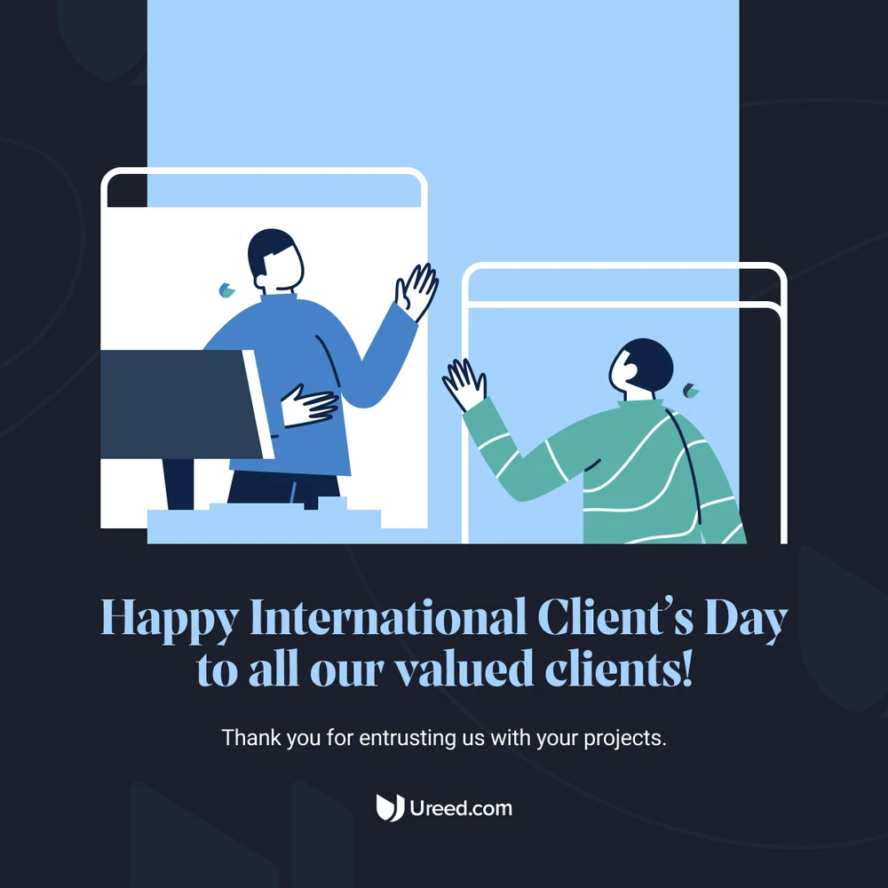
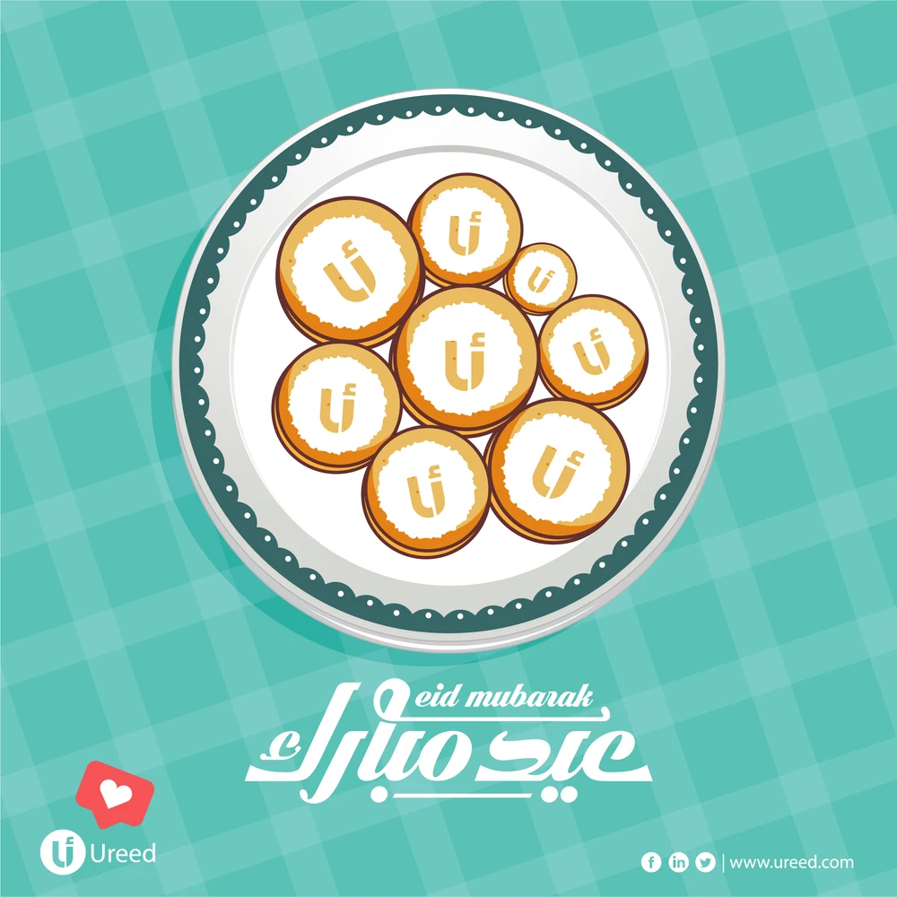
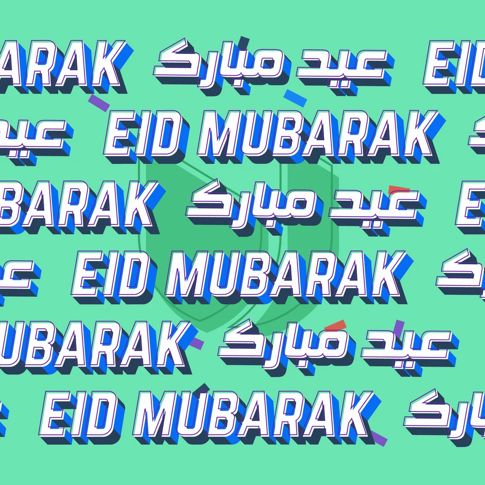
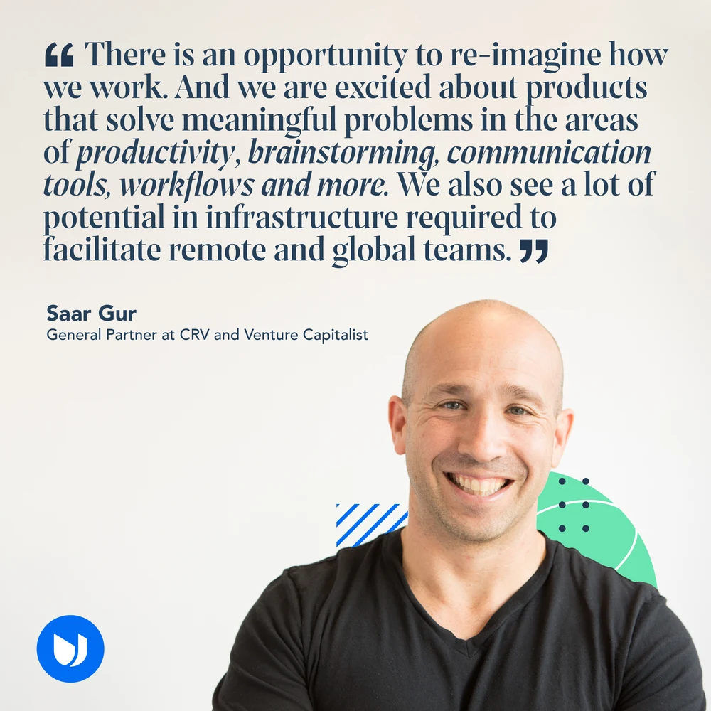
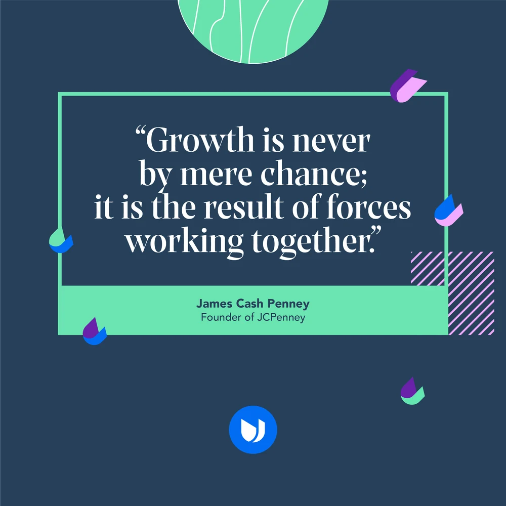
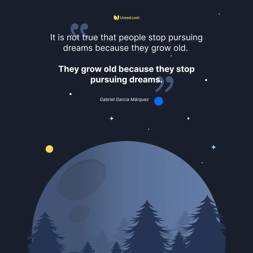
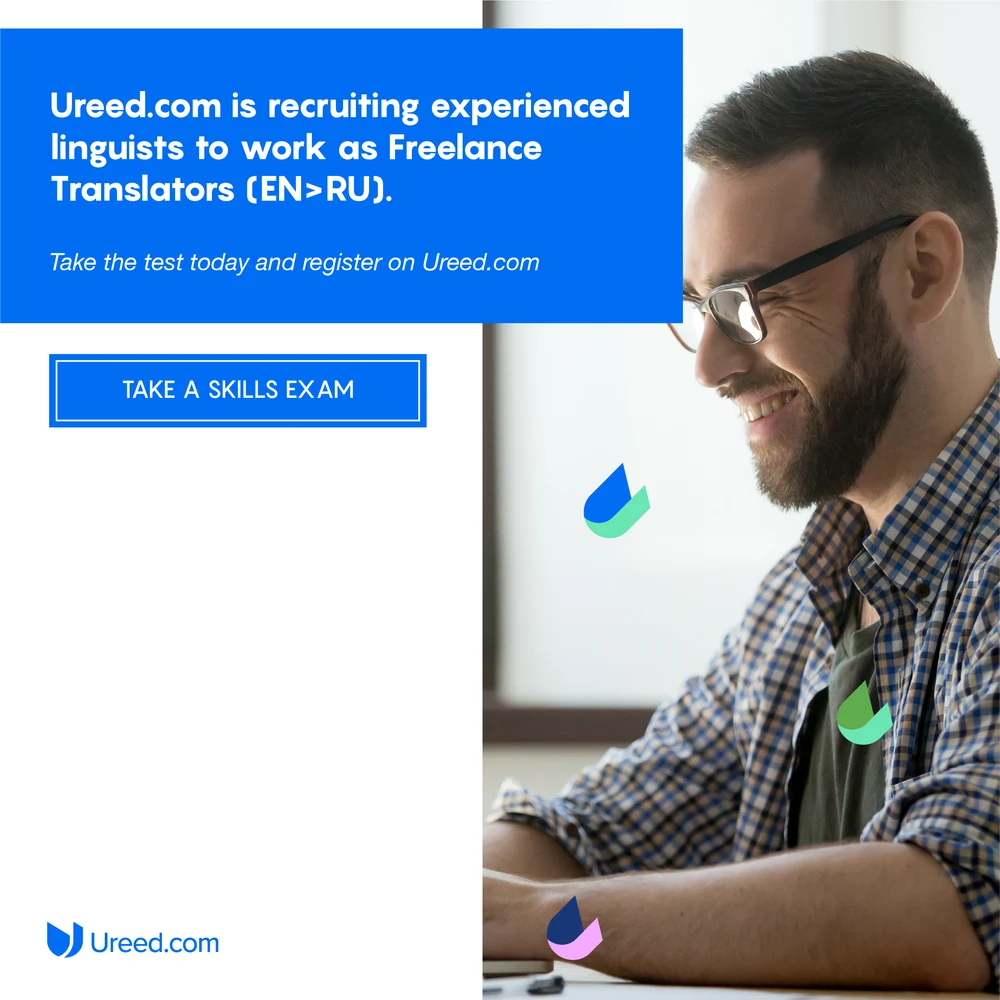
The posts that sell nothing: five thousand employers counted and named, a client’s day card, Eid in two registers, a case study with a number in it, and the quotes a marketplace puts up when it wants to sound like a company rather than a shop.

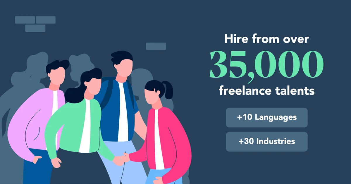
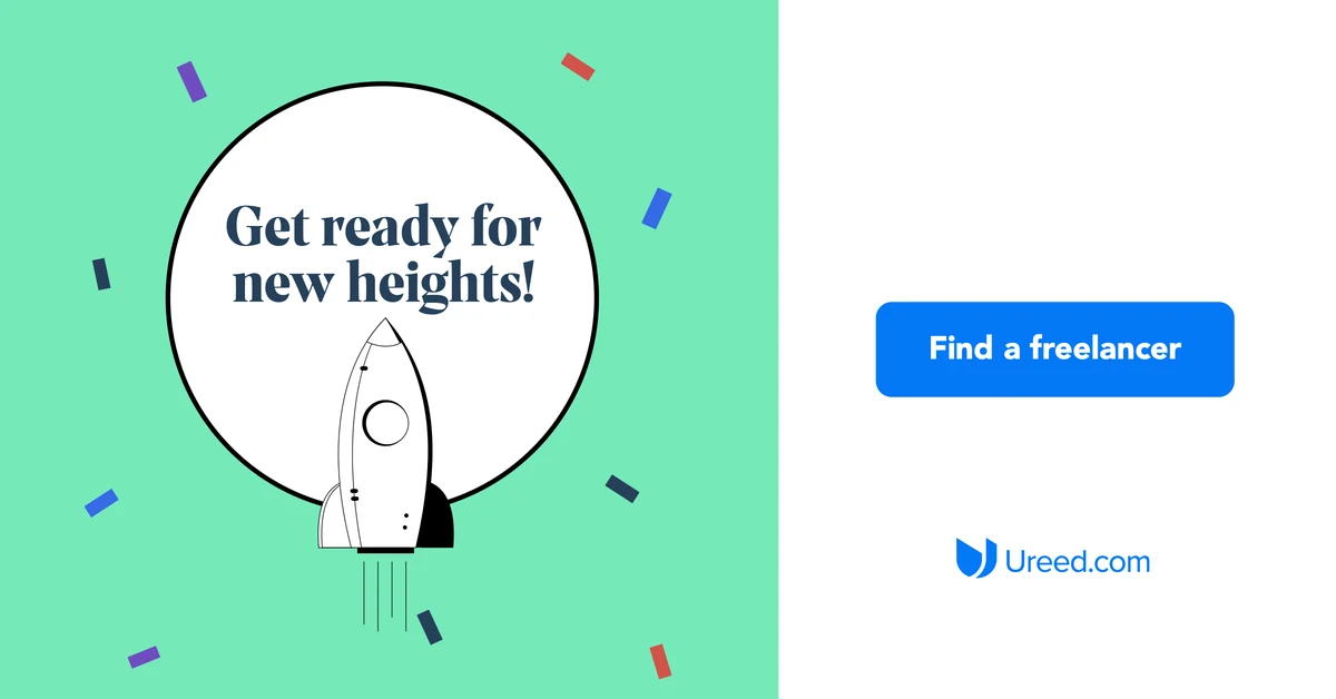
Off the feed and into the ad slots, where there is no caption underneath to finish the thought: the line, the number and the button all have to sit in one 1200 by 628 frame.