

















Brand work across the group · Canada, 2026
Cority
Cority is enterprise EHS software — environment, health and safety — and, since the acquisition, Meddbase’s parent. Which sets the brief before anyone writes a line of it: a product with fifteen years of its own name, its own market and its own customers has to come inside a parent’s brand without either of them coming off worse for it.
The settlement is a demotion that does not read as one. Cority’s logo leads; meddbase sits beside it in lower case, as a label rather than a partner — a property of the group, named where the buyer can still find it. Everything else is the parent’s: the cast of greyscale clinicians knocked out to the page, the teal held back for the one thing on the slide that has to be read first, and a grid strict enough that a post, an email header and a two-metre stand are plainly the same company talking.
What follows is everything that kit had to carry. The redesigned homepage, a nine-post campaign with five decks inside it, the single posts that run between them, the conference and release headers, the emails, the exhibition stand, a press ad, and the sales collateral the team actually sends — each one a different amount of room for the same argument.
The homepage, live in the frame — and the whole of it is one window away. Cority’s logo leads and “meddbase” stands beside it as a label, not a partner: a property of the group, said plainly. Below it the hero is a six-layer parallax, the product surfaces interleaved with the photograph so the figures occlude what sits behind them.

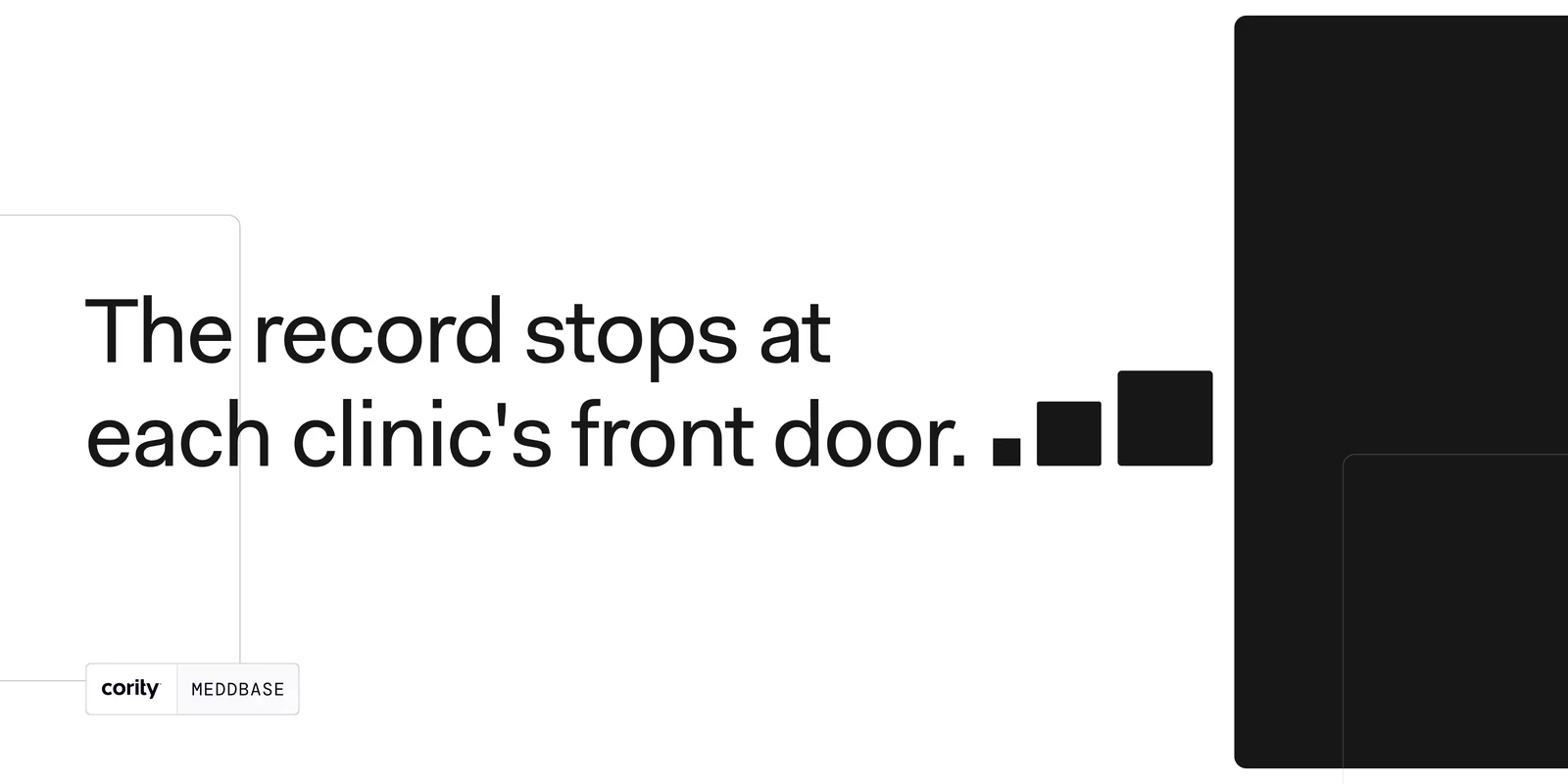
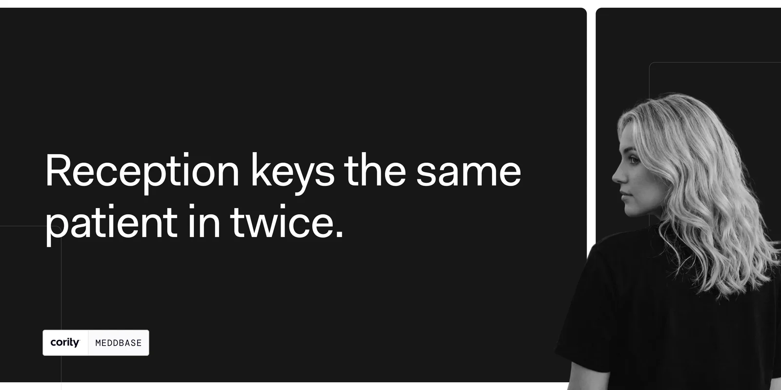
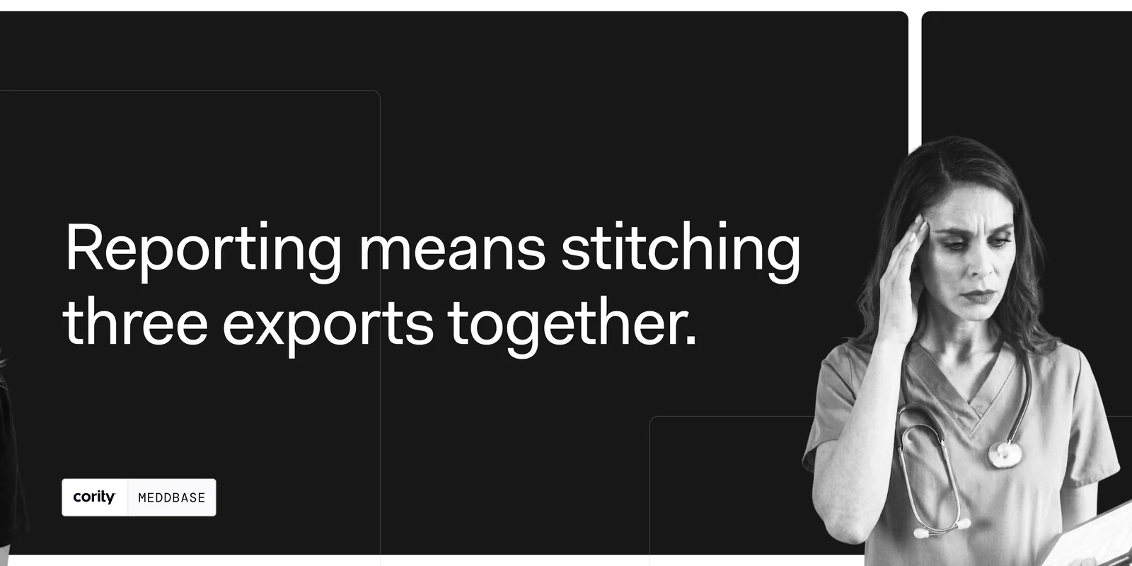
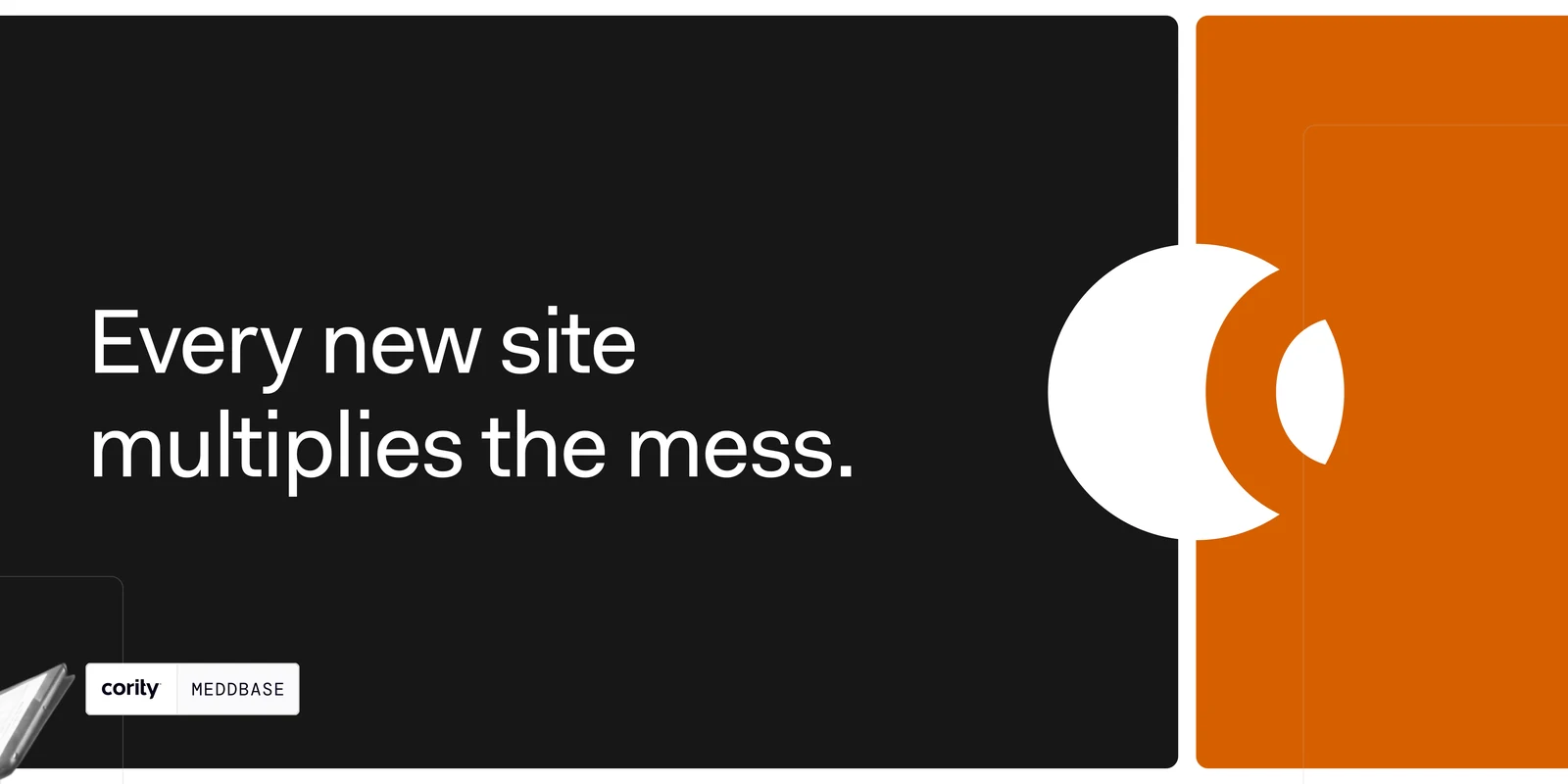
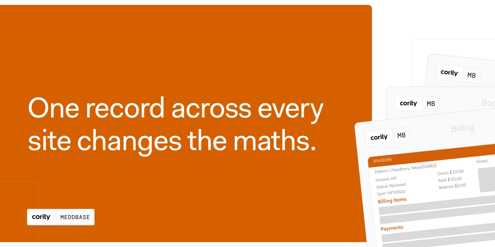
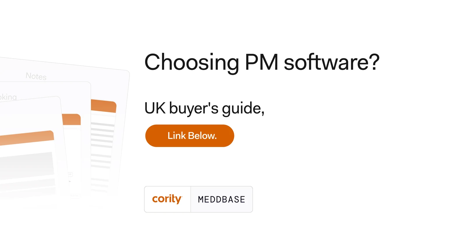
The campaign the site sits at the end of — nine posts, five of them carousels, all built out of one kit: the lockup in its plate, the greyscale cast knocked out to the page, and the thin rounded outlines that carry over from the site’s own product surfaces. This is the sharpest of them. It walks a three-site practice through its own week and inverts as it goes: white while the problem is still hypothetical, black once it is being described, orange at the answer.

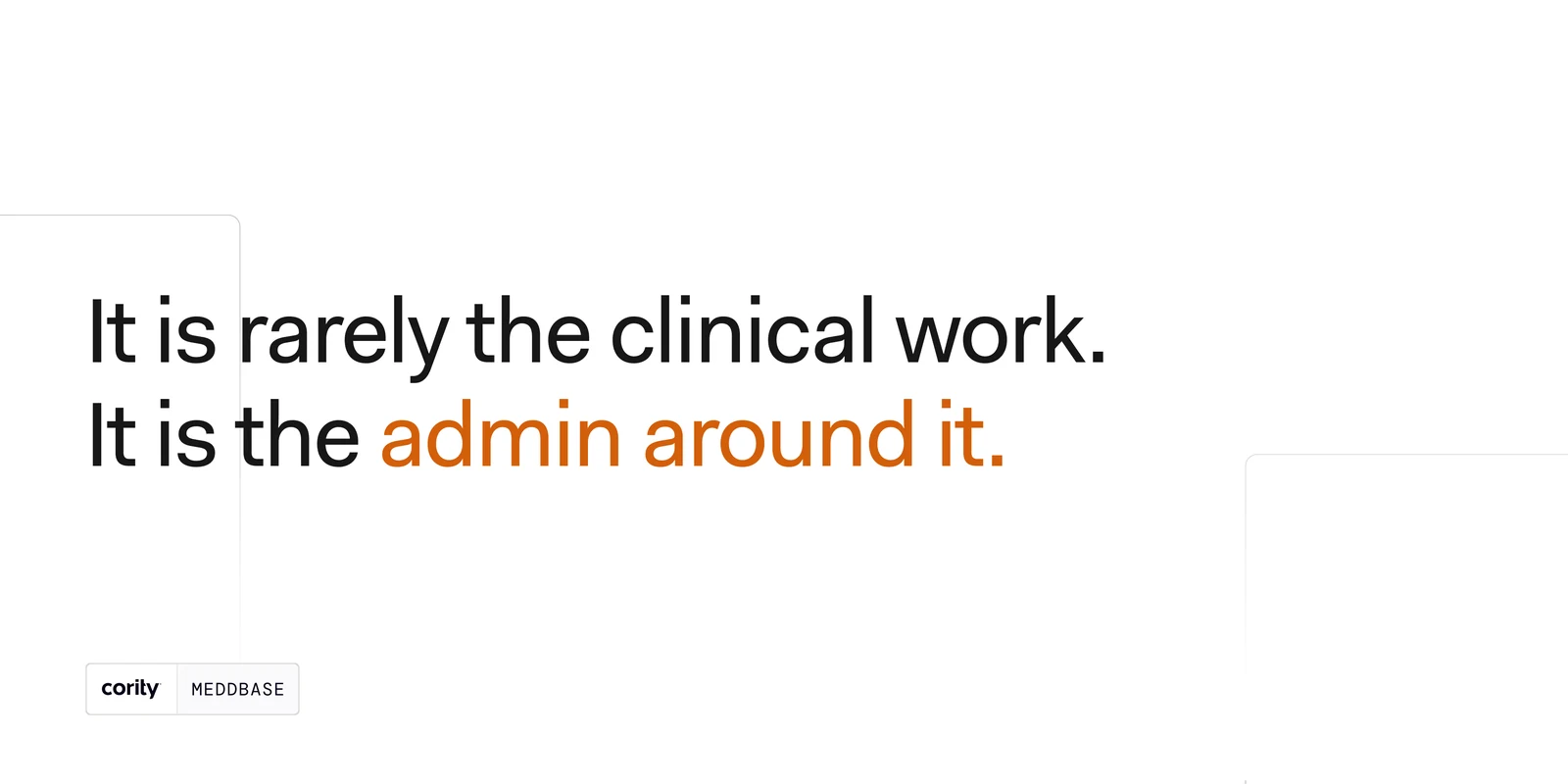
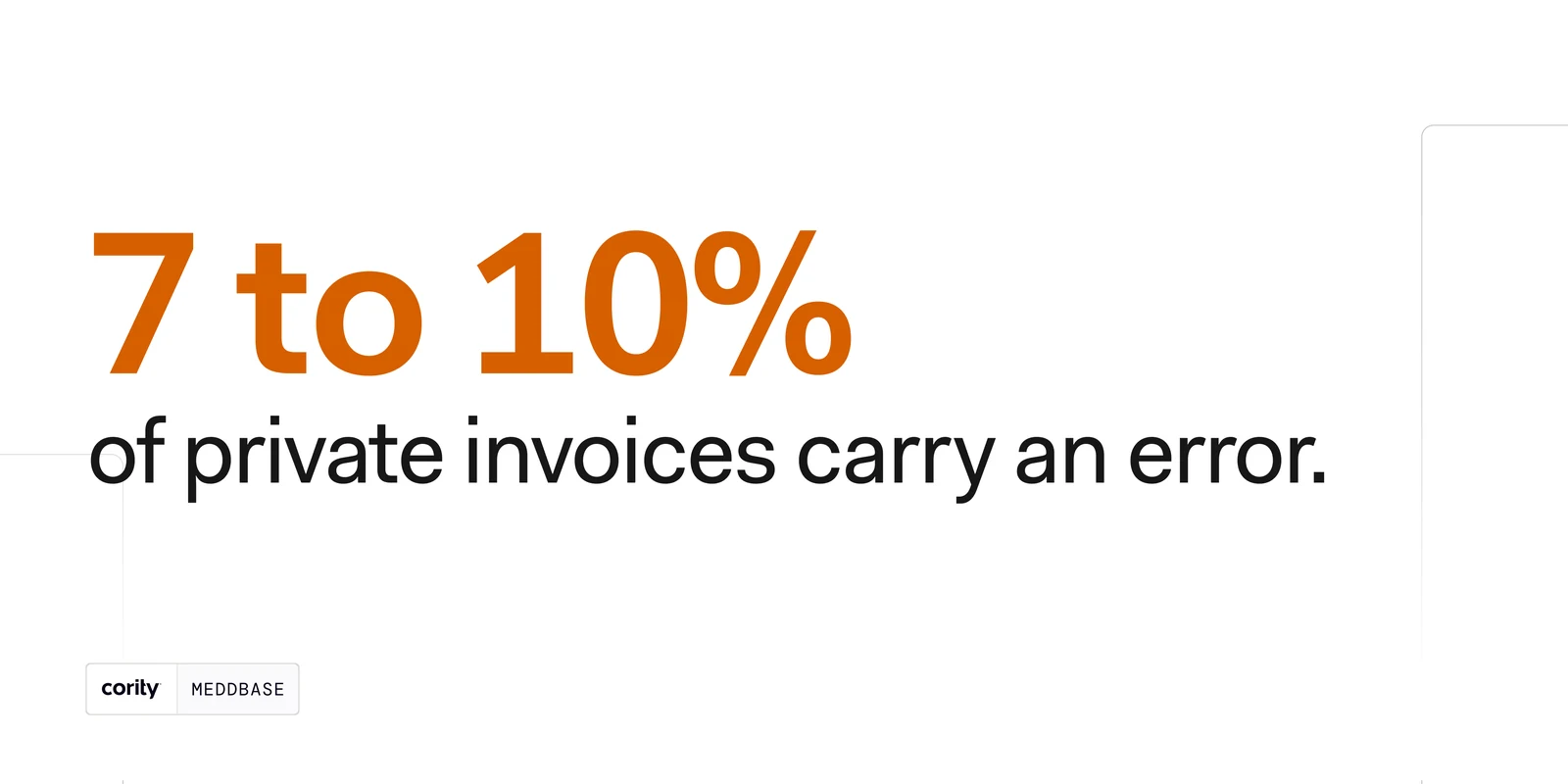
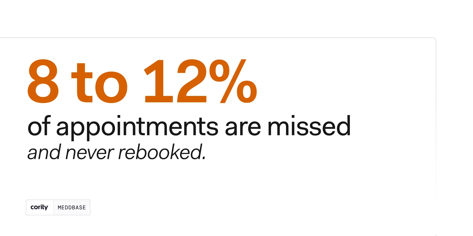
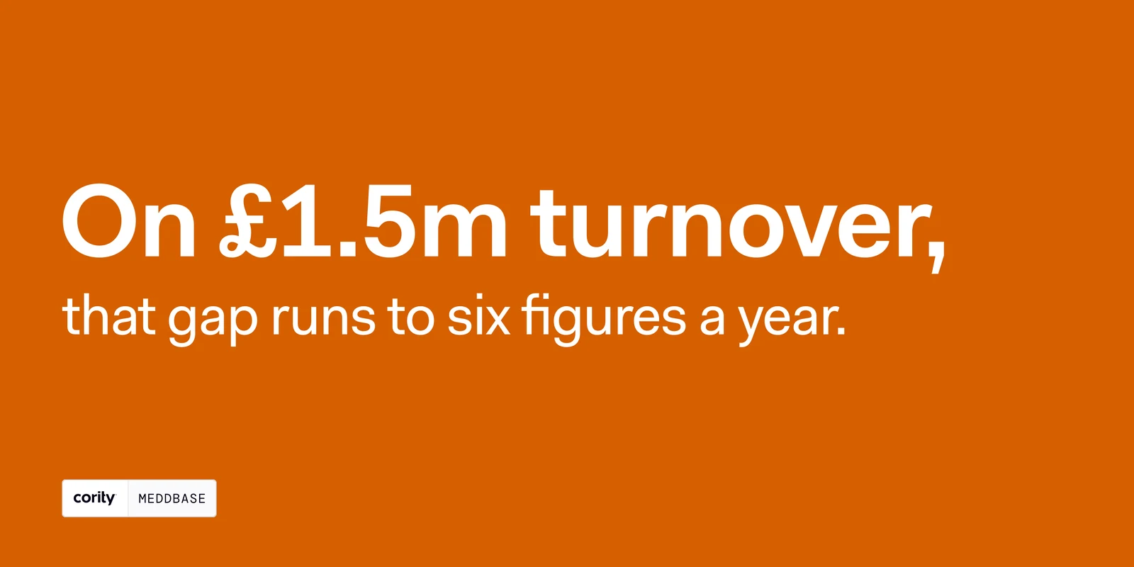
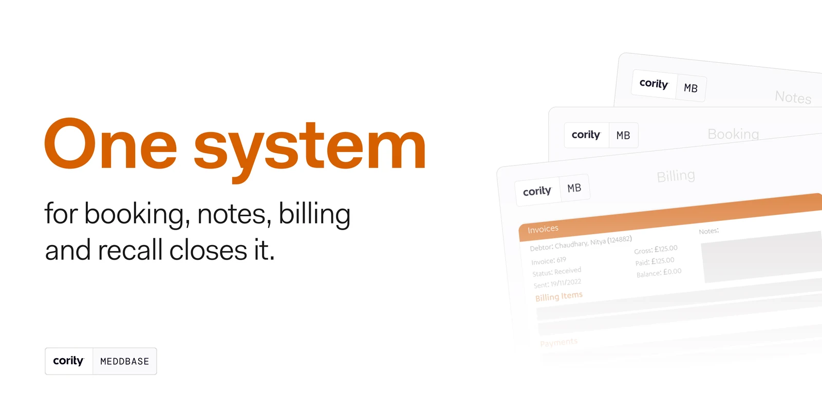
The same argument run at the P&L instead of the rota. It opens on a question the reader has already asked themselves, spends four slides turning it into arithmetic — invoice errors, missed appointments, the two multiplied against turnover — and only then names the product. The orange slide is the one that has to land, so it is the only one that changes ground.

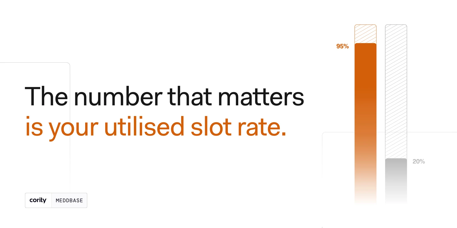
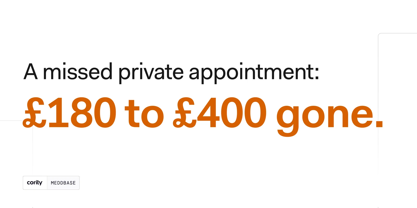
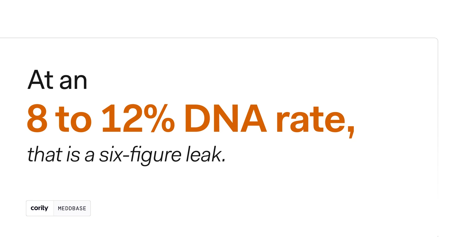
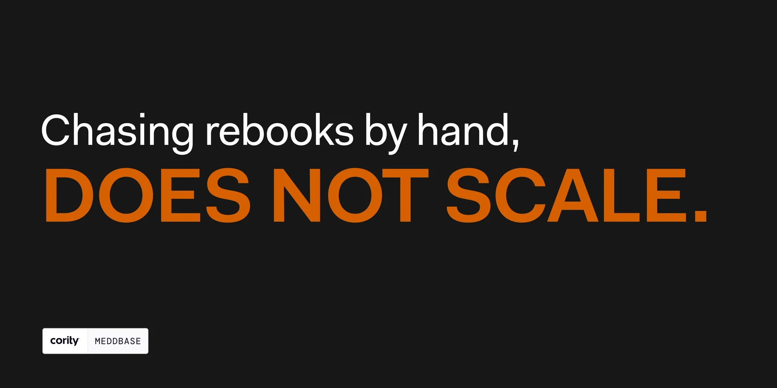
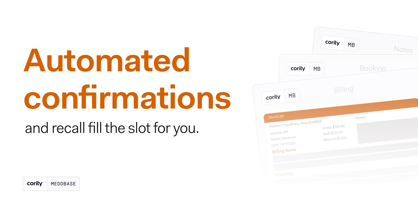
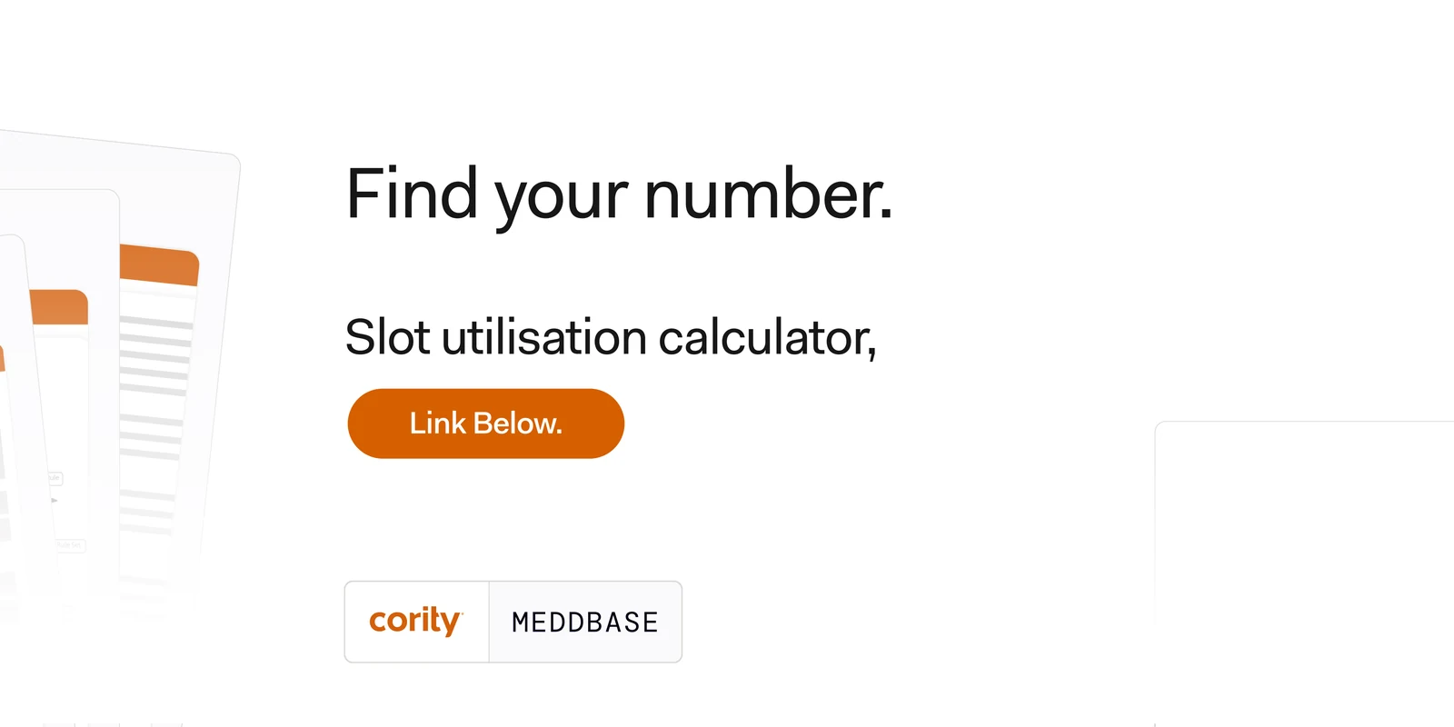
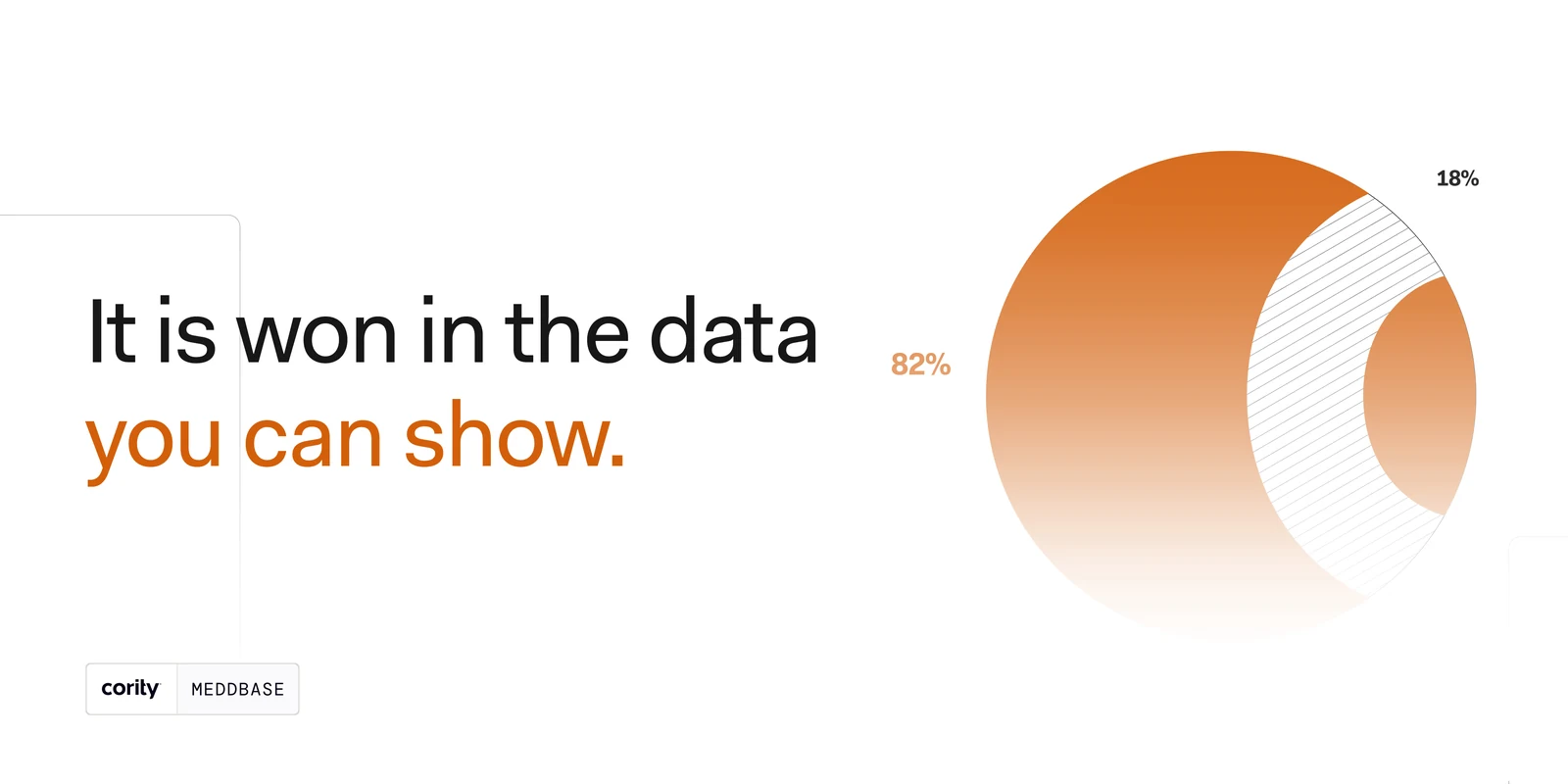
Third in the sequence and the one that puts a number on the wall: a full diary and a thin month are the same diary, and the difference is the utilised slot rate. The charts are drawn in the kit rather than plotted — two bars, one hatched, no axis, because the comparison is the whole point and a grid would only invite arithmetic the post is not making.

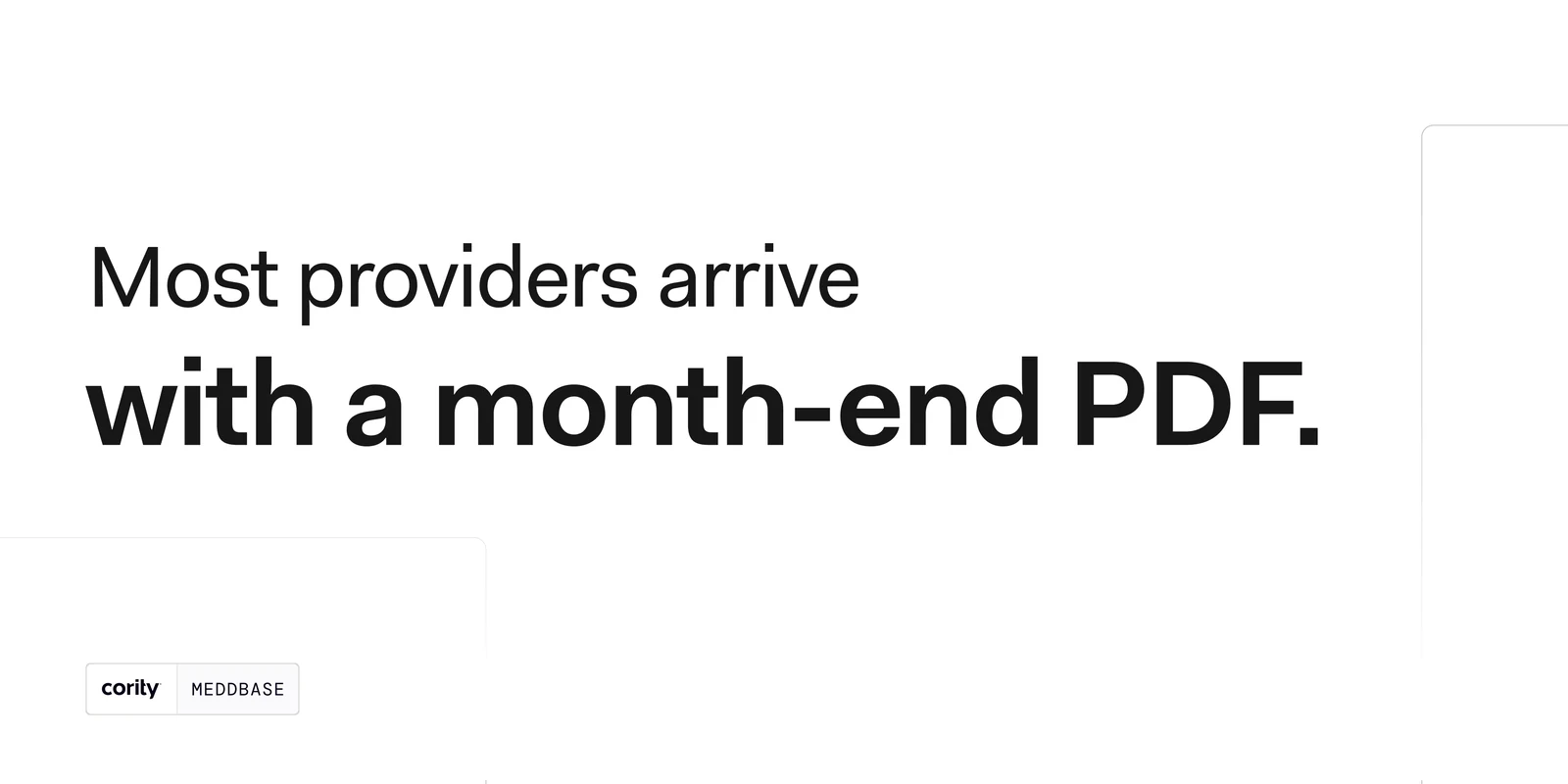
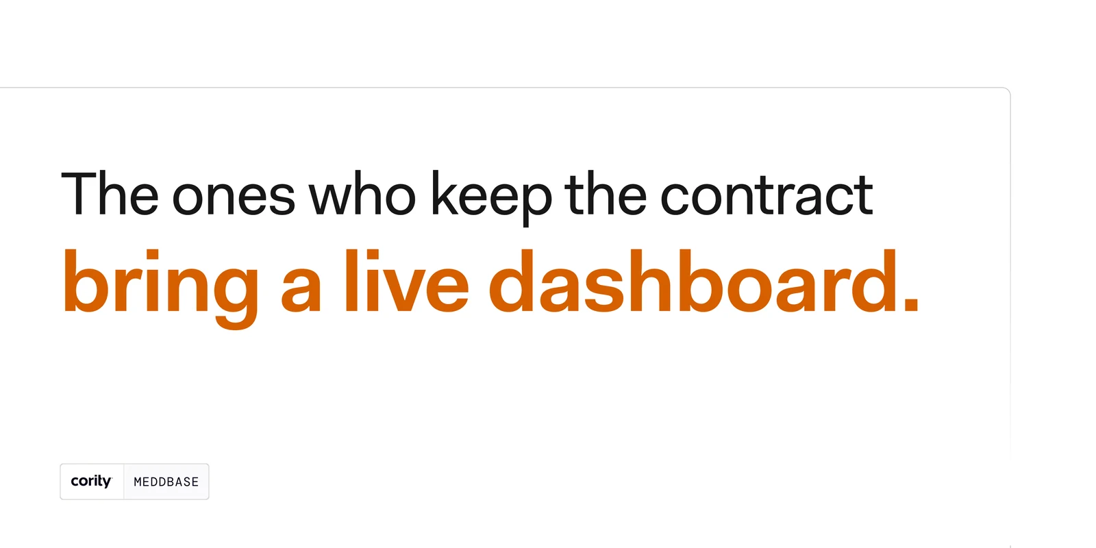
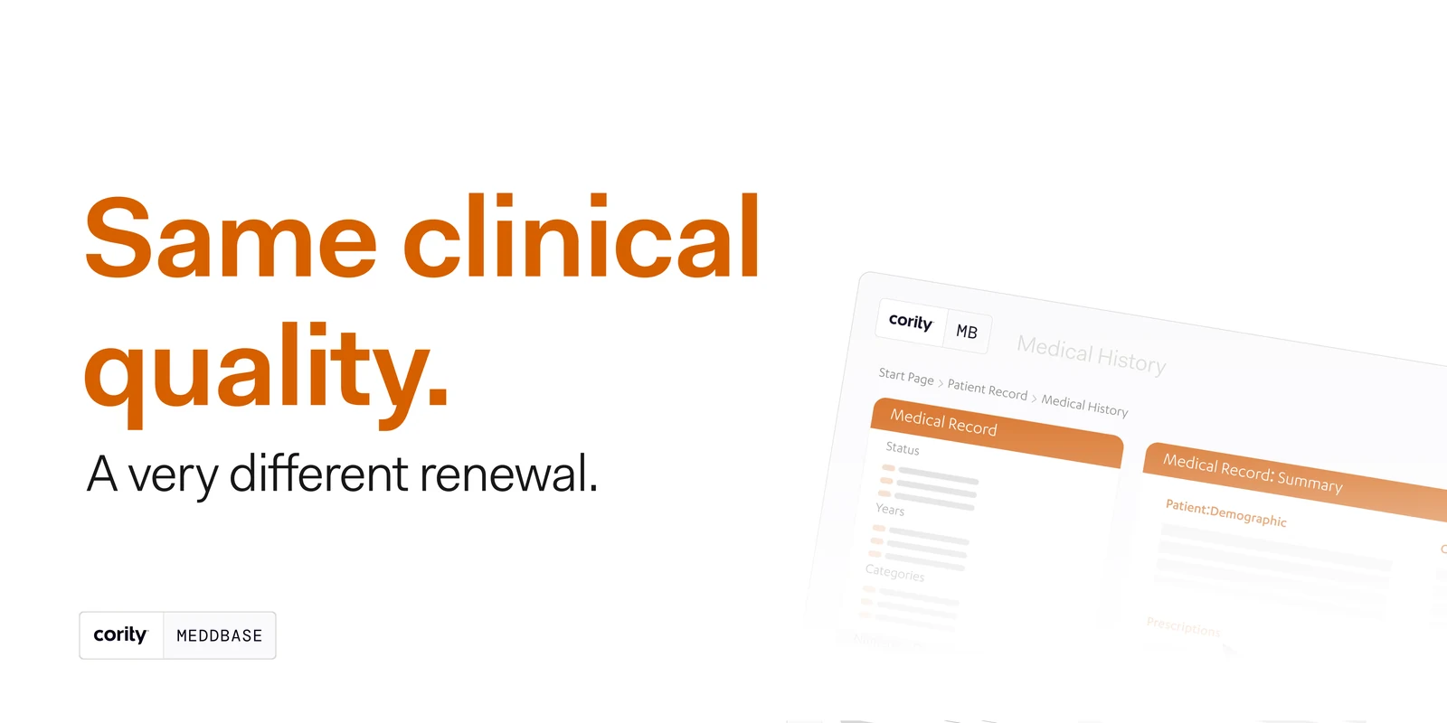
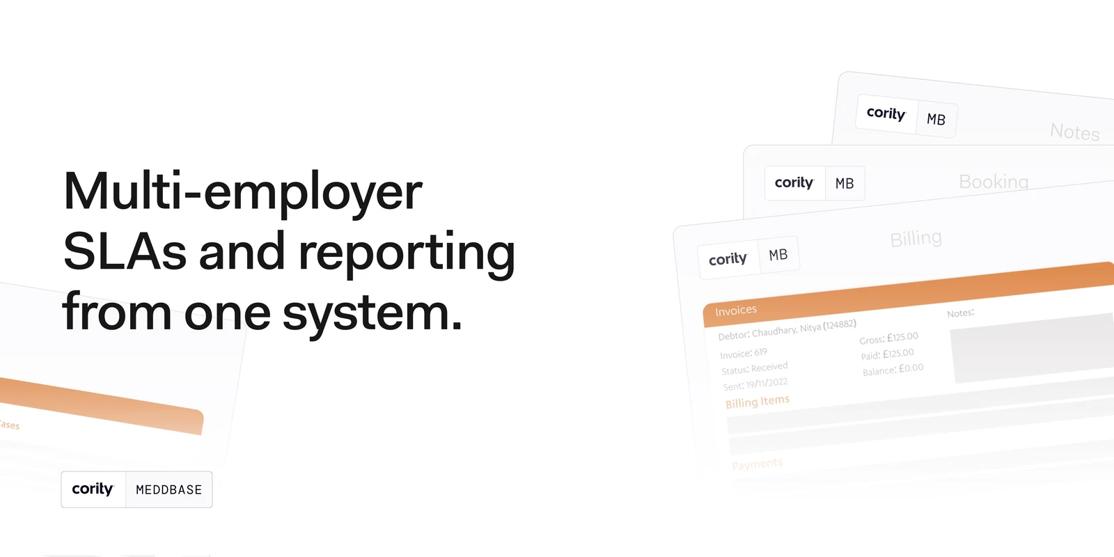
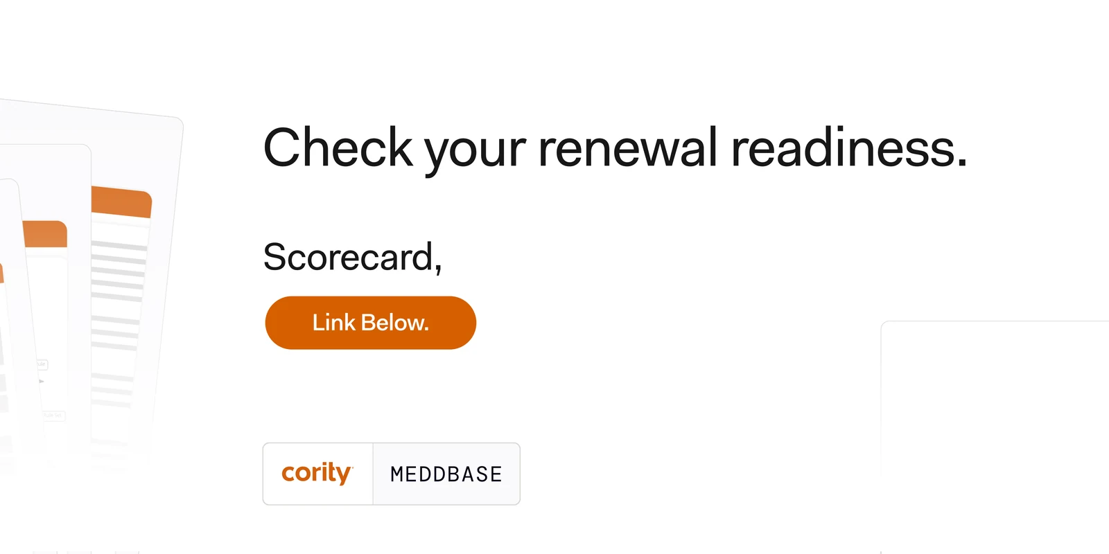
The occupational-health audience, who do not buy on clinical quality because they assume it. What they buy on is what they can put in front of the employer at renewal, so the deck is built on one contrast — the month-end PDF against the live dashboard — and the product only appears once it has something to prove.

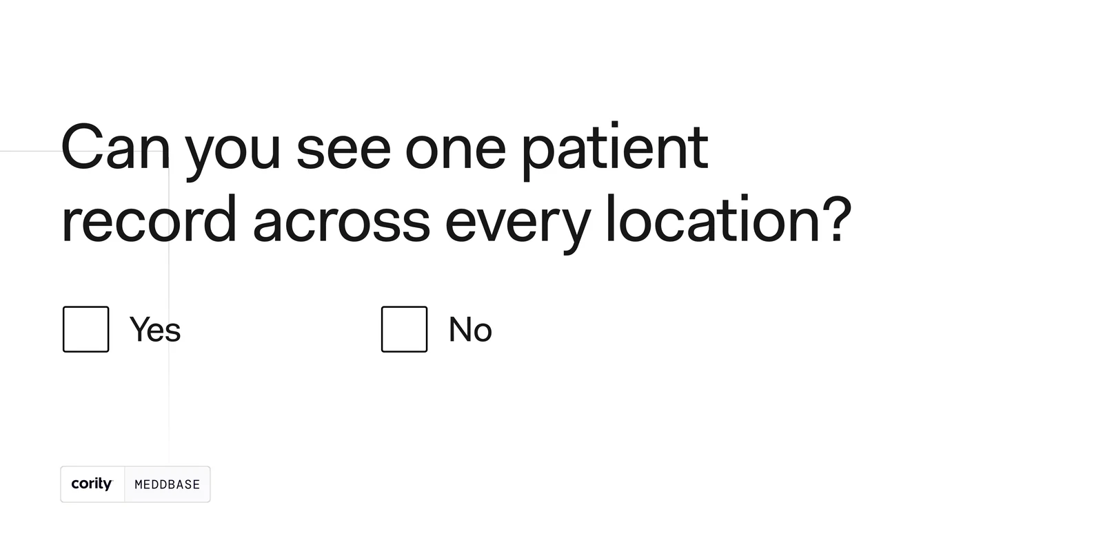
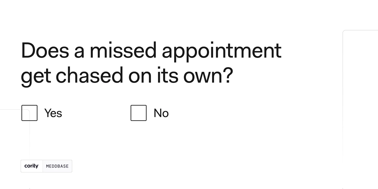
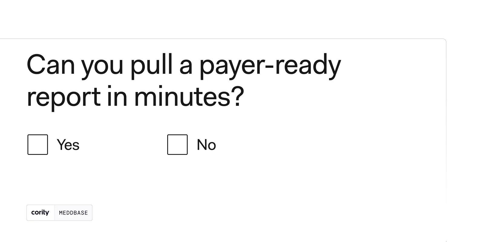
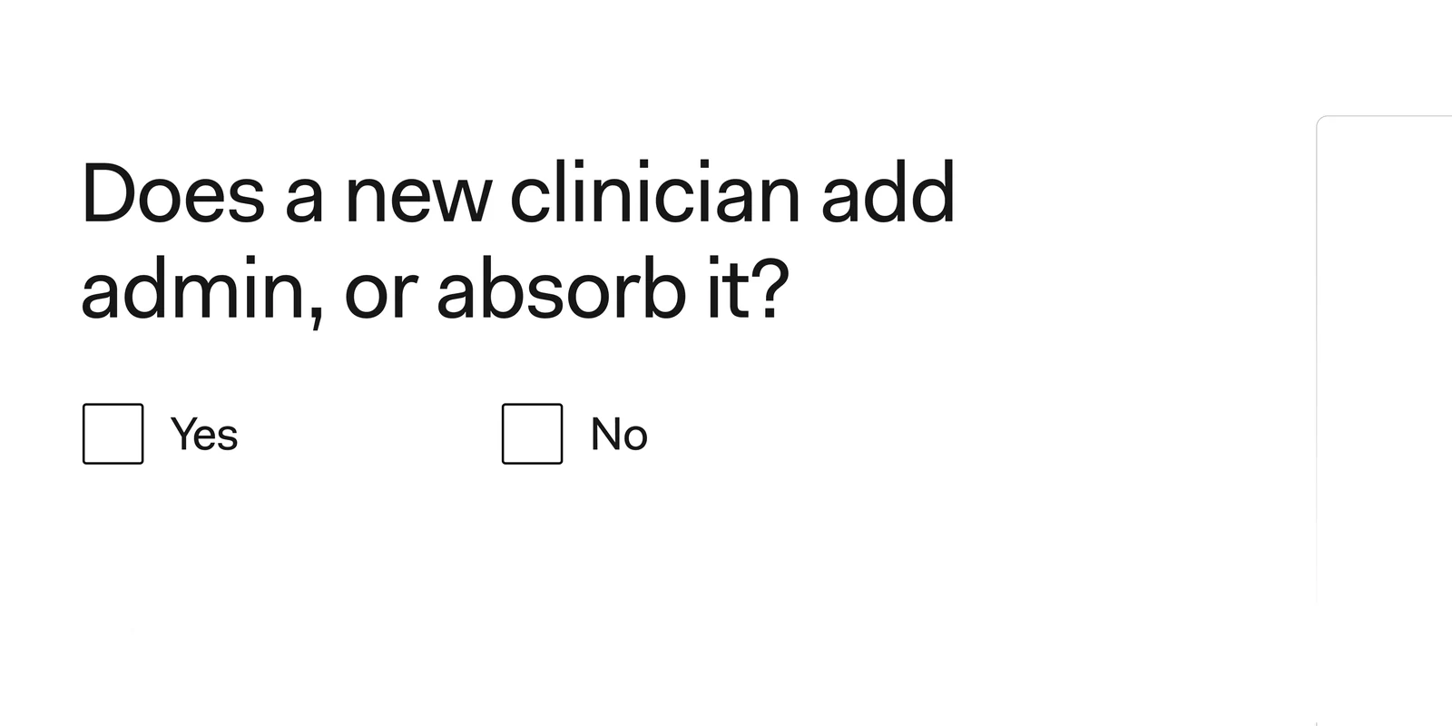
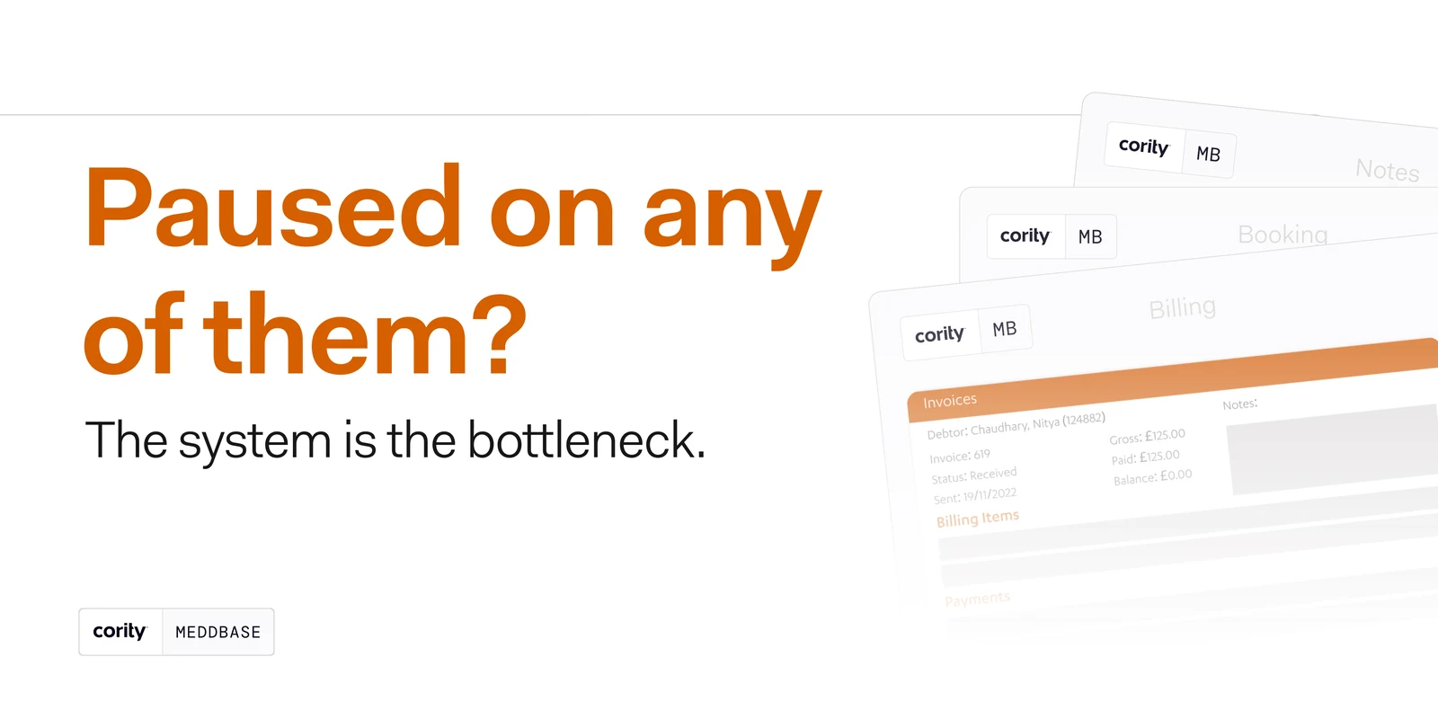
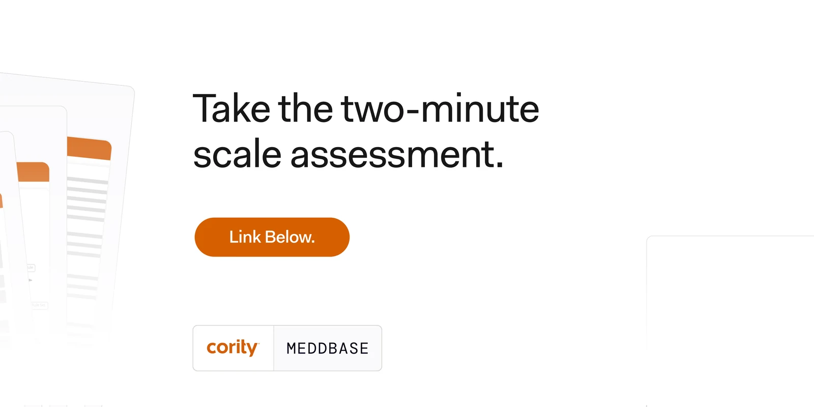
The quietest of the five and the one that asks for the most. Four slides, four questions, an empty Yes and an empty No under each — no illustration, no product, nothing to look at but the question. A reader who ticks honestly has diagnosed themselves by slide five, which is where the post finally answers.
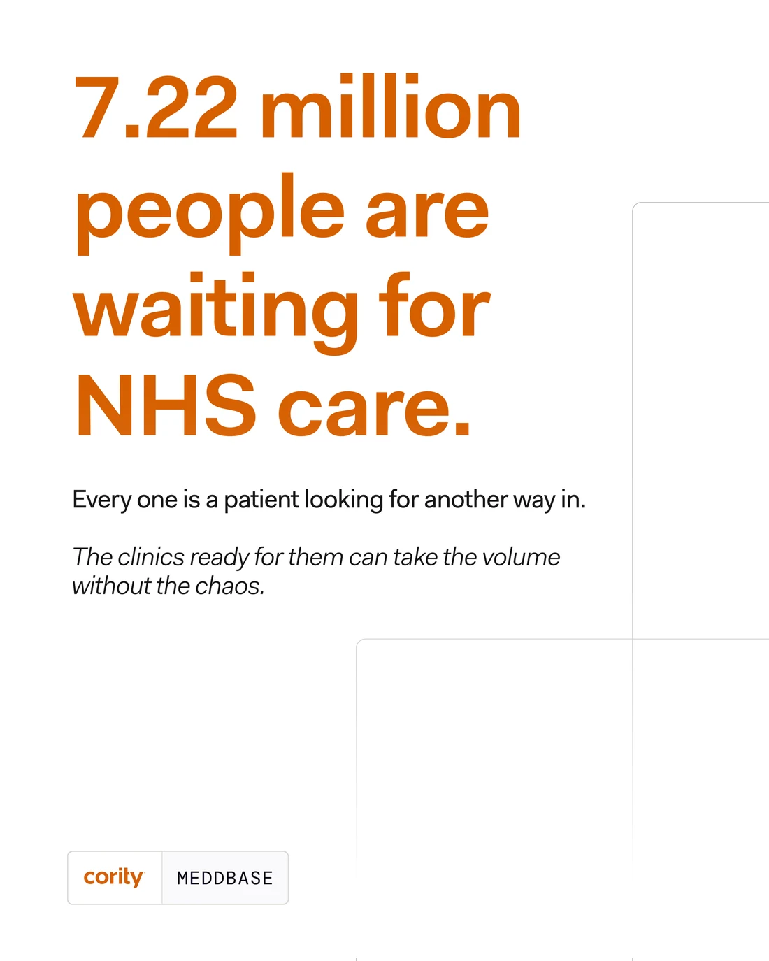

Between the decks run the single posts, cut to the feed’s portrait frame and carrying one line each. This one puts the whole market in a number and then declines to celebrate it: a waiting list is a queue of people, and the sentence under it is about capacity, not opportunity.
Its pair, for the insurer and the employer rather than the clinic: the referral is not the hard part, and a referral sitting in an inbox is a risk rather than a service.
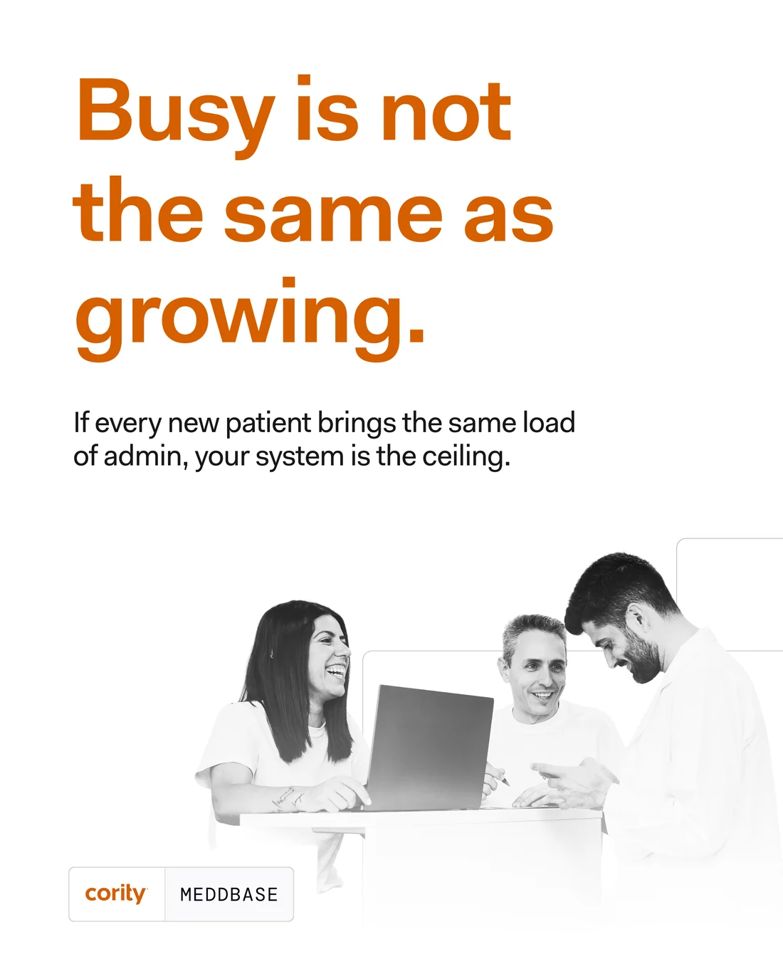

Six words that do the work of a whole deck, which is what the single posts are for. The line under it is the campaign’s actual thesis: if every new patient brings the same load of admin, the system is the ceiling.
And the credentials post, which is the only place the campaign is allowed to talk about itself — four flat lines, no adjectives, the proof left to do its own work.
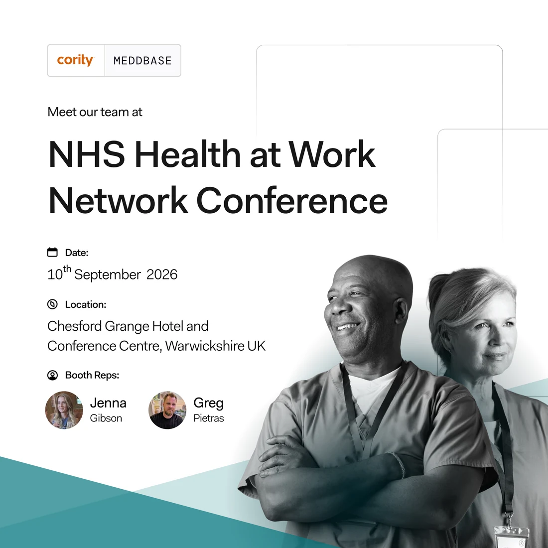
The system off the feed and onto a stand: the conference post, square, with the same kit holding a date, a venue and two faces. The teal wedge is the one place it departs from the palette — an event is a different kind of invitation and it should not look like the eighth post in a row.


Two routes for the product-release header, drawn identically so the only variable is the cast. One is the clinicians the release is for; the other is the colour accent the brand otherwise spends only on type.


The email headers, where the kit has to survive being cut to a fifth of its height: the lockup holds its left margin, the cast sits to the right in its outlines, and everything else is the page. Two options for the confirmation mail — the same frame, a different room.


And the nurture mail, which goes out to someone who has already met the brand, so it runs to single figures rather than groups.
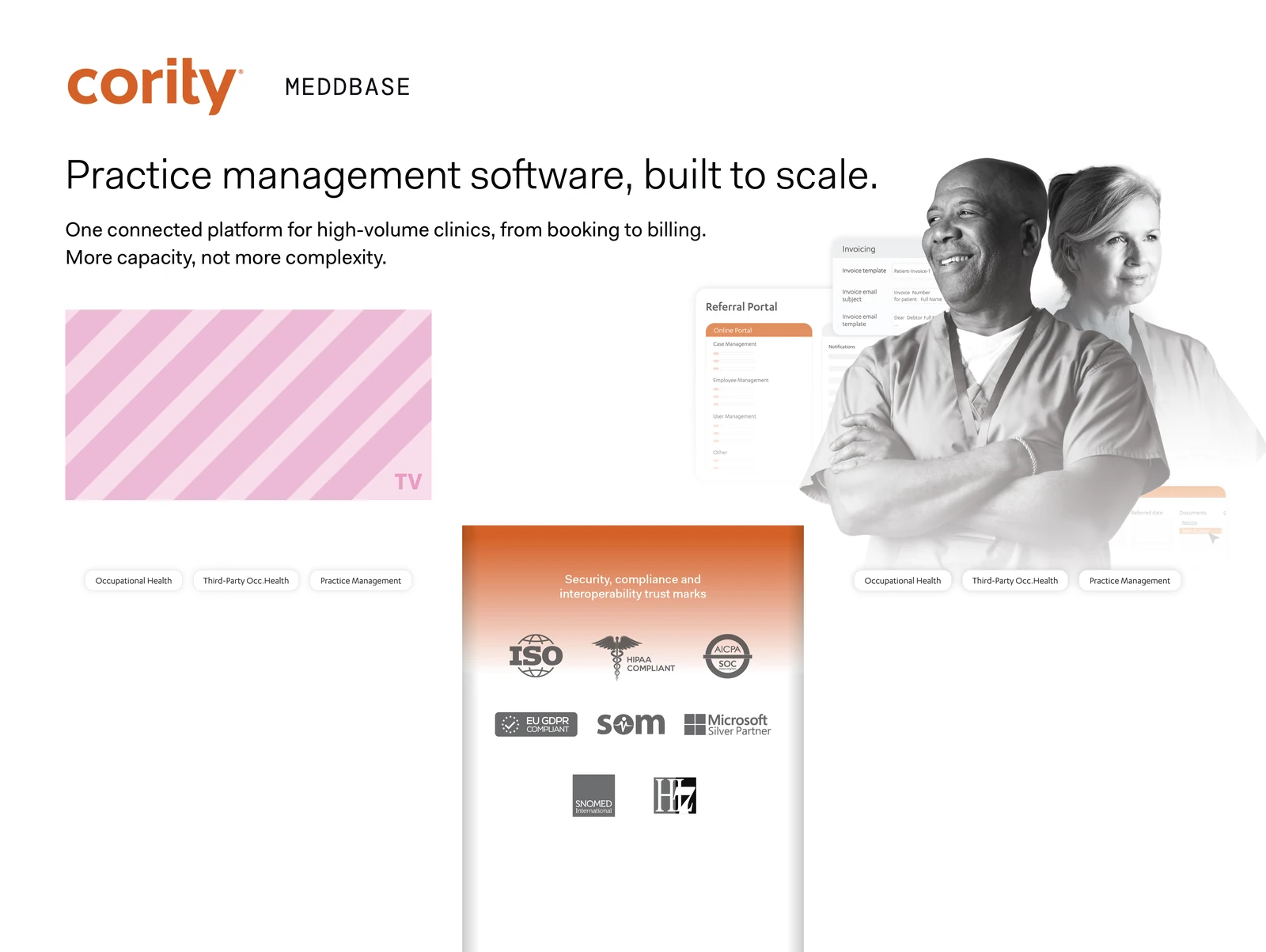
Off the screen entirely: the stand for the private acute market, drawn as one piece so the wall, the cut-out for the television and the counter wrap all come off the same grid. The trust marks — ISO, HIPAA, SOC, GDPR, SOM, SNOMED, HL7 — are the only place a crowd of foreign logos is allowed in, so they are given their own panel on the counter and a gradient to sit on rather than being scattered across the wall.
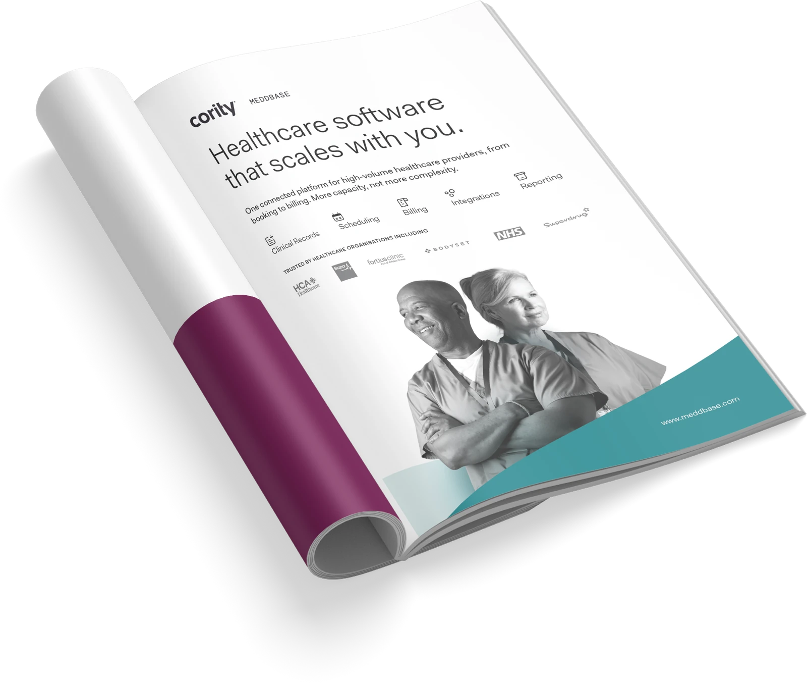
The press ad, which has one page and no scroll, so the proposition is the headline and everything under it is proof: six capability marks in a line, then the organisations already running on it — HCA, Bupa, Fortius, Bodyset, the NHS, Superdrug. The teal wedge is carried over from the event work; on paper it is the only thing stopping a white page from disappearing into a white magazine.
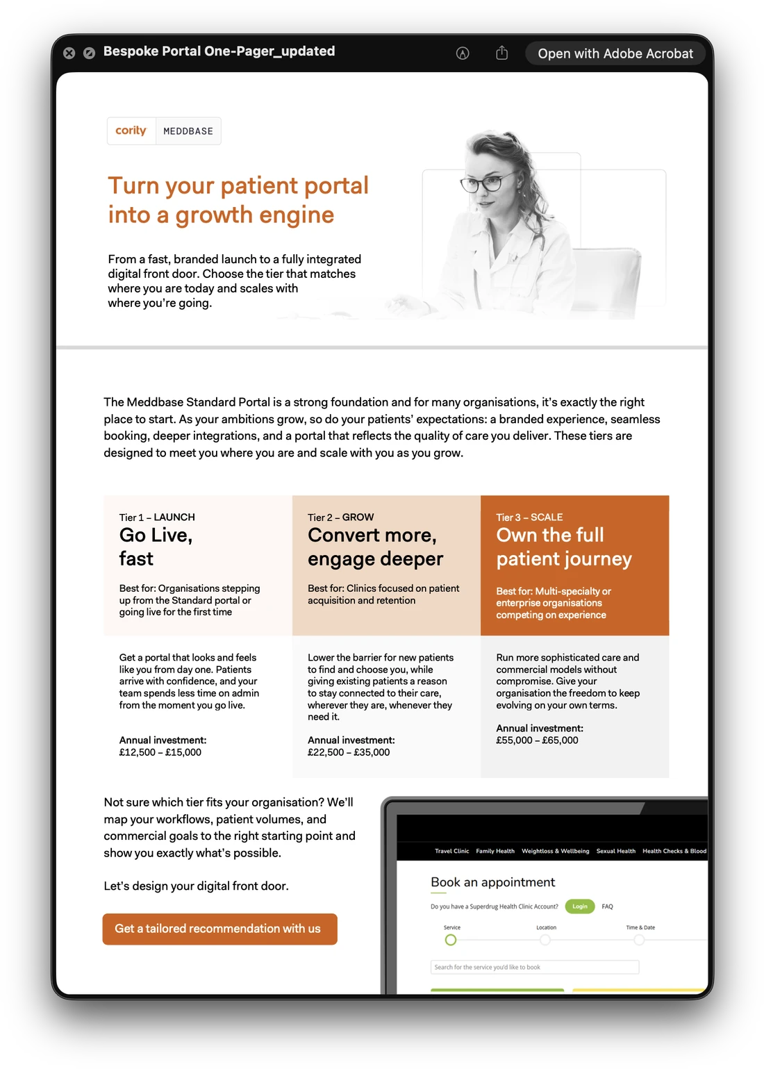
The sales side of the same system. The bespoke-portal one-pager has to price three tiers without turning into a table, so the tiers are a ramp — the ground going from almost white to full orange as the commitment rises — and the reading order does the rest.
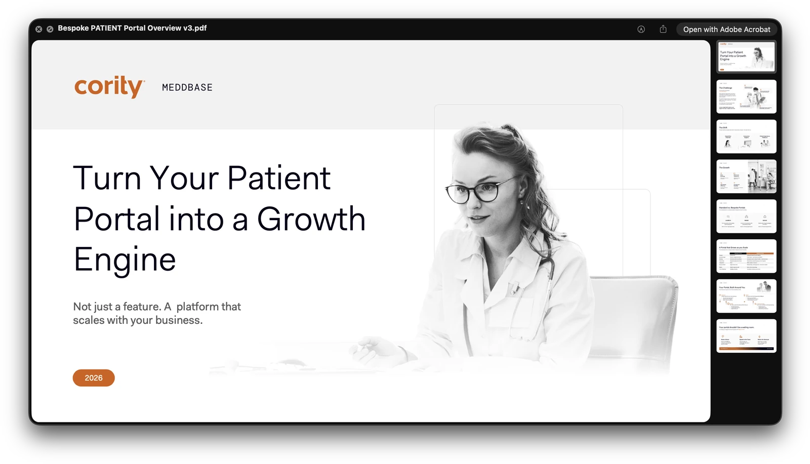
And the deck behind it, eight pages on the same argument for a longer meeting — the challenge, the shift, the growth, standard against bespoke, and the portal built around the buyer.