









Brand identity, bilingual · Kingdom of Saudi Arabia, 2024
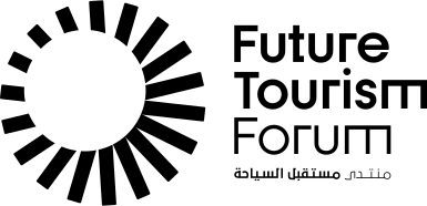
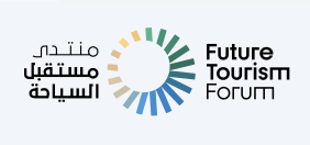
Future Tourism Forum
Saudi Arabia was opening to the world, and its tourism forum had to be able to stand on any stage in it. That ruled out a national emblem. The brief was harder than a flag: look global, read unmistakably Saudi, and do both at once.
It also had to be fluent in two languages. Arabic and English were drawn as equals rather than as a translation of one another — either can carry the identity alone, and together neither defers to the other.
And the palette had to sell the country before a single word is read. Three colours, three reasons to come: the green of the meadows, the gold of the desert, the blue of the shore.
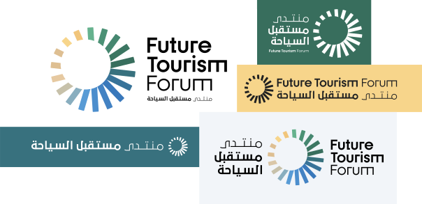
One identity, two languages, no hierarchy. Every lockup stands on its own, and every pairing works in either reading direction.
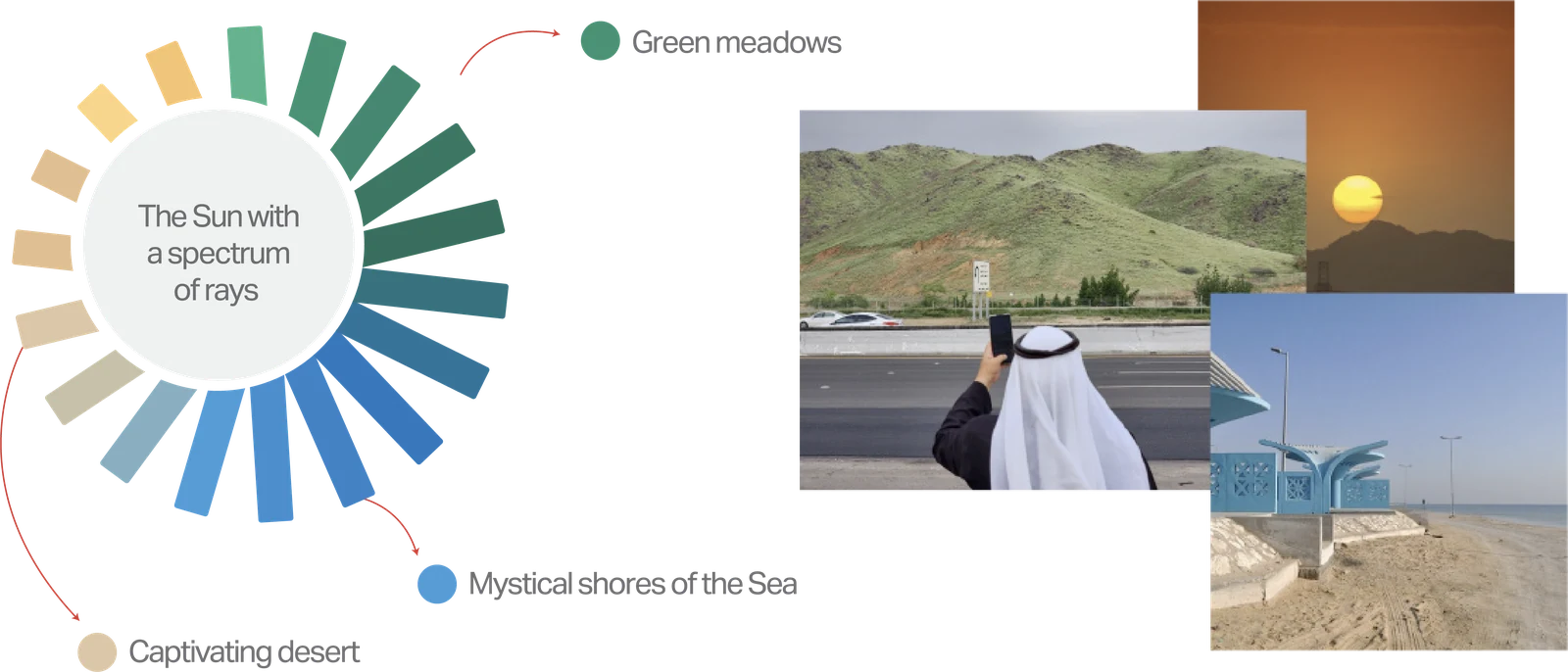
The mark is a sun, and its rays are the itinerary. Meadow green, desert gold and sea blue are not decoration — they are the three things a visitor comes for.
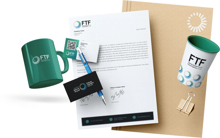
A brand is only as strong as its dullest touchpoint. The sun holds from a press folder down to a coffee cup, and the card carries both languages at business-card size without either shrinking to fit.
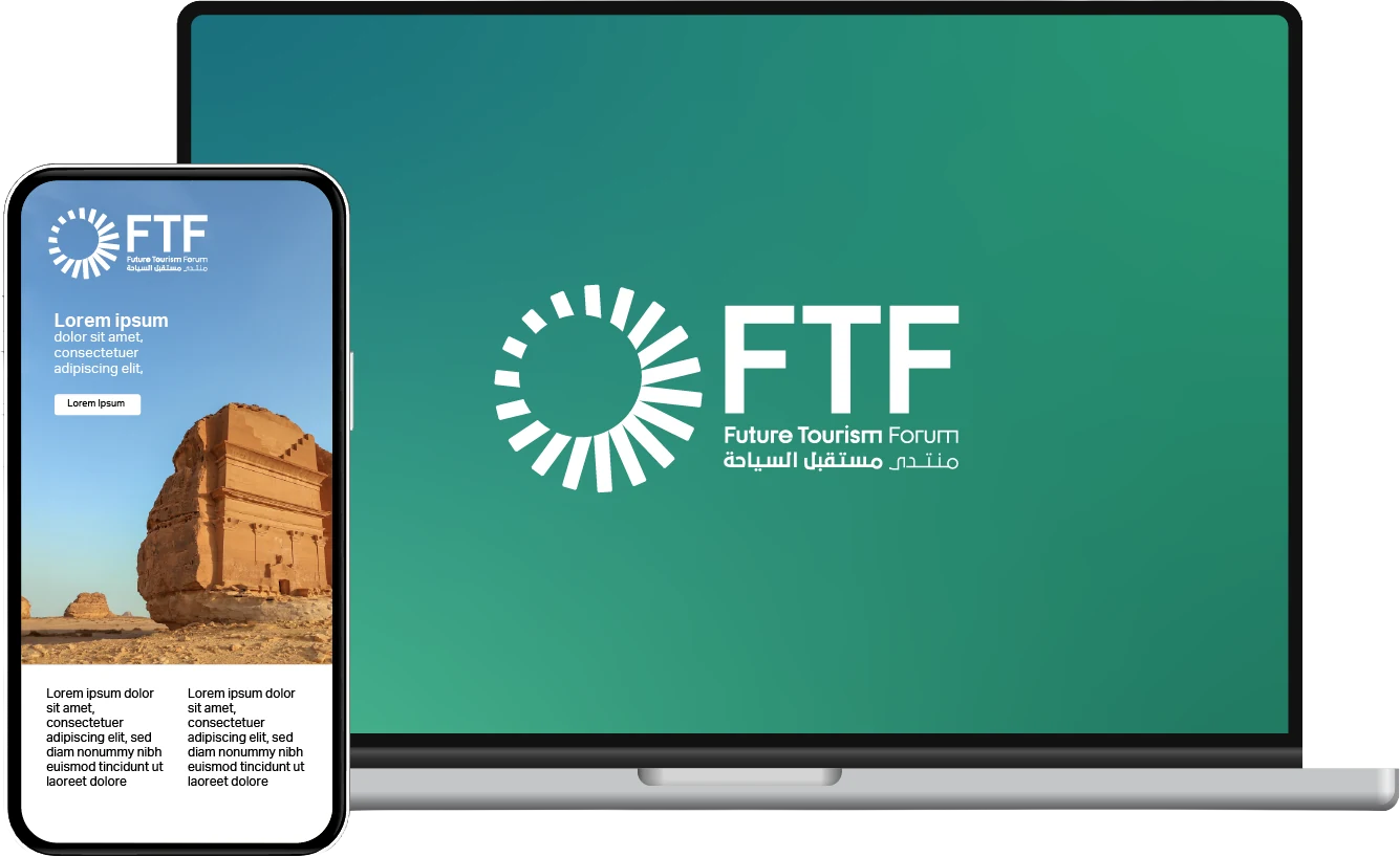
And it had to hold where most people actually meet a forum — a screen. Full-bleed on the desktop, a header on the phone, the same three rays either way and no redraw.