



Brand system, campaigns and collateral · United Arab Emirates, 2023–2025
Tarjama&
Tarjama& is the brand Tarjama ran on before the 2026 rebrand — the wordmark with the ampersand in its own red box, and an ampersand that was never only punctuation: rendered in three dimensions, lit and turned, it was the house image for everything the company did.
Which is the system in one object. Black ground, one red form catching the light, type in white, and underneath it a product line that kept getting more technical — a machine-translation engine, a translation management system, a services portal, a data-annotation arm. The feed had to sell all of it without ever looking like four companies.
What follows is the applied half: the campaigns, the event, the calendar, the films and the document library the sales team actually sent.
The mark, moving. Six seconds of the ampersand forming out of its own ribbon — the thing every still in this case study is a frame of.
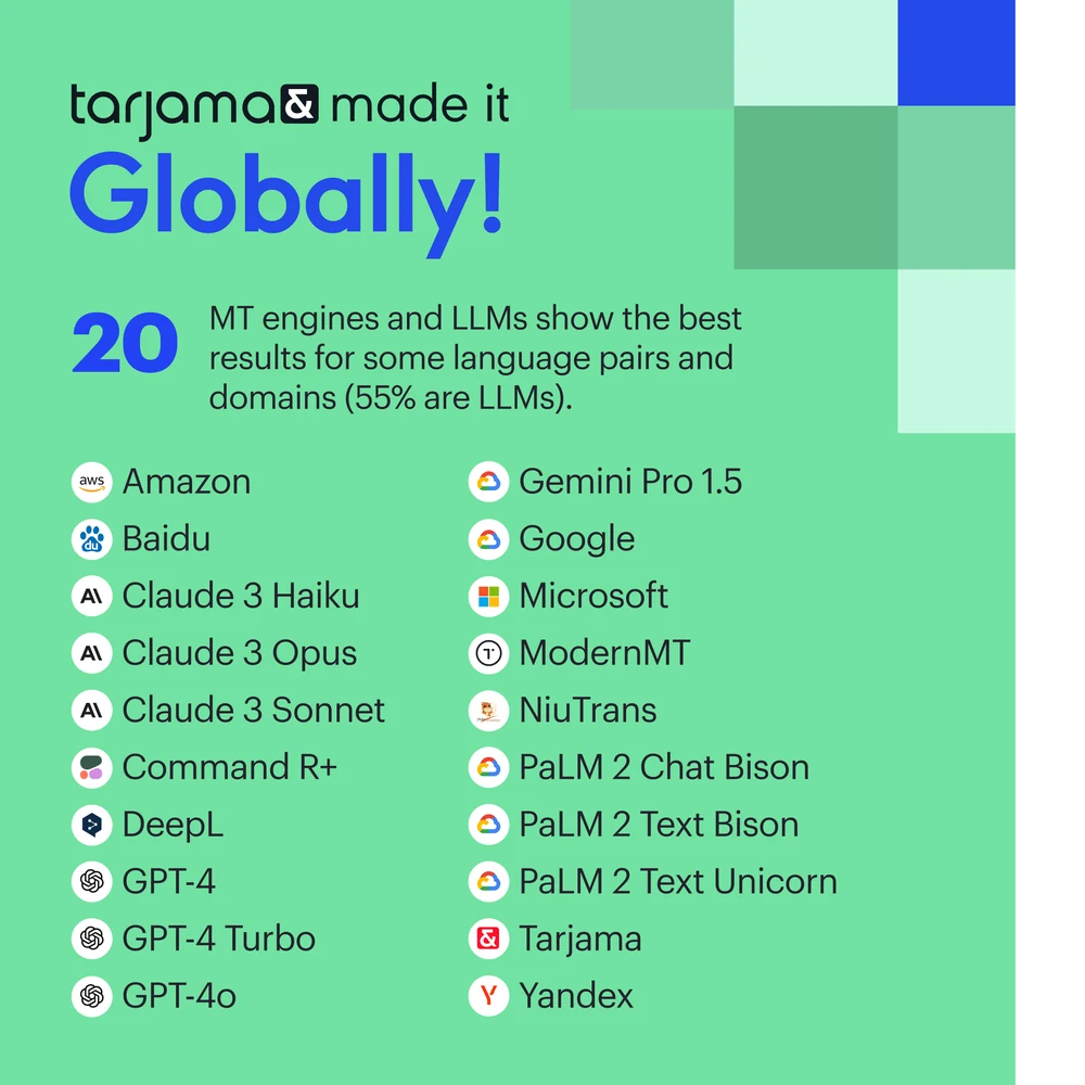
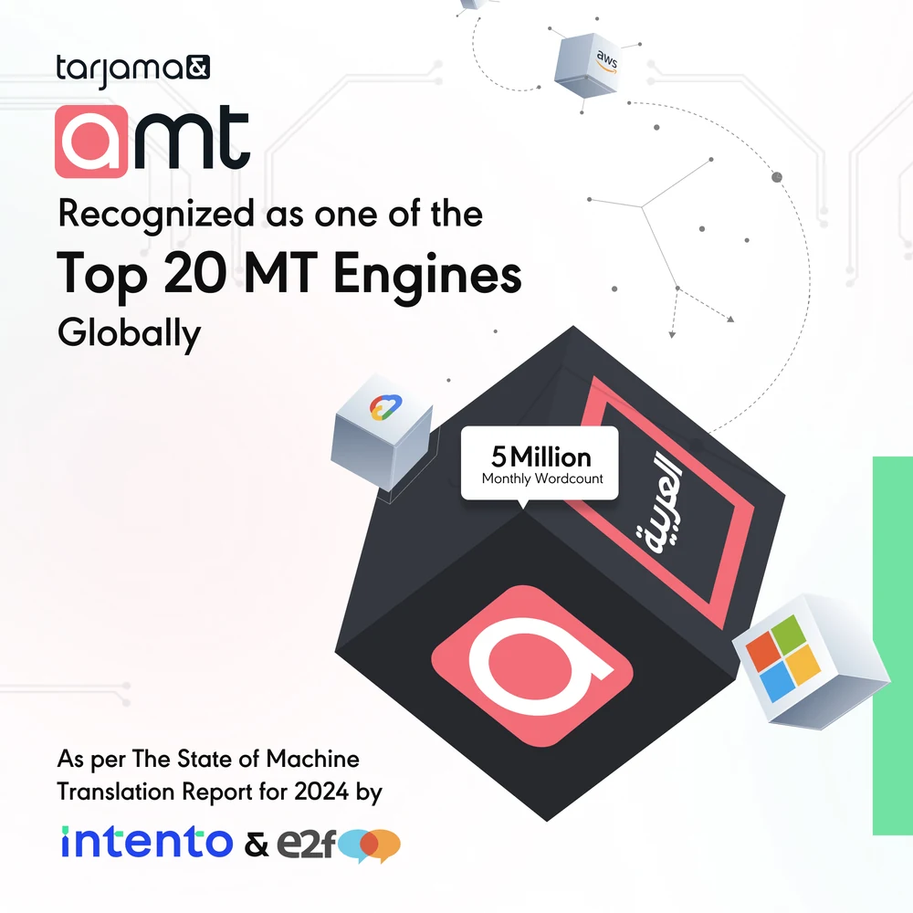
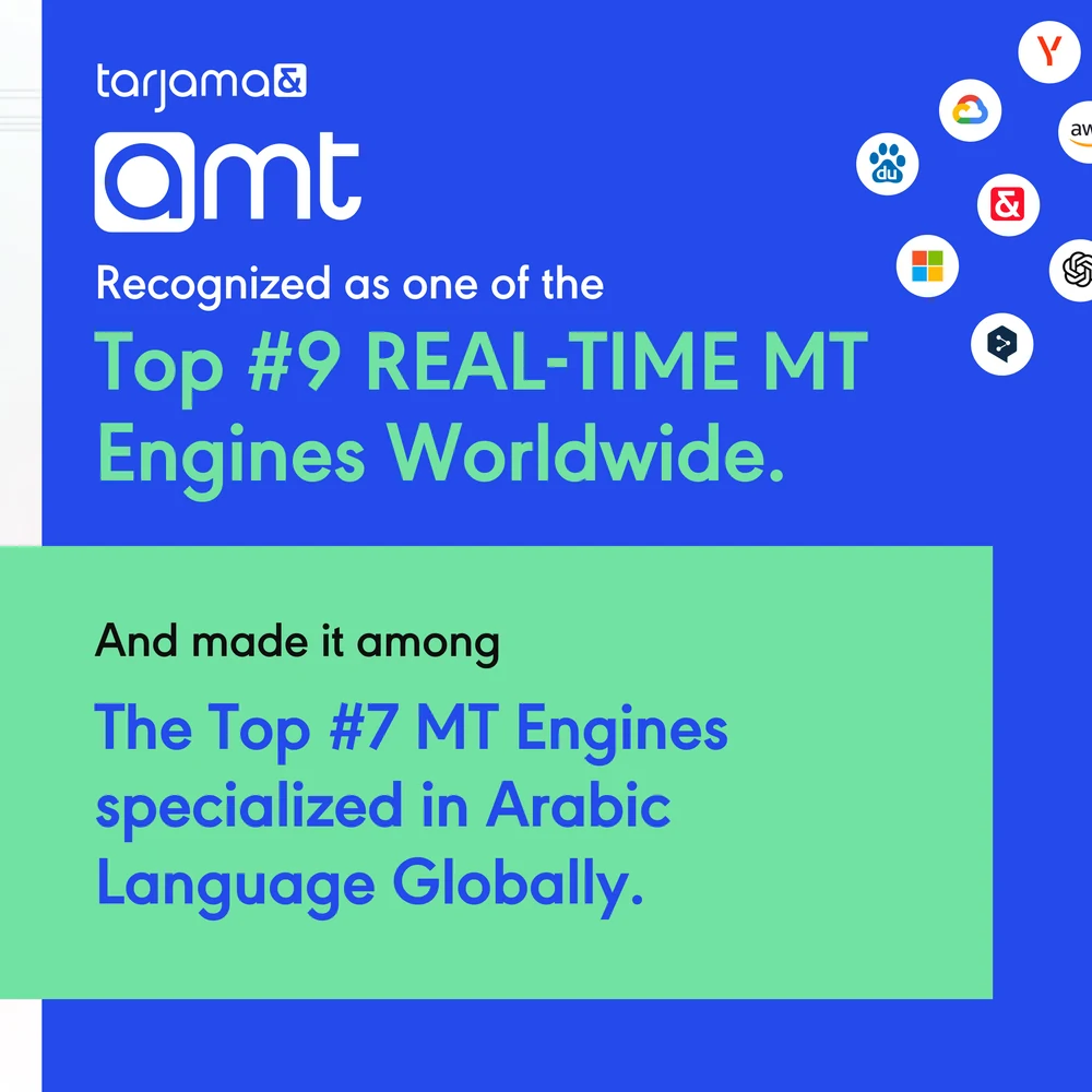
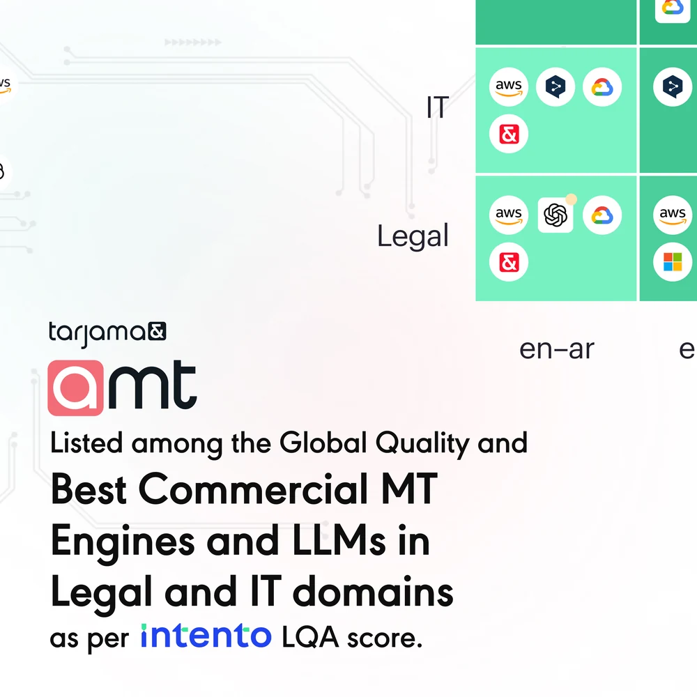
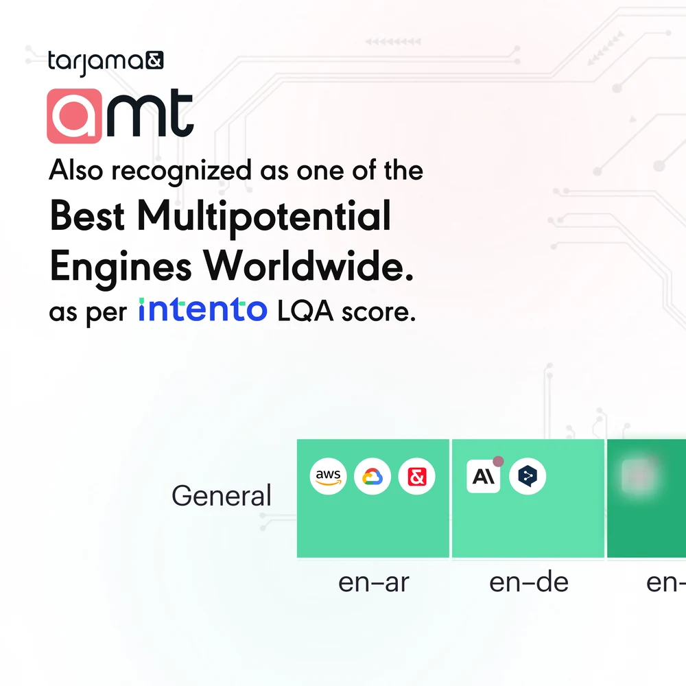
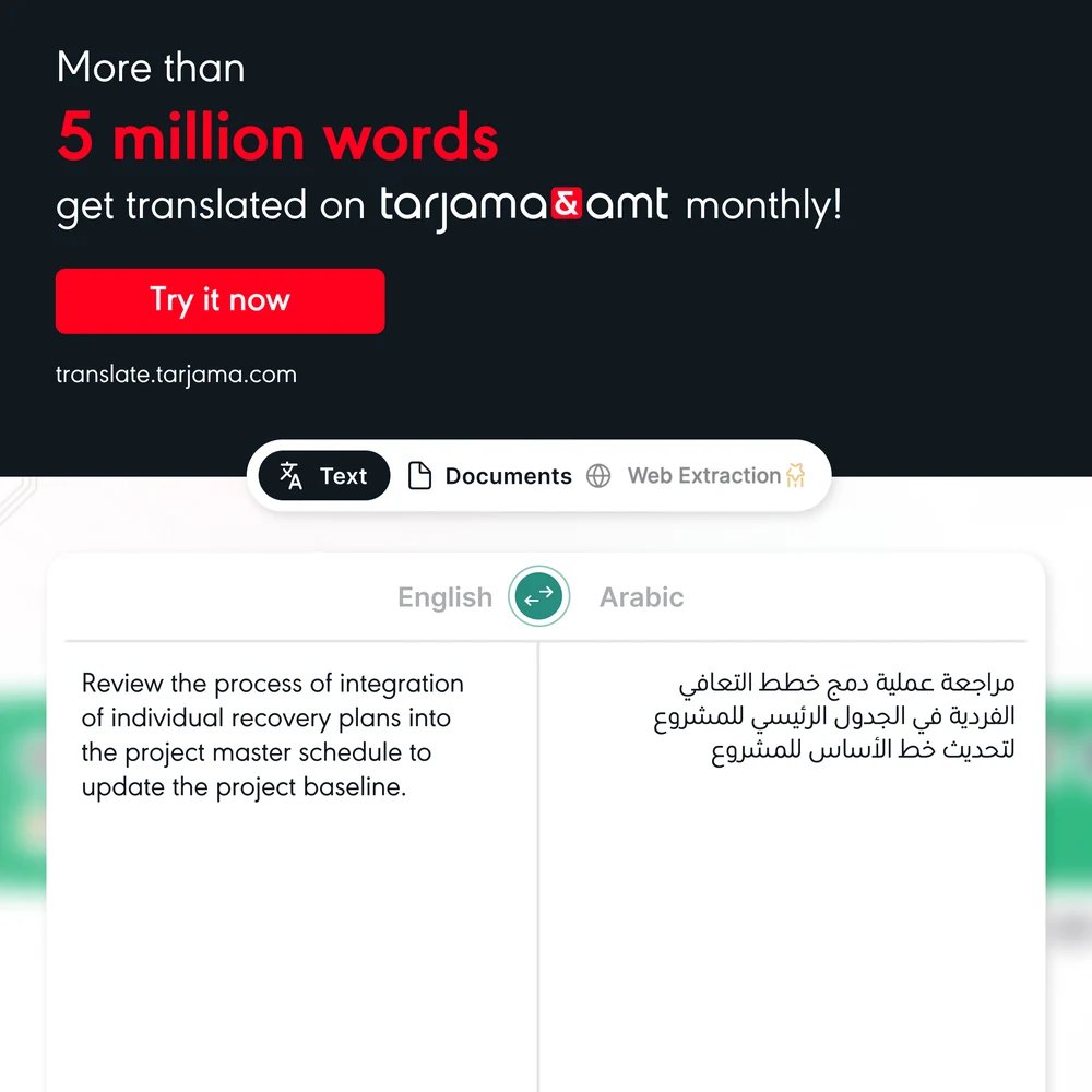
The campaign that had the most to prove: amt, the Arabic machine-translation engine, placed in the 2024 State of Machine Translation report. Six slides to turn a ranking into an argument — the twenty engines it beat, the domains it won, the five million words a month going through it.
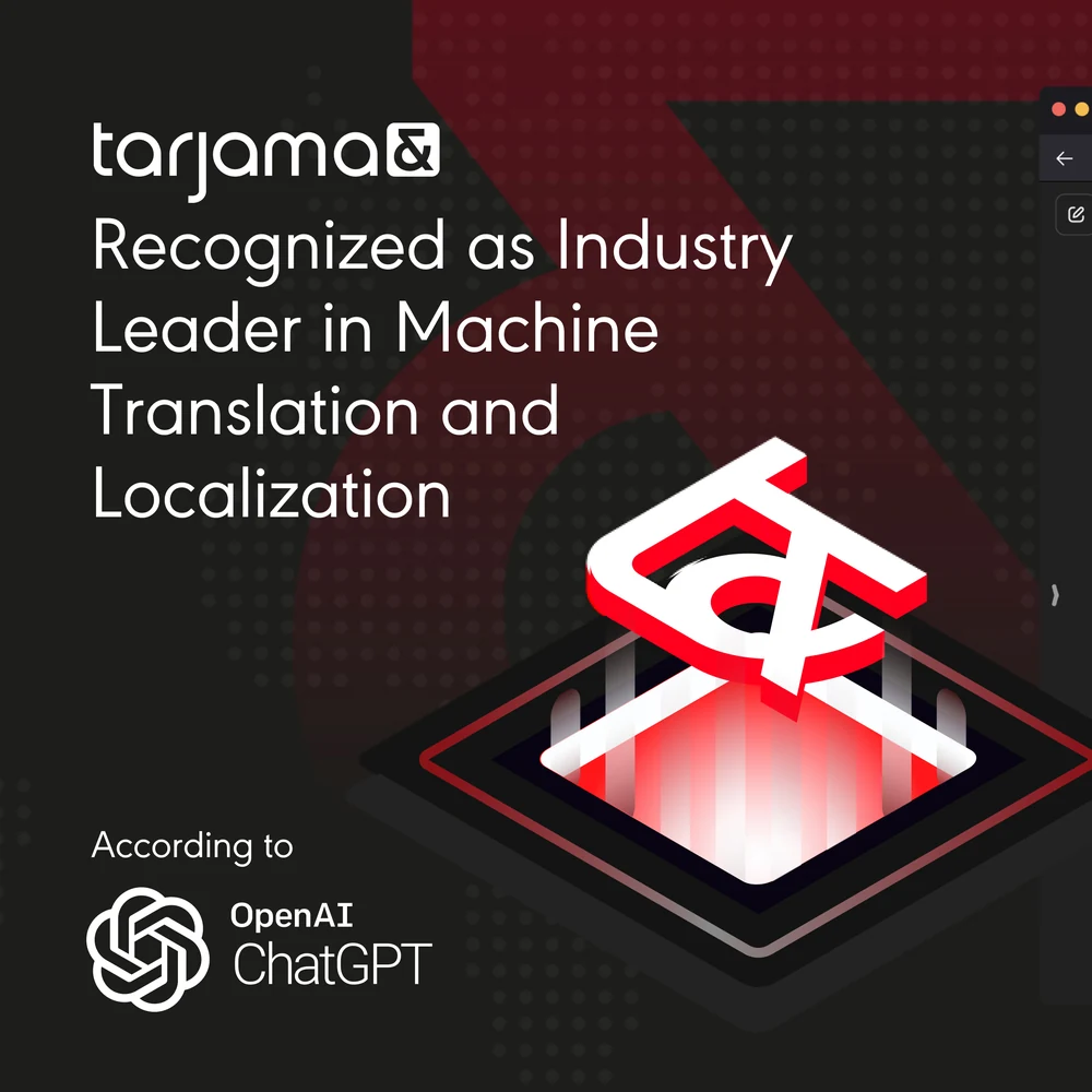
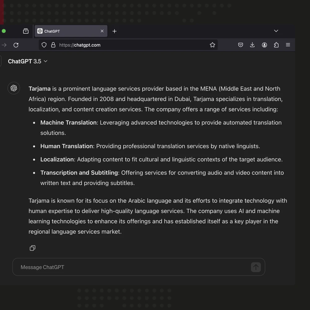
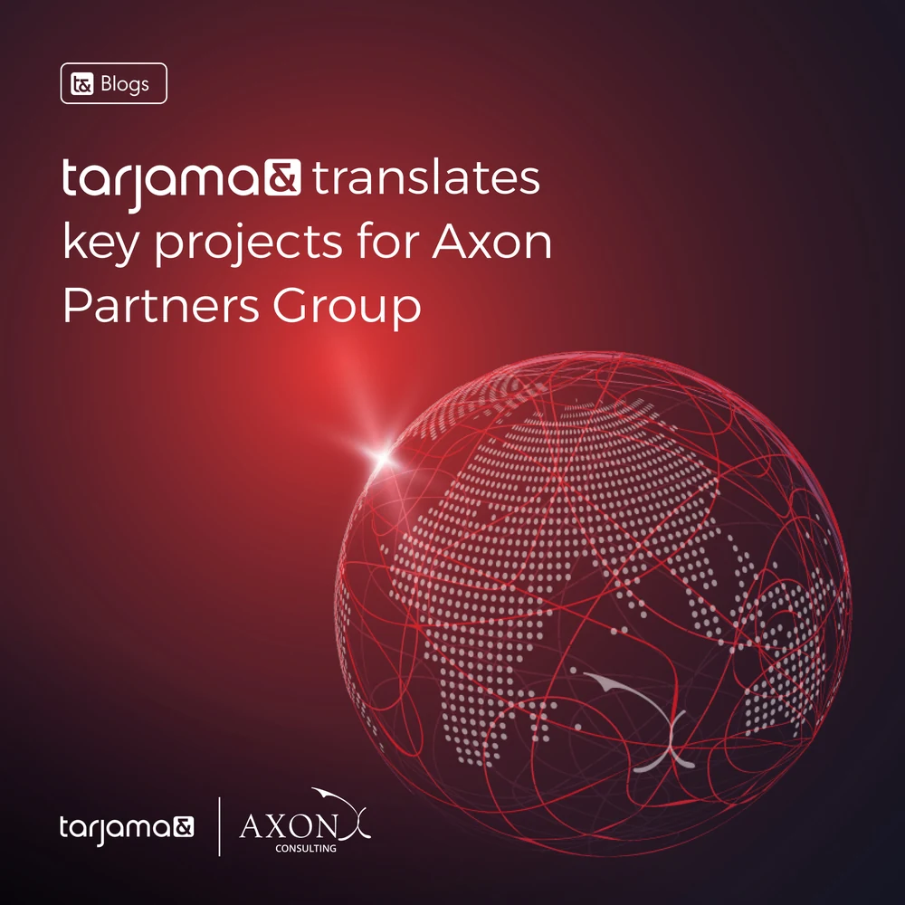
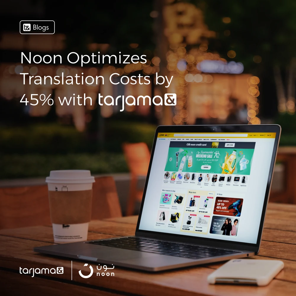
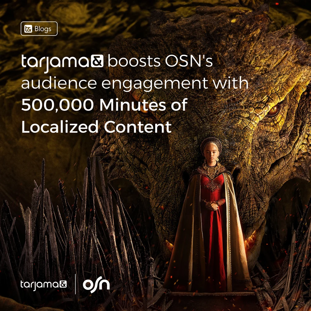
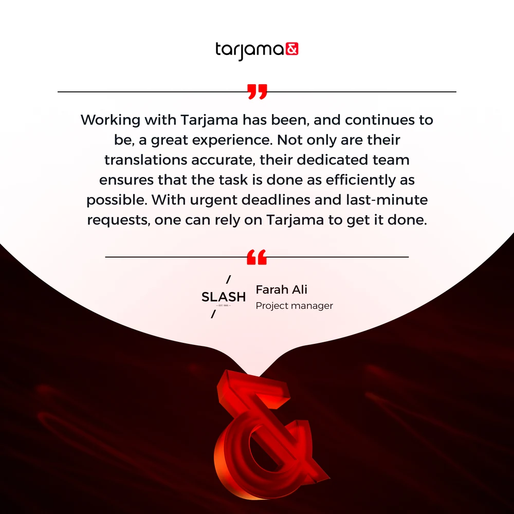
Around it the proof posts, which are the hardest thing to make look like design rather than a press release. A third-party verdict, three client results, and a project manager saying something a brand could not say about itself.
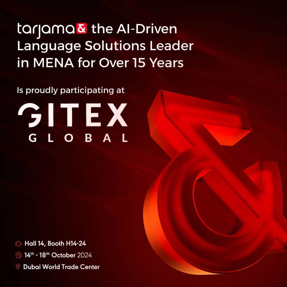
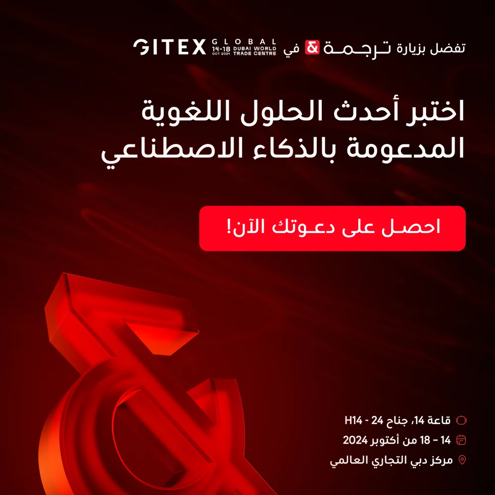
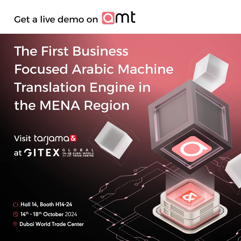
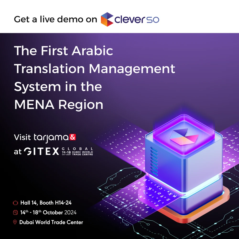
Gitex Global 2024, in both languages. The stand details — hall, booth, dates — carried on the same black, and two of the four give a product its own demo rather than selling the company: amt for translation, CleverSo for managing it.
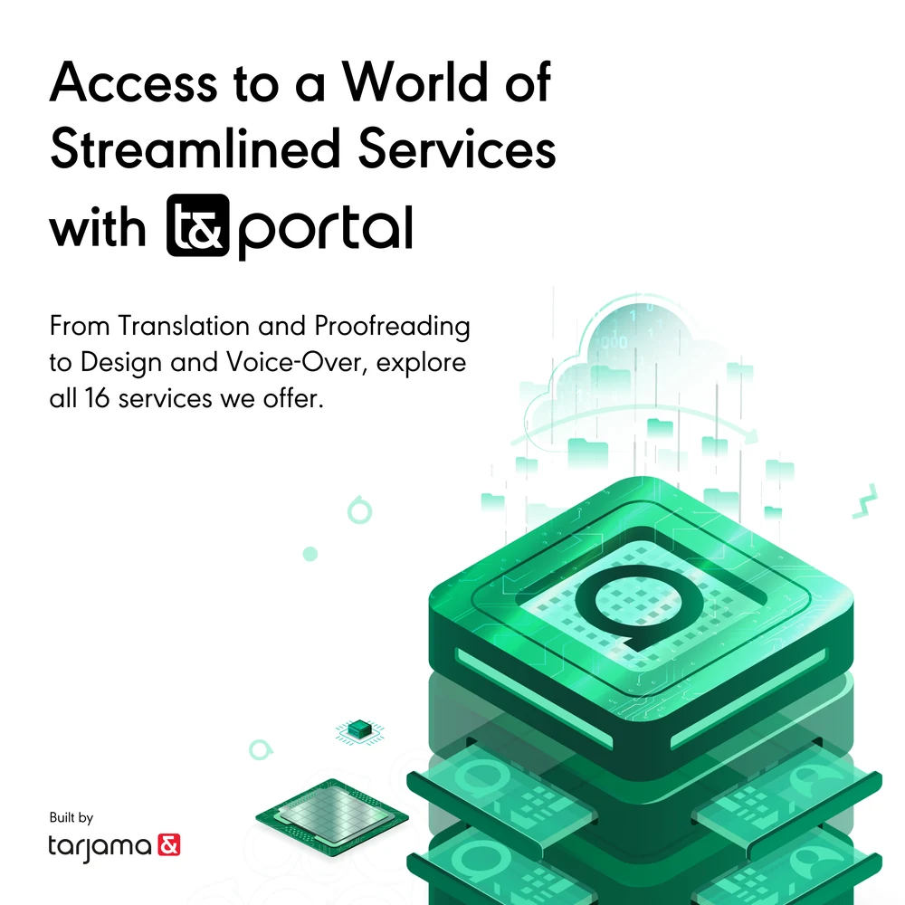
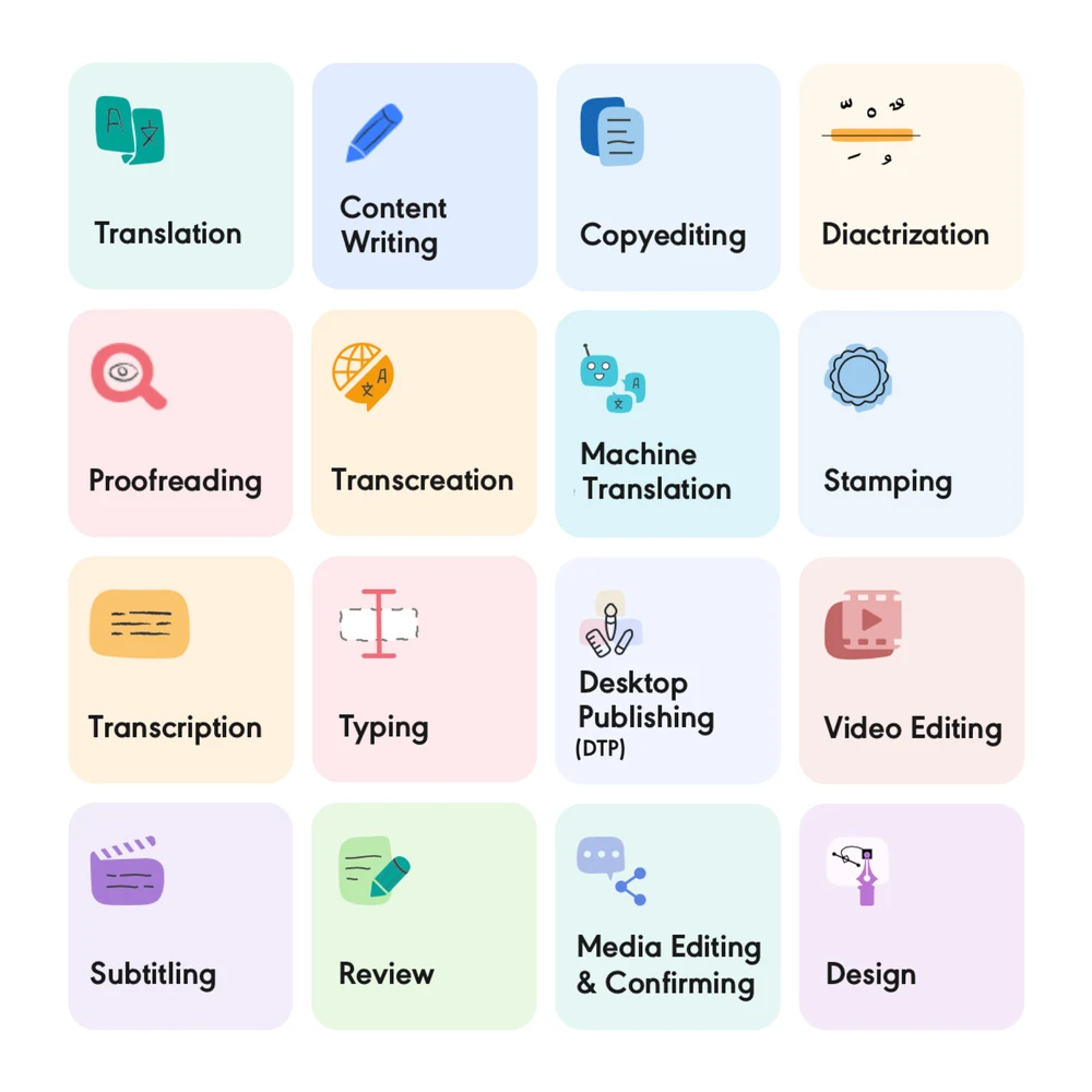
t&portal, sold the way a portal has to be sold — by showing the whole menu at once. Sixteen services on one grid, then a single button.
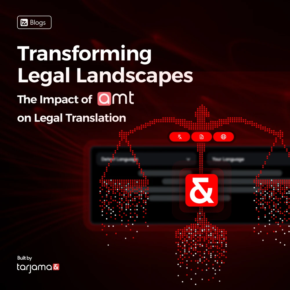
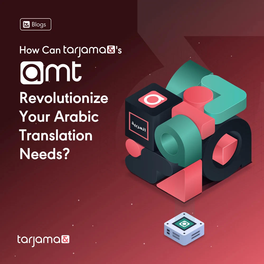
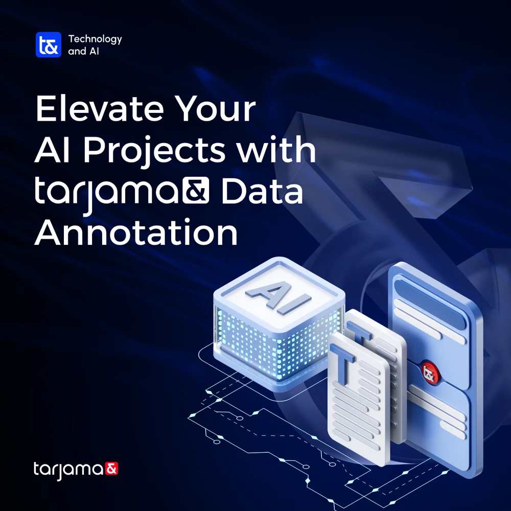
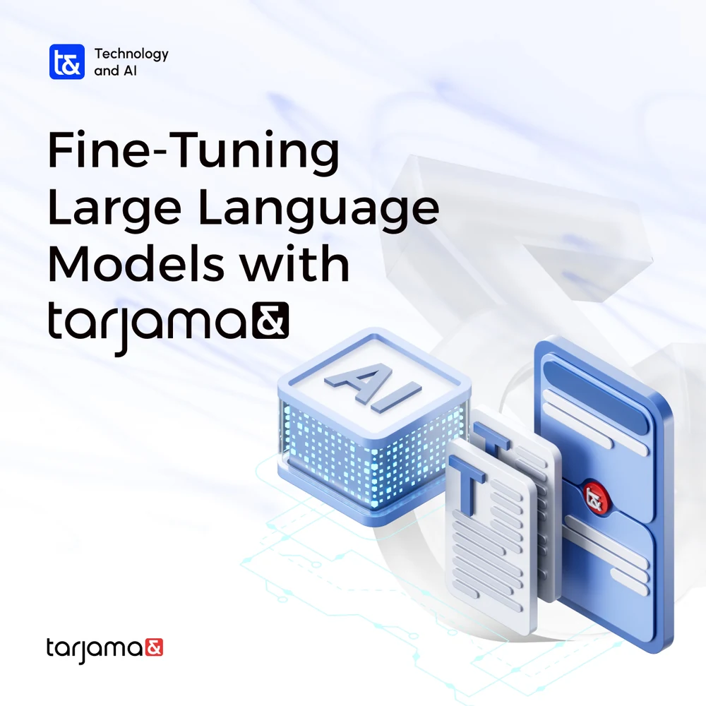
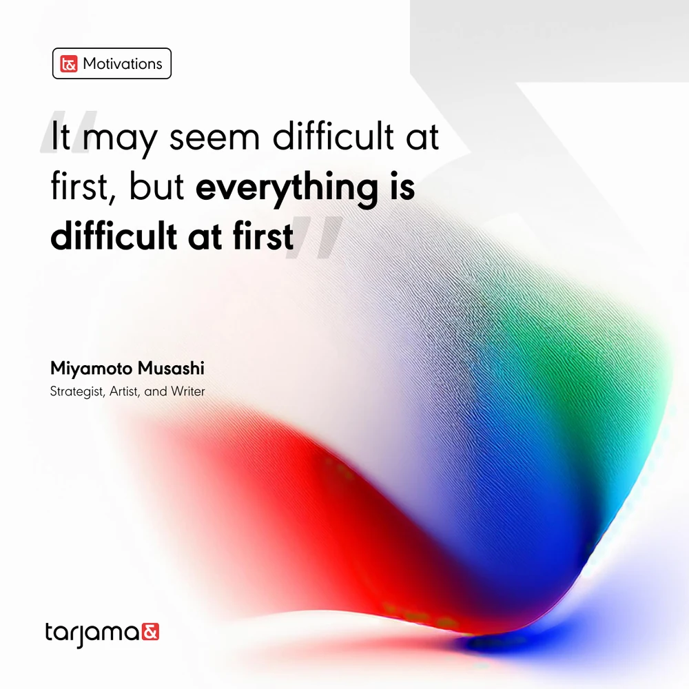
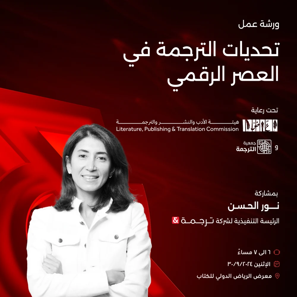
The everyday feed under it: the blog cards, the monthly calendar posts on data annotation and model fine-tuning, a workshop at the Riyadh International Book Fair, and the one post a month that is only a sentence worth reading.
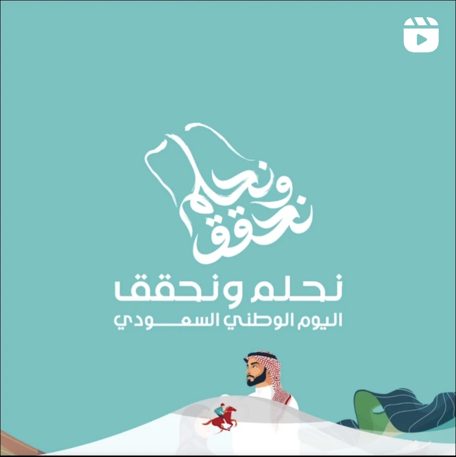
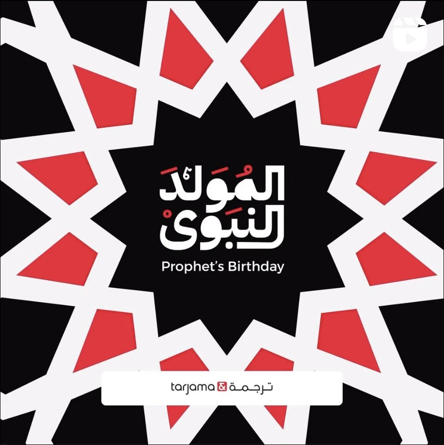
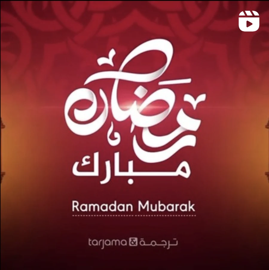
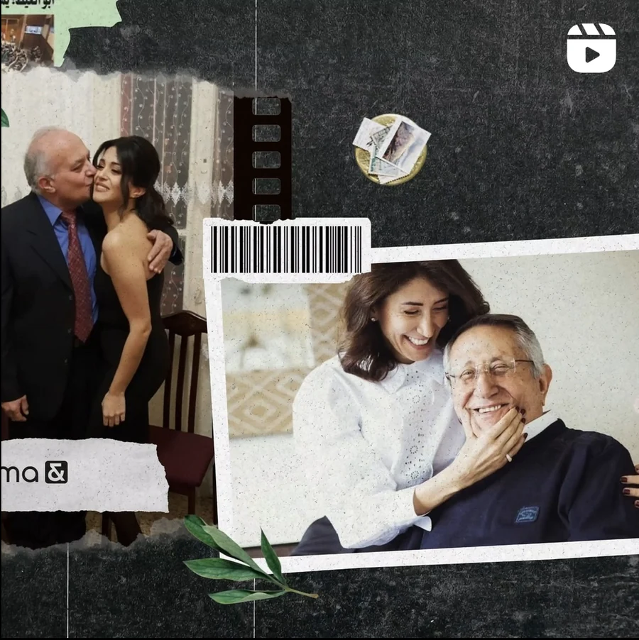
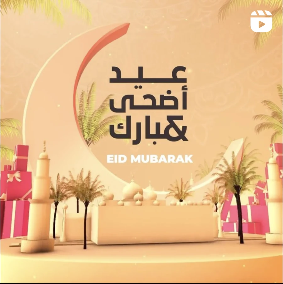
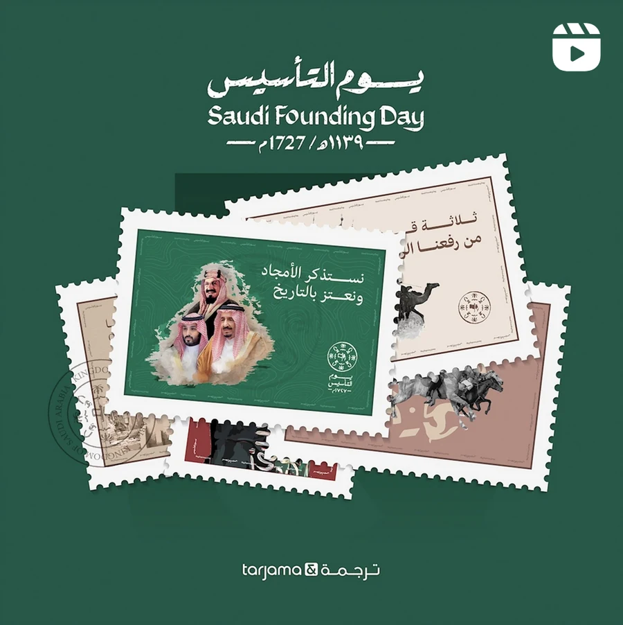
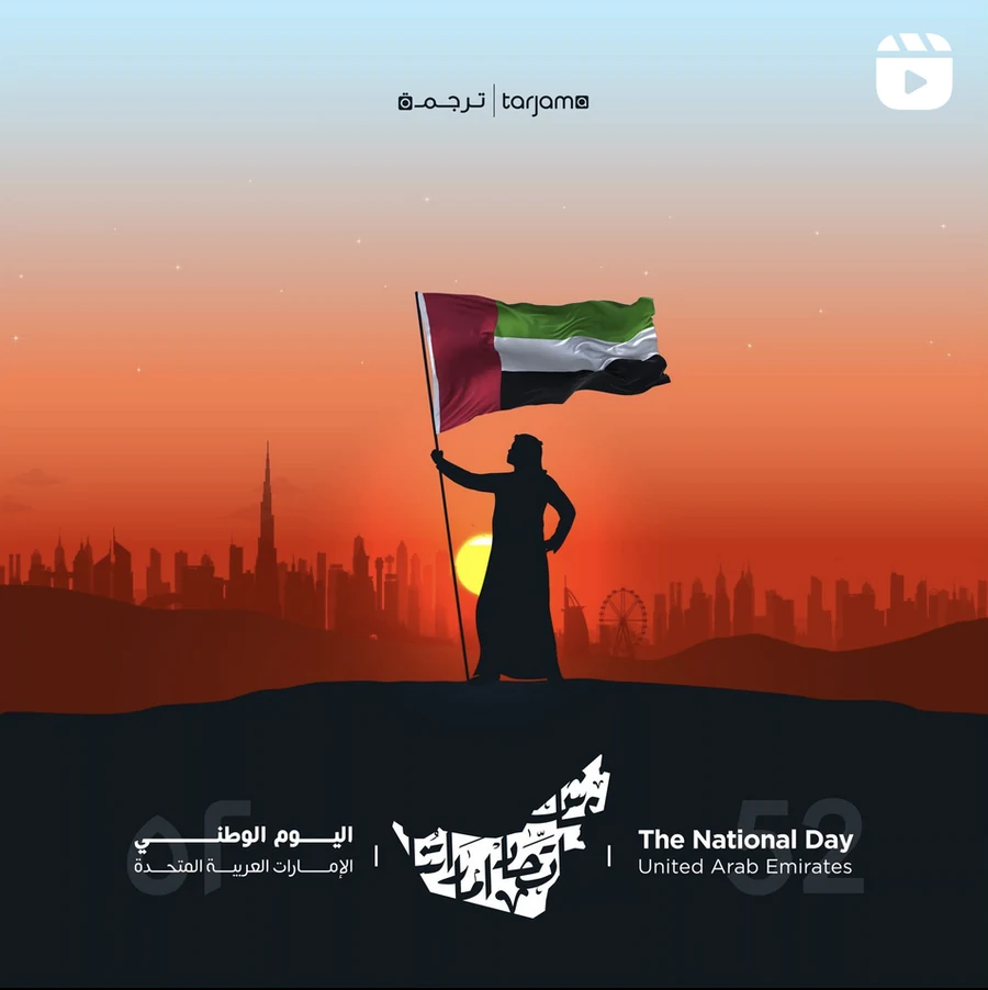
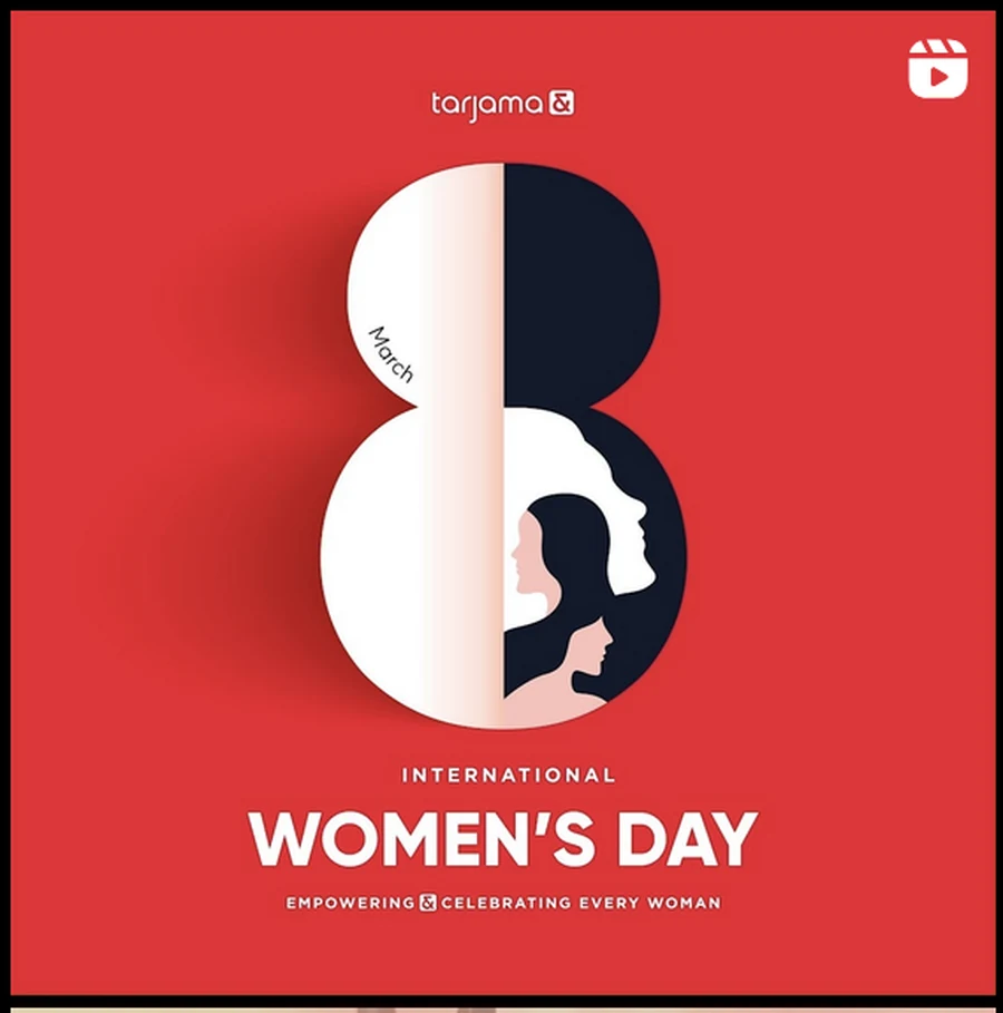
And the calendar, which is where a regional brand is actually judged. Eight occasions — Saudi National Day, the Prophet’s Birthday, Ramadan, two Eids, Saudi Founding Day, UAE National Day, International Women’s Day — each one animated, each one built out of the same red, white and black rather than borrowed ornament. Shown as they were posted, play badge and all.
The year, counted and cut. Forty-seven seconds of 2024 — what shipped, where, in how many languages — which is the one film a language company can make that no competitor can copy, because the numbers are its own.
And the Eid film, cut vertical for the feed, where the ampersand finally stops being a logo and becomes ornament — the one time a year the system is allowed to be decorative.
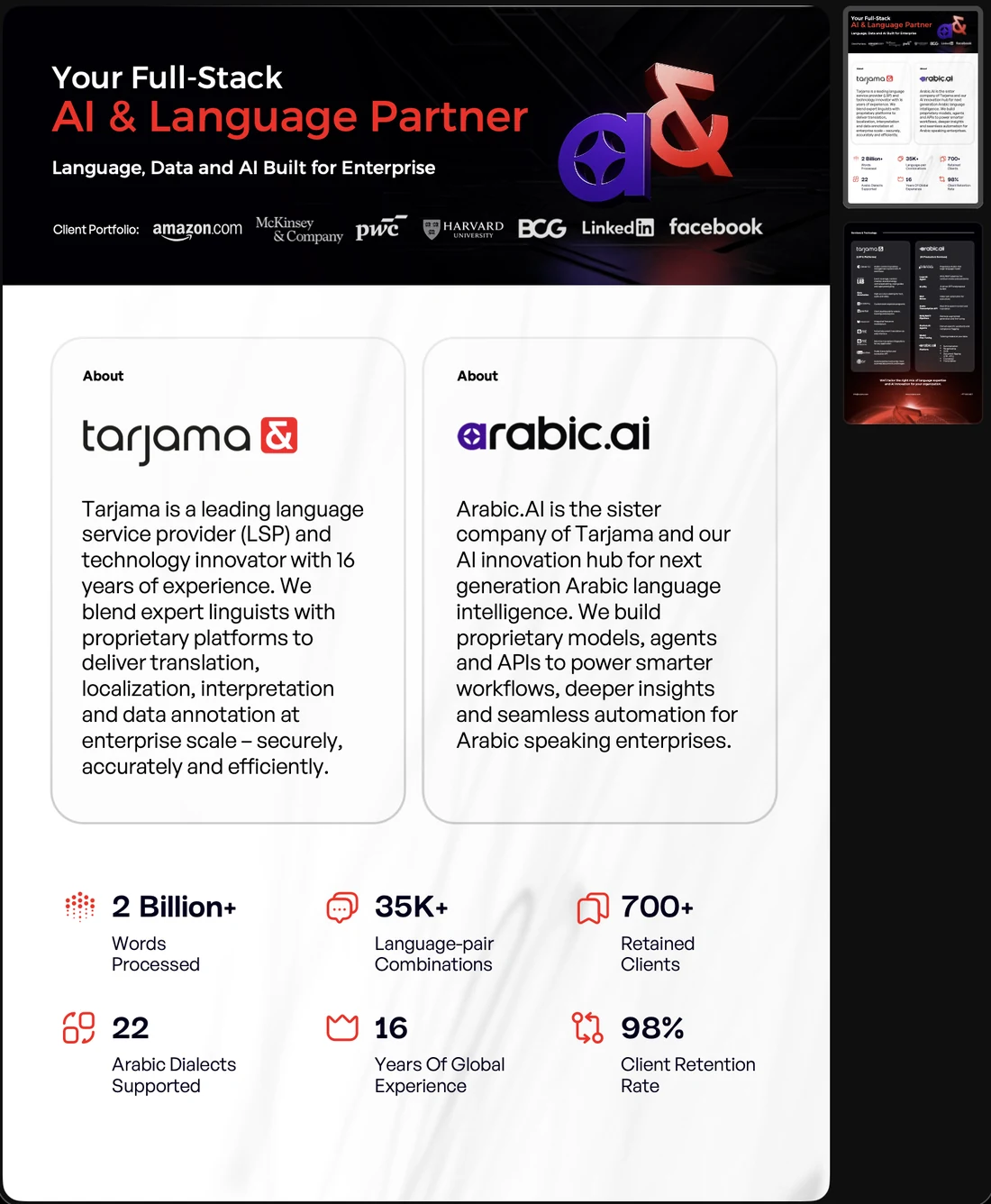
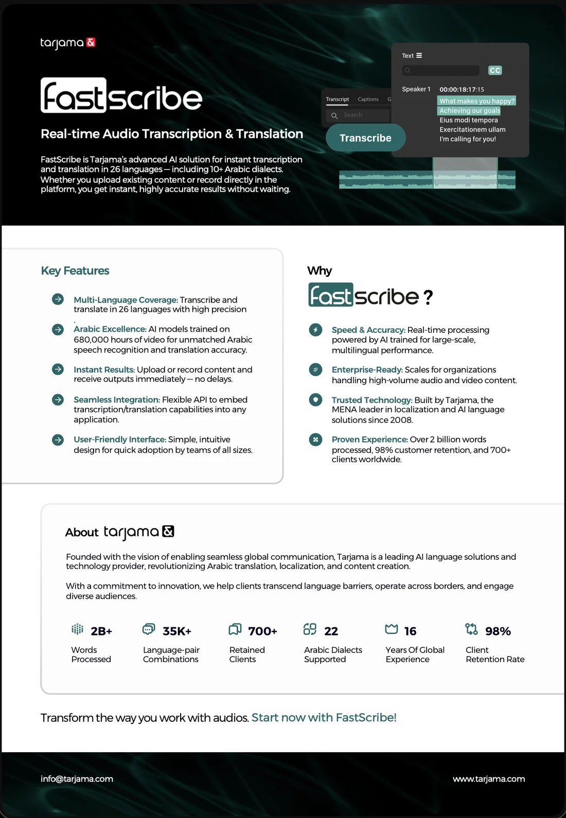
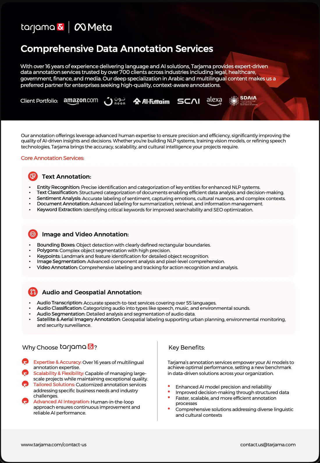
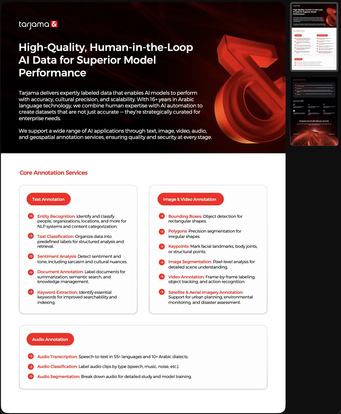
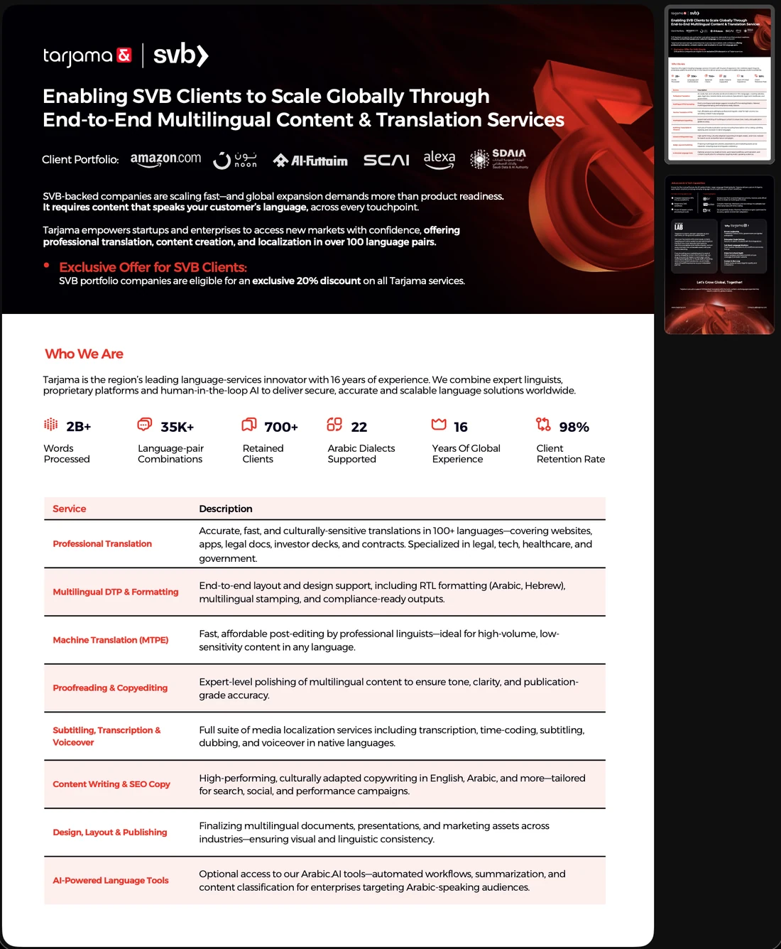
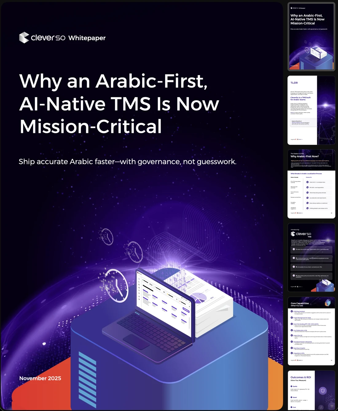
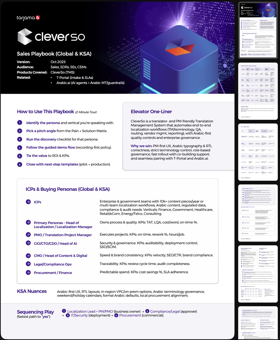
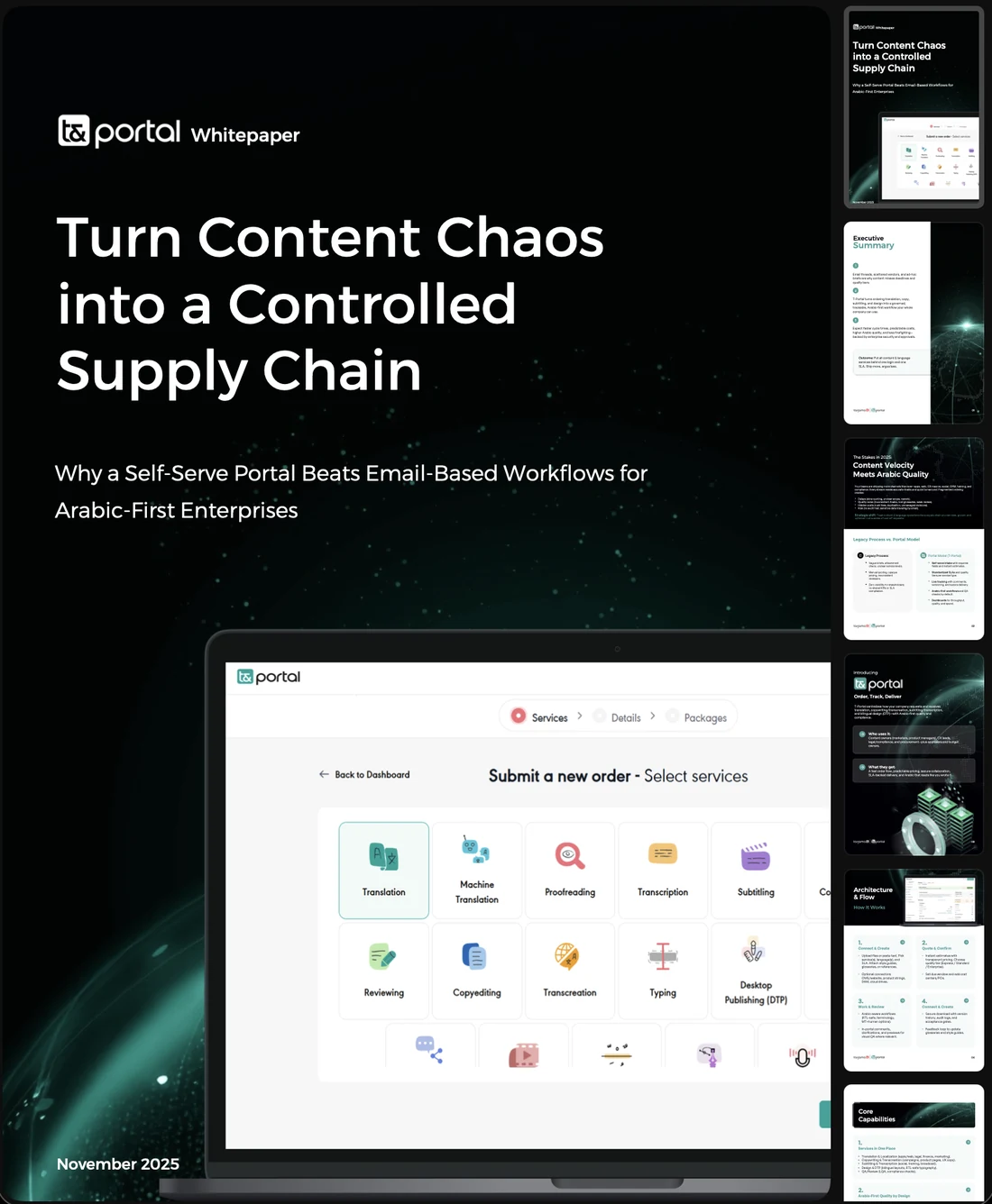
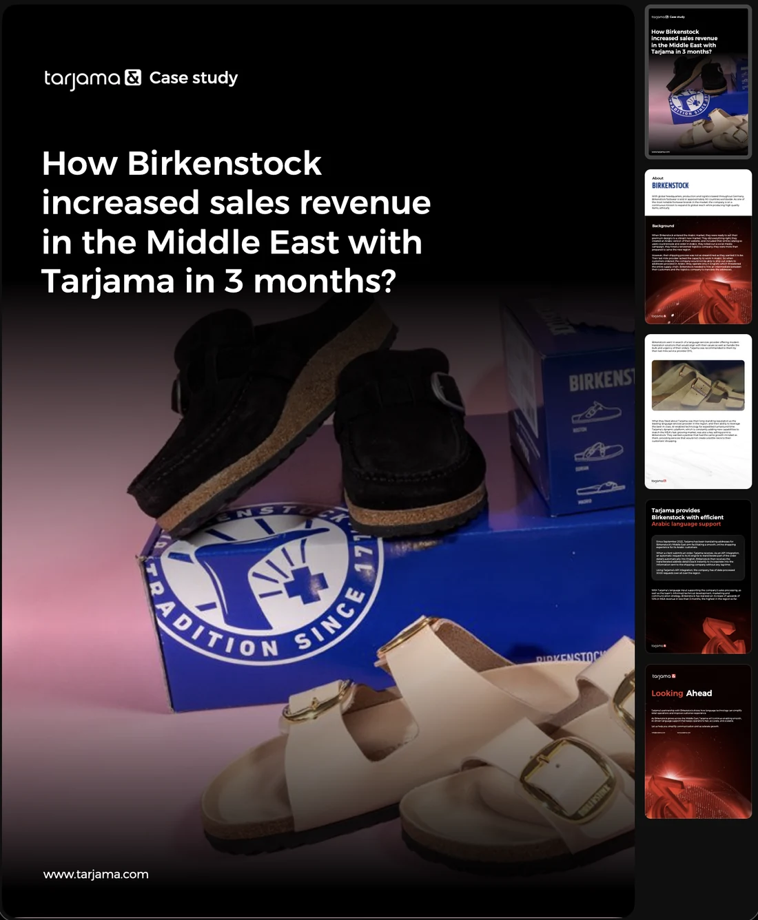
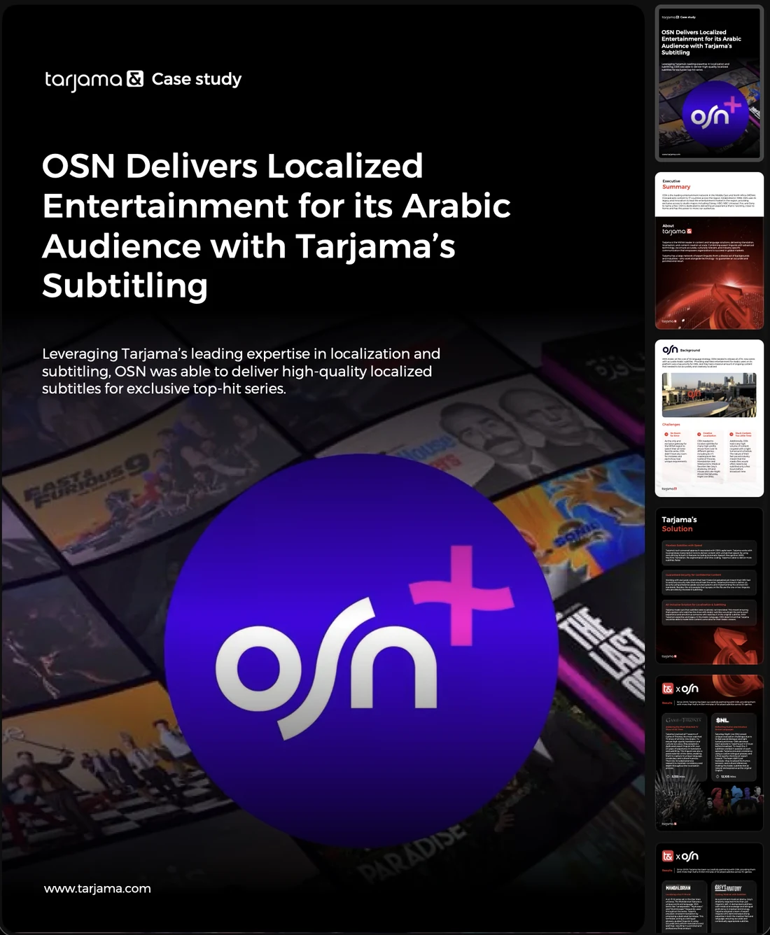
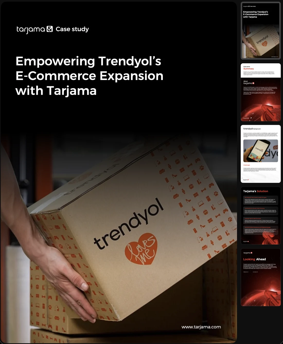
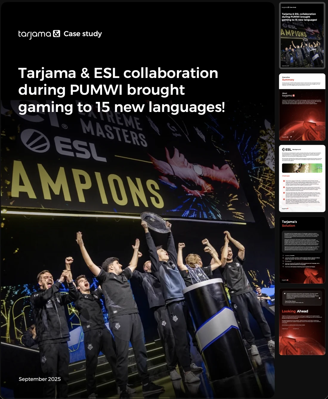
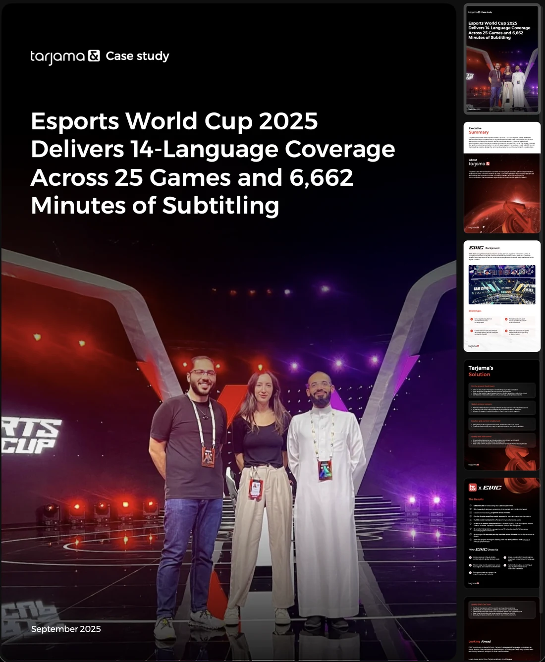
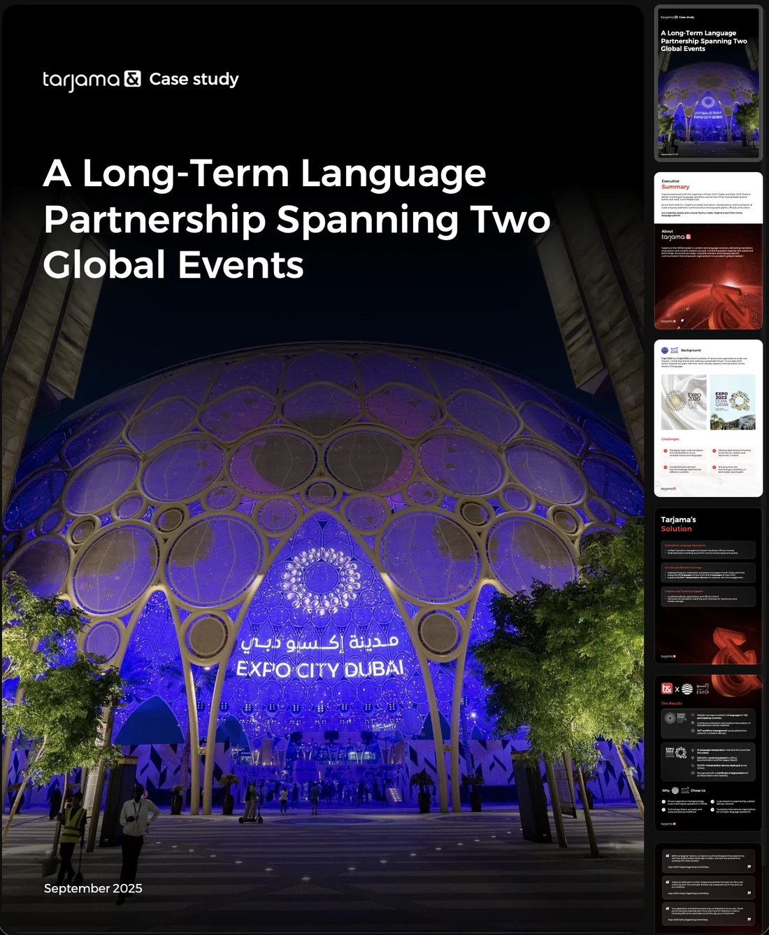
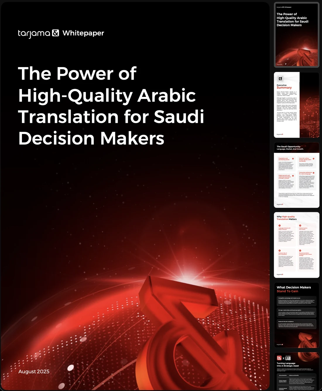
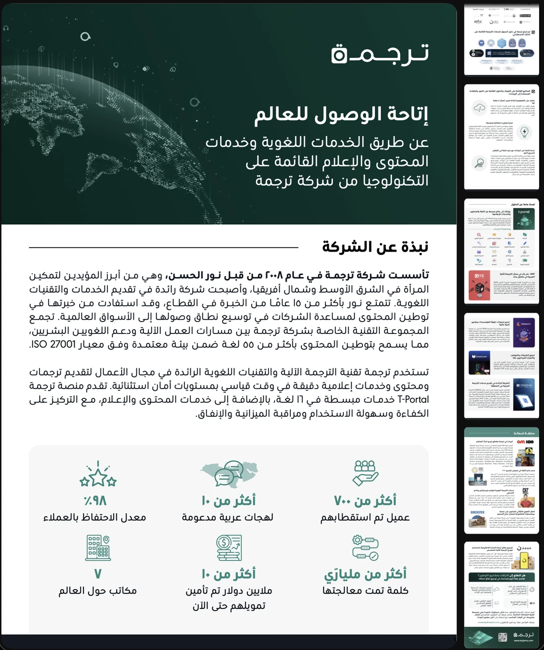
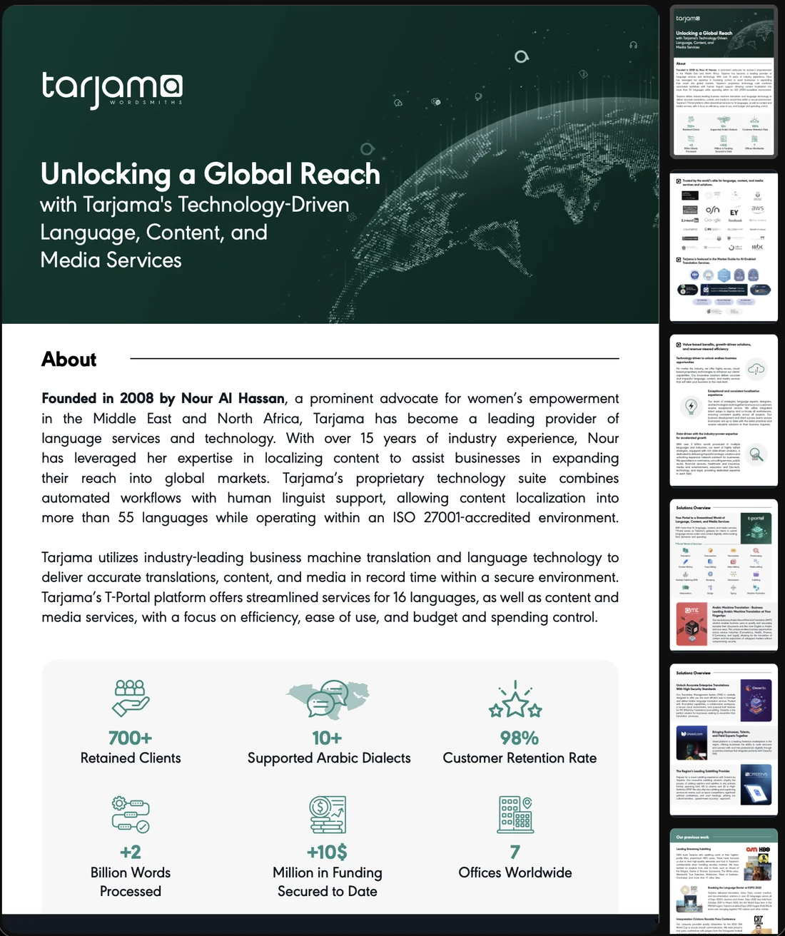
Under all of it, the library the sales team actually sends. Seventeen documents on the page shape: one-pagers per product, whitepapers per argument, case studies per client, a playbook per market, and the brochure in both languages. Each is a cover that has to survive being an email attachment and a body that has to survive being read.
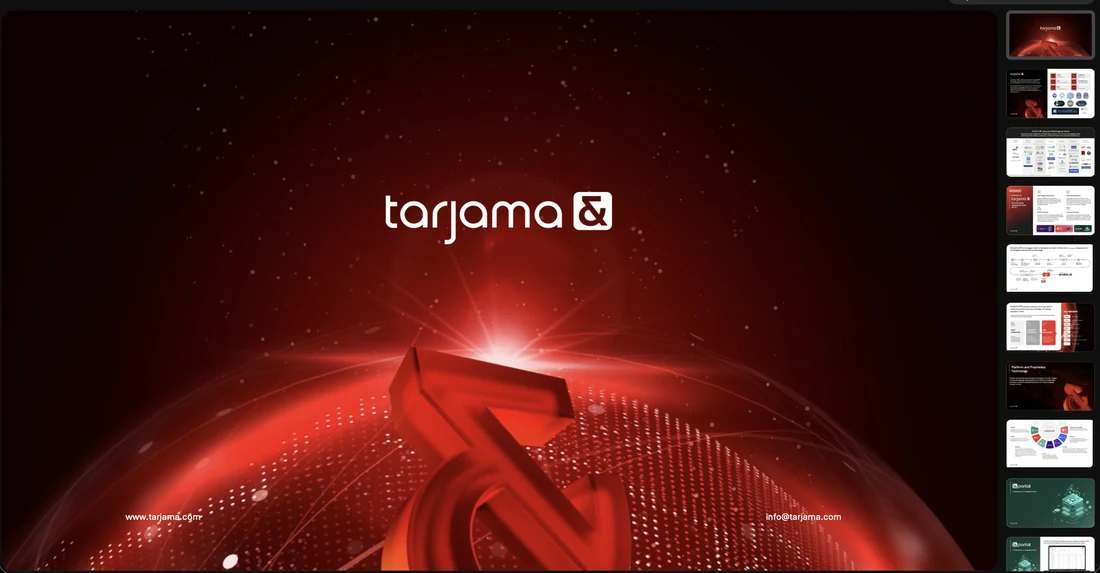
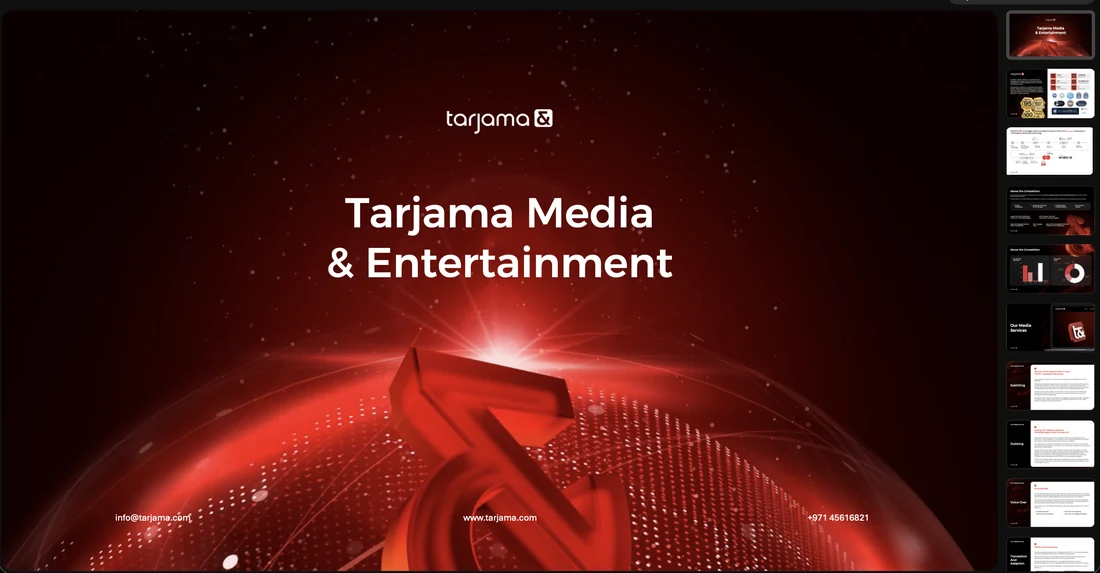
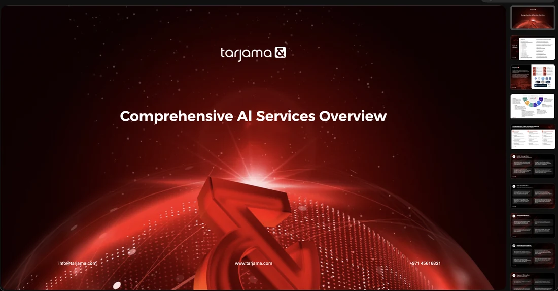
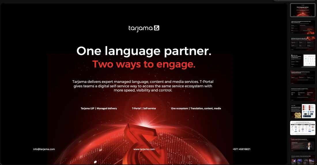
And the decks, which get their own run because they are the other shape. A landscape page is a room being presented to rather than a document being read, and the covers are drawn for it — the ampersand full-bleed behind a single line.
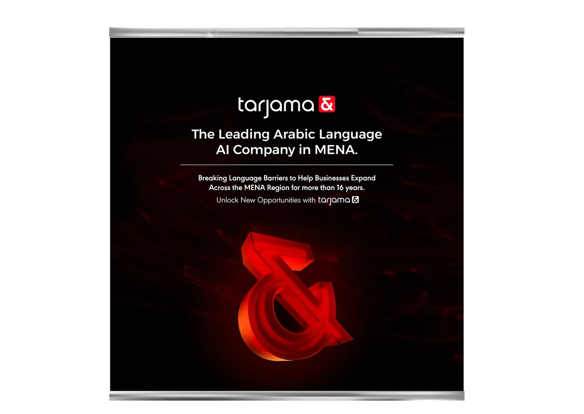
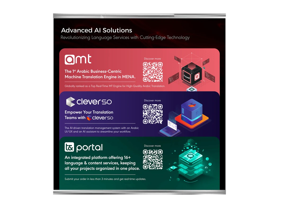
Off the screen and onto the floor: the exhibition panels, where the whole proposition has to land from three metres away — the claim, the three products, and a QR code each.