










Brand identity, product and marketing · United Arab Emirates, 2025
Arabic.AI
Arabic.AI is Tarjama’s own model — the region’s highest-ranked Arabic LLM on Stanford’s HELM benchmark, built to run lean enough to deploy on affordable hardware.
The identity was established from zero and runs one system across both halves of the company’s life: the product surfaces people work in, and the marketing surfaces that have to sell a model to people who cannot see one.
Most of what follows is the second half, because that is where the volume is: a film, eighteen carousels, sixty-odd single posts, twenty-nine whitepapers and decks, a stand, a banner and the stationery — run in English and in Arabic, where the Arabic is written and set for the script rather than translated into it.
The site, live in the frame — and the whole of it is one window away.
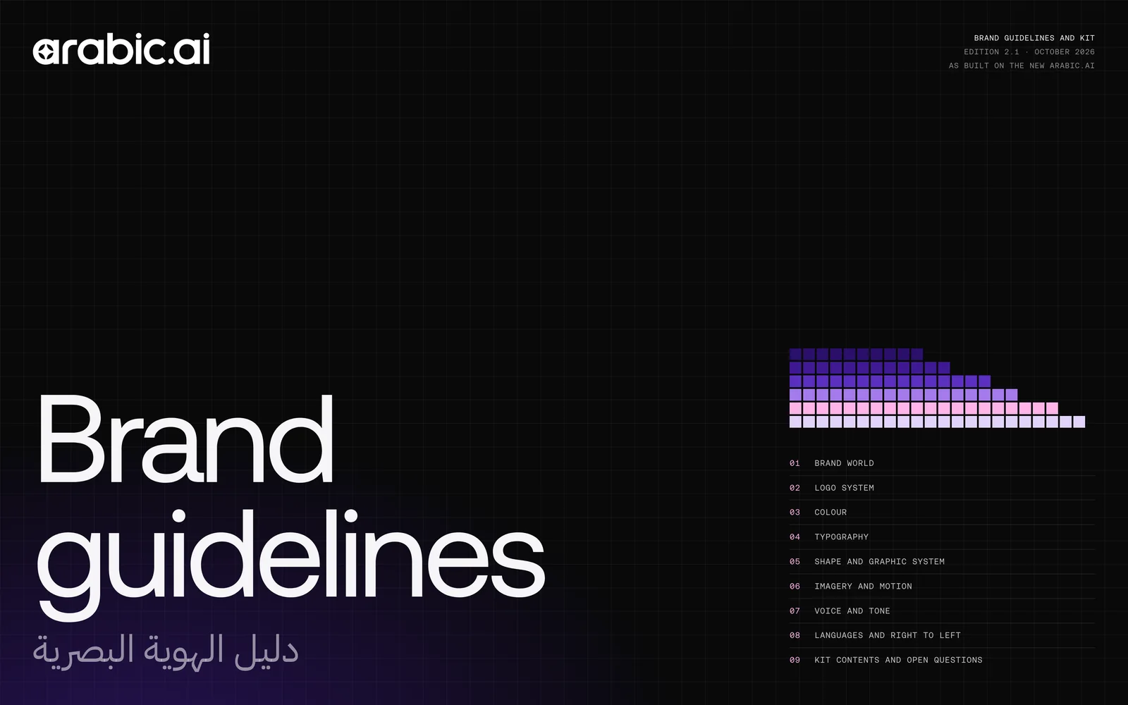
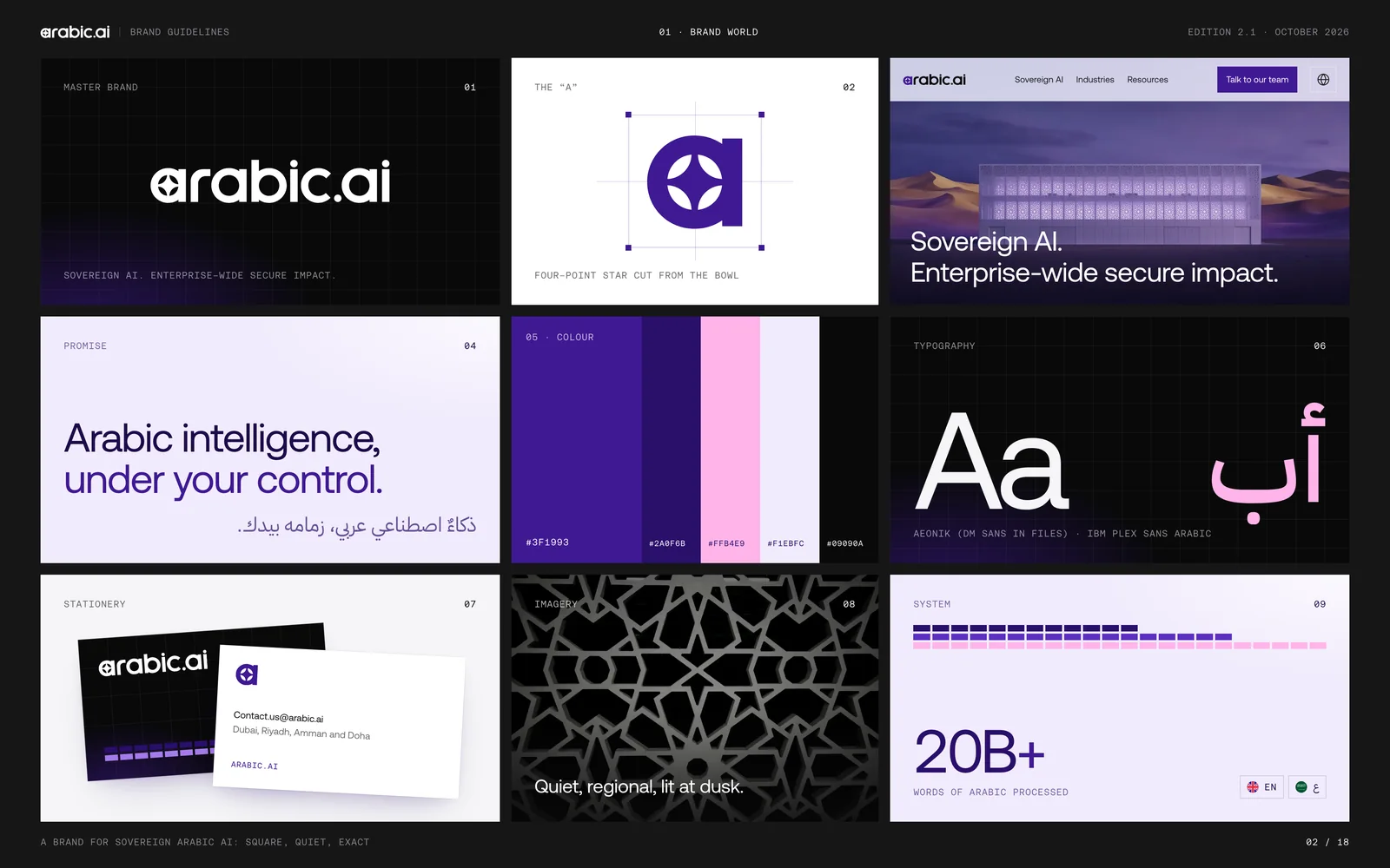
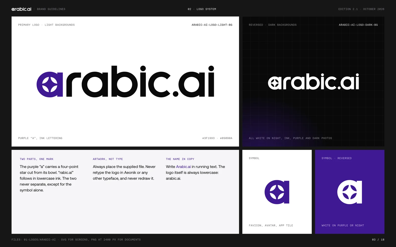
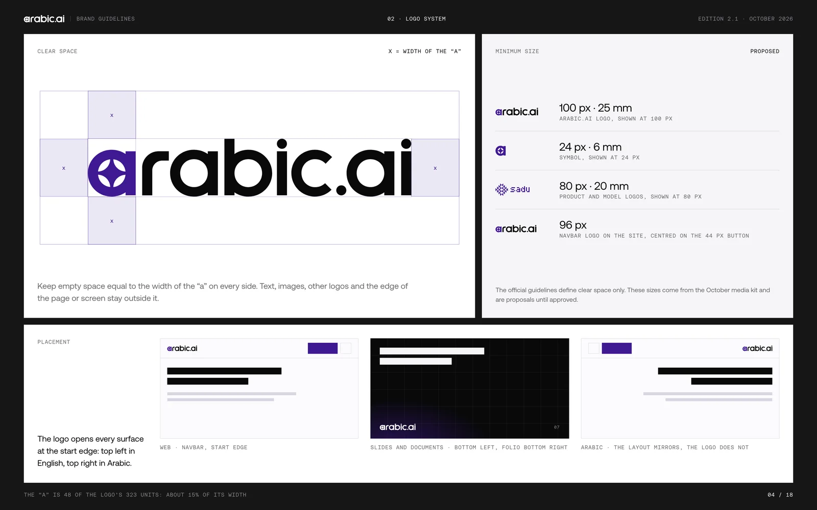
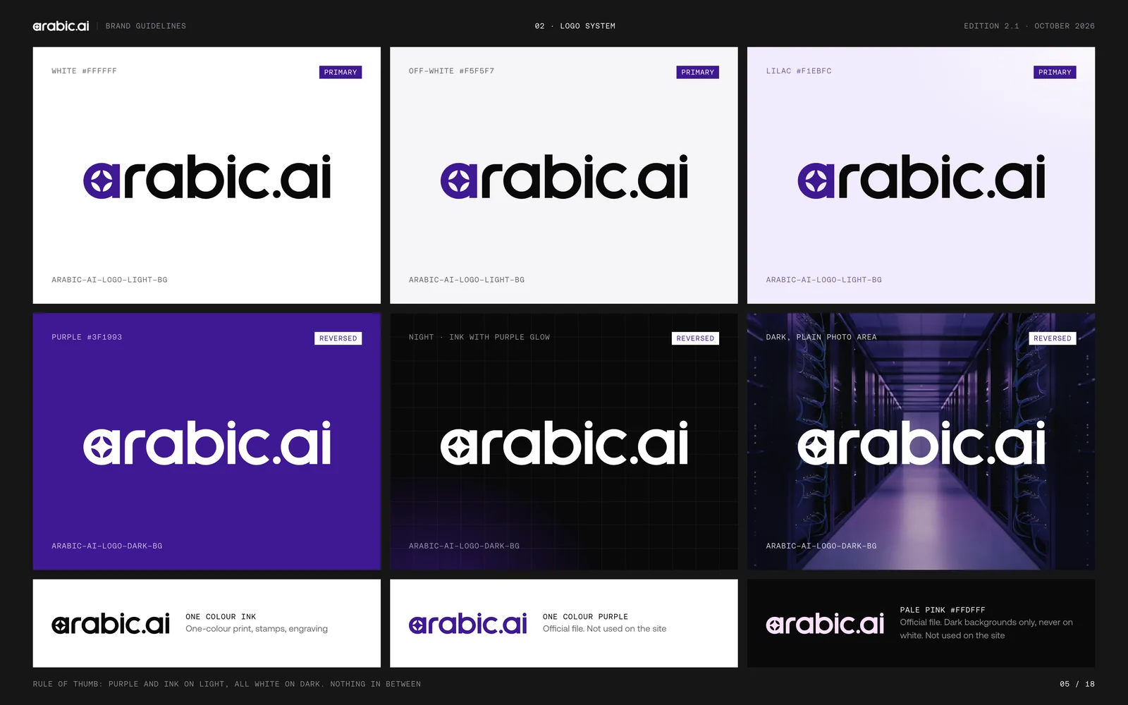
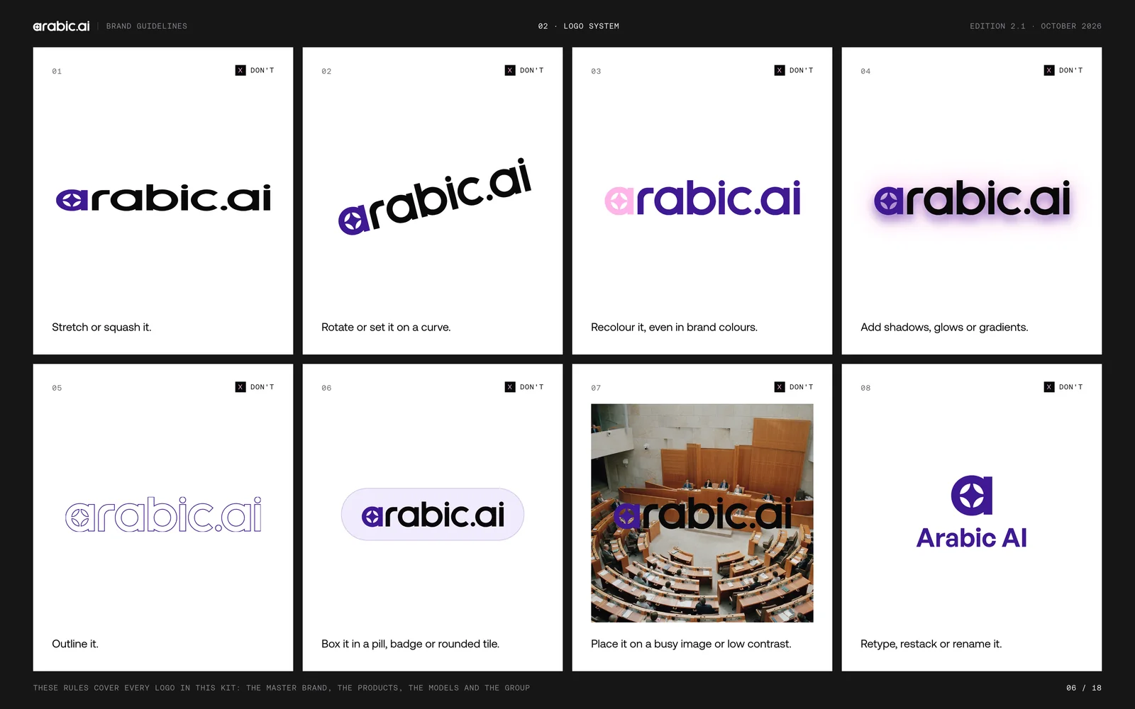
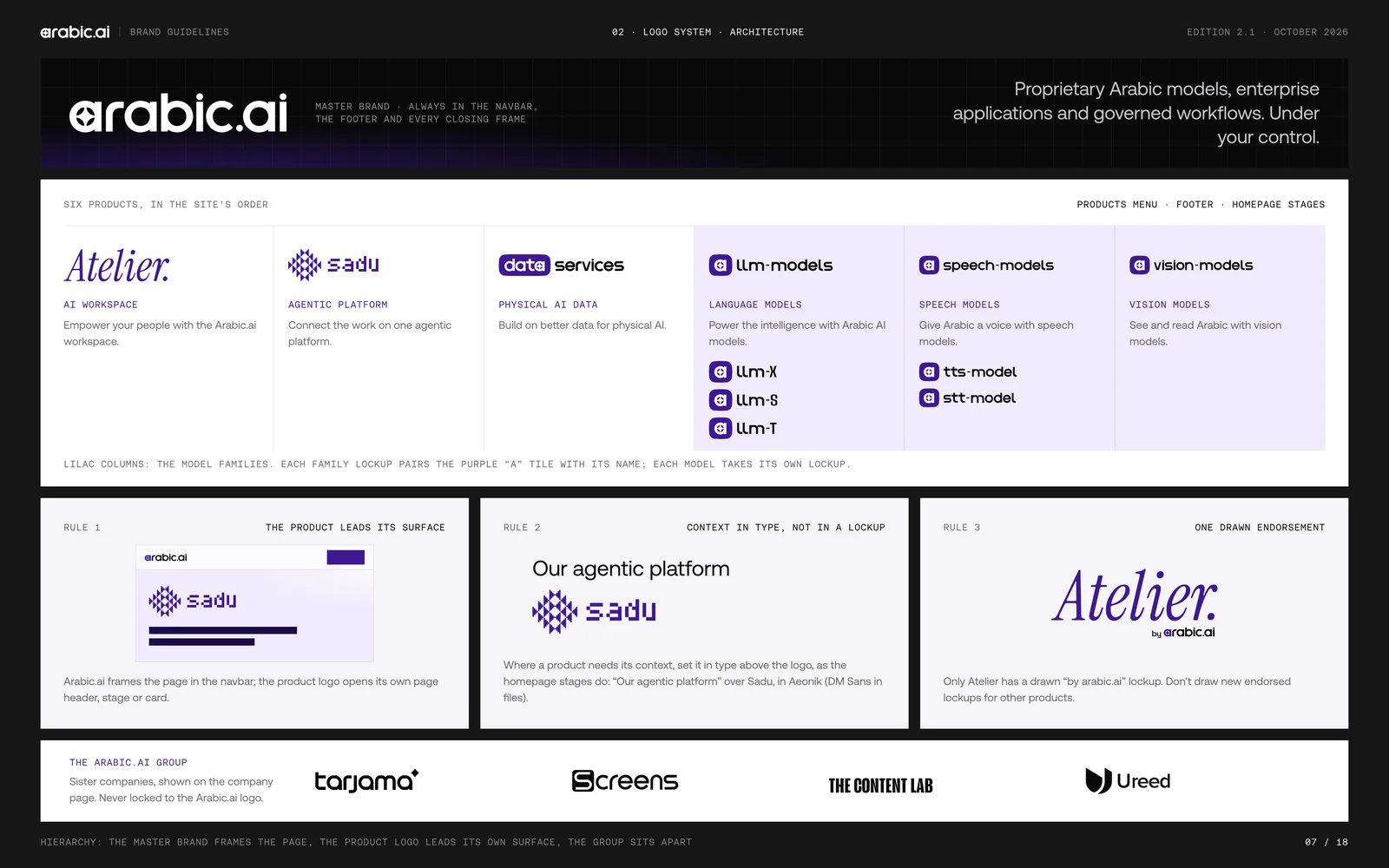
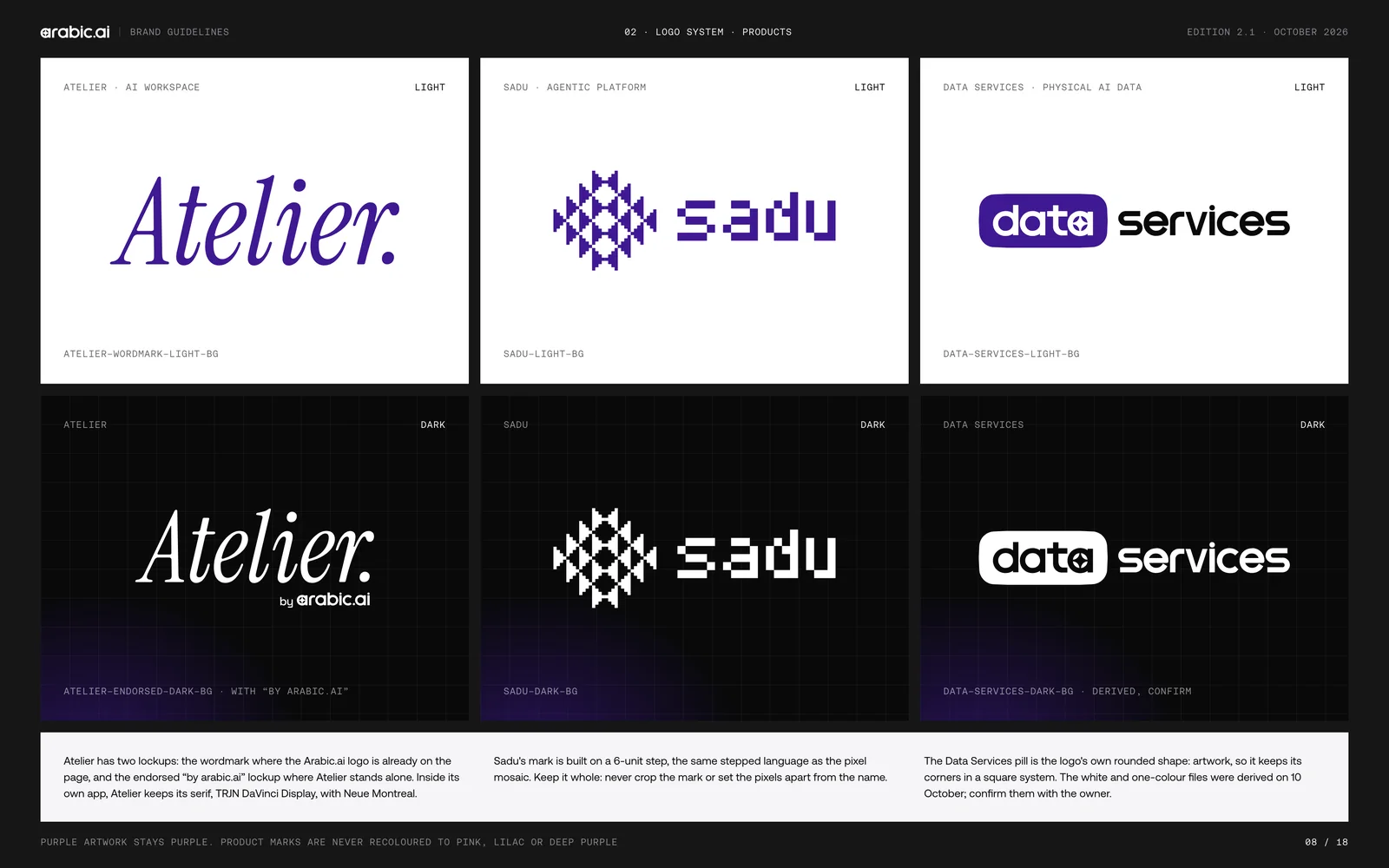
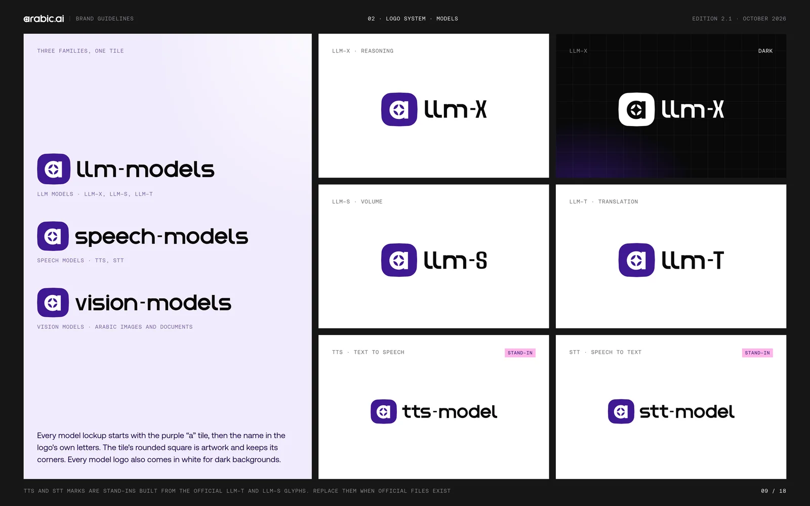
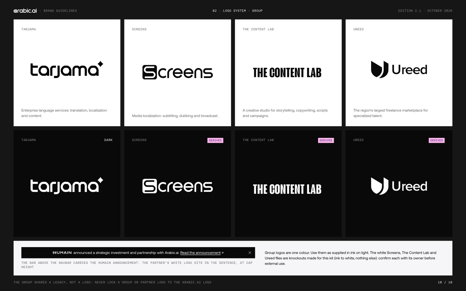
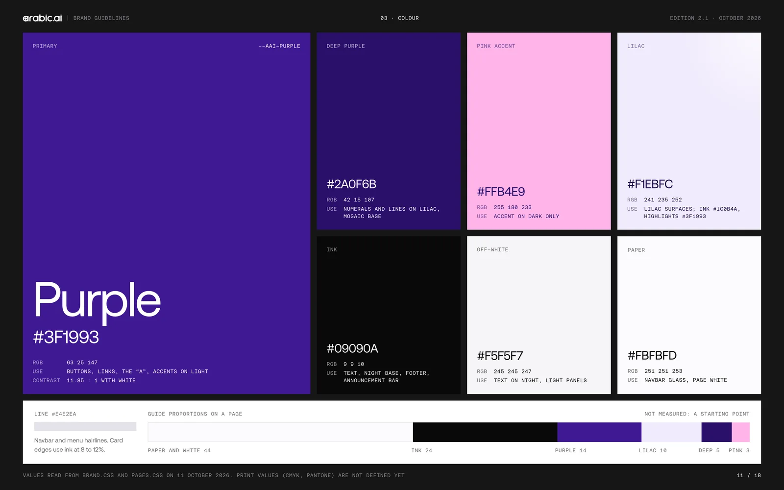
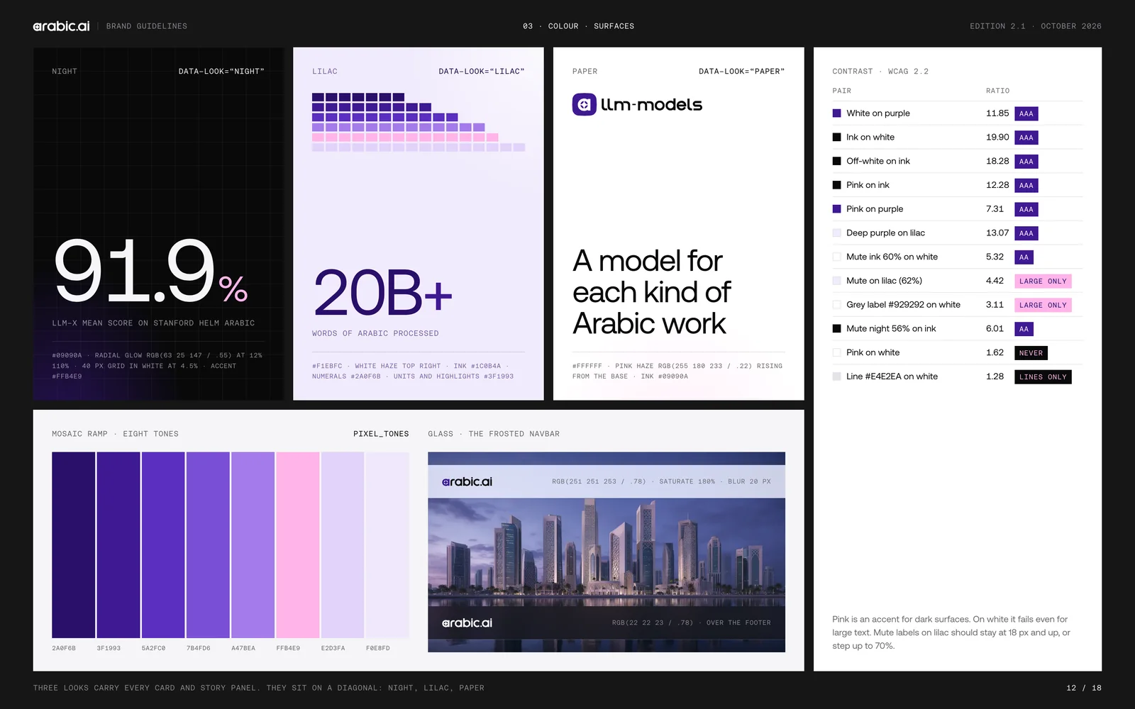
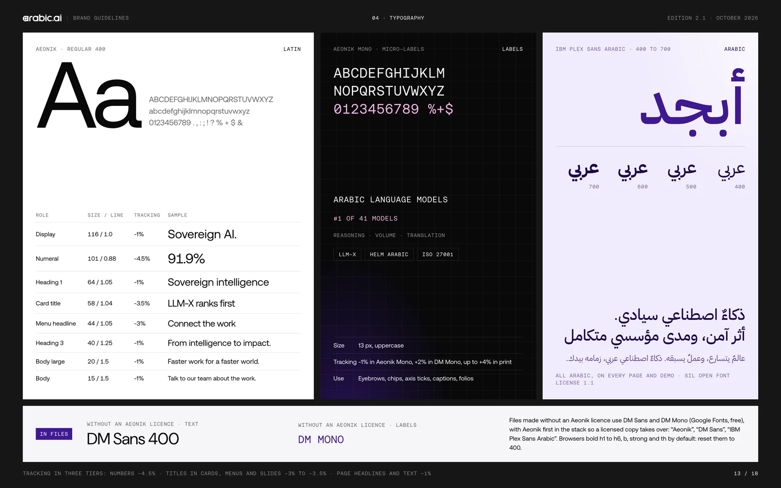
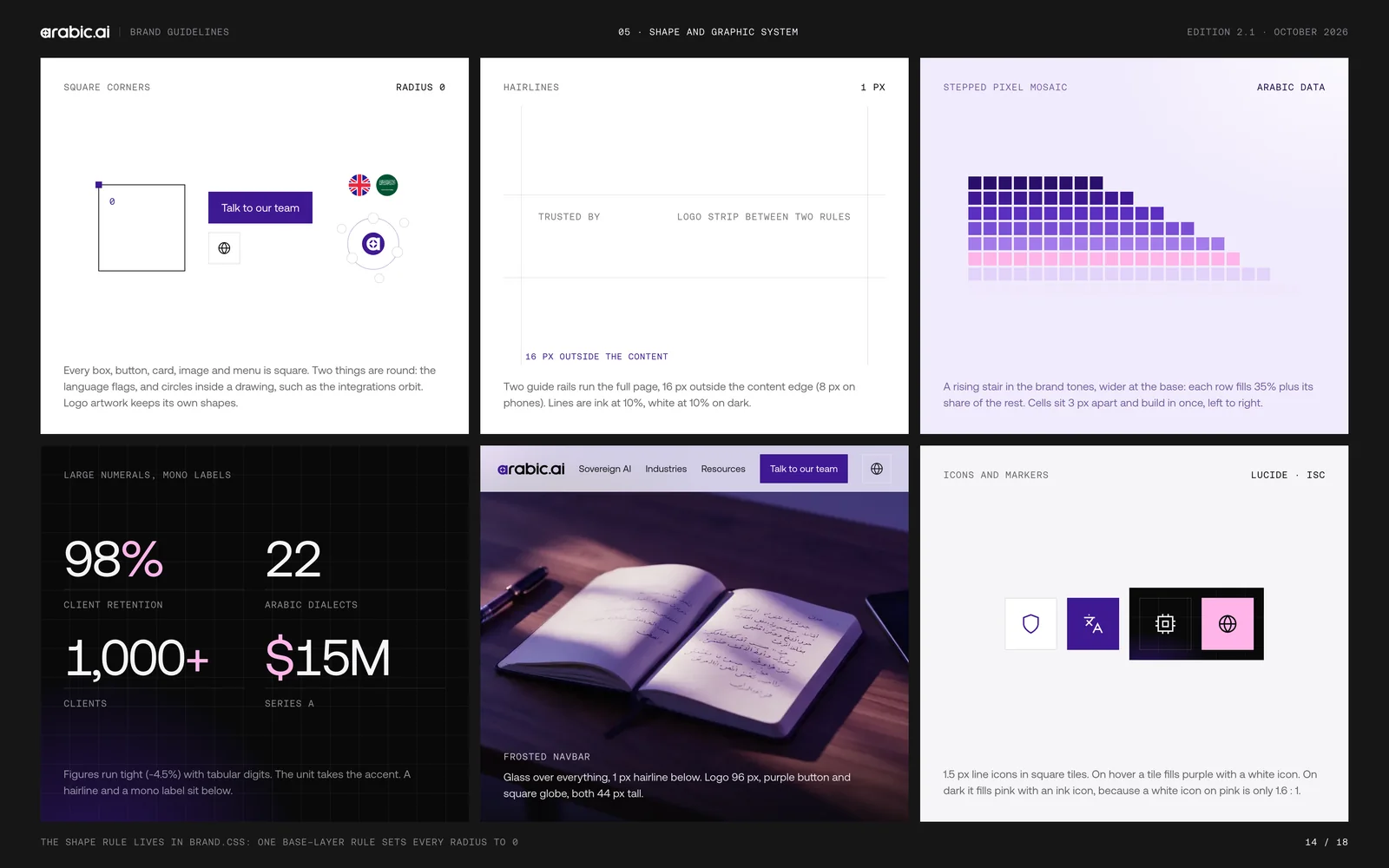
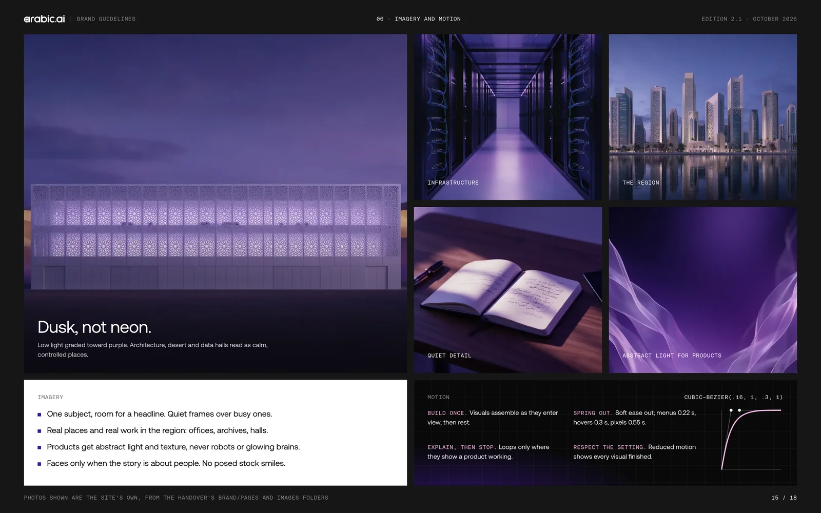
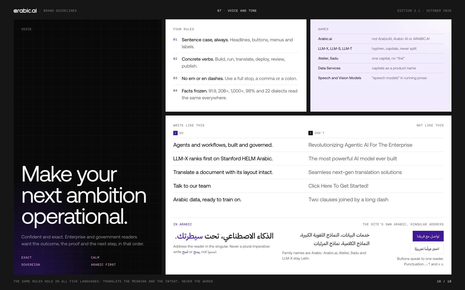
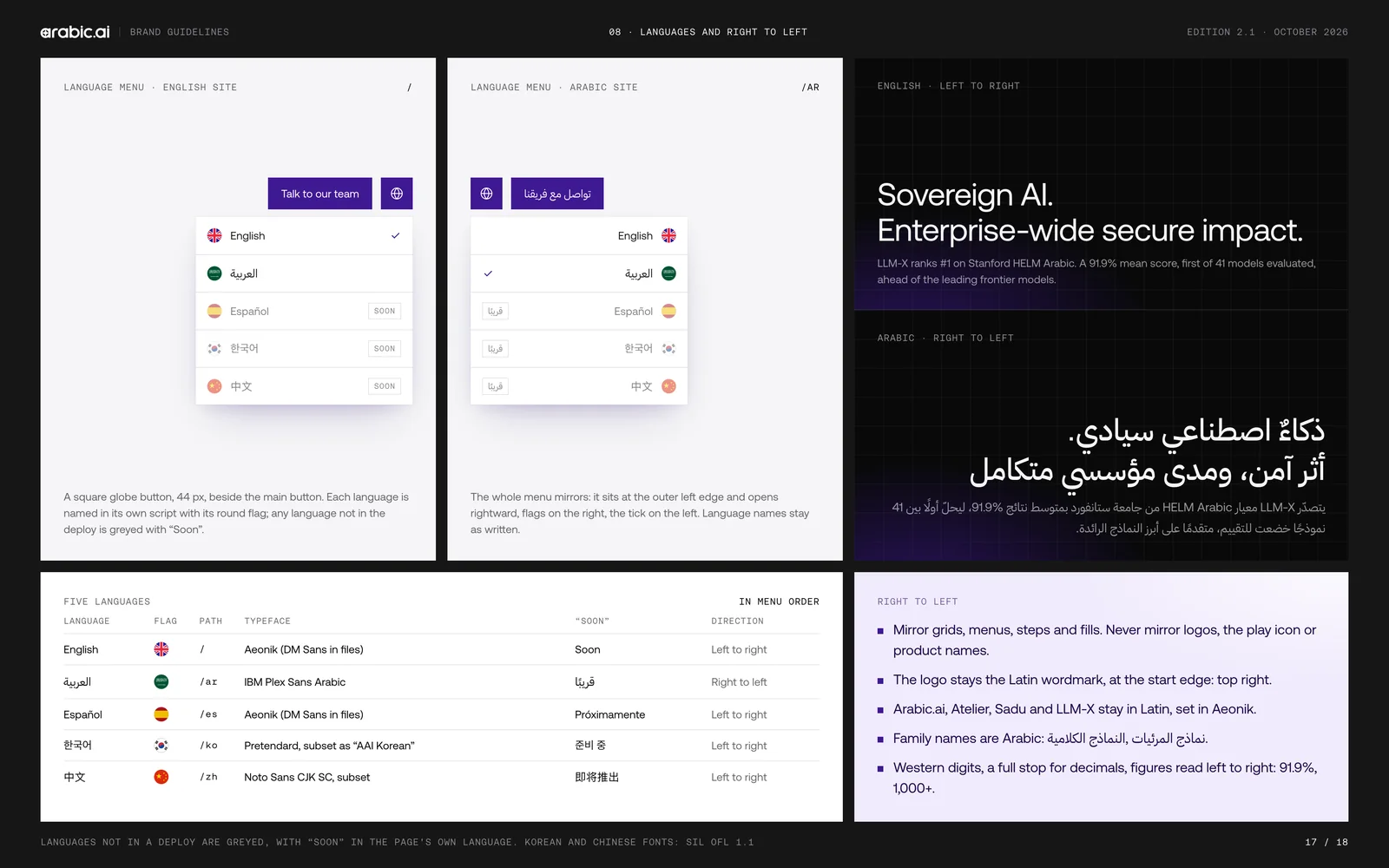
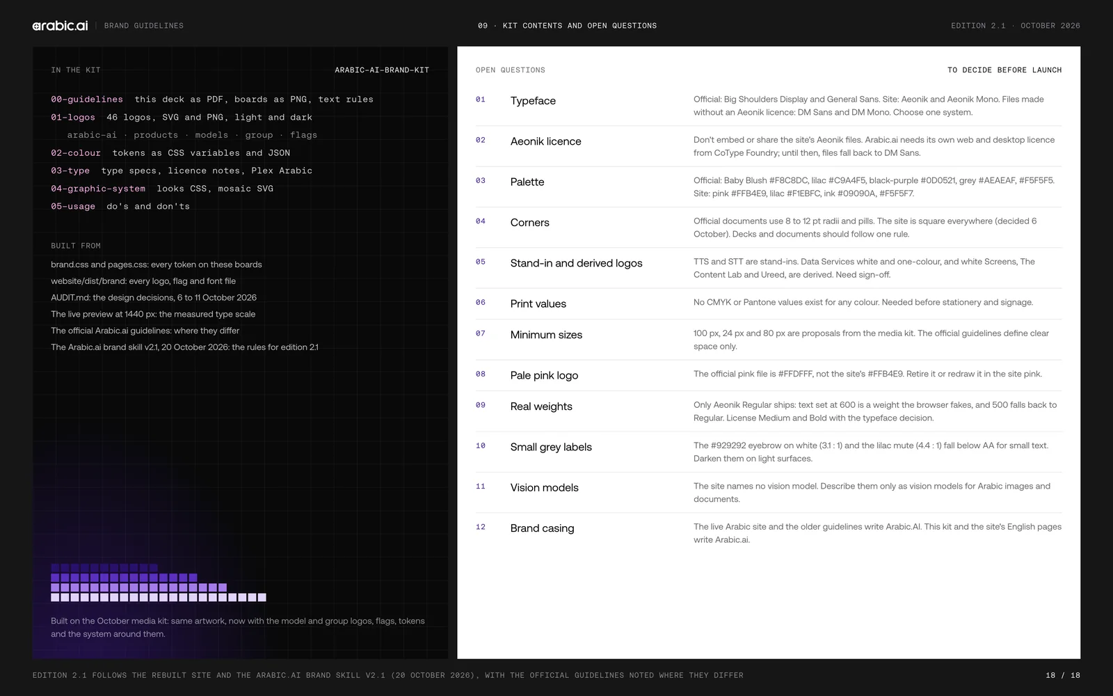
The book itself — the logo, the architecture and the art direction, eighteen boards of it. The mark is two parts, one word: a four-point star cut out of the bowl of the “a”, and “arabic.ai” set lowercase beside it and never anywhere else. From there it has to hold a company that keeps multiplying — four products, six models, four sister companies — so the architecture is a rule rather than a drawing: the model lockups all start from the same purple tile, the products take the endorsement, the group keeps its own marks. The misuse page is the one that does the real work, because a system is only as strong as the eight things it says you may not do. It went out as a kit rather than a PDF: forty-six logo files across the master, the products, the models, the sister companies and the five language flags, the colour as CSS variables and JSON tokens, the licensed fonts, and a dos-and-don’ts page a developer can read in a minute.
The brand film. Twenty-nine seconds that have to make a language model look like something, which is the hardest brief in the category: the wordmark builds, the model picker opens on LLM-X, a wall of Arabic runs past at reading speed, and the product appears only long enough to prove it exists. “Faster work for a faster world” is the whole argument, and it is on screen for two of the twenty-nine.
And the fifteen-second cut of the same argument, for the places nobody gives you fifteen seconds: no product, no interface, one ring of light assembling itself out of a grid and one line — the #1 Arabic AI. Everything the long film takes half a minute to earn, compressed to the claim and the mark.
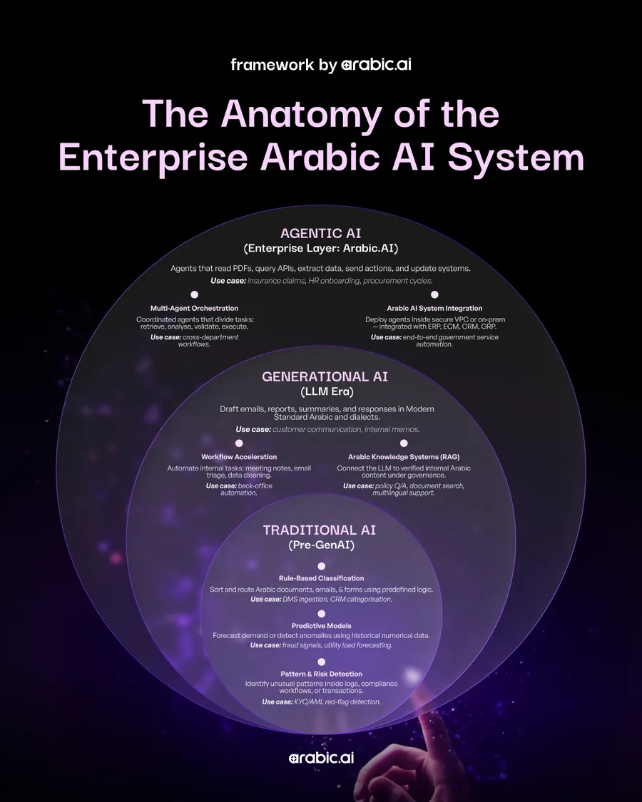
The diagram the whole campaign rests on: traditional AI, the generative layer and the agentic one drawn as three rings rather than three boxes, because the argument is that the outer one contains the others rather than replacing them. Every deck below is some slice of this picture, aimed at whoever is being sold to.
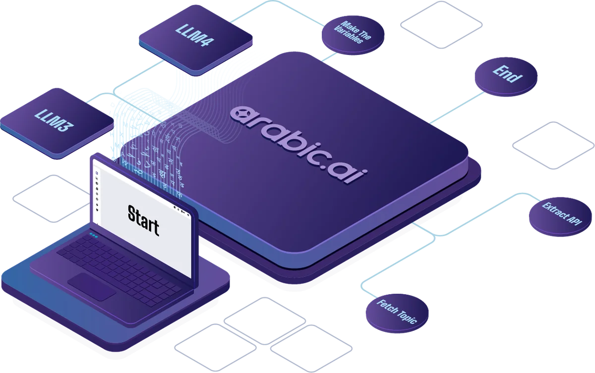
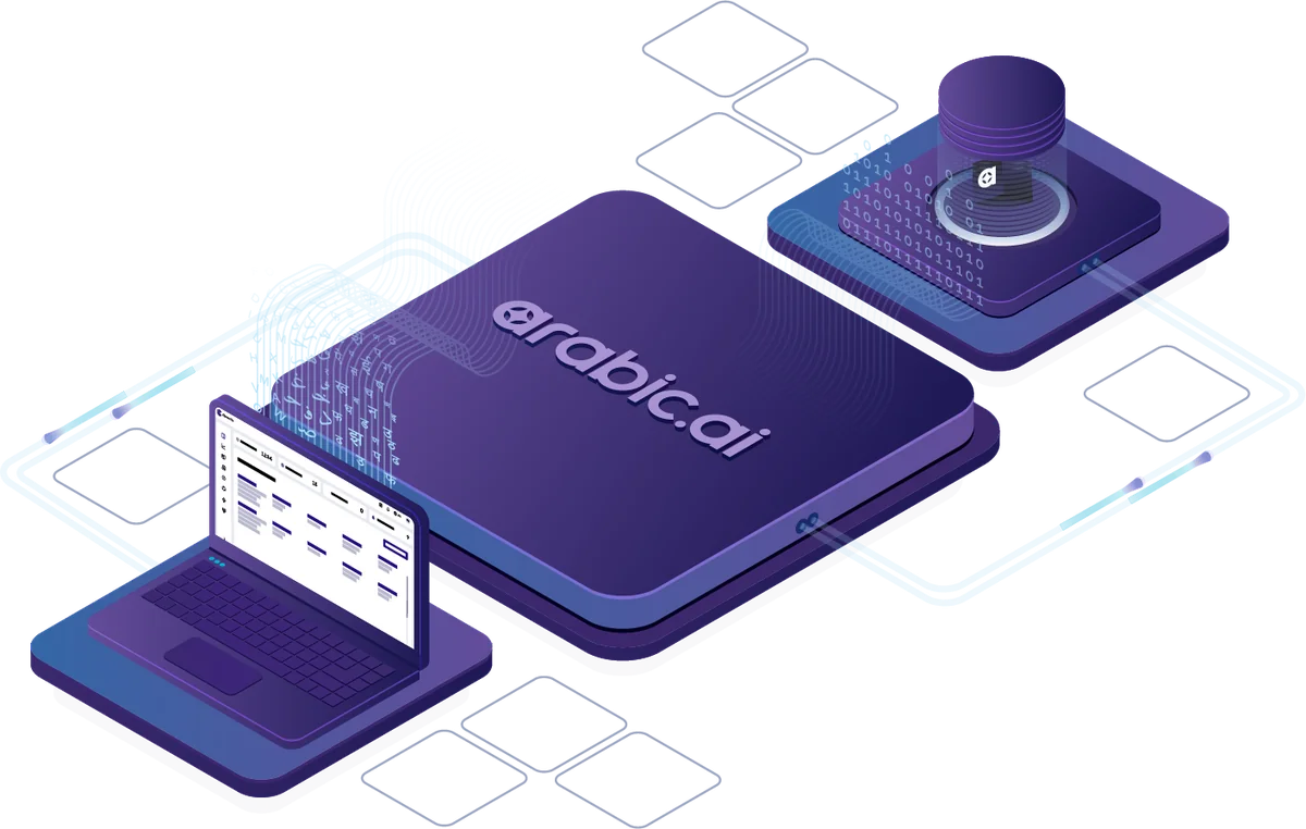
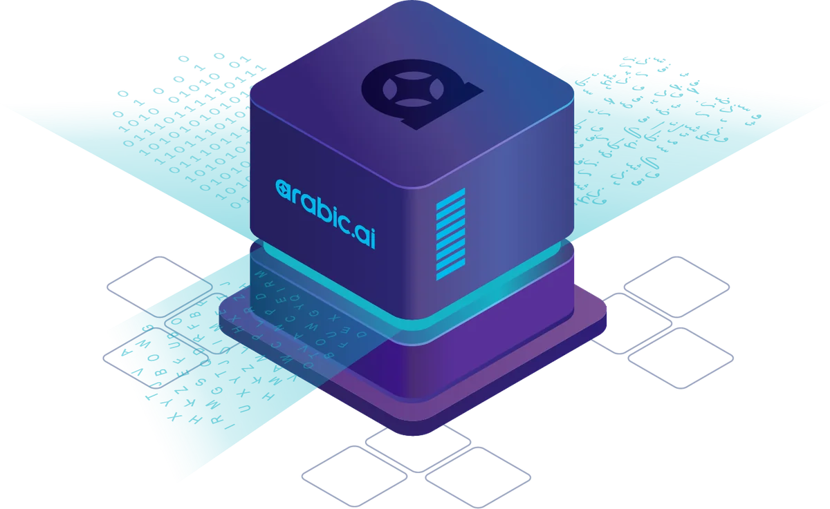
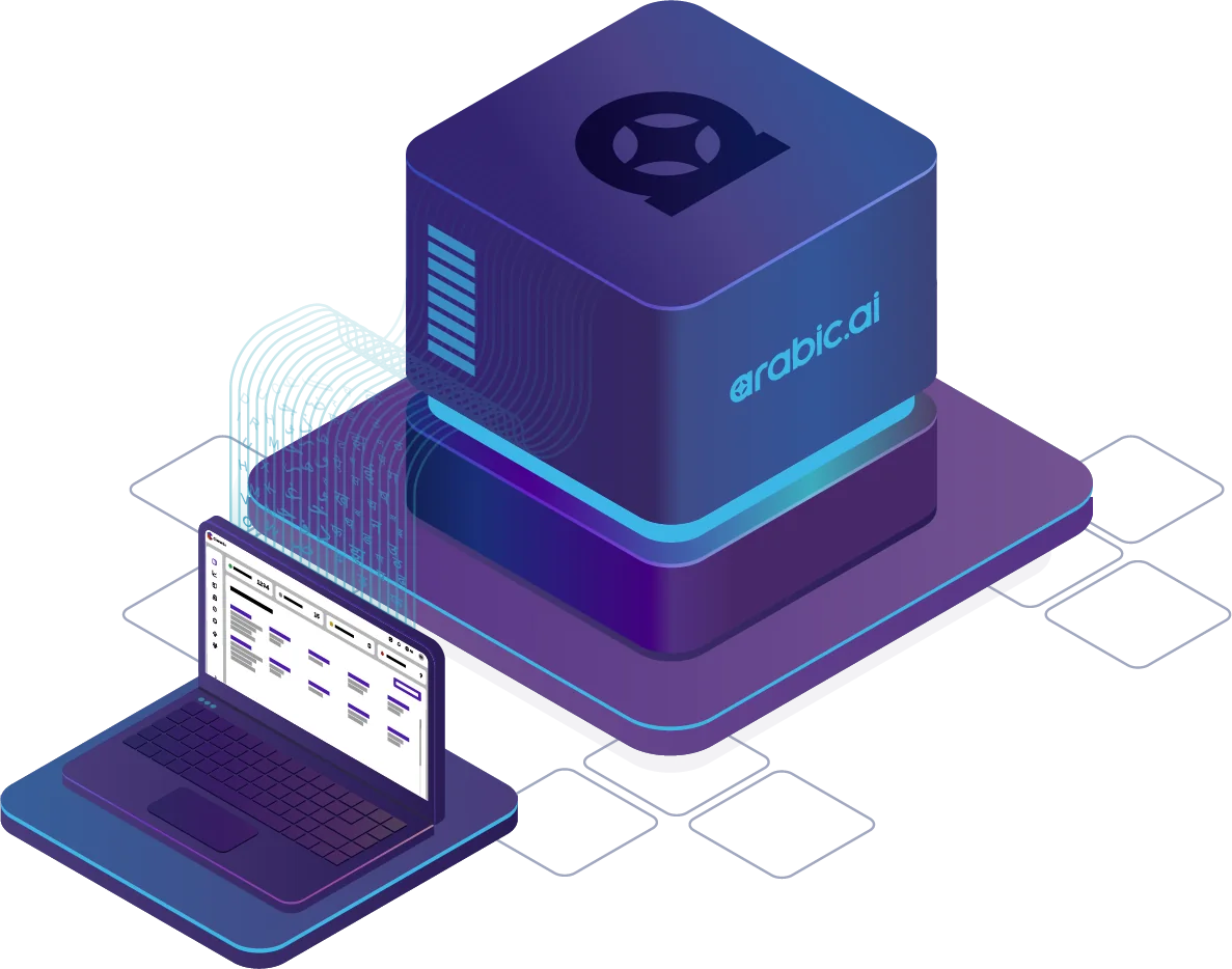
The product itself, drawn rather than screenshotted: four isometric builds — the agentic platform, the data services, the LLM and the translation management system — on one axonometric grid, under one light, in one palette. A thing nobody can photograph still has to look like the same company made it.
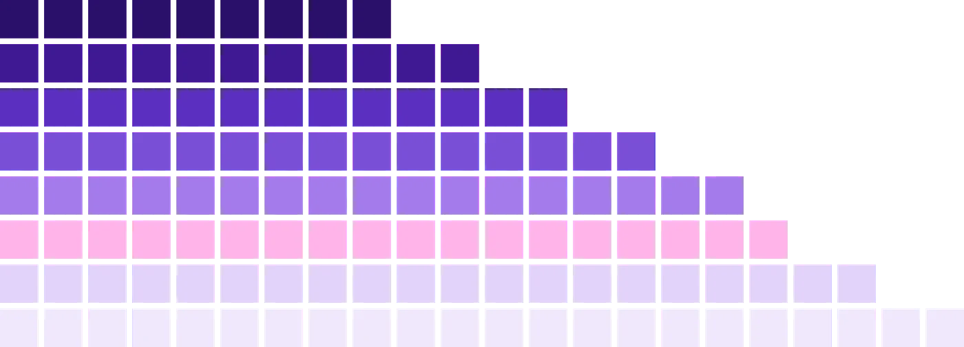
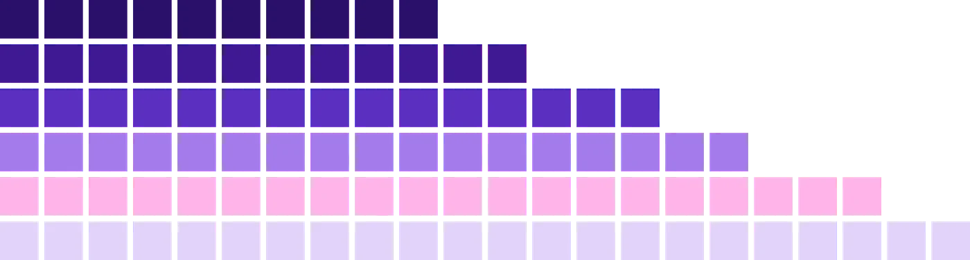
The one drawing in the system that is not drawn: the stepped mosaic is generated by a rule — each row takes 35 per cent of the width plus its share of what is left, toned from deep purple down to pale lilac, 3px gaps — so it can be made at any size without anyone deciding where the squares go. It stands for Arabic data and scale, and the one instruction attached to it is that you may not rearrange its rows. It ships at three widths, down to a two-row strip used as trim.
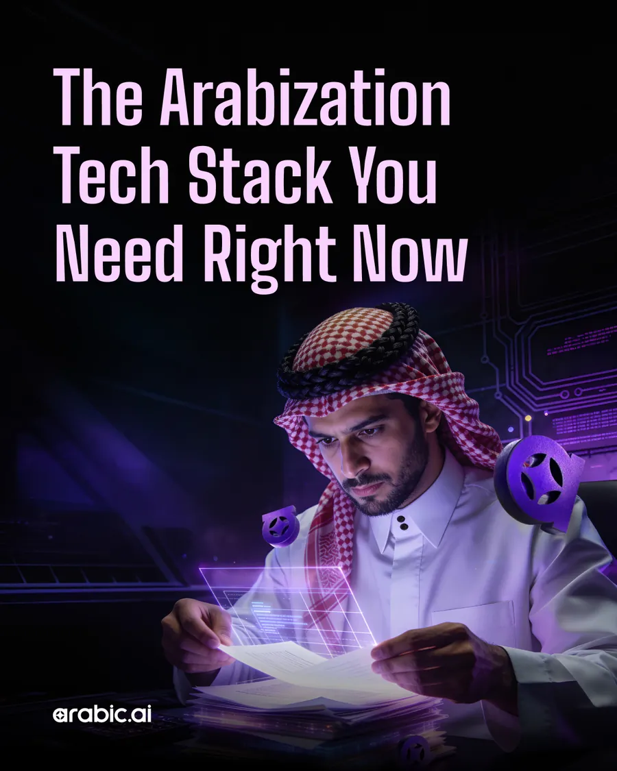
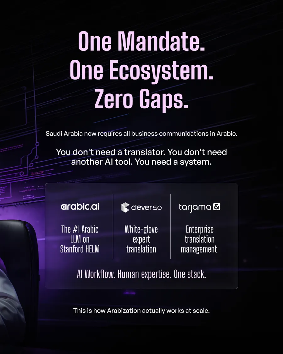
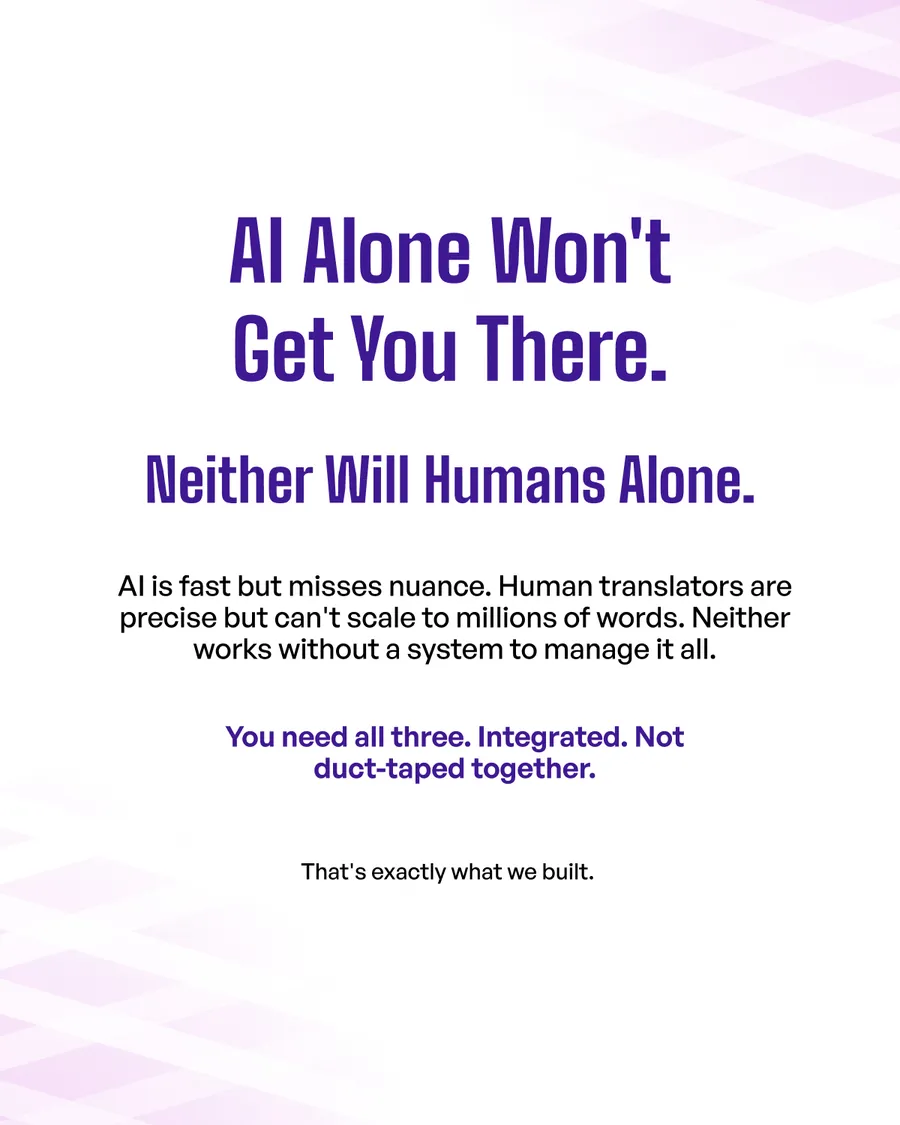
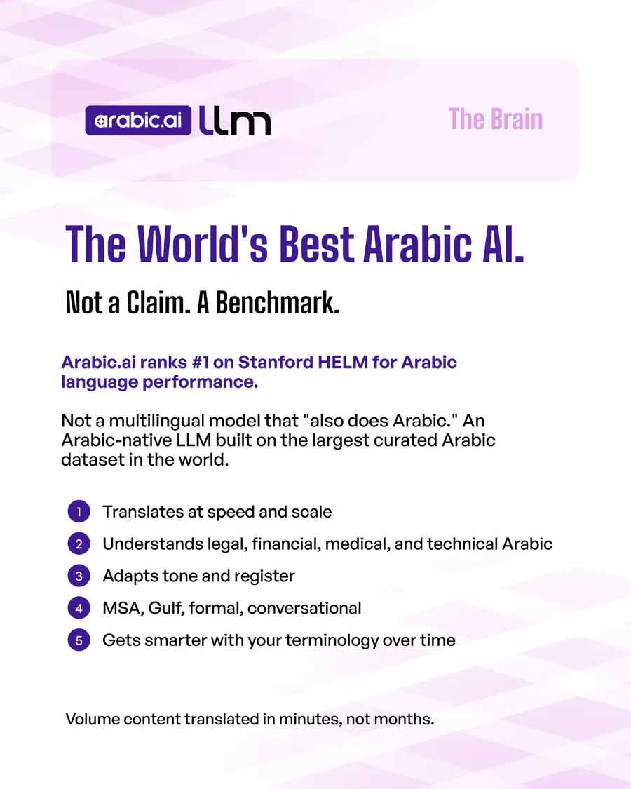
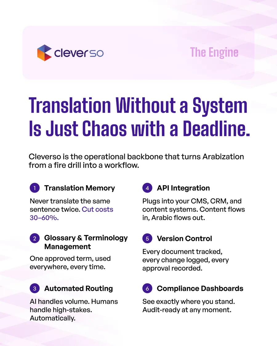
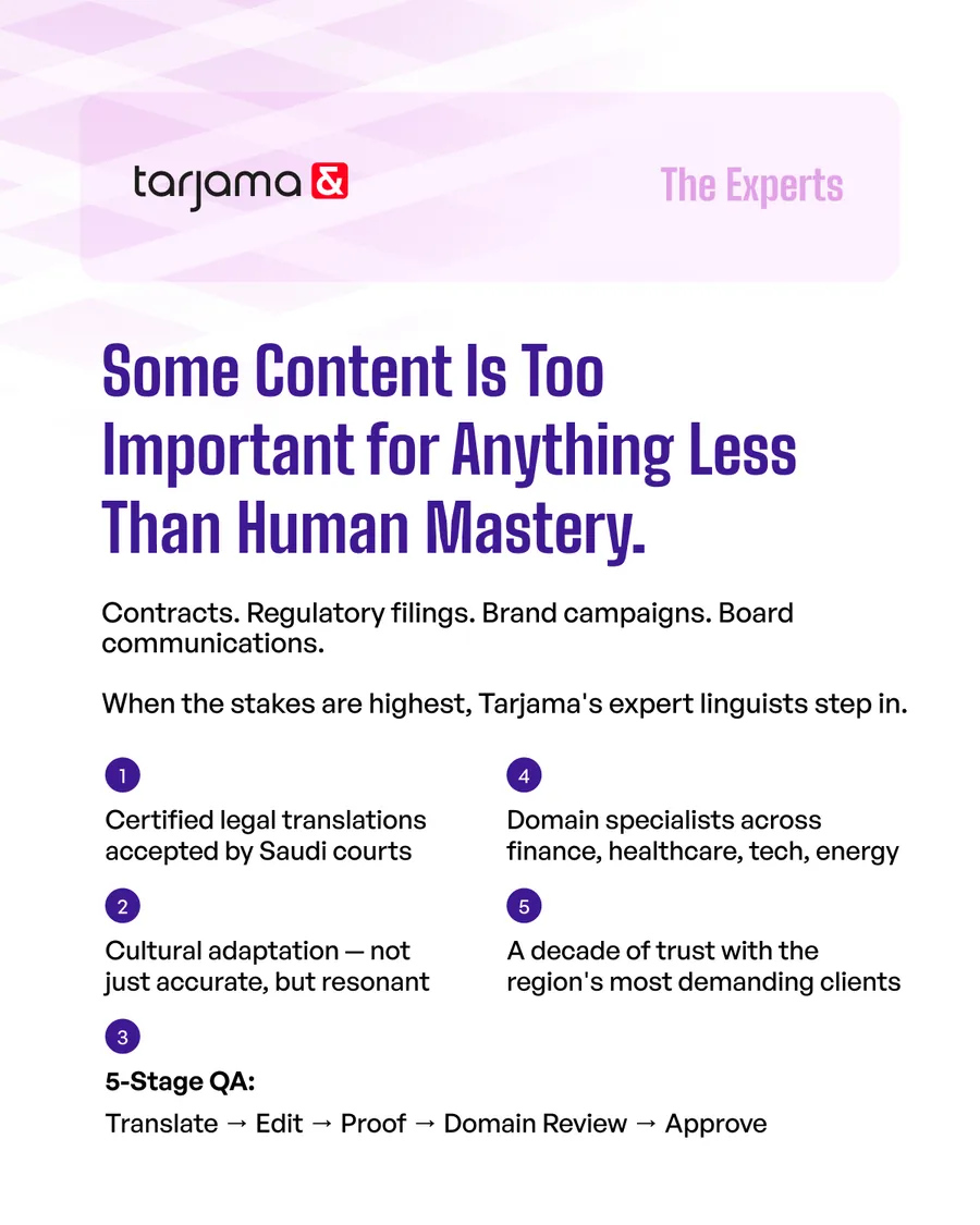
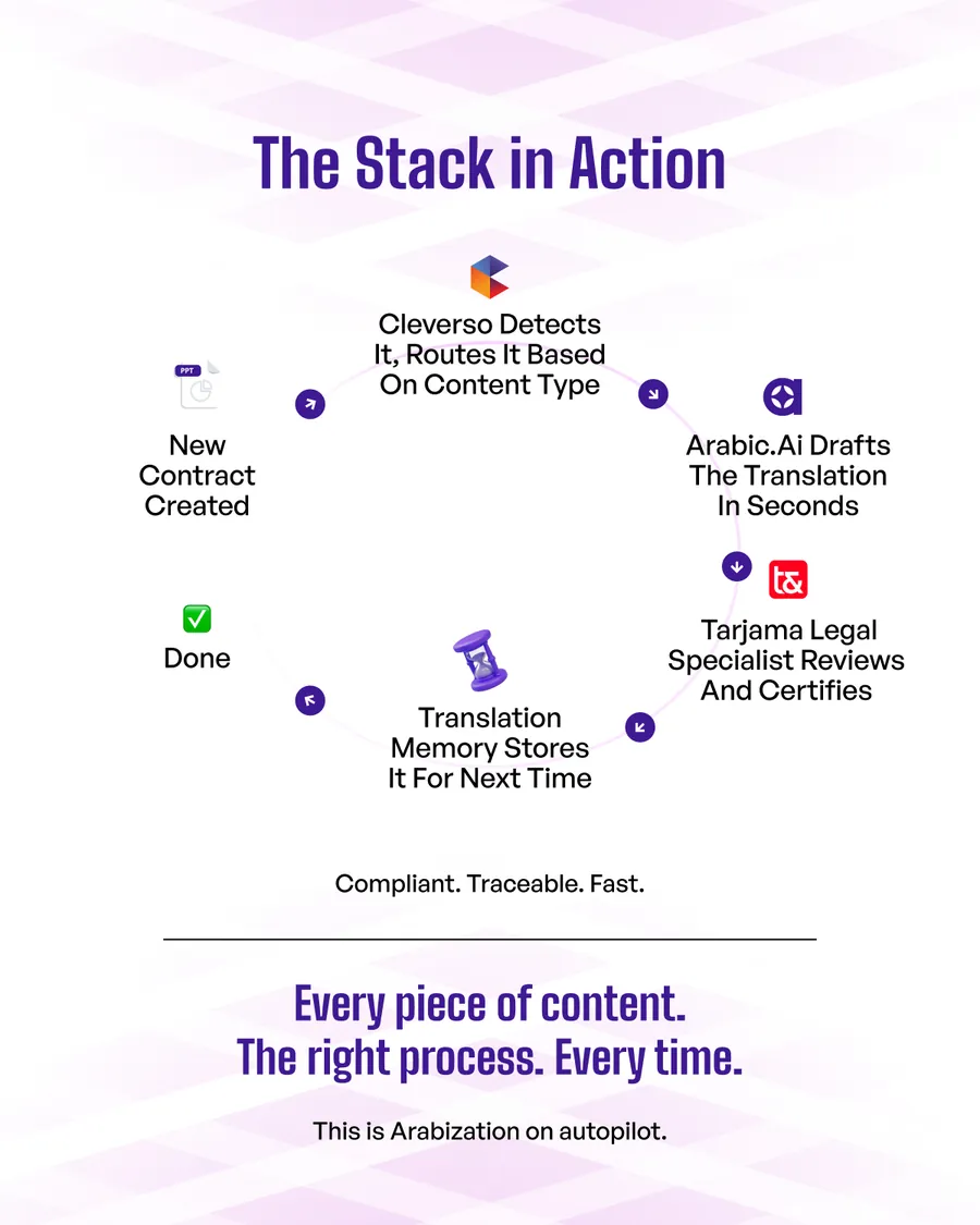
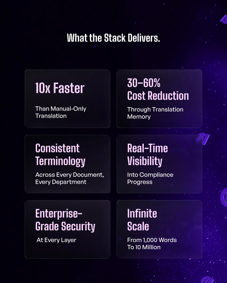
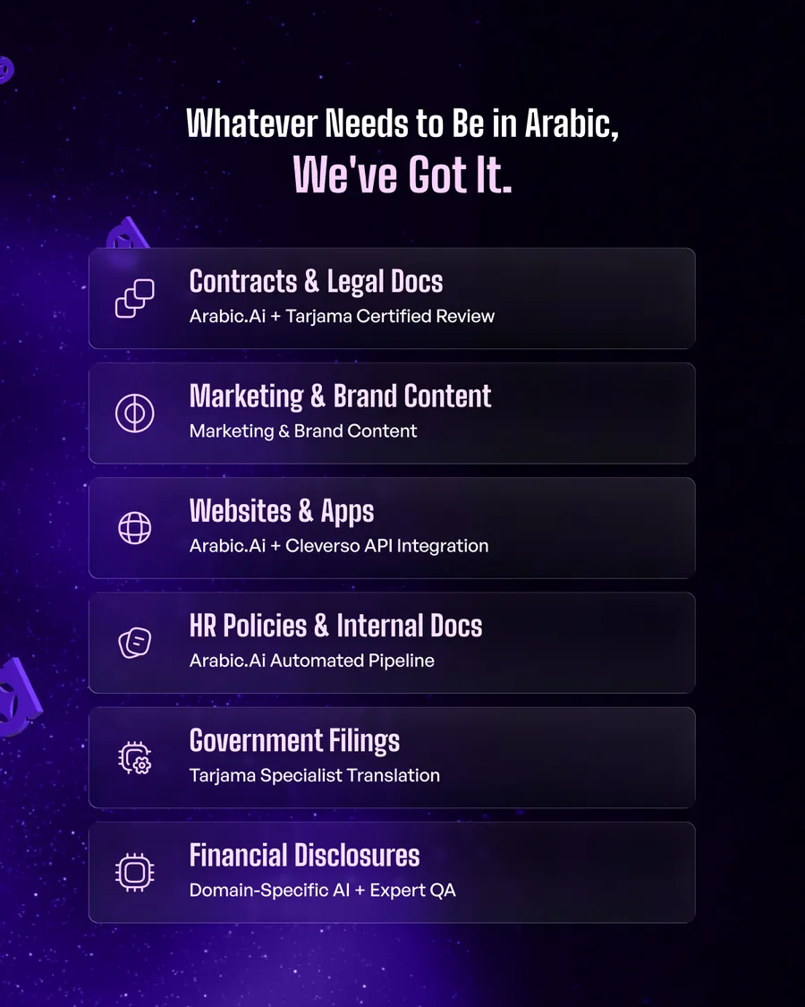
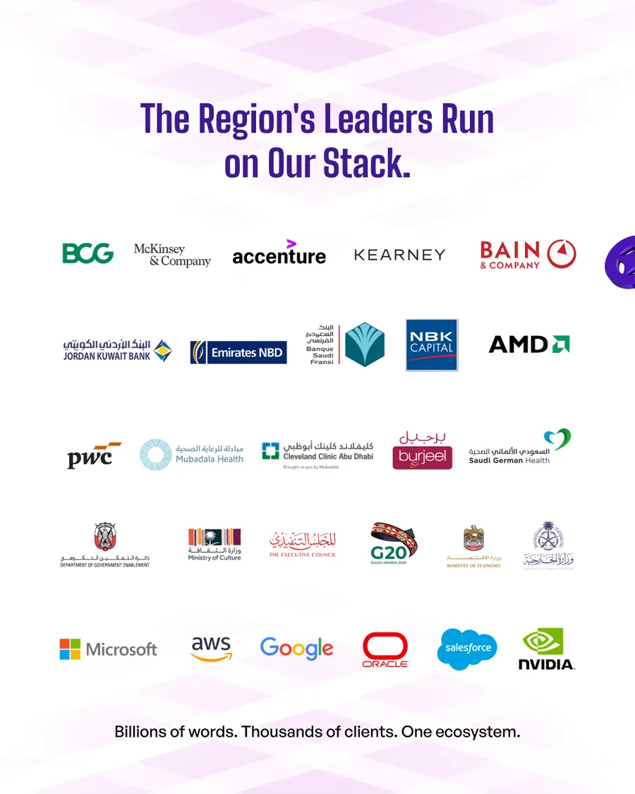
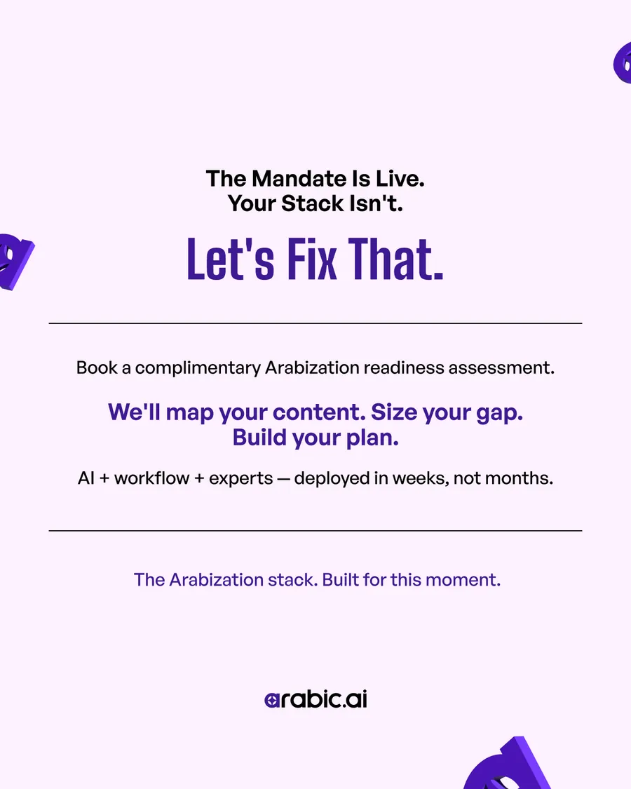
The flagship. Saudi Arabia now requires business communications in Arabic, which turns a language problem into a compliance deadline, and the deck sells a stack rather than a tool: arabic.ai as the brain, Cleverso as the engine, Tarjama as the experts. Eleven slides, each one a product doing a job — and the logo wall near the end is the part that closes.
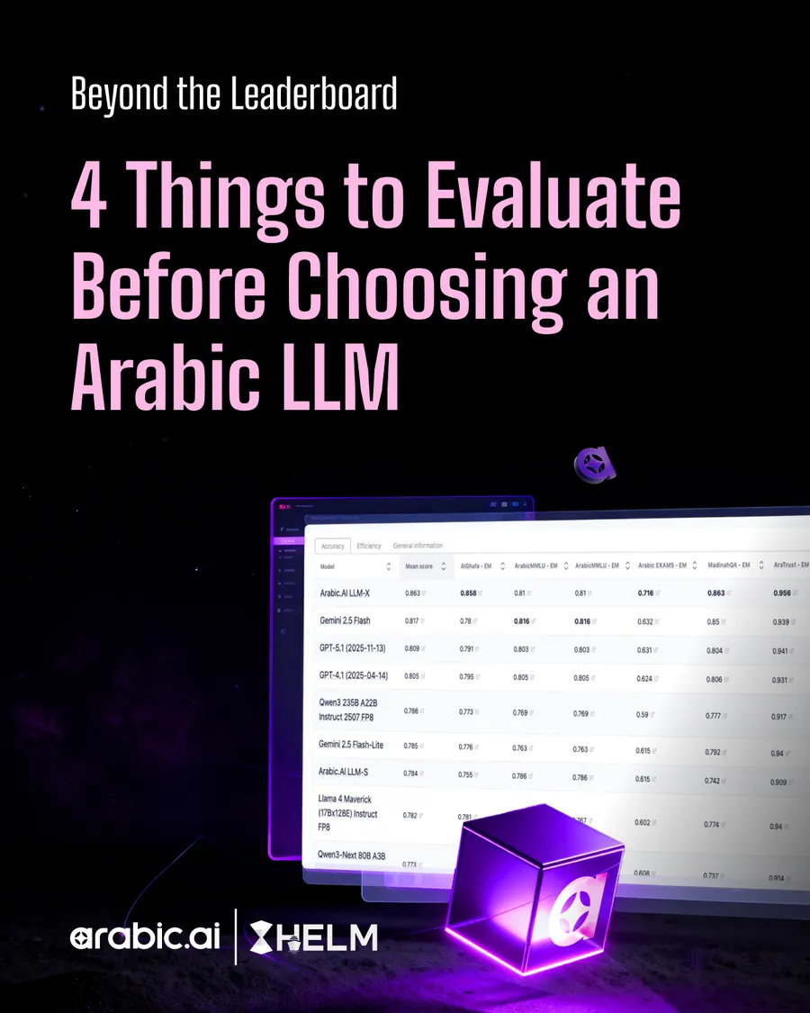
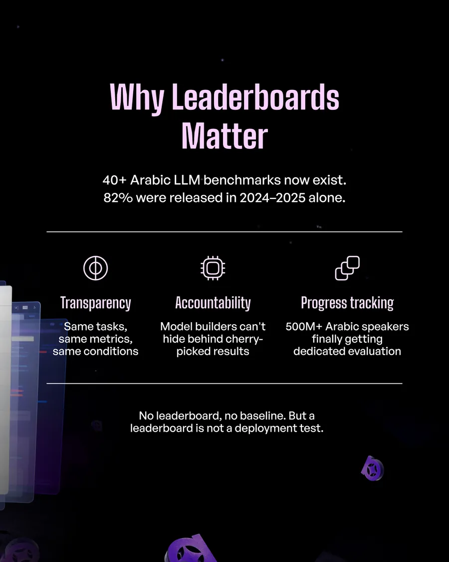
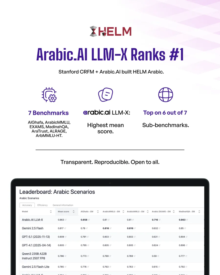
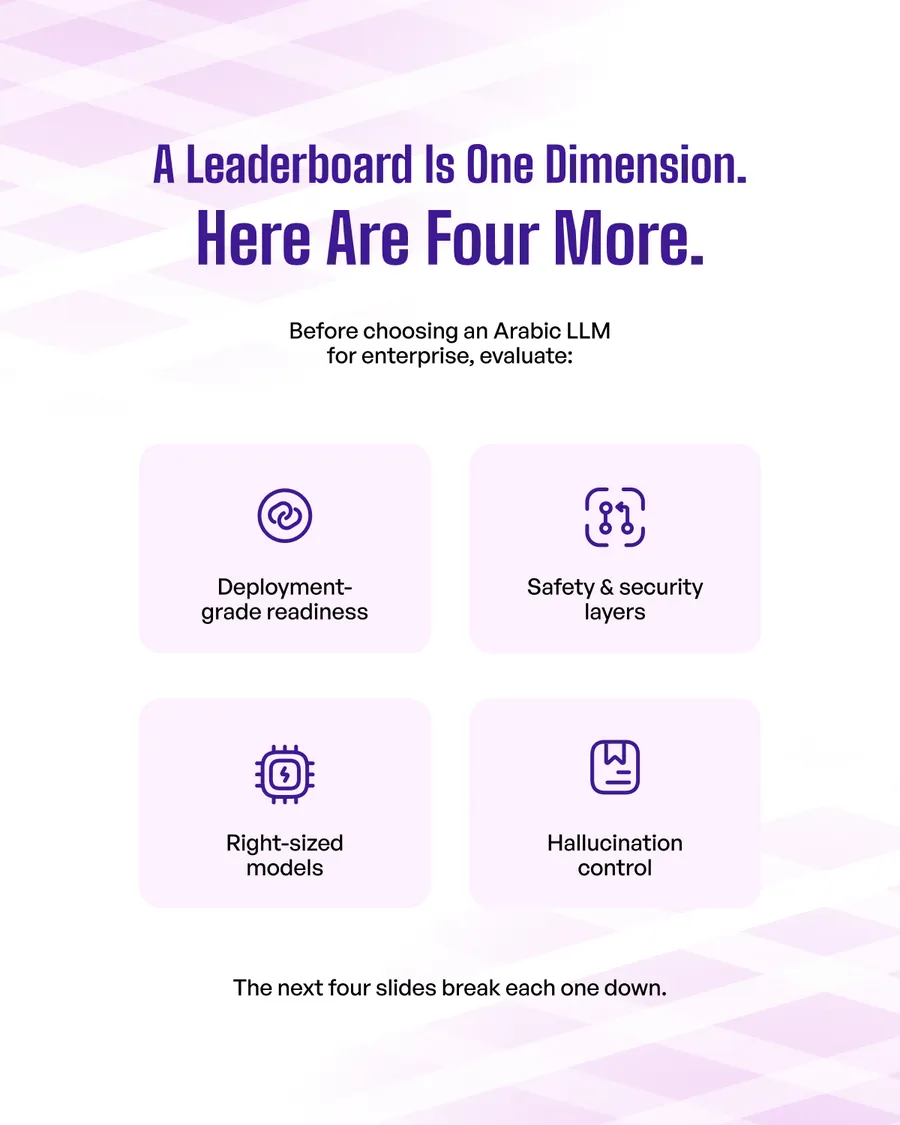
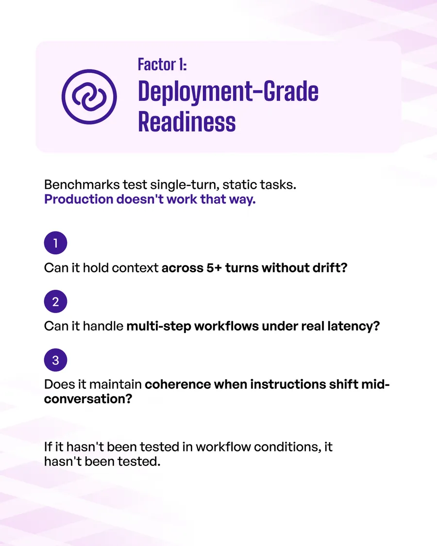
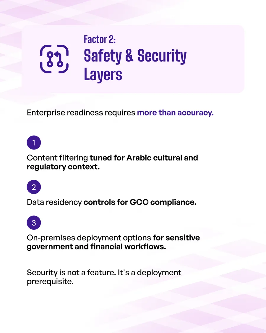
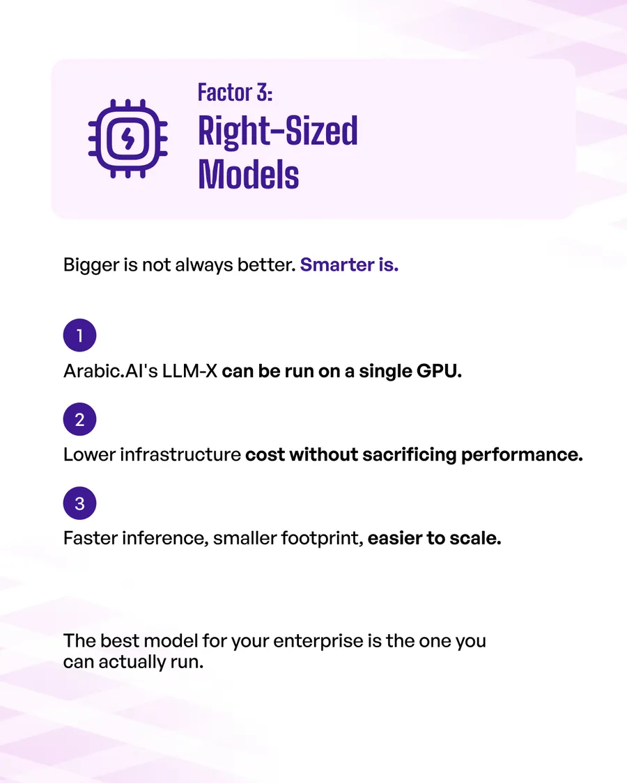
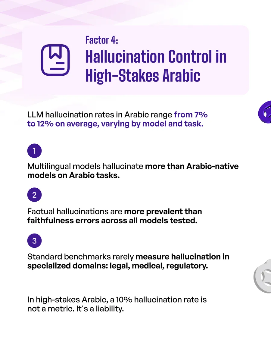
The benchmark deck, and the only claim here that can be checked: LLM-X ranks first on Stanford’s HELM for Arabic. So it spends one slide on the ranking and eight on why a ranking is not a deployment test — deployment-grade readiness, safety layers, right-sized models, hallucination control. Selling the number would have been easier and worth less.
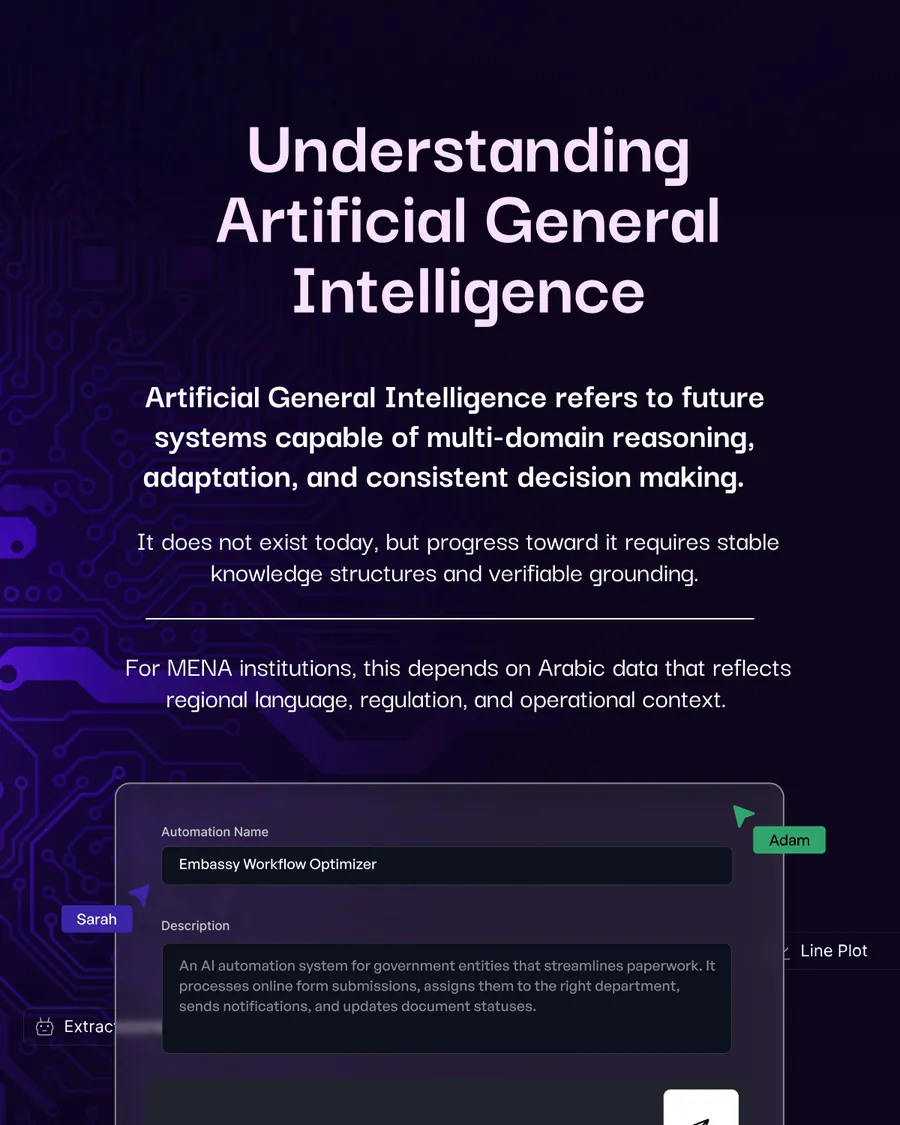
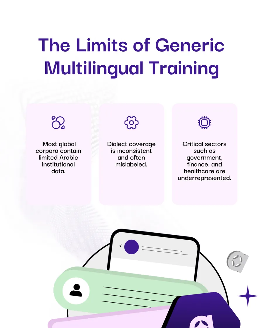
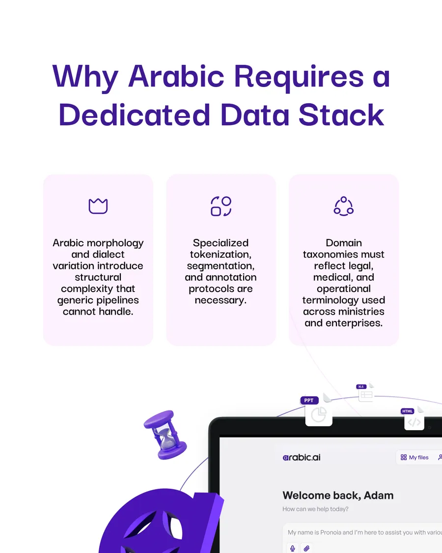
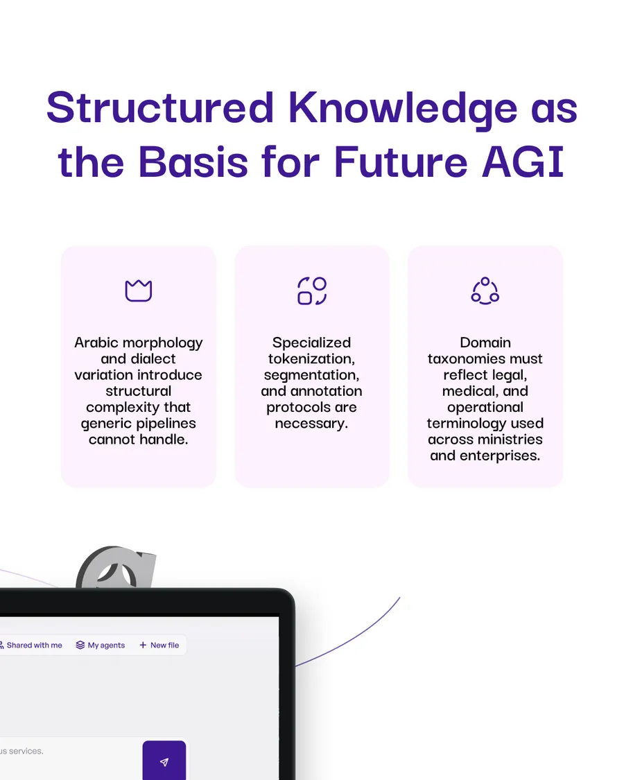
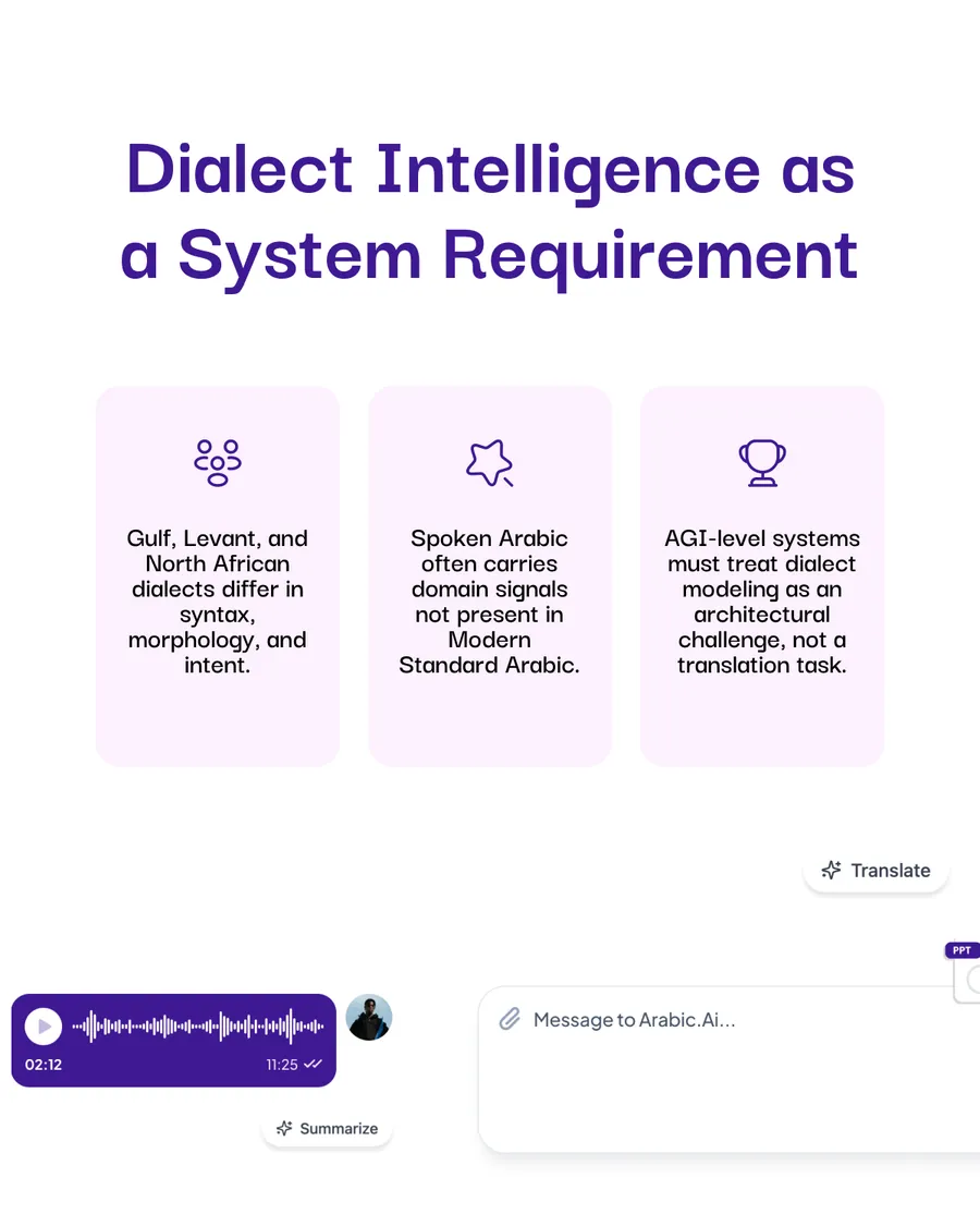
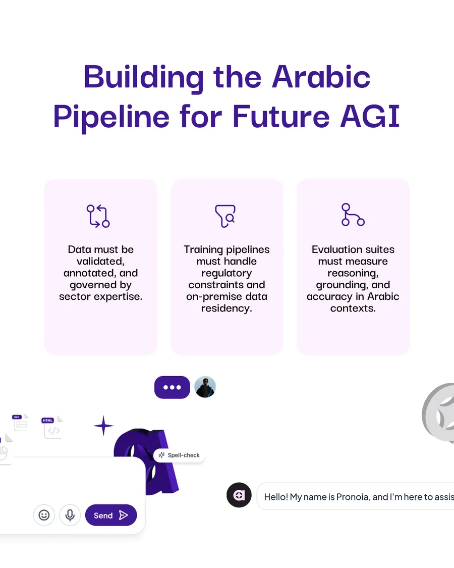
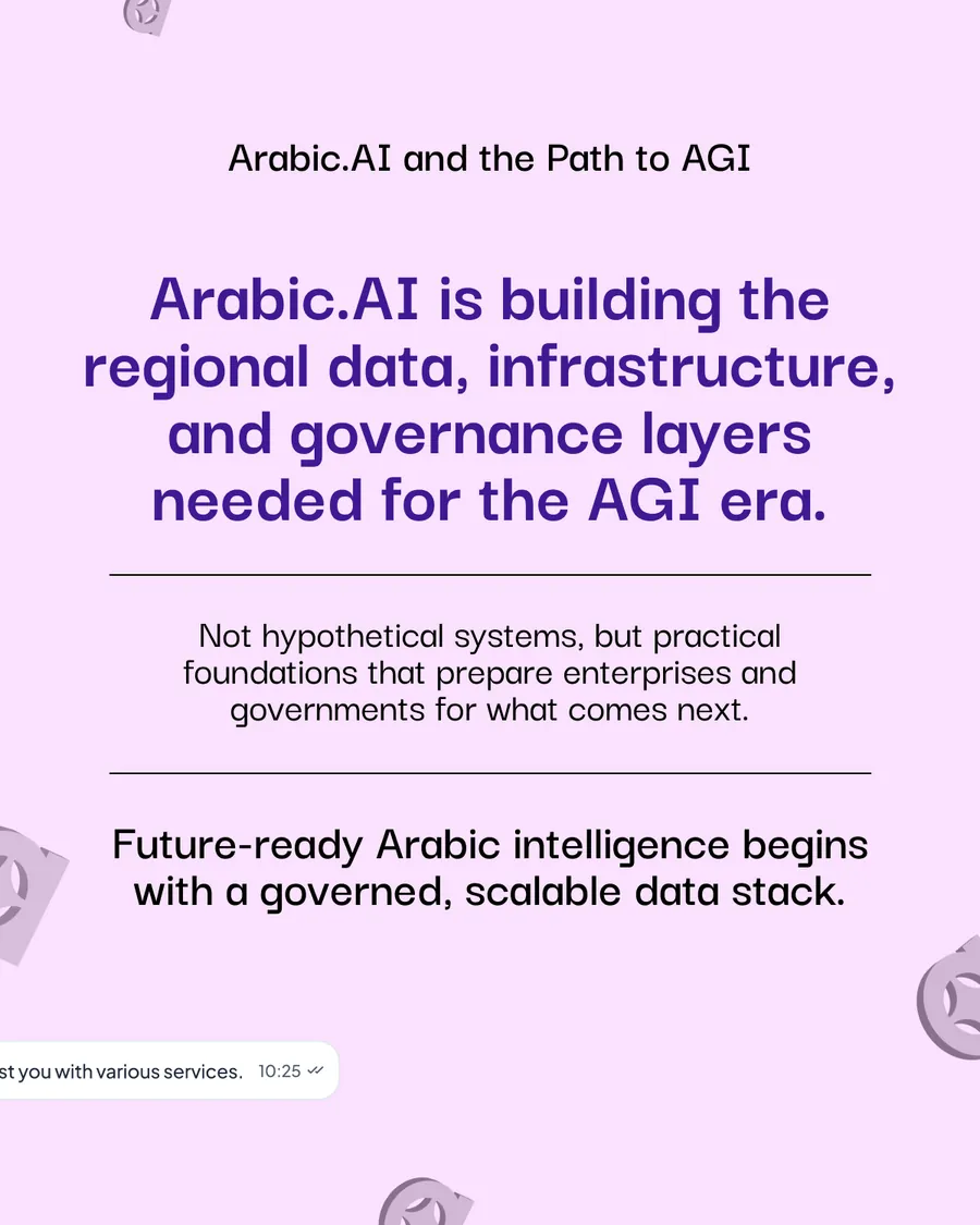
AGI, argued from the data rather than the model. Ten slides that keep refusing the easy version of the claim — larger models alone cannot deliver reliable institutional behaviour, dialect is a system requirement and not a translation task — and land on something a ministry can actually buy: a governed, scalable Arabic data stack.
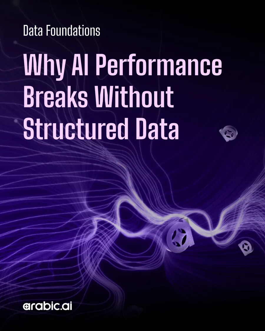

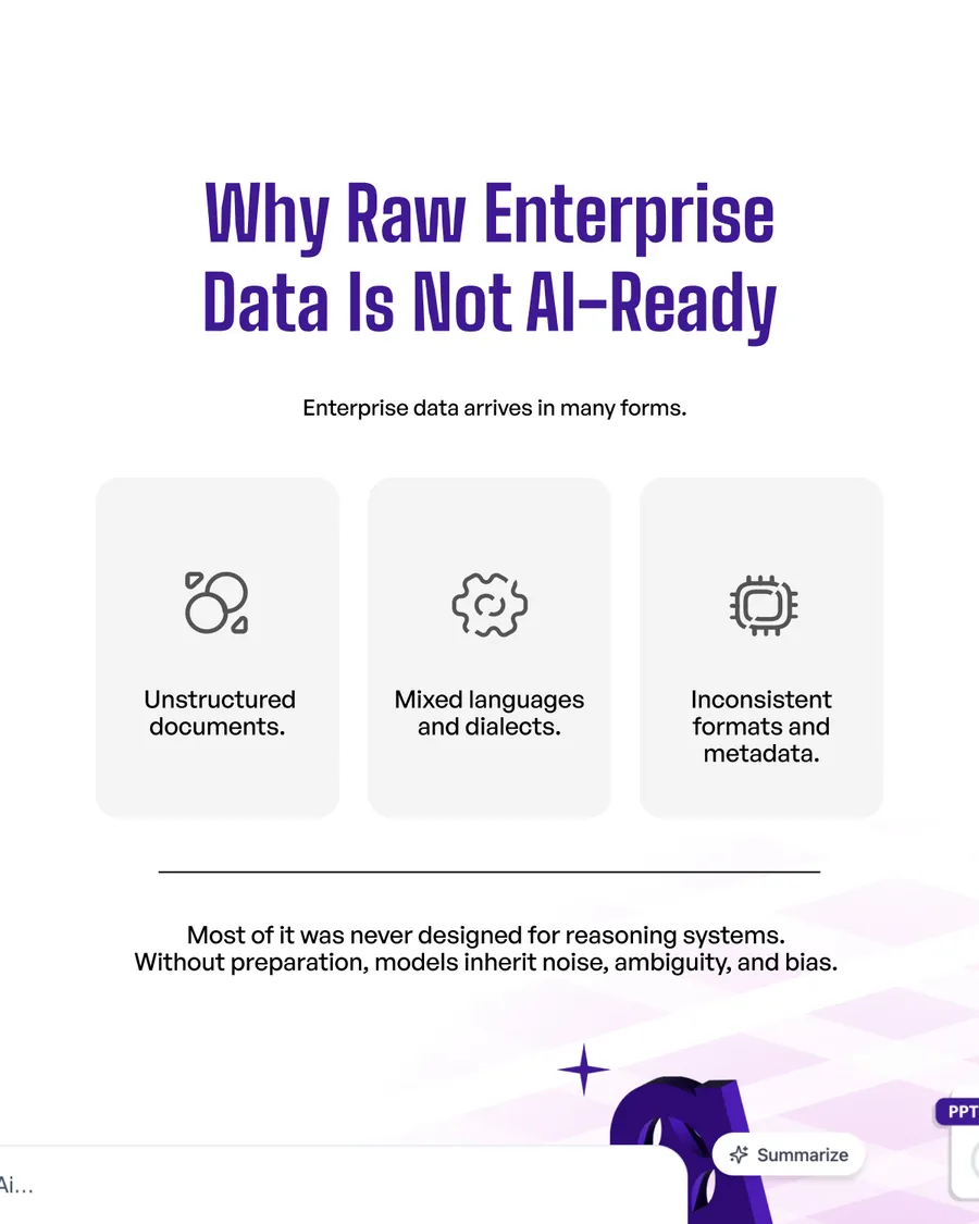
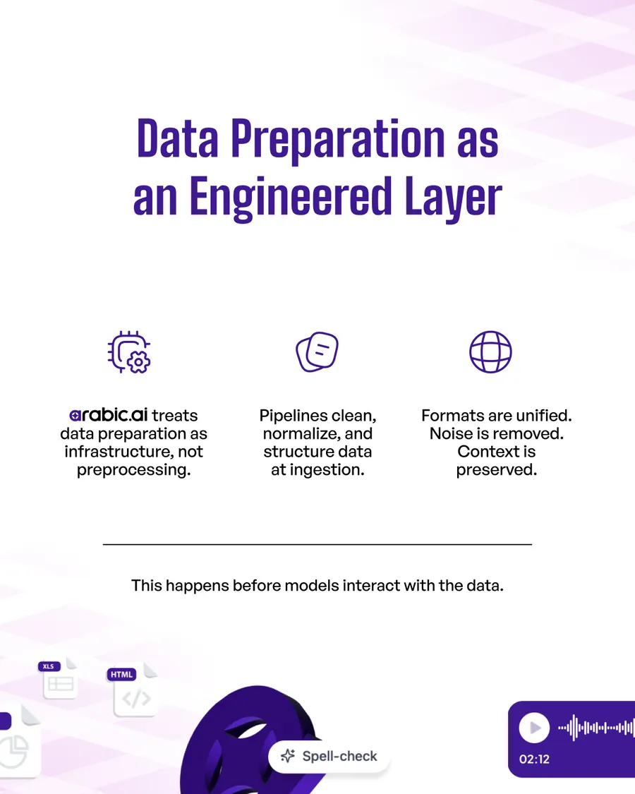
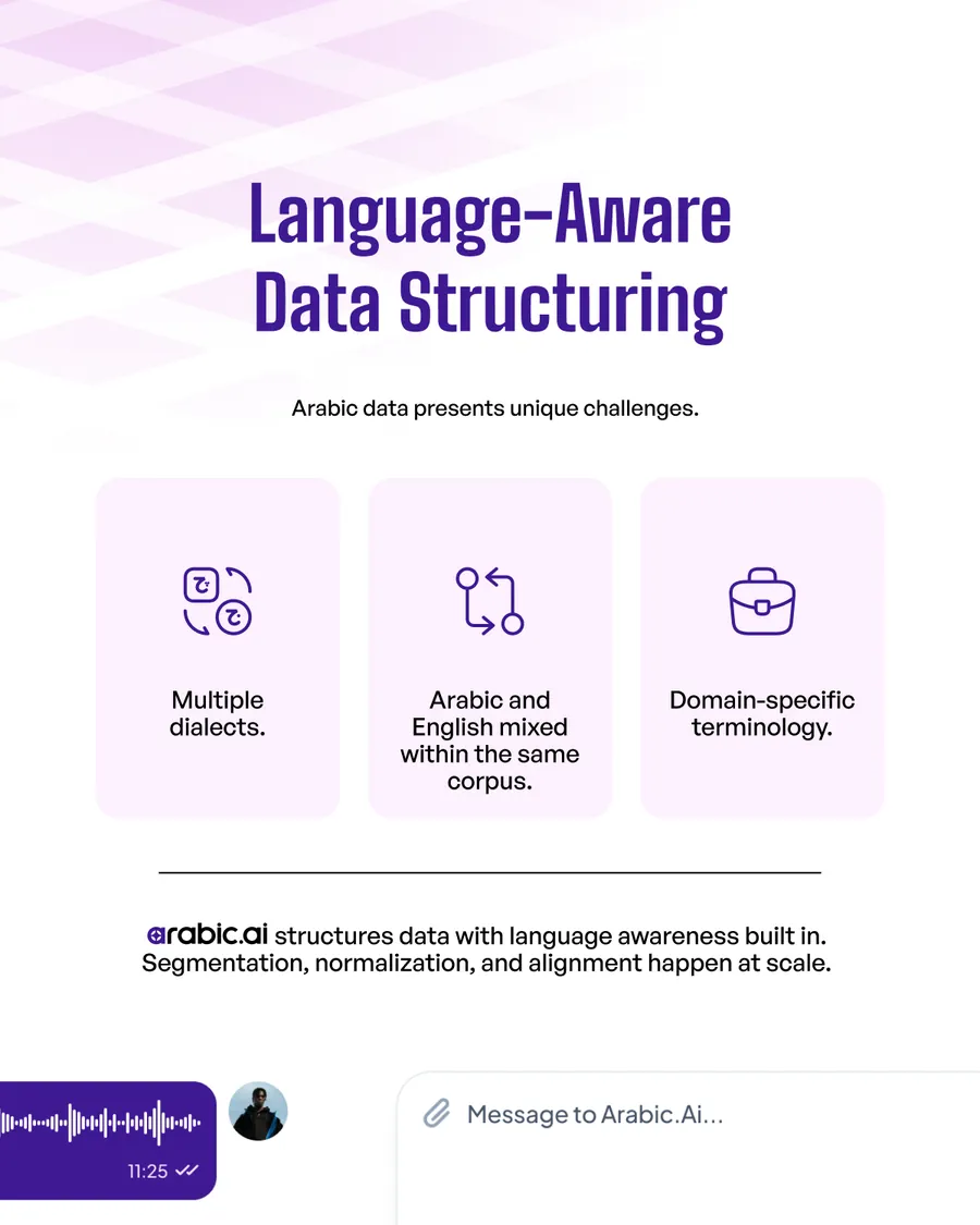
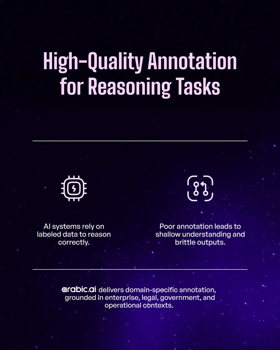
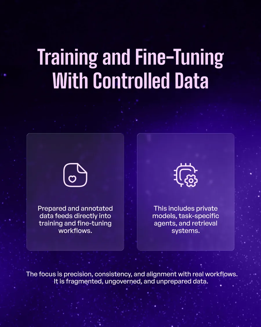
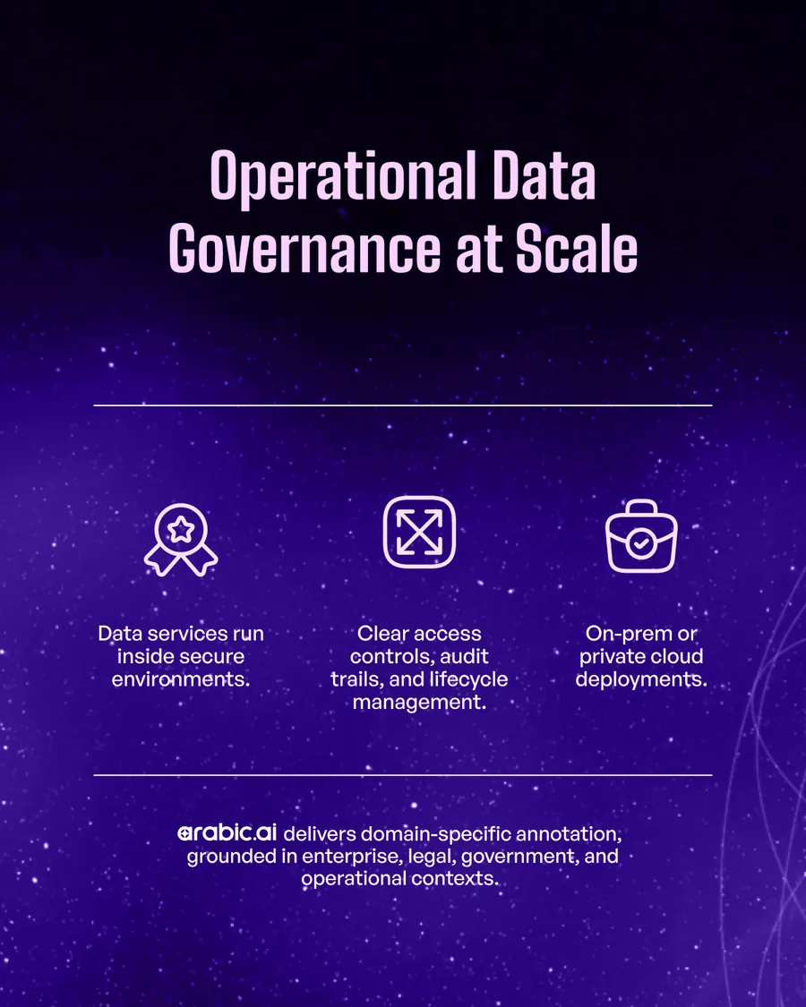
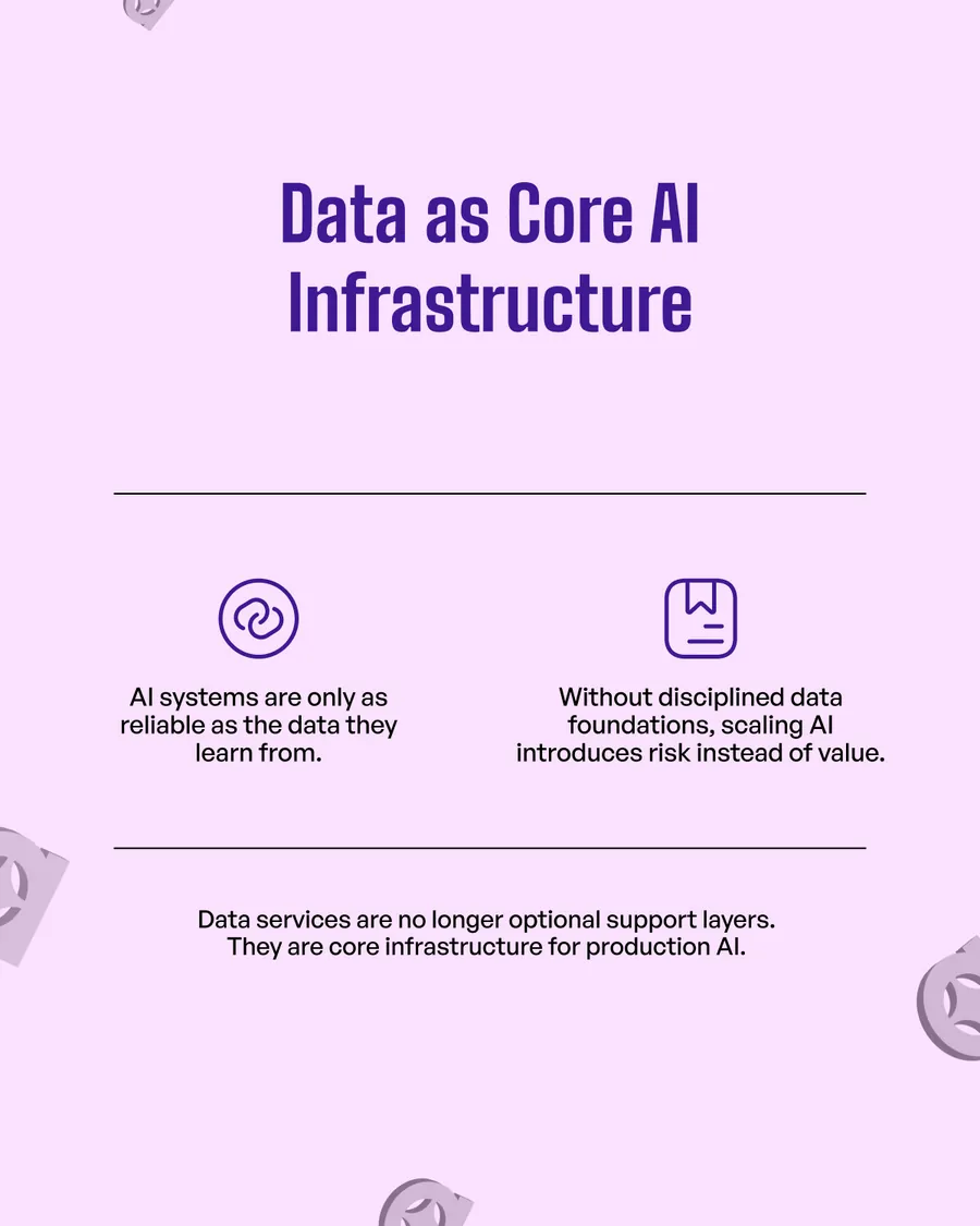
Data Foundations, for the buyer who has already bought a model and cannot work out why it plateaued. The answer is never flattering — the data was never prepared — so the deck says it on slide two and spends the next eight making preparation sound like infrastructure, which is what it is being sold as.
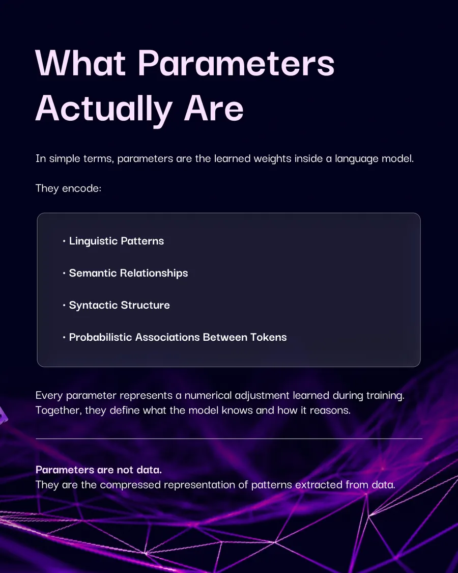
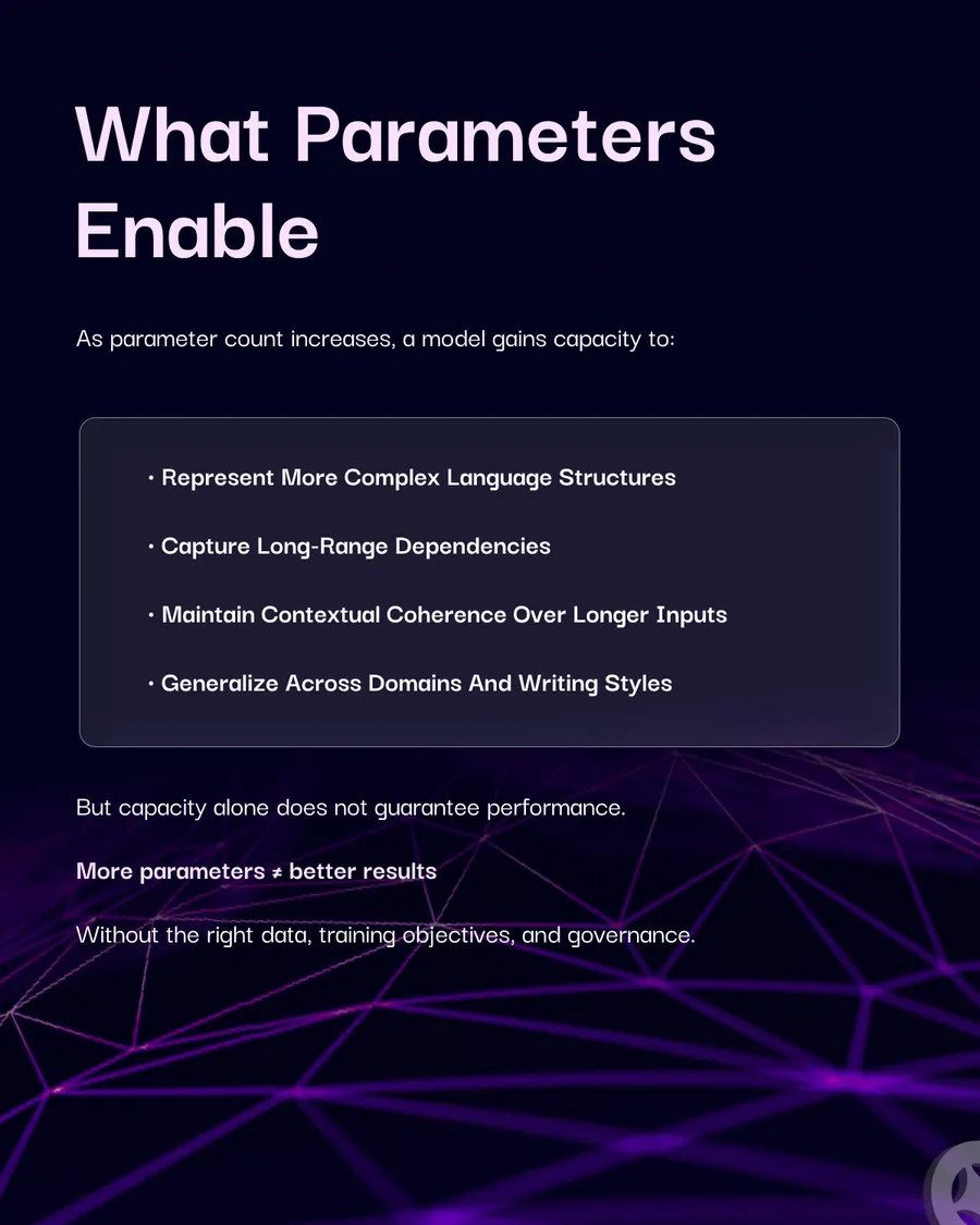
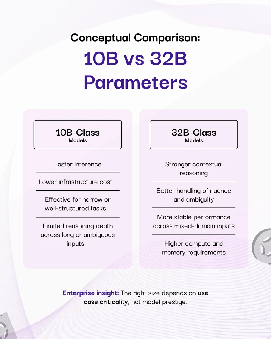
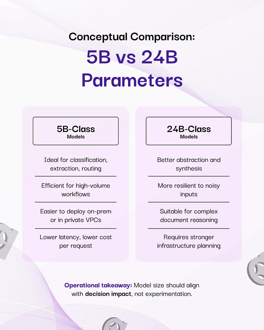
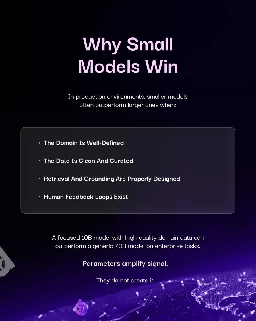
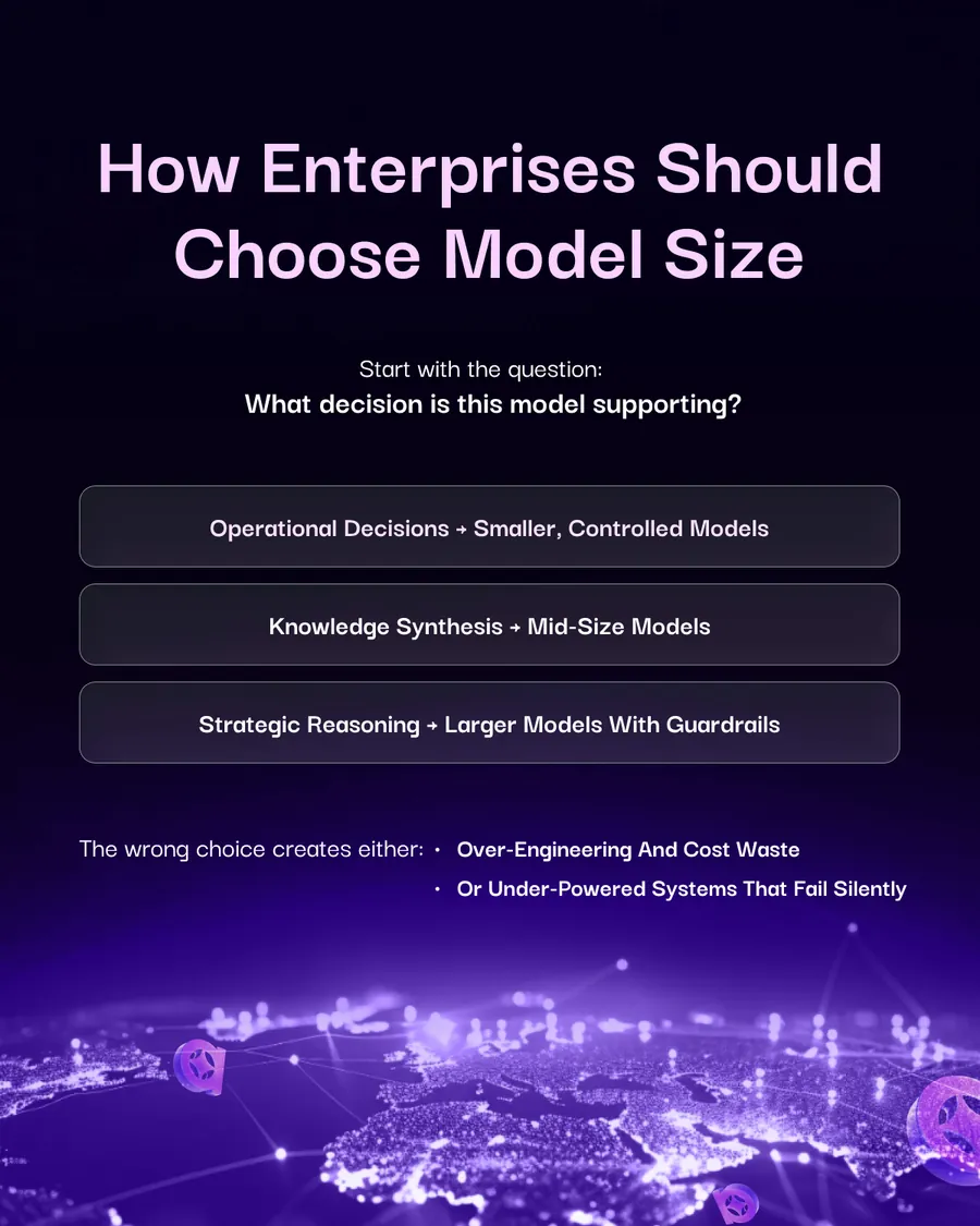
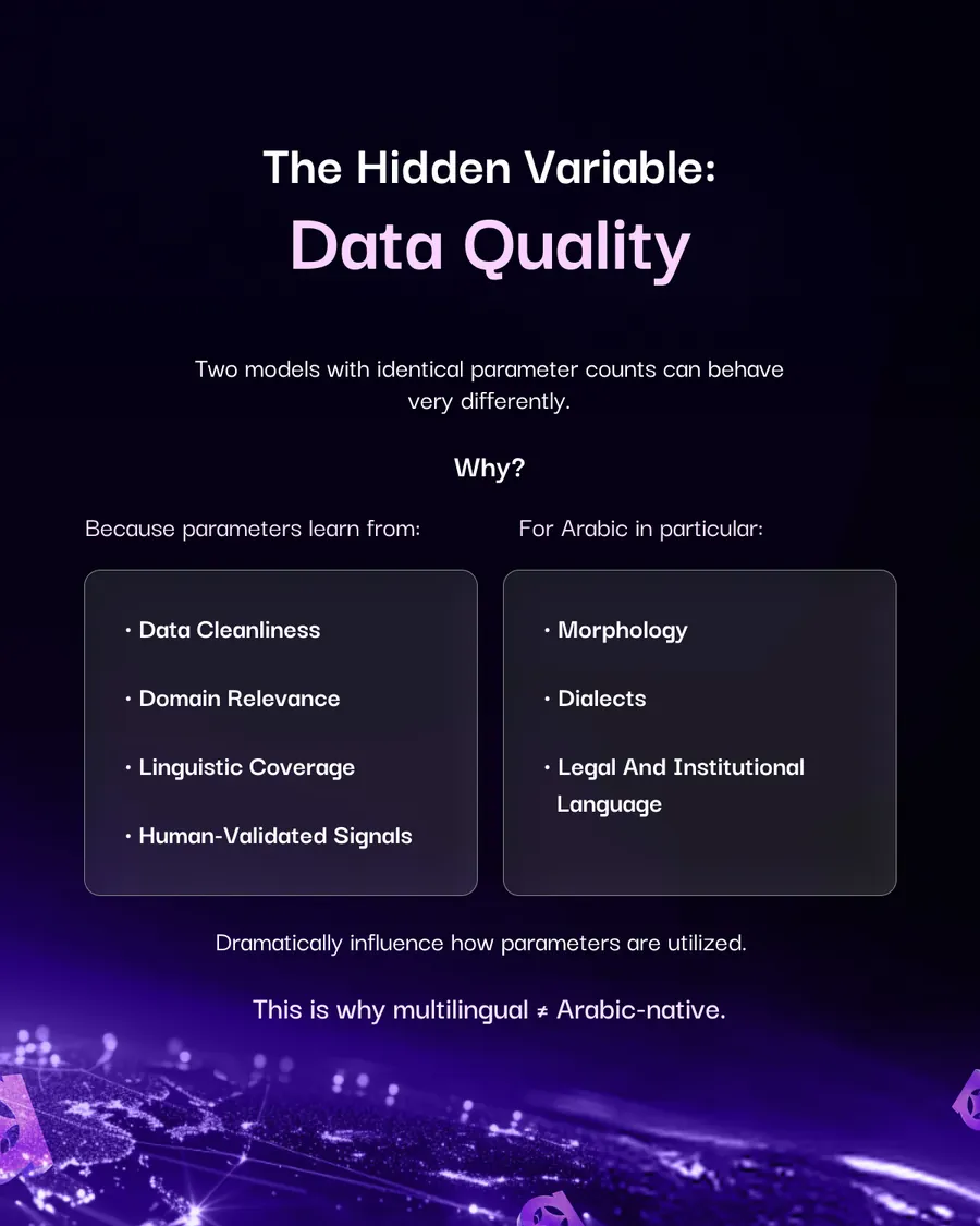
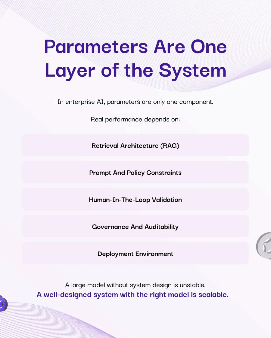
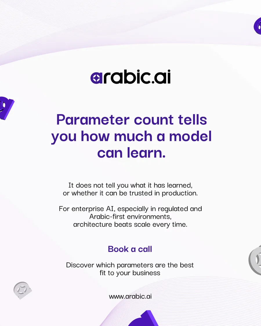
The explainer, for anyone who has been told bigger is better. It defines parameters, then takes the claim apart over two comparison slides — 10B against 32B, 5B against 24B — and argues that a focused 10B on clean domain data beats a generic 70B on enterprise tasks. A sales deck that talks a customer down a size is unusual, and it is why this one reads as honest.
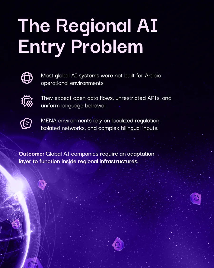
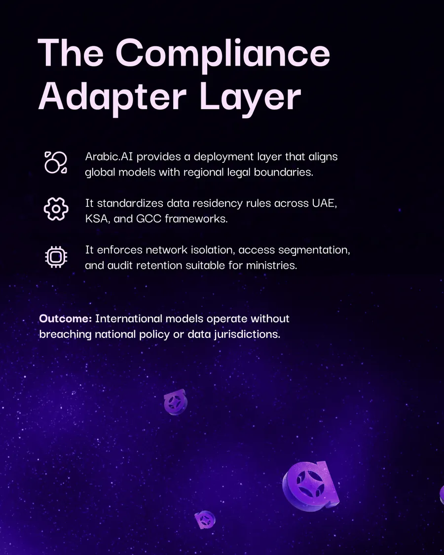
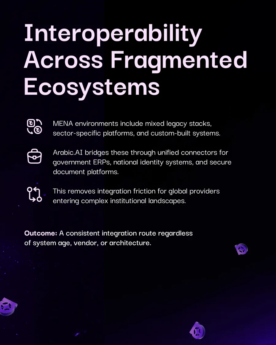
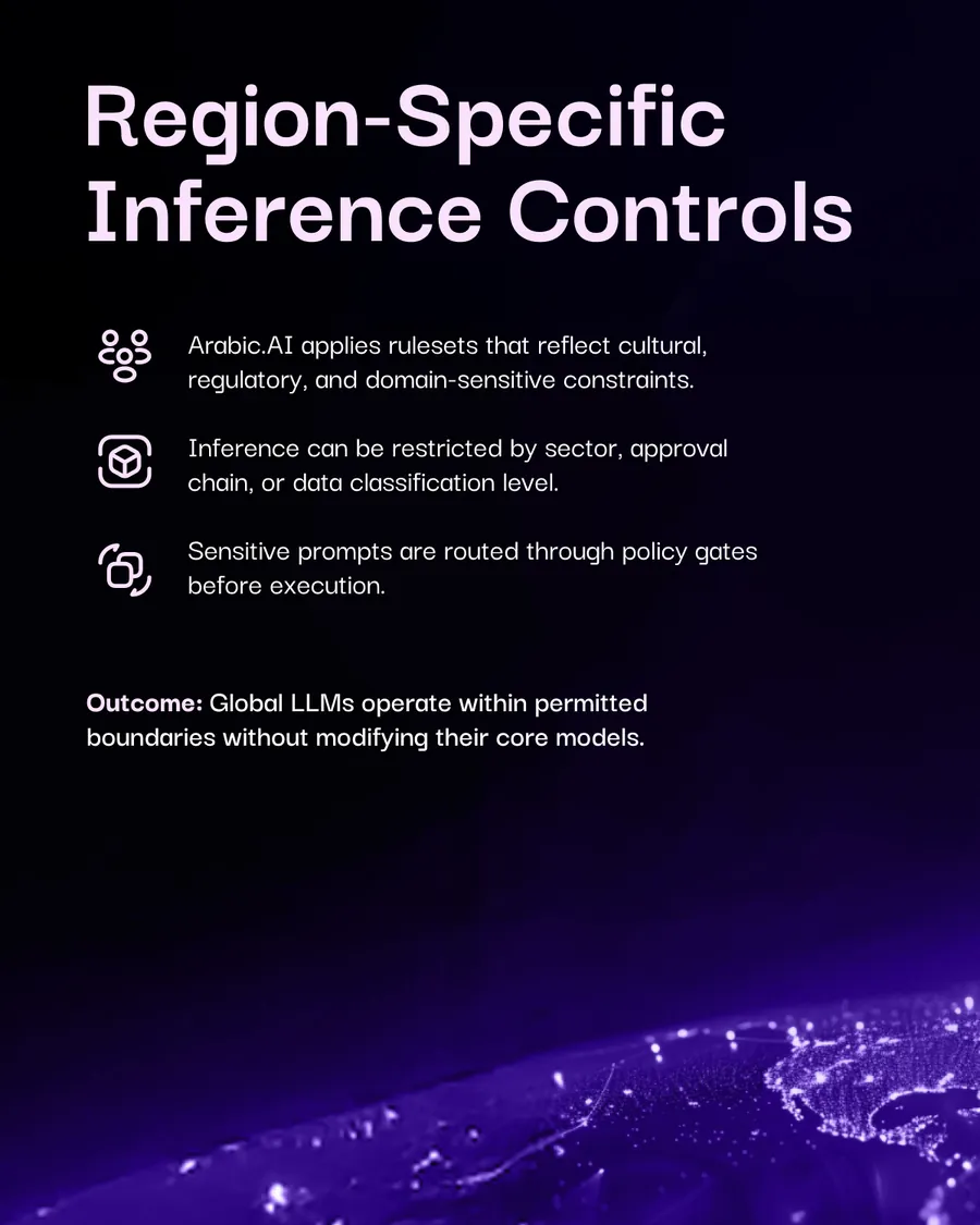
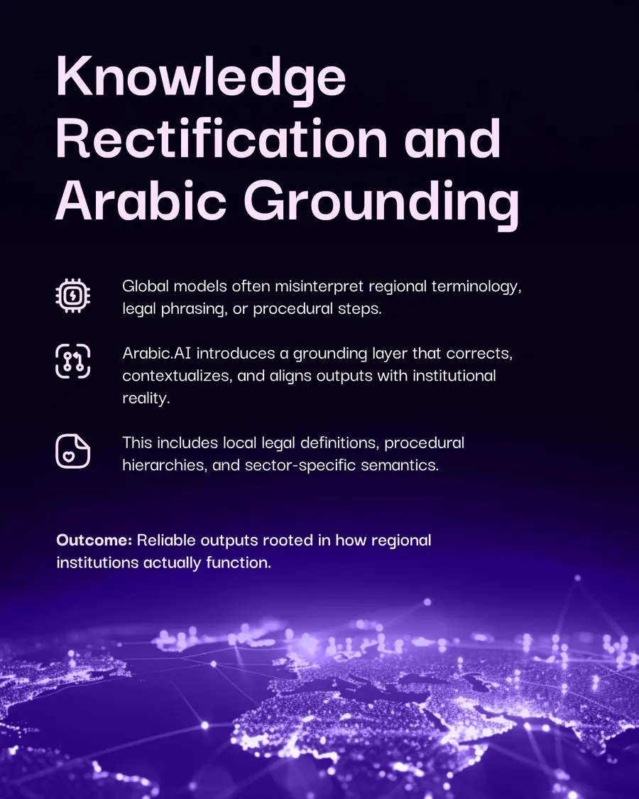
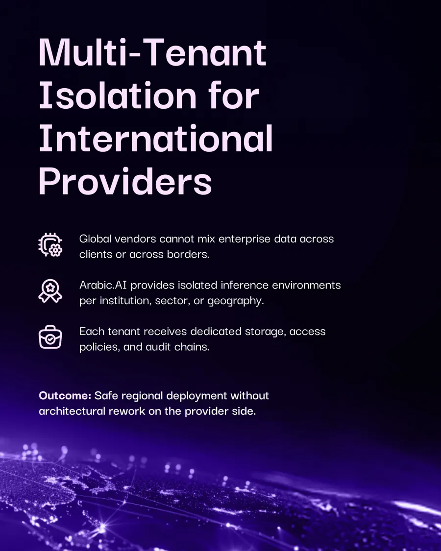
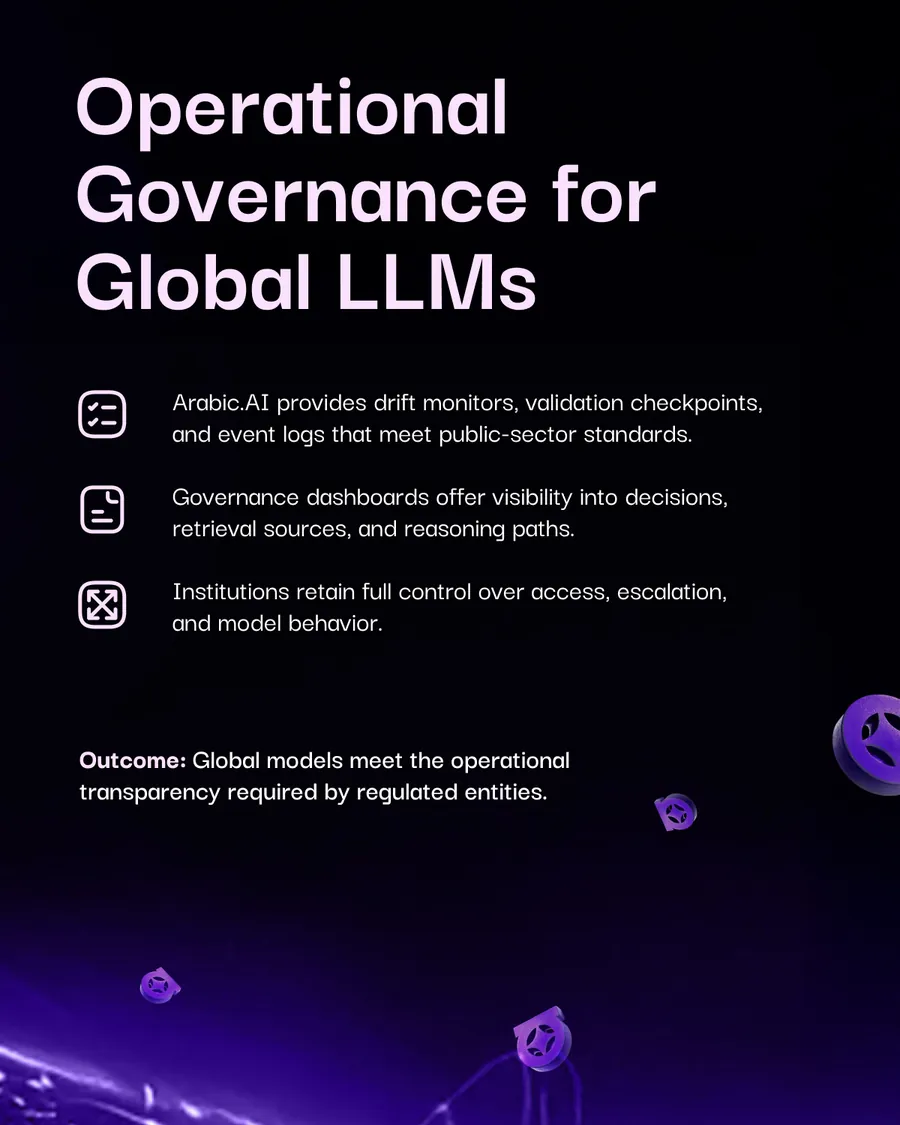
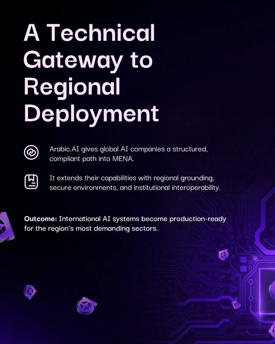
The one aimed outward: global AI companies that want into MENA and cannot get there on their own terms. Arabic.AI is positioned as the adapter — compliance layer, residency rules, inference controls, tenant isolation — a quieter sell than the others, and the only one where the client is also a competitor.
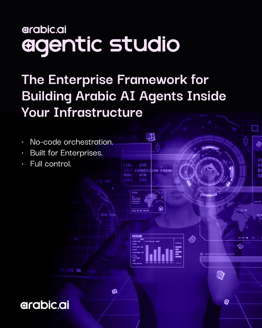
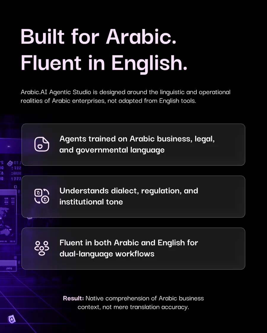
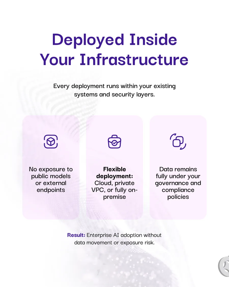
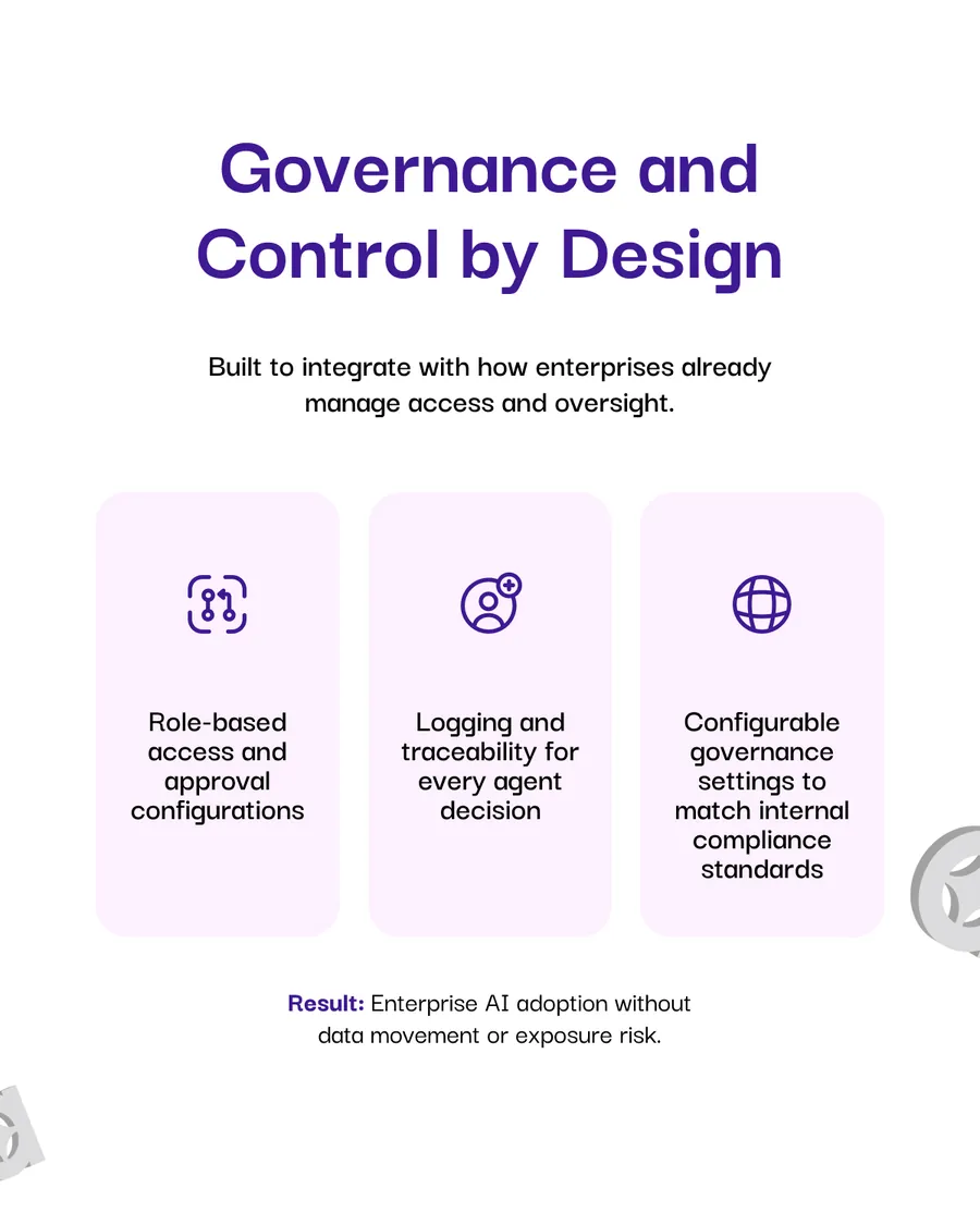
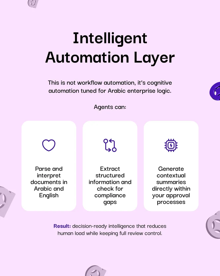
Agentic Studio gets its own lockup and its own six slides, because a platform sells differently from a model: deployed inside your infrastructure, governed by design, and an automation layer that is explicitly not workflow automation. The last line does the work — deploy your first Arabic AI agent inside your infrastructure.
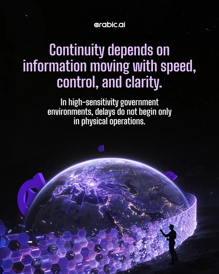
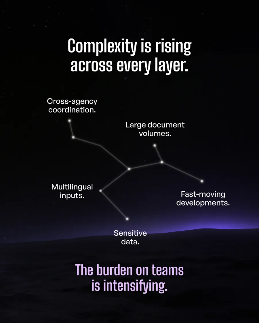
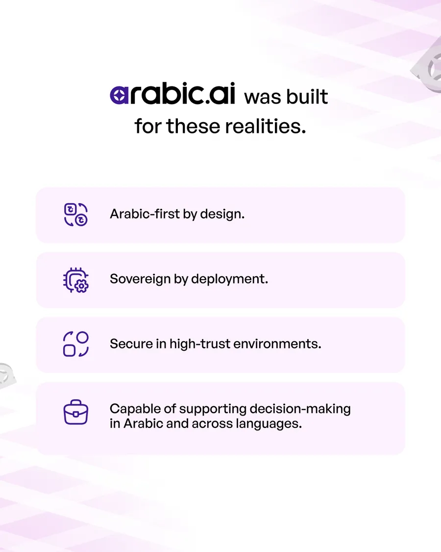
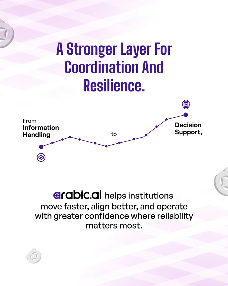
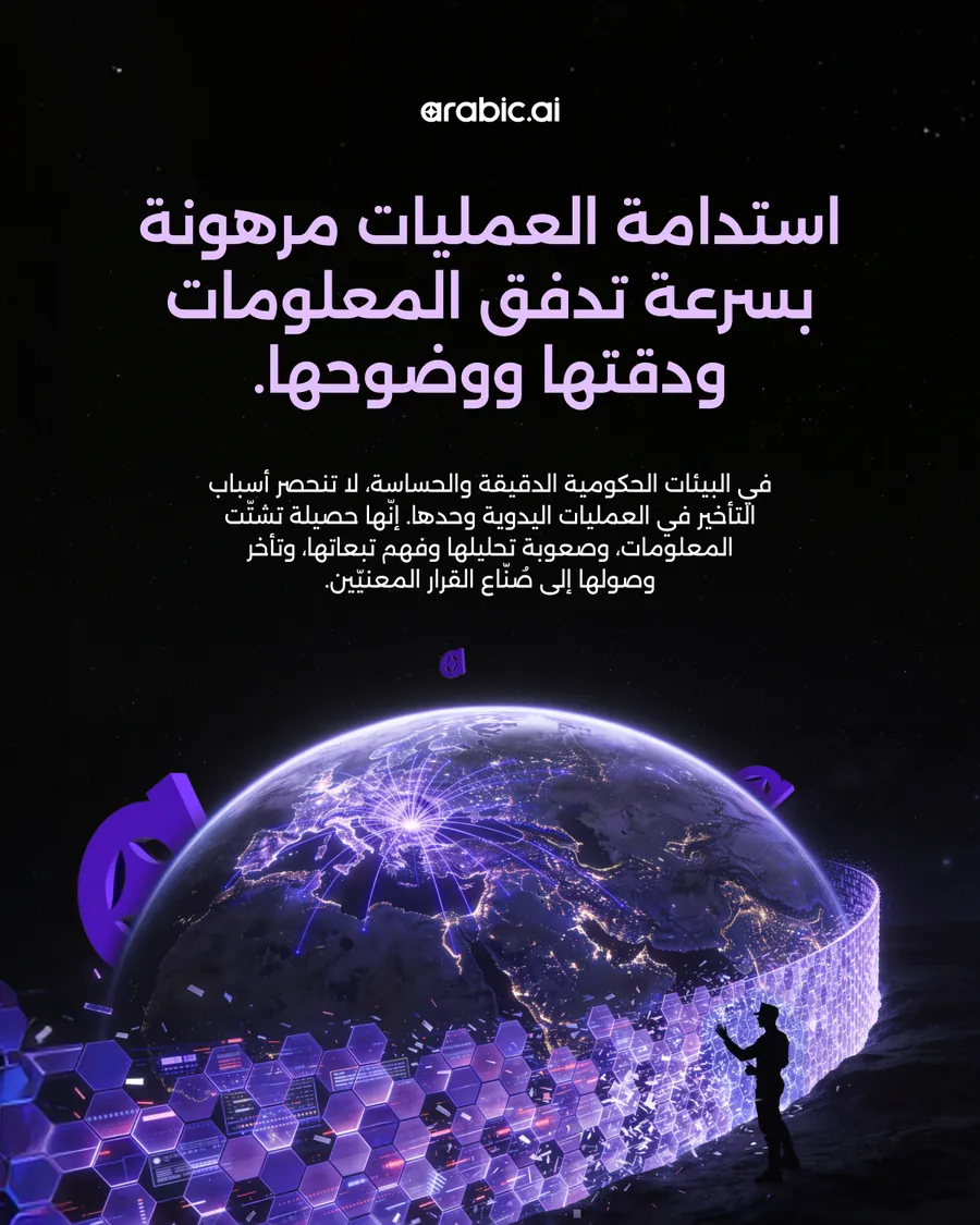
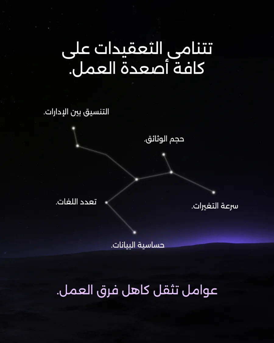
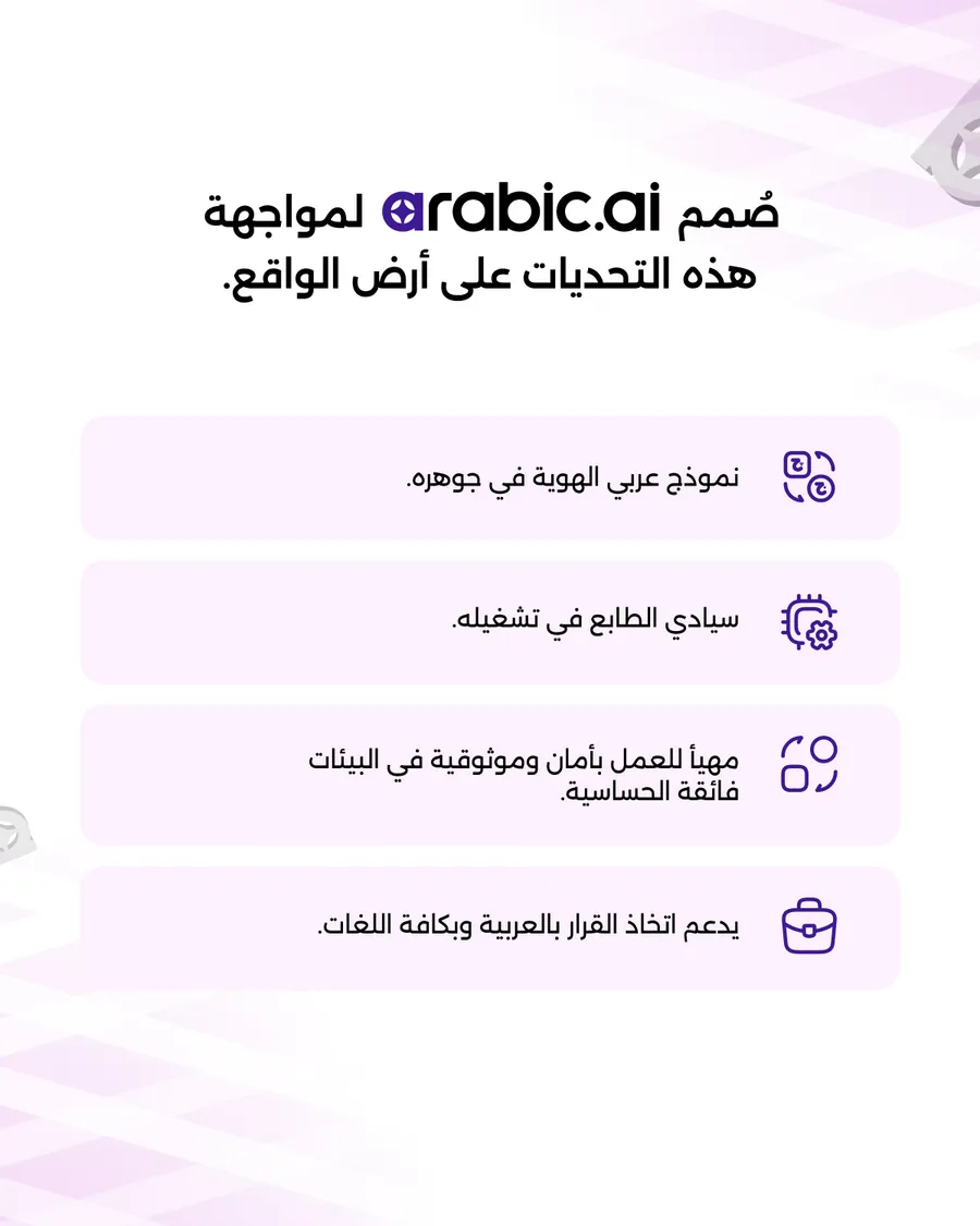
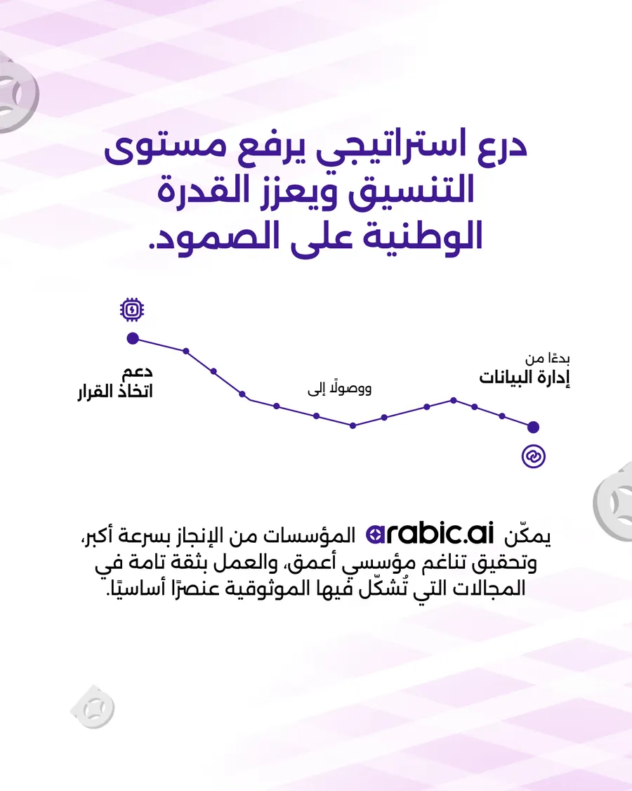
The government deck, and its Arabic cut after it. Continuity is the word the whole thing turns on — delays in a ministry do not begin in physical operations, they begin in information — and the Arabic is re-set rather than flipped: the type is drawn for the script, the reading order runs right to left, and the one chart in it is rebuilt rather than mirrored.
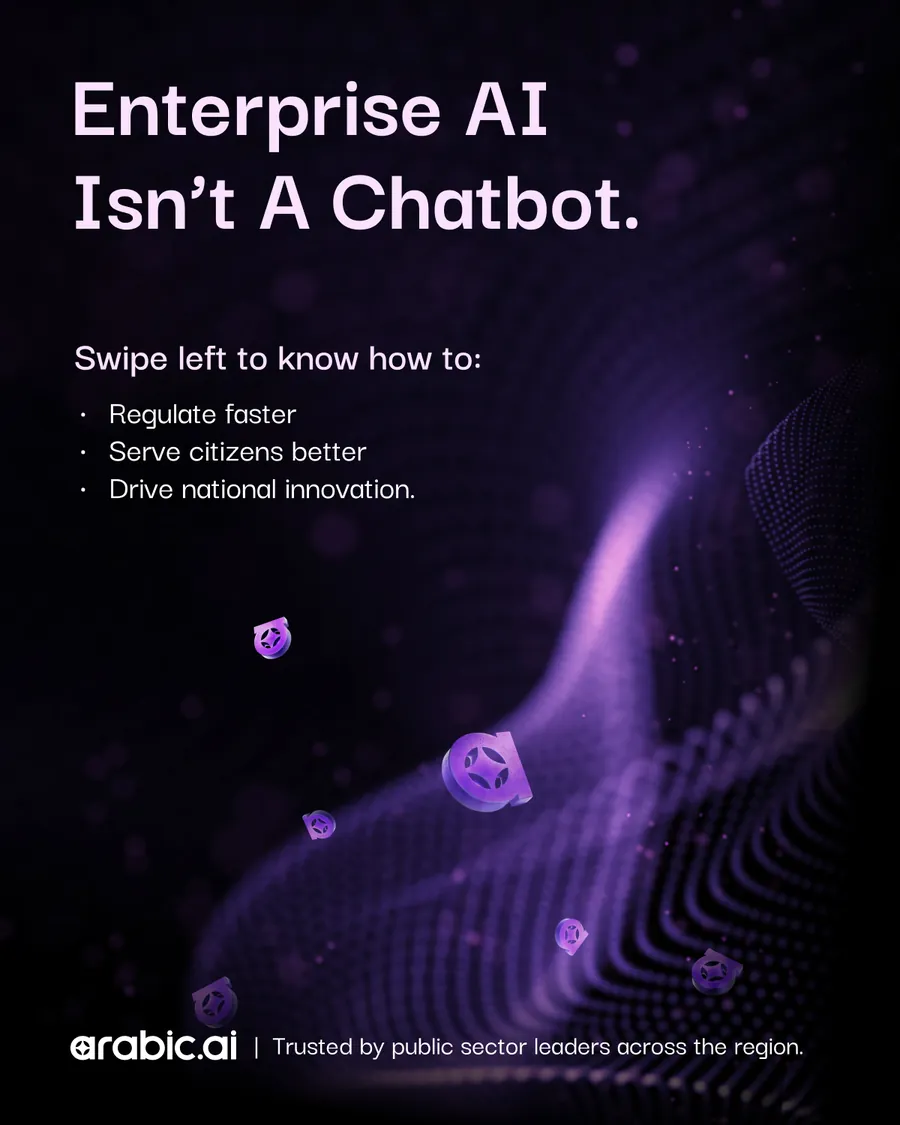
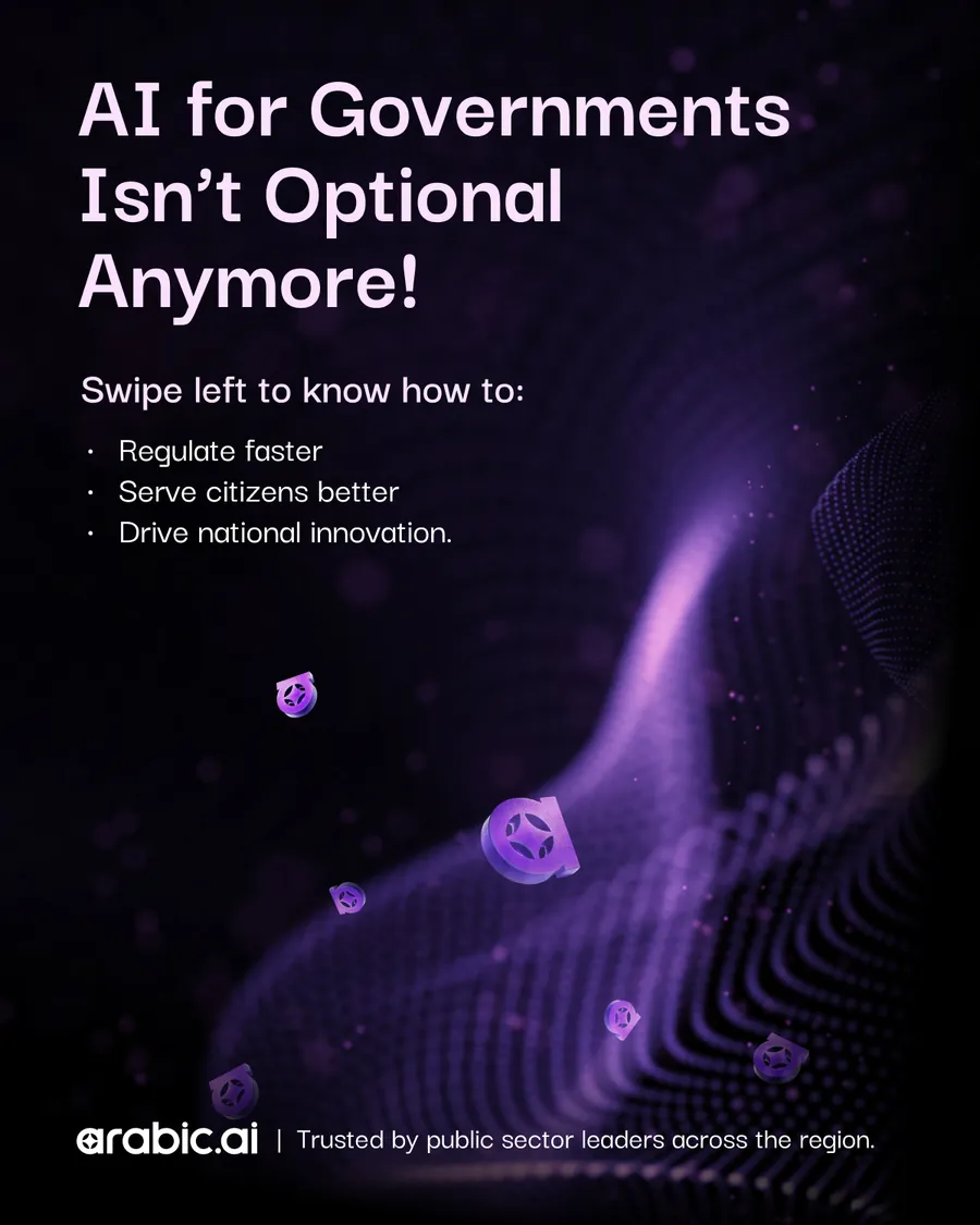
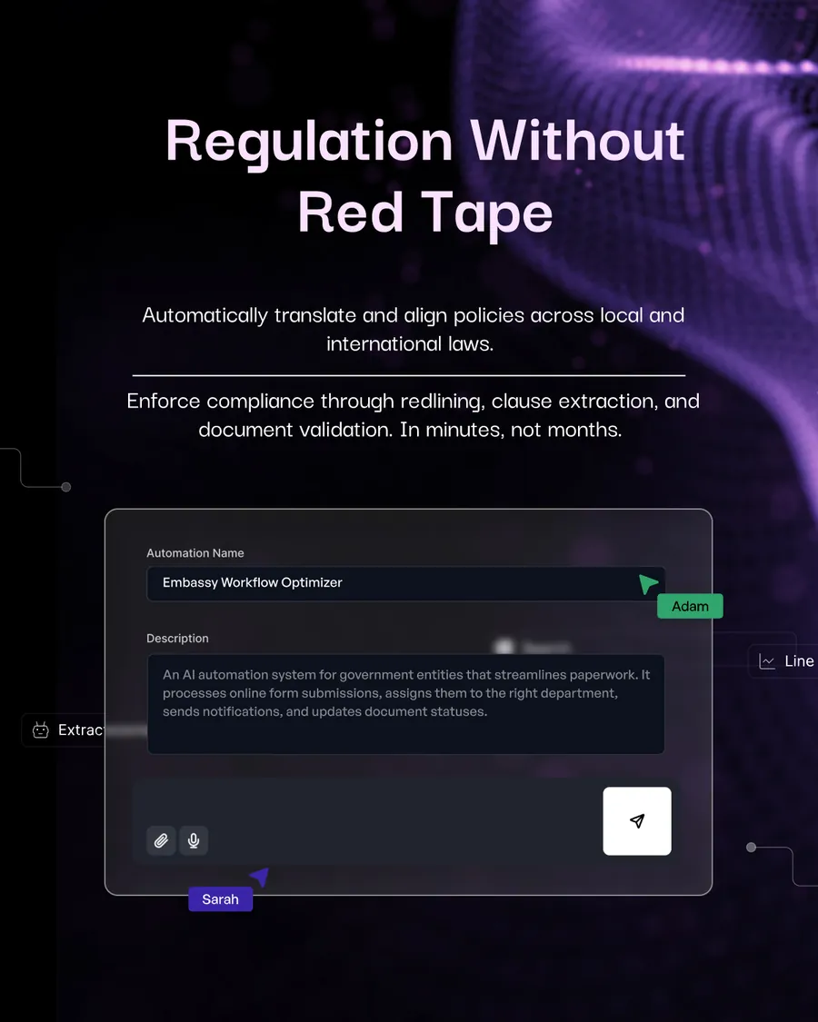
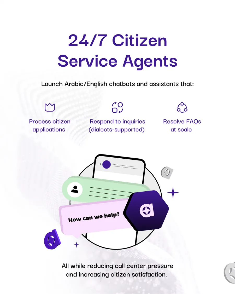
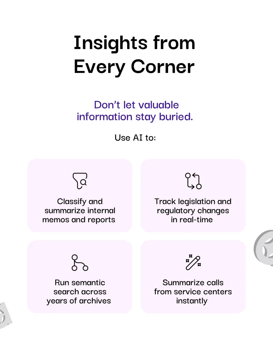
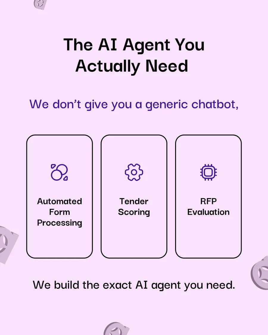
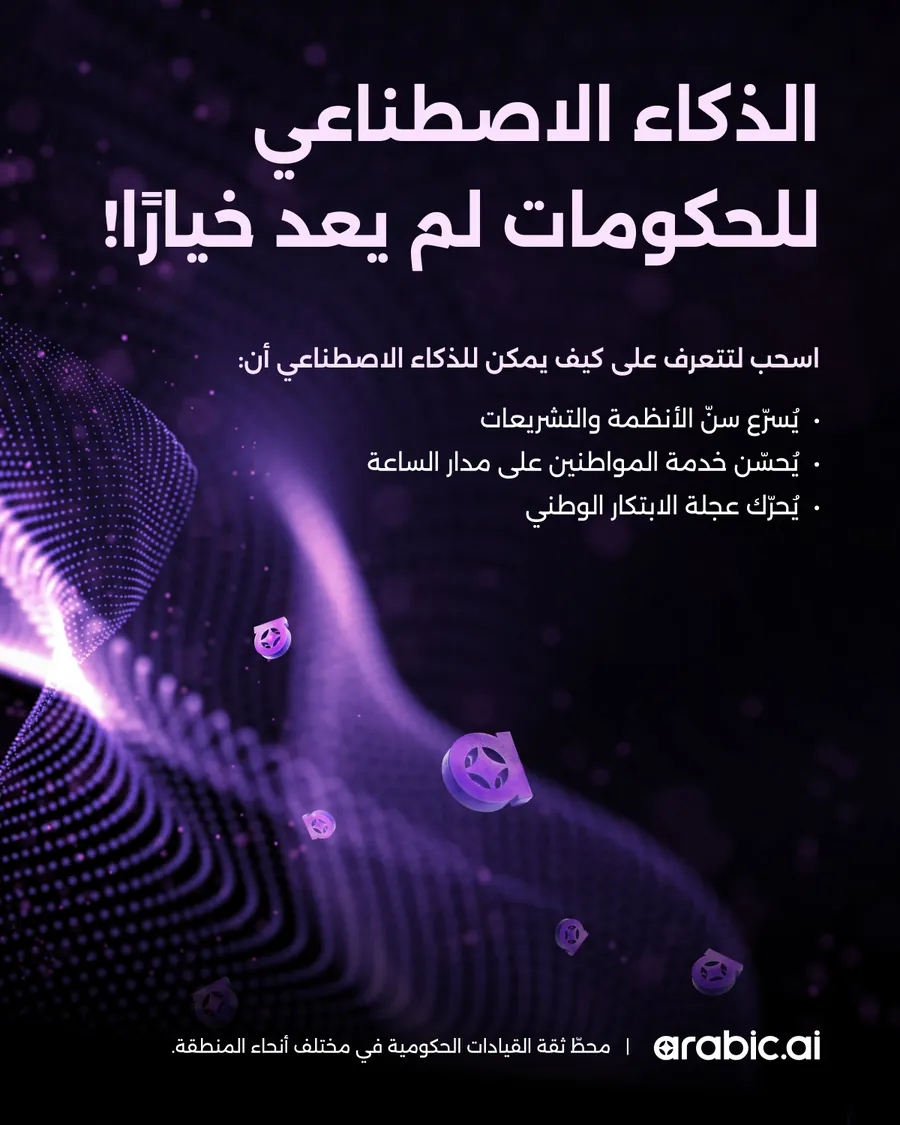
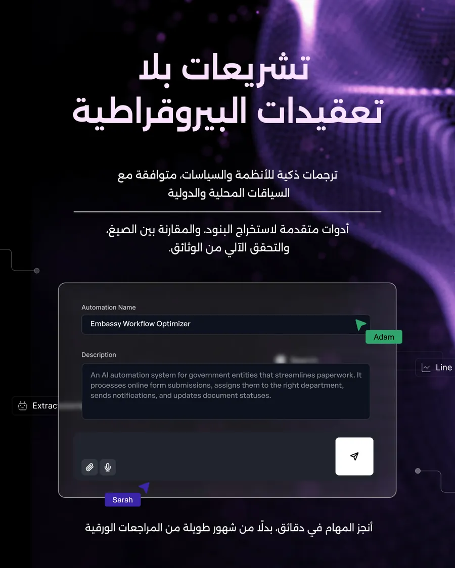
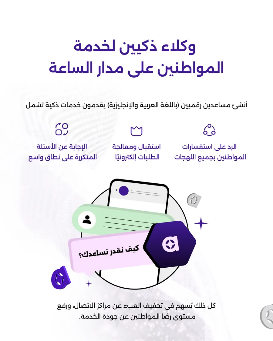
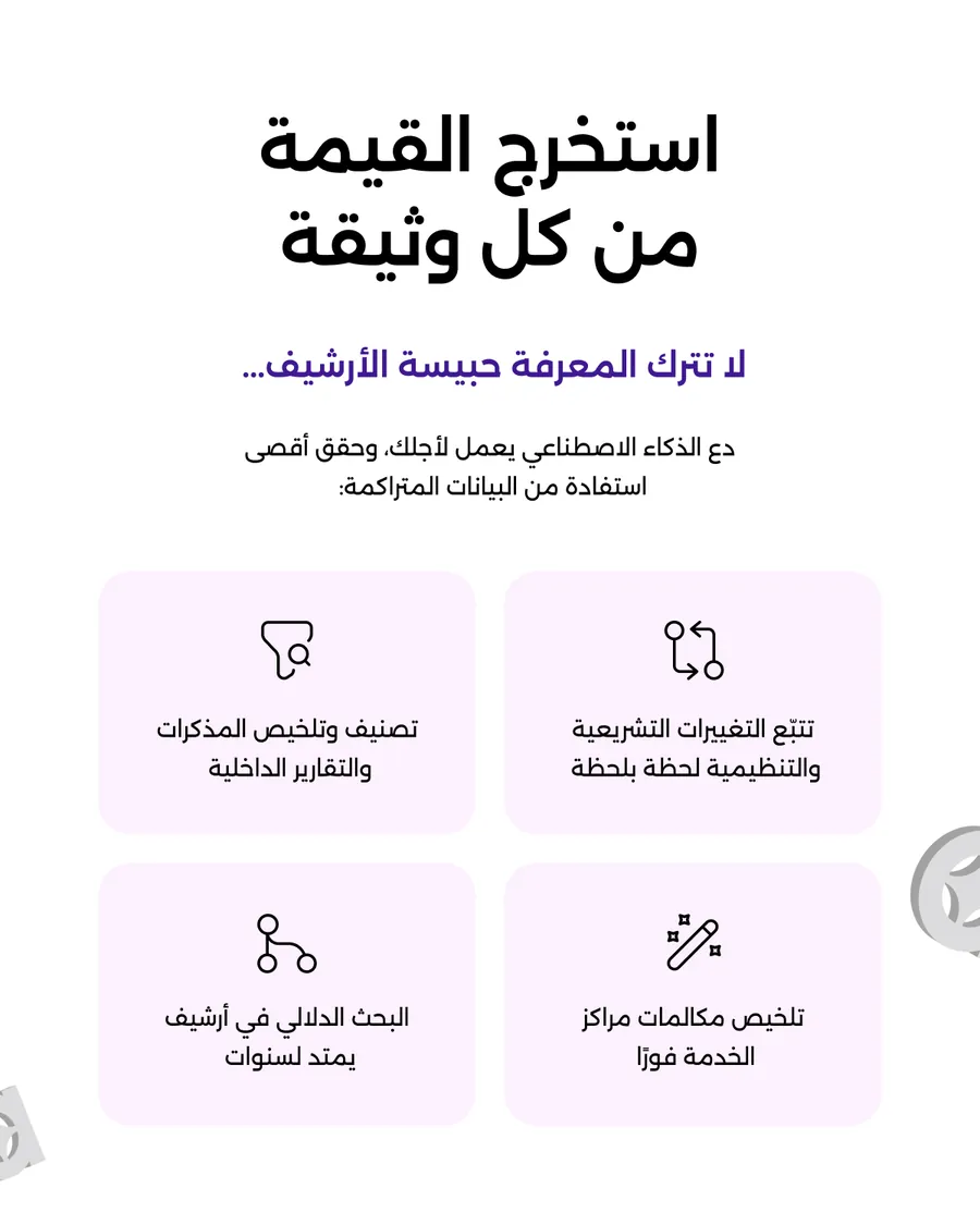
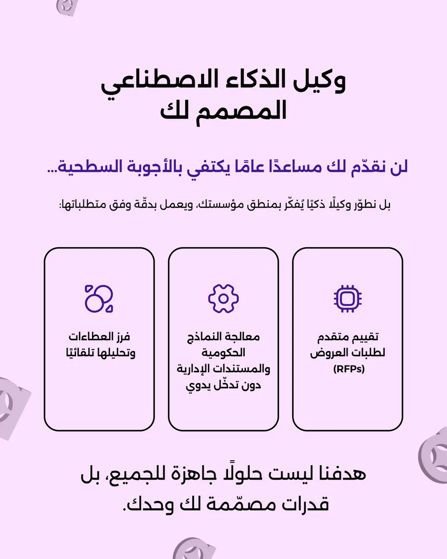
Two covers, one body. The same five slides are sold to a ministry as “AI for Governments Isn’t Optional Anymore” and to a board as “Enterprise AI Isn’t A Chatbot” — the argument underneath never changes, only the door. The Arabic cut runs at the end. This is the economics of a system: the expensive part gets made once.
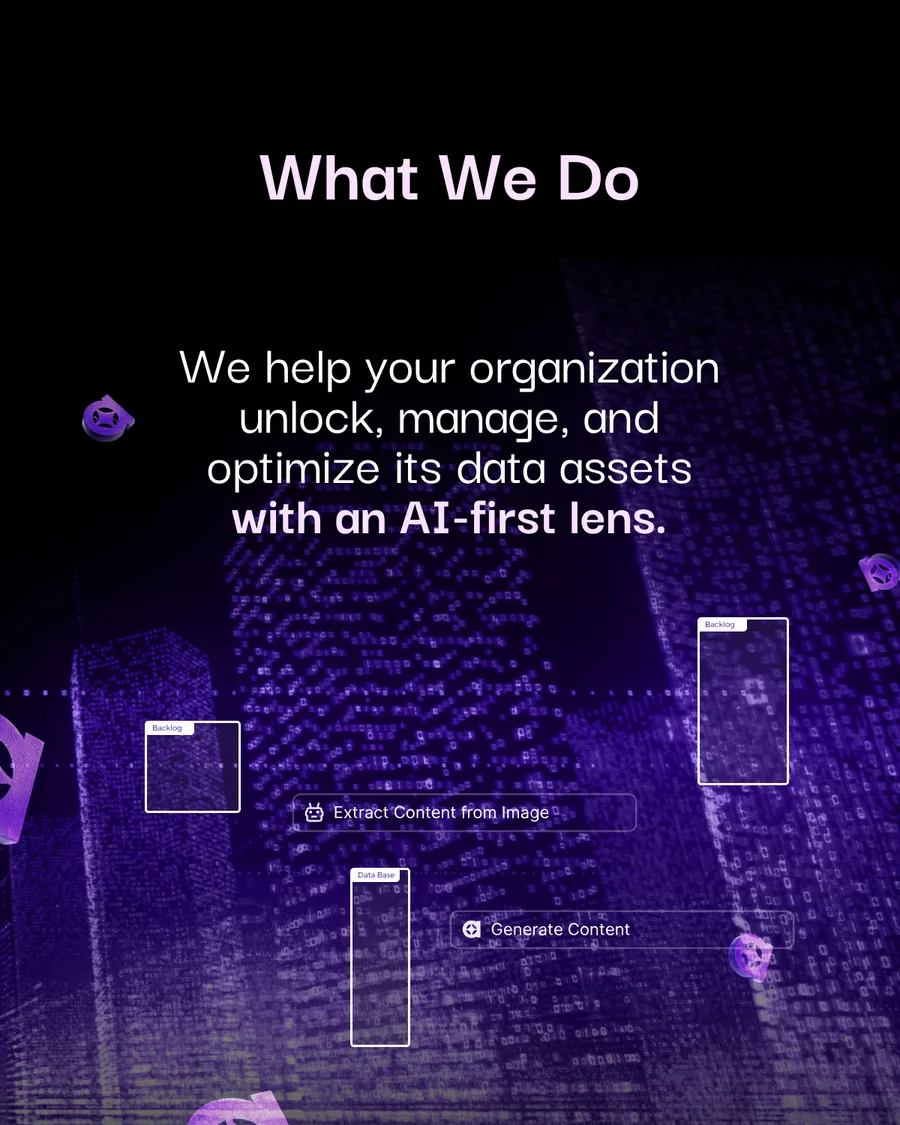
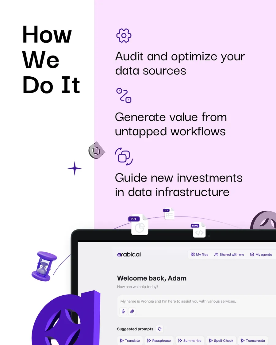
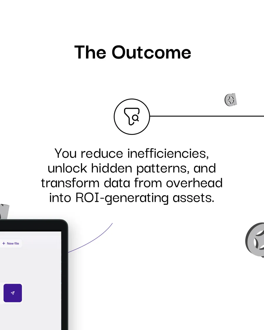
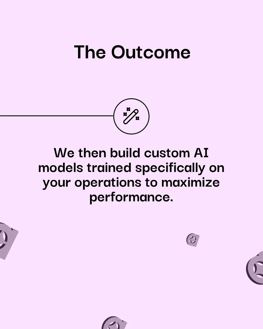
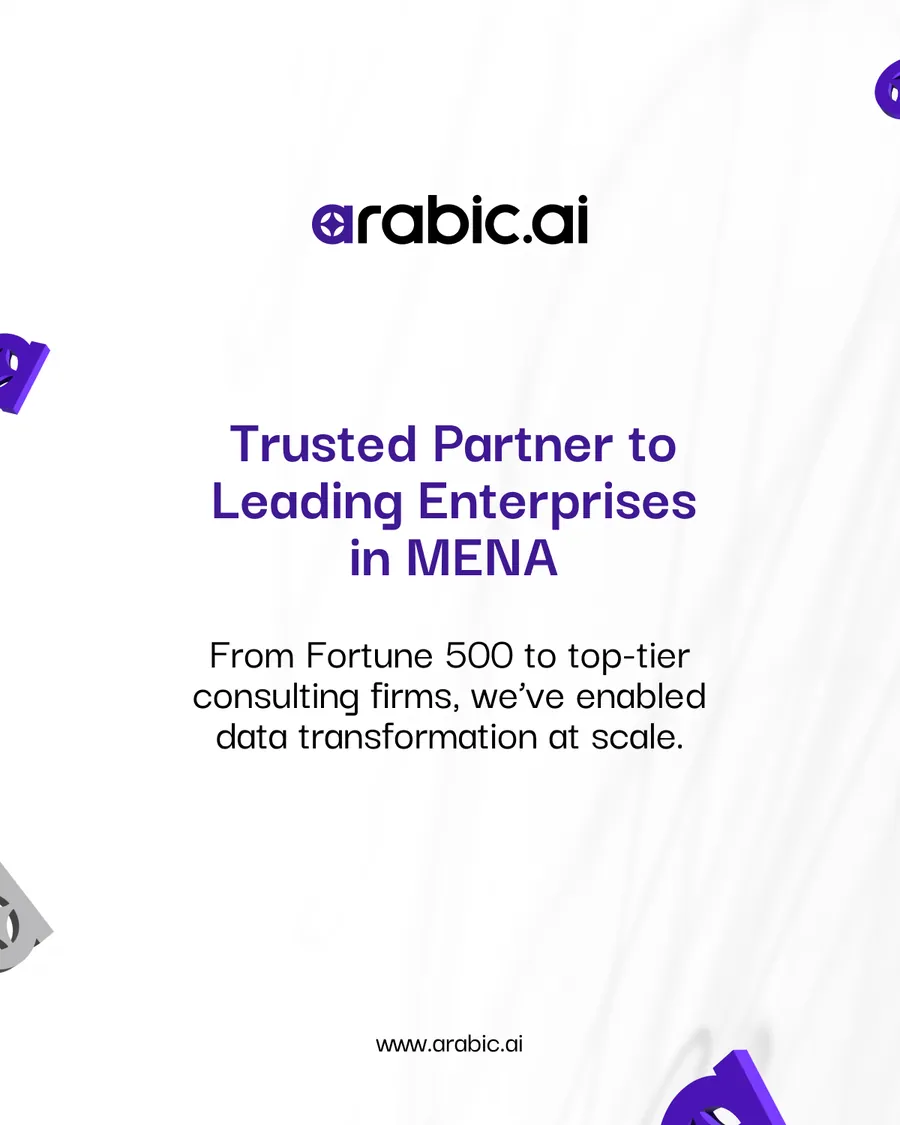
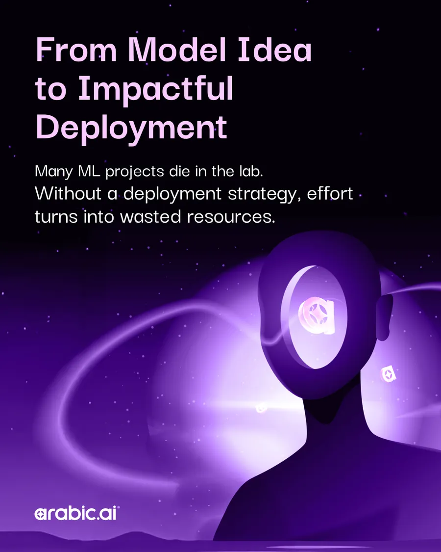
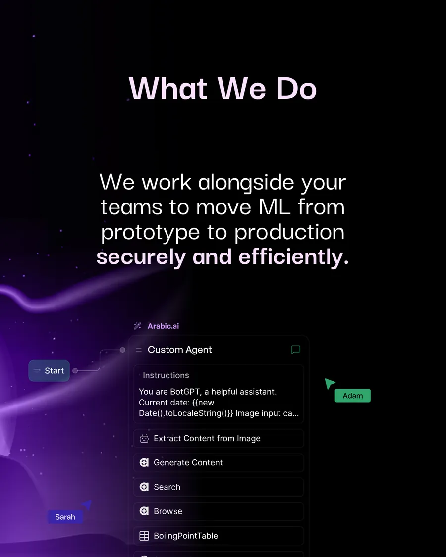
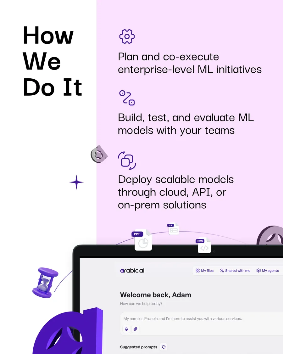
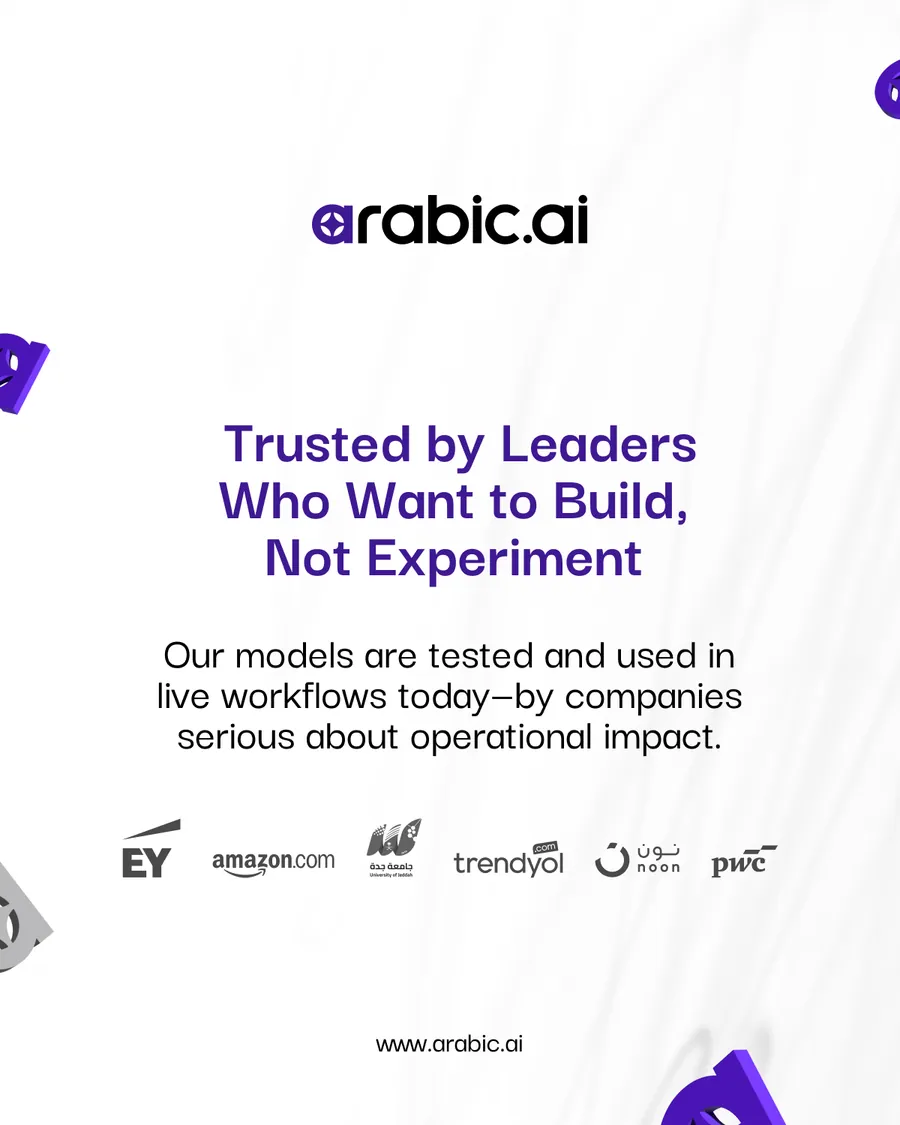

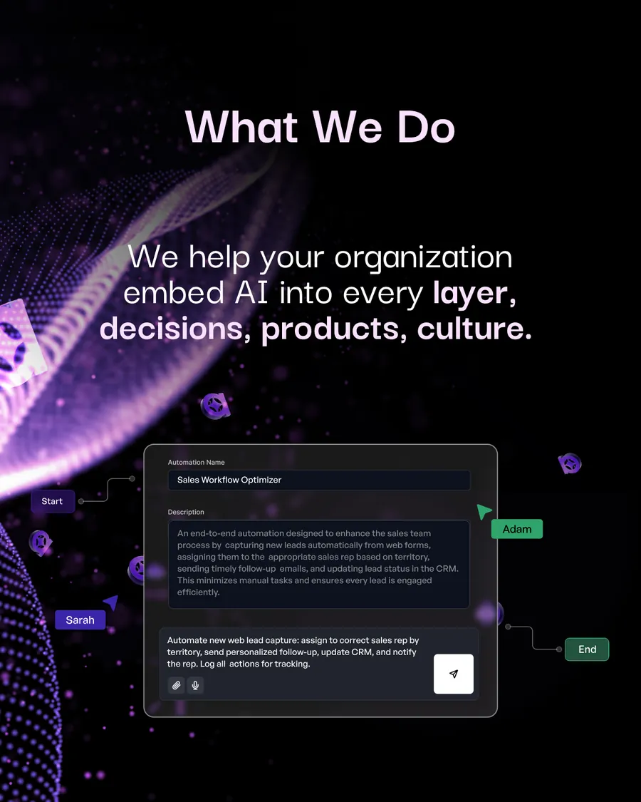
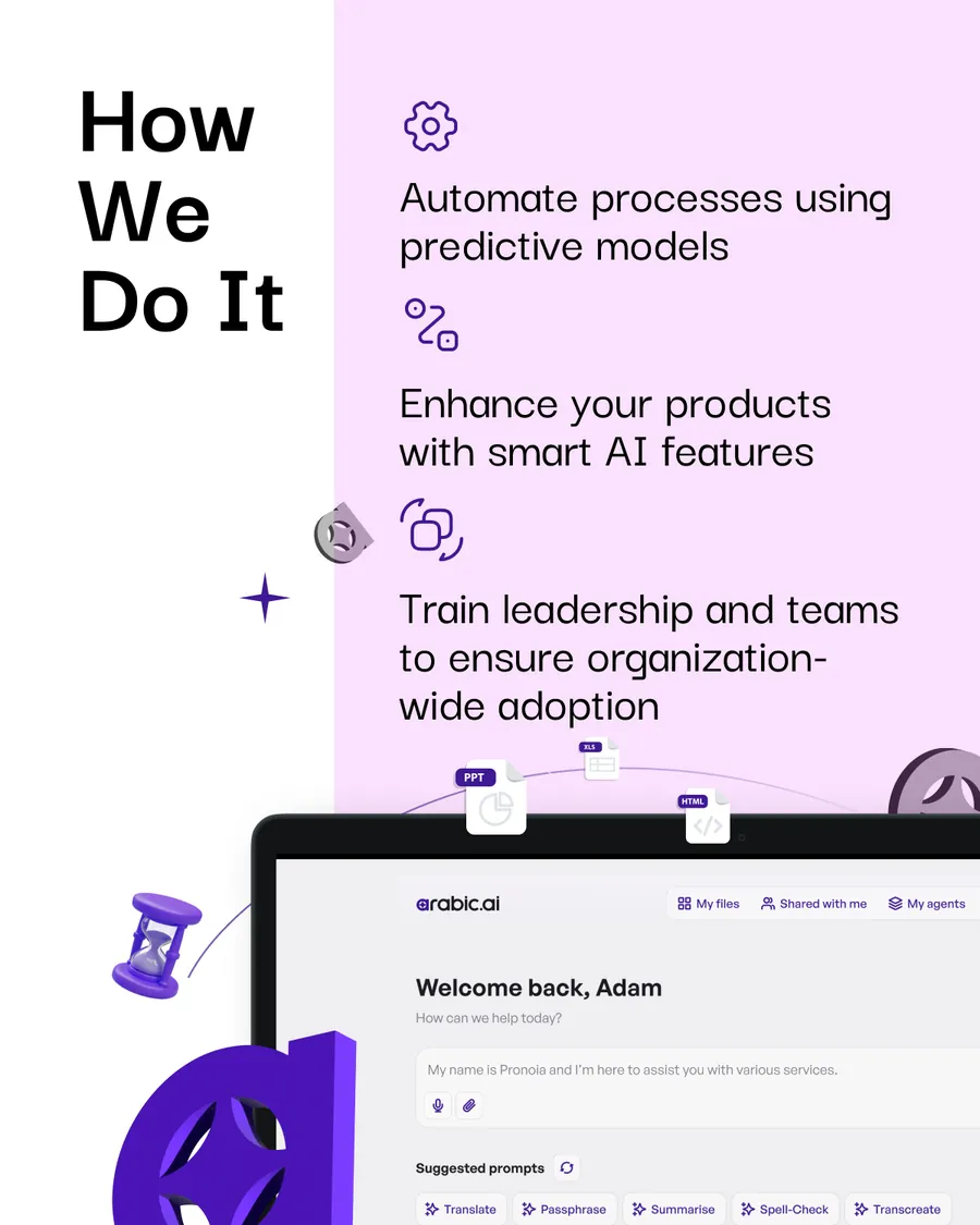
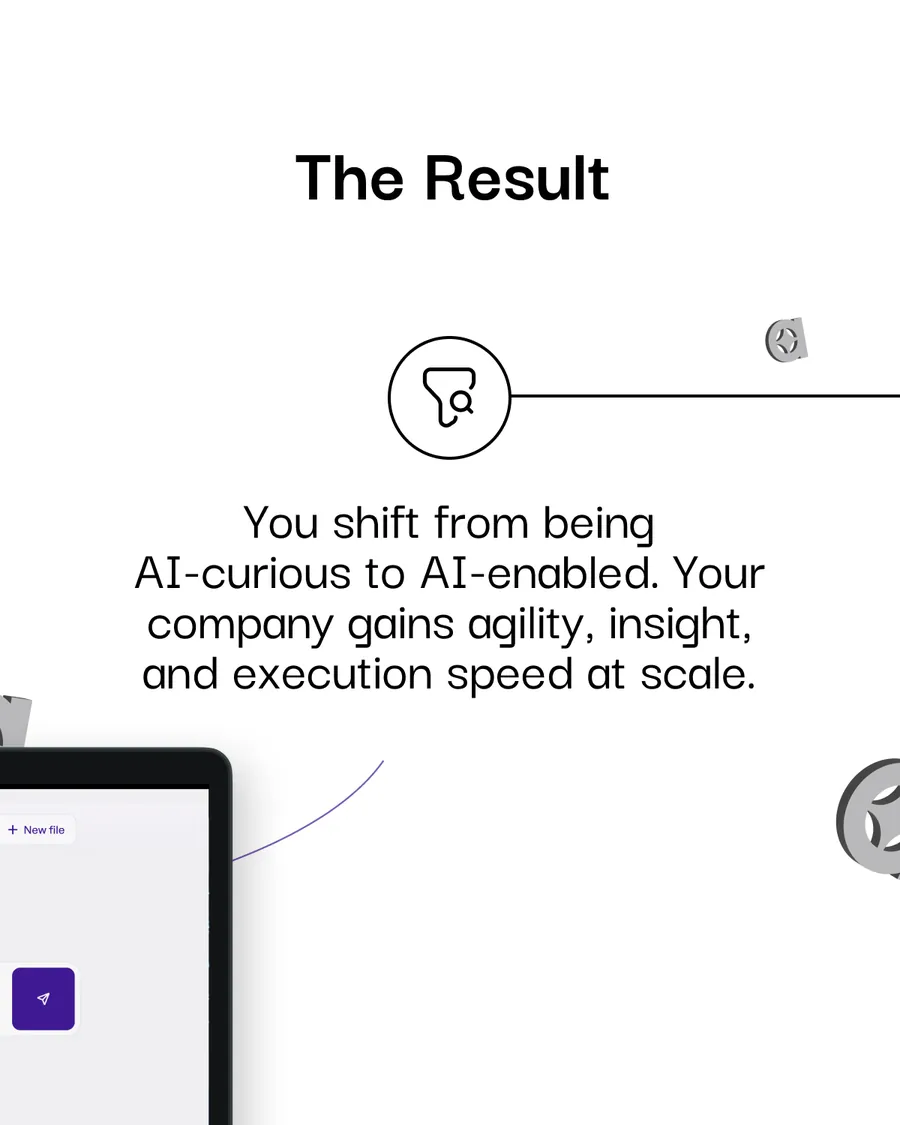
Three openings on one chassis. Strategy, deployment and integration each get their own cover and their own first line, then drop into the same six-slide frame — What We Do, How We Do It, The Outcome, The Outcome, and the client wall. Eighteen slides that cost about what eight should.
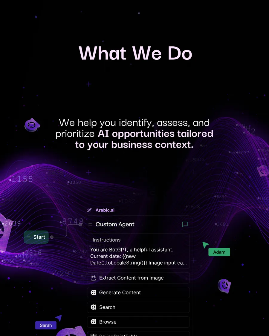
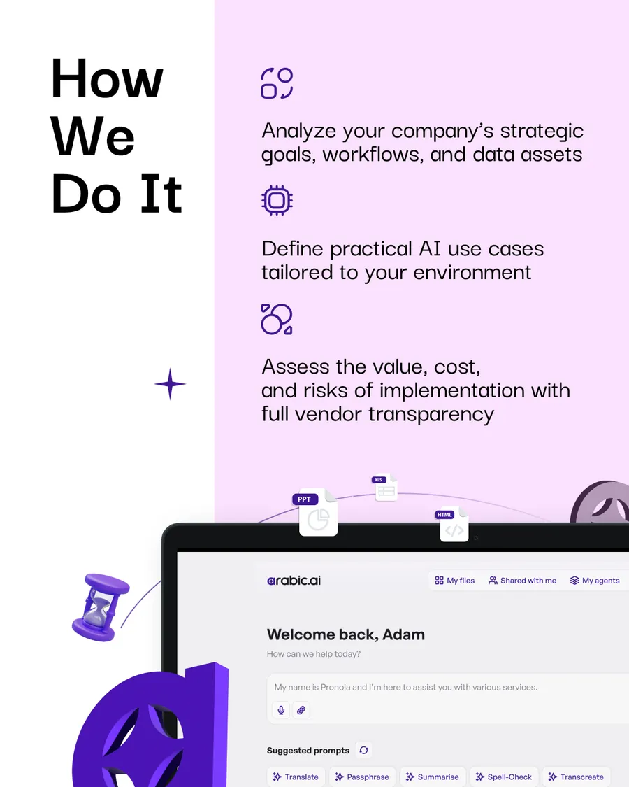
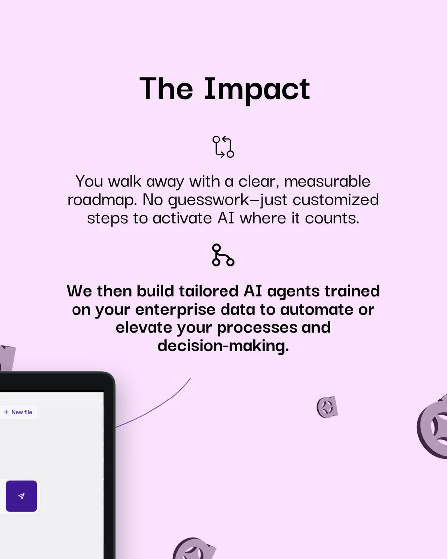
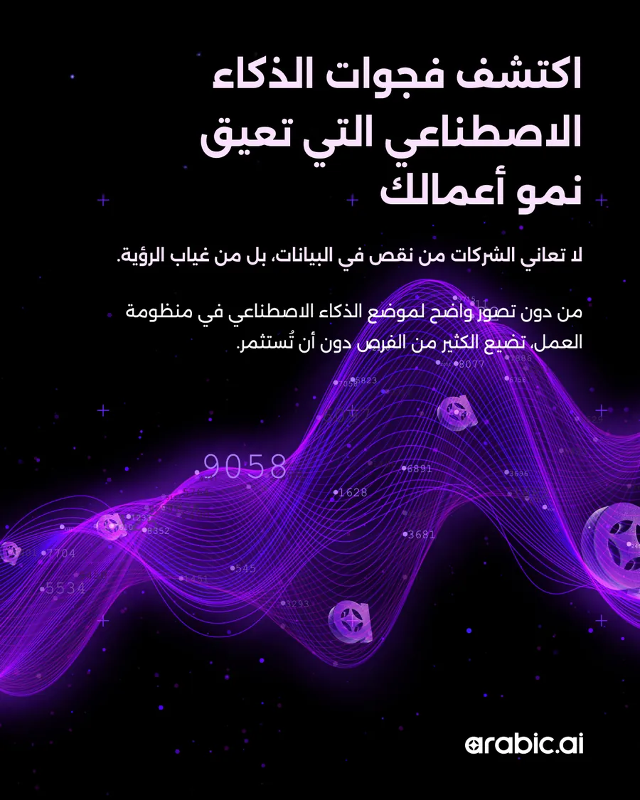
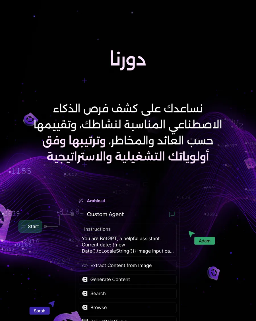
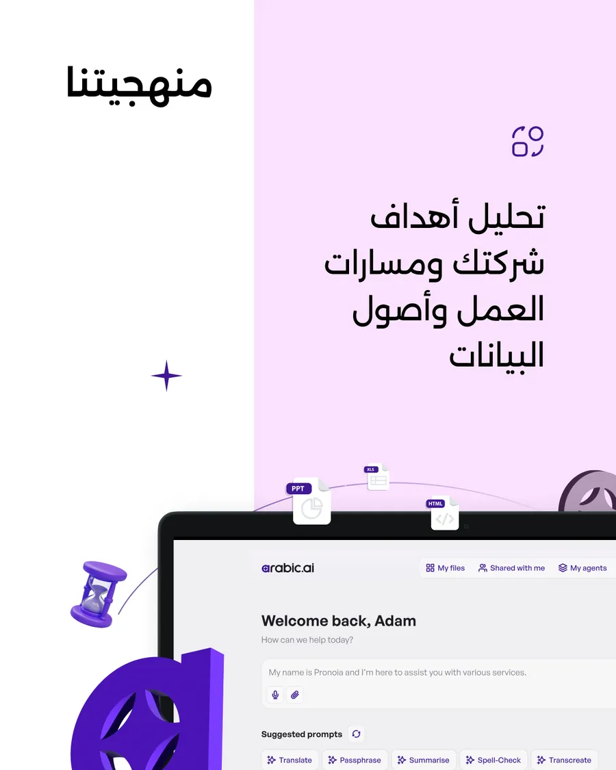
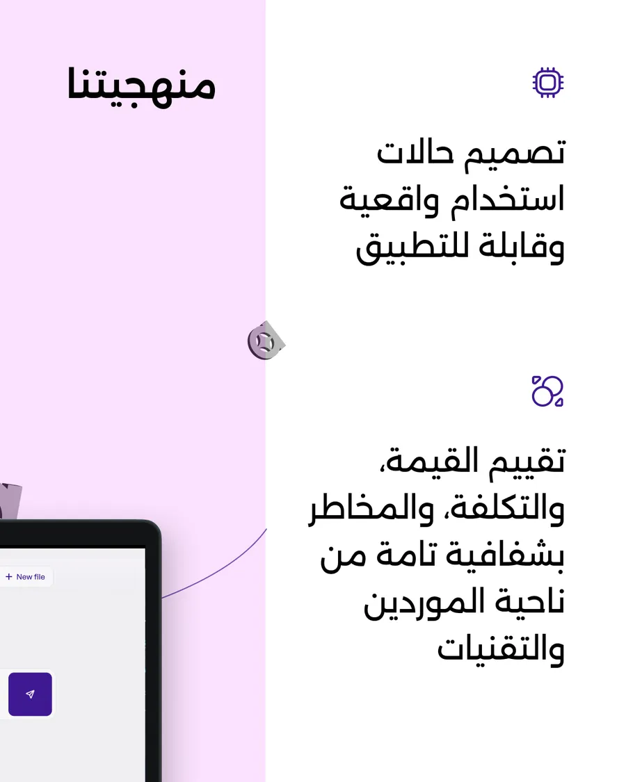
The same chassis again, in both languages — and the Arabic needs a slide the English does not. Set properly, the script runs long, the measure changes, and a page that held in English stops holding. Adding a beat is the right fix. Shrinking the type to make it fit is the wrong one.
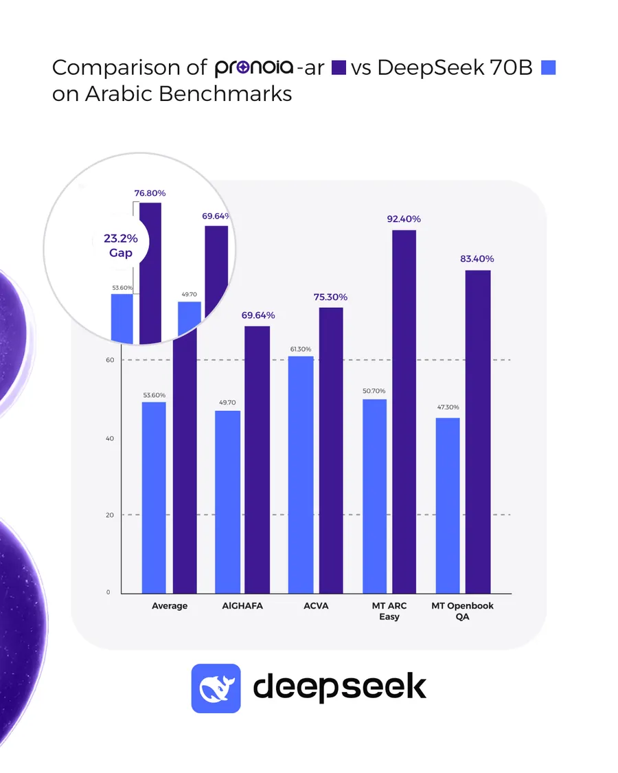
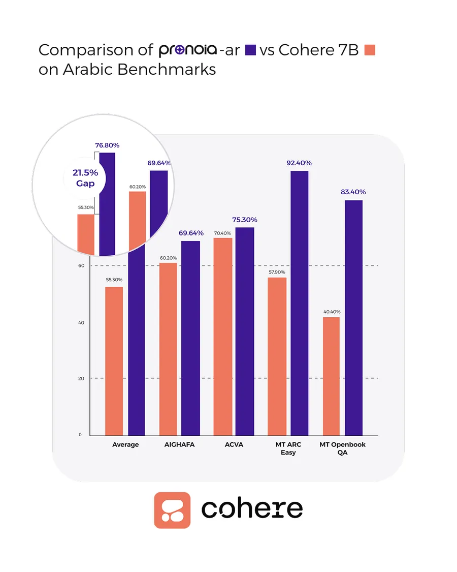
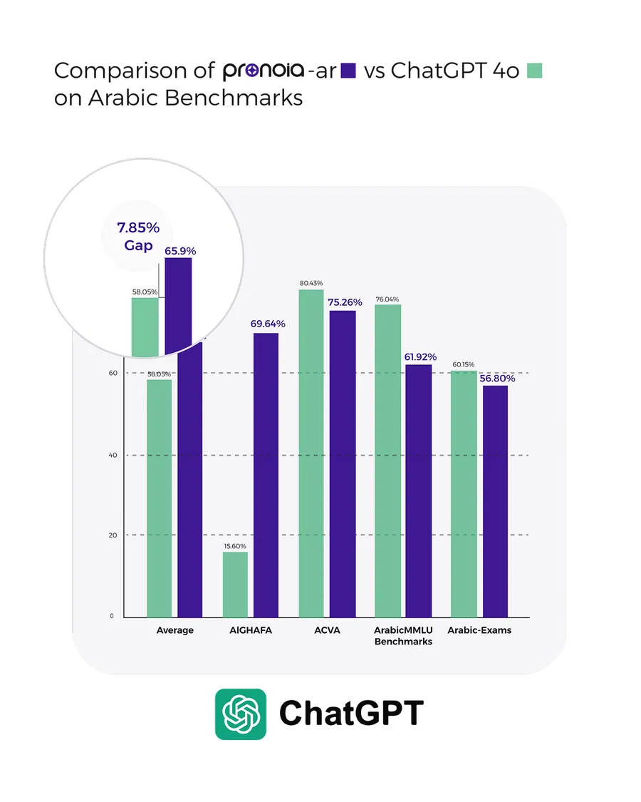
Pronoia, benchmarked against the names people already trust: DeepSeek 70B, Cohere 7B, ChatGPT 4o. One chart construction, one callout circling the bar that matters, and the competitor’s own logotype at the foot of each slide — which only works if you are winning.
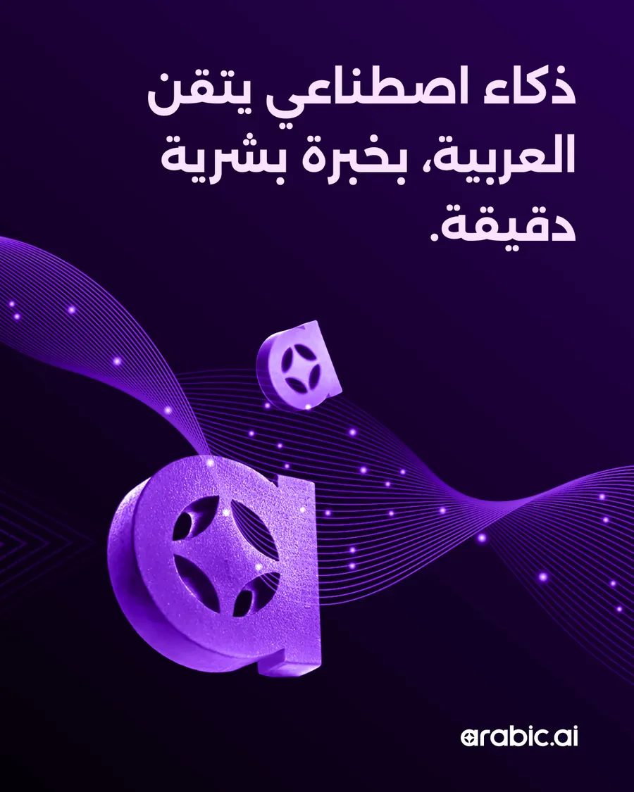
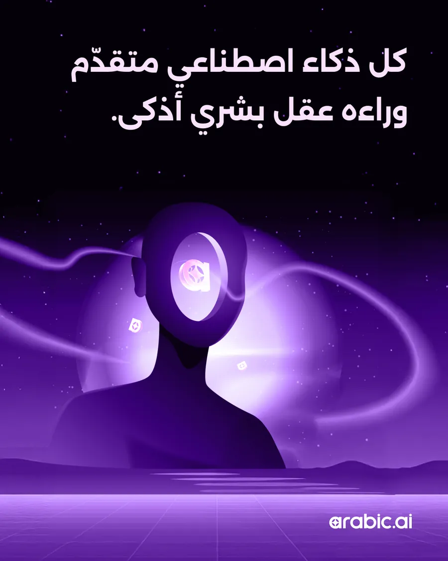
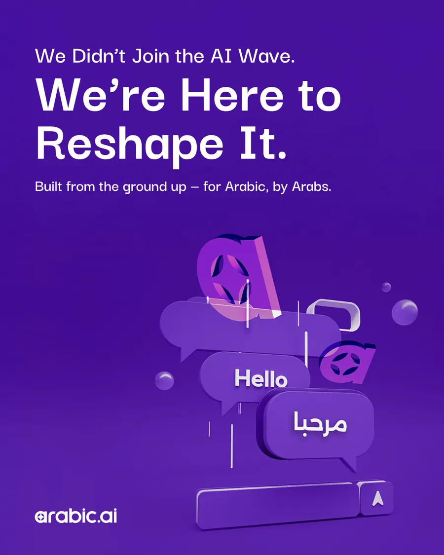
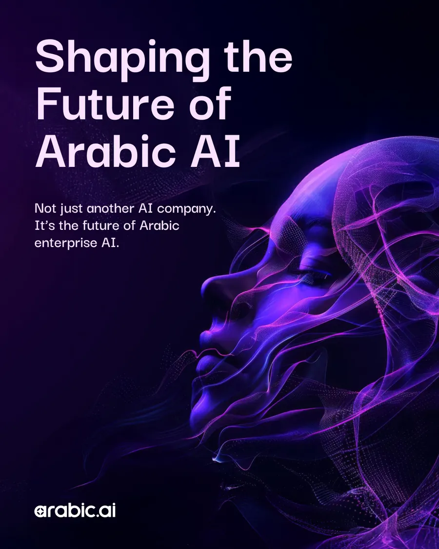
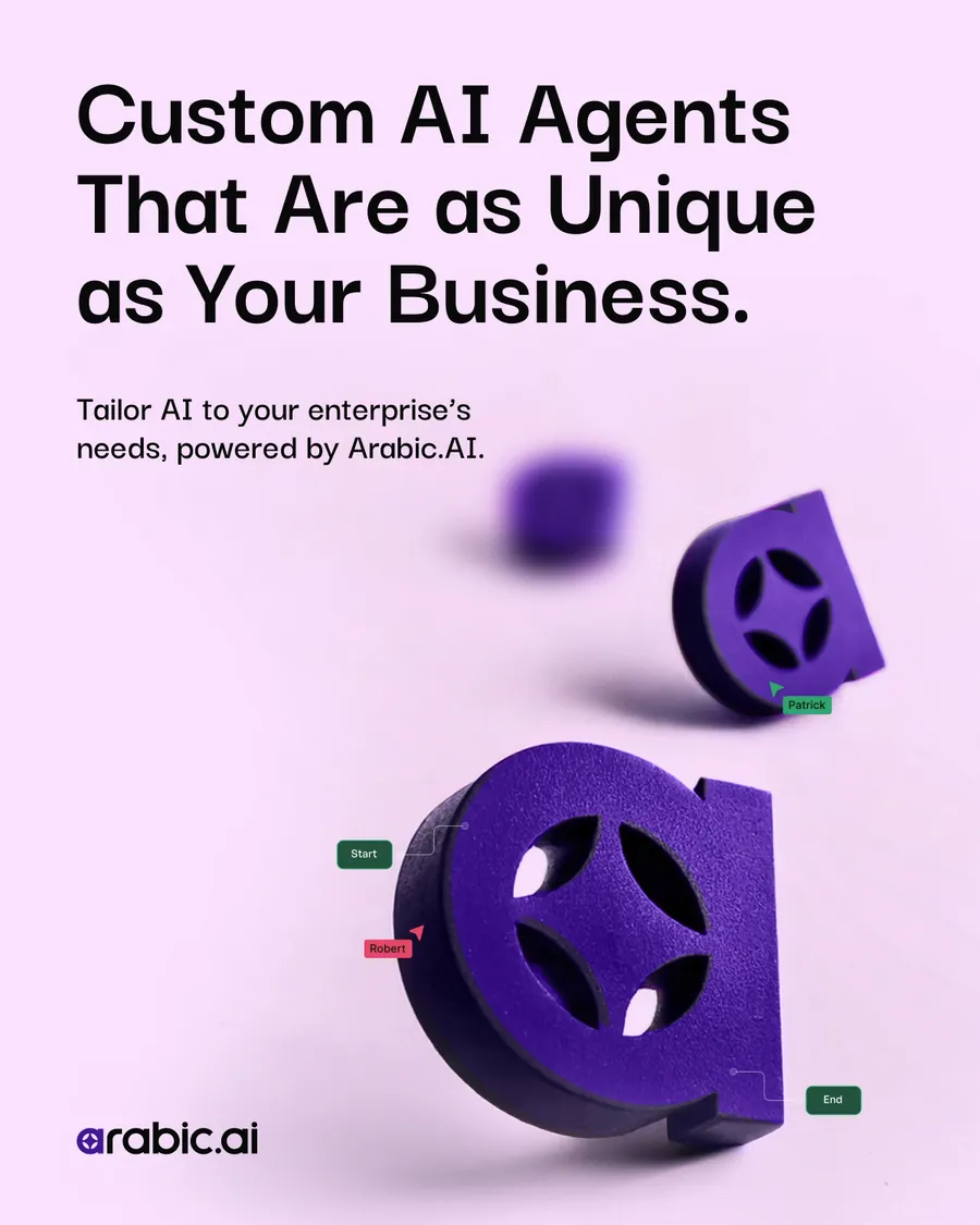
The single posts, as the board lays them out: the eleven Arabic ones first, then the eleven English. They are the same eleven claims run twice — written for each script rather than translated into it — on four grounds, the knocked-out portrait, the particle field, the ribbon and the fan, so a feed of them has a rhythm instead of a template.
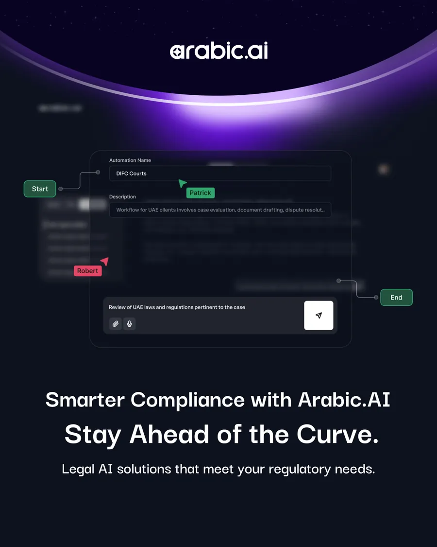
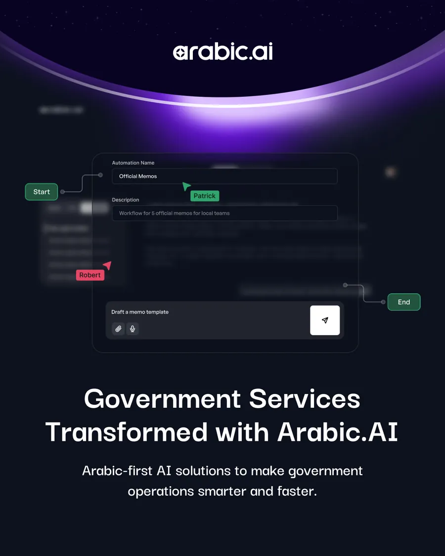
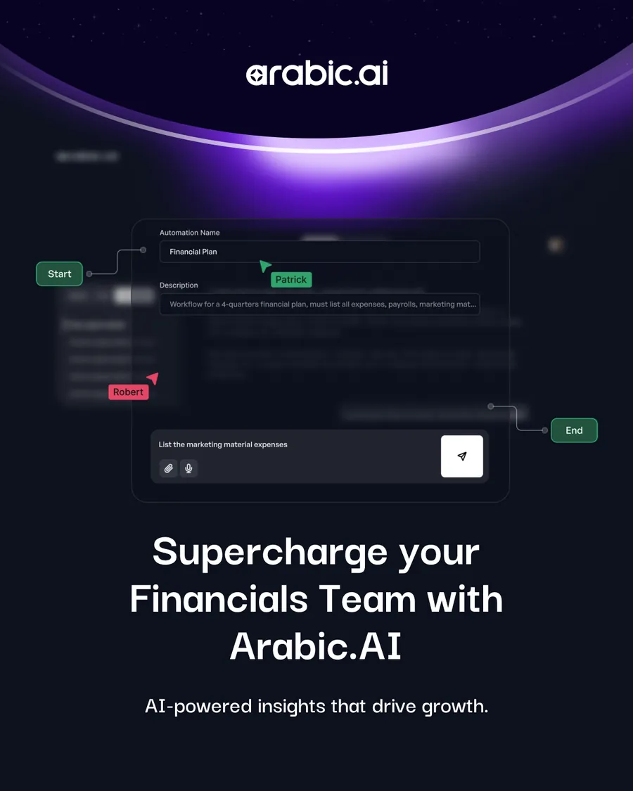

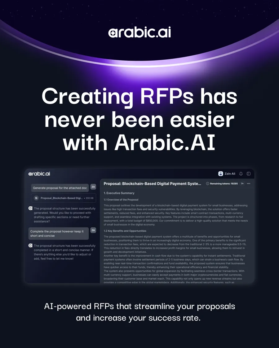
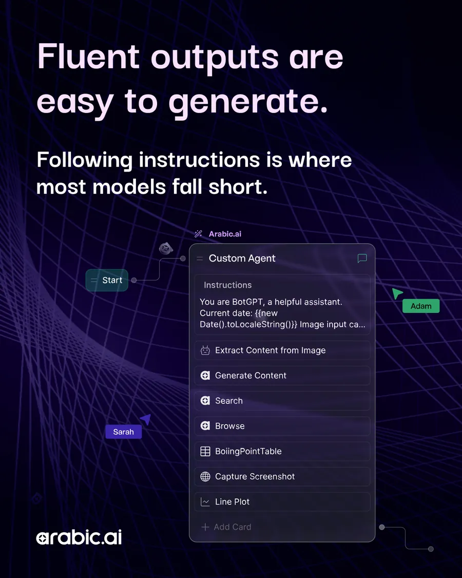
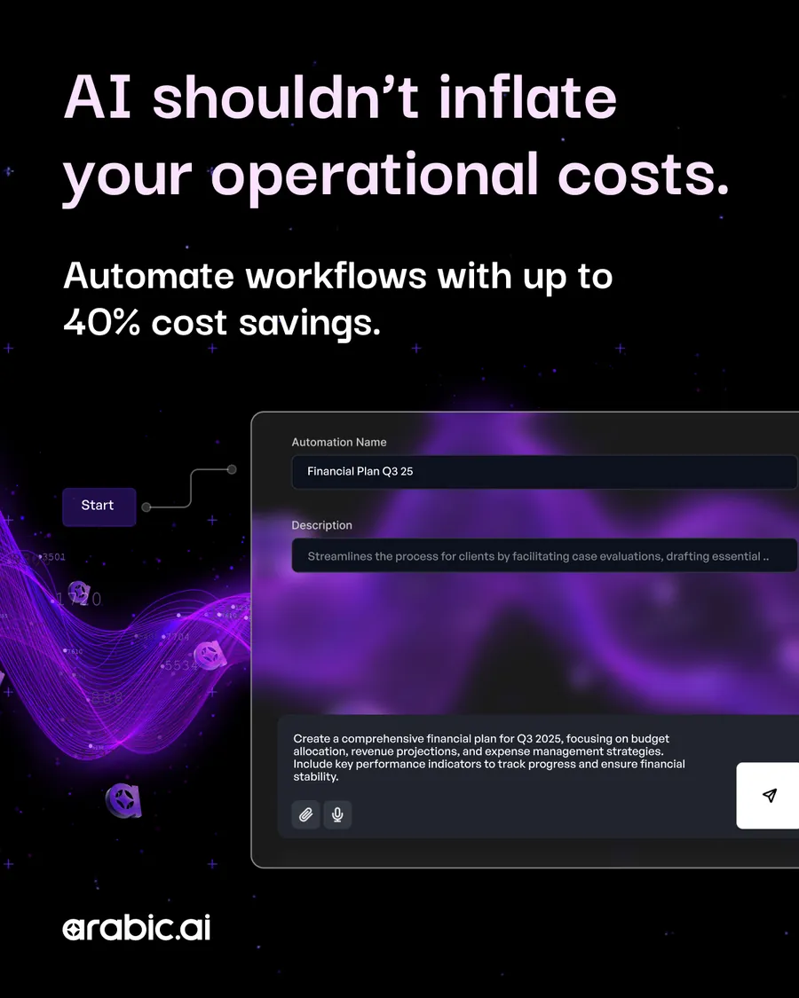
And the announcement run, where the product has to be visible: fifteen posts that put a real screen in the frame — compliance, government services, financials, RFPs, healthcare — rather than another abstract render. The screens are small on purpose. They are the proof, not the subject.
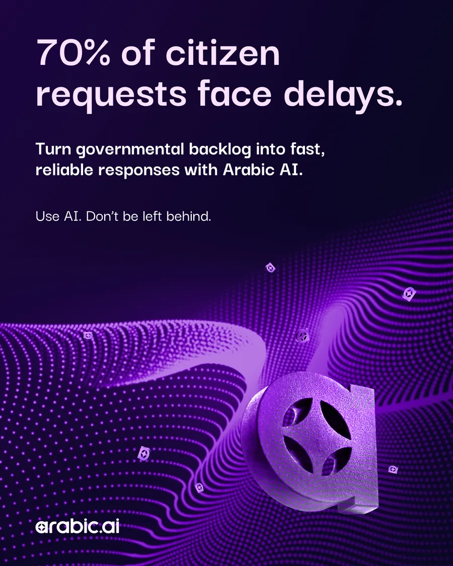
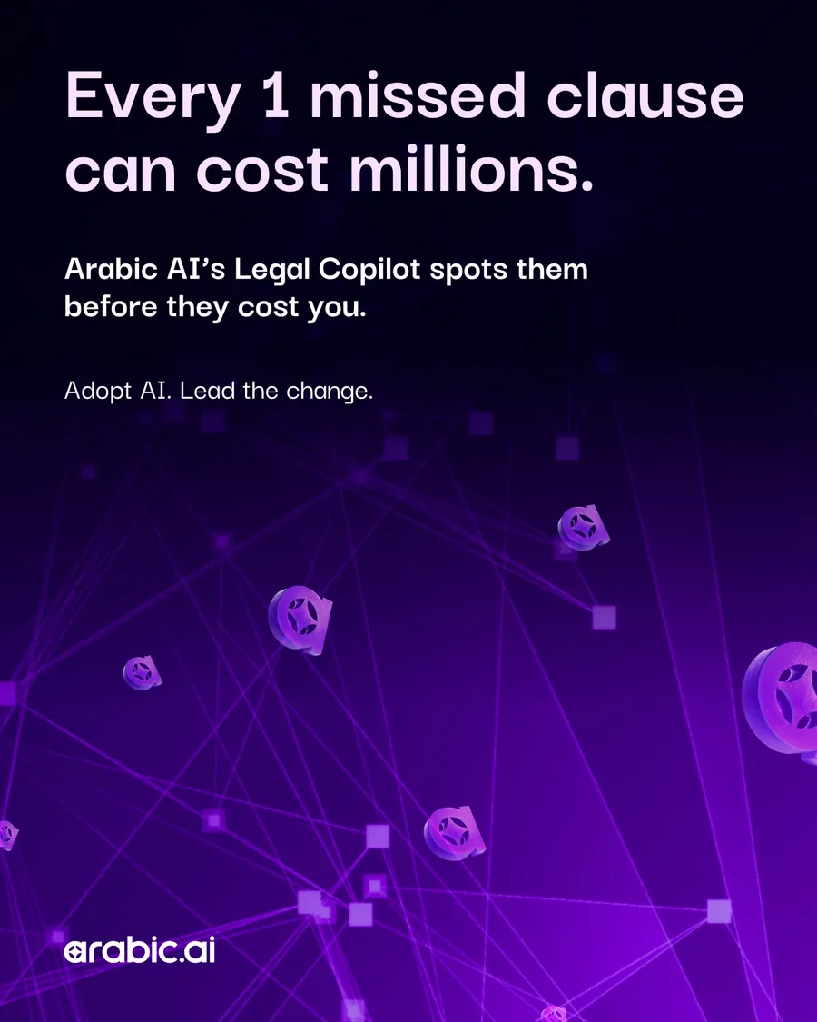
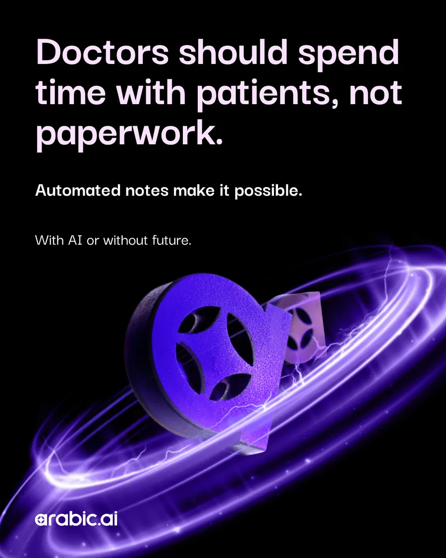
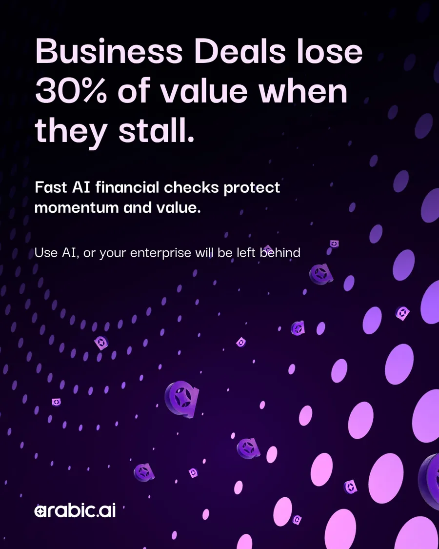
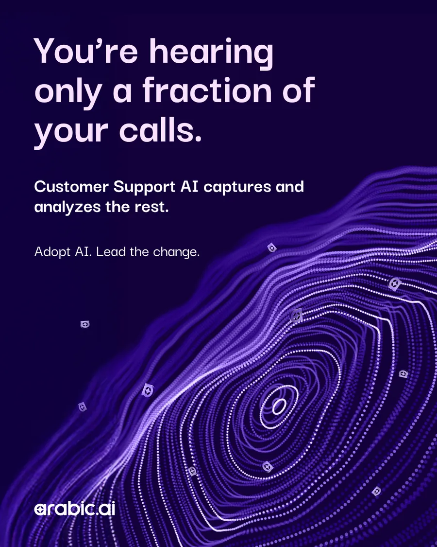
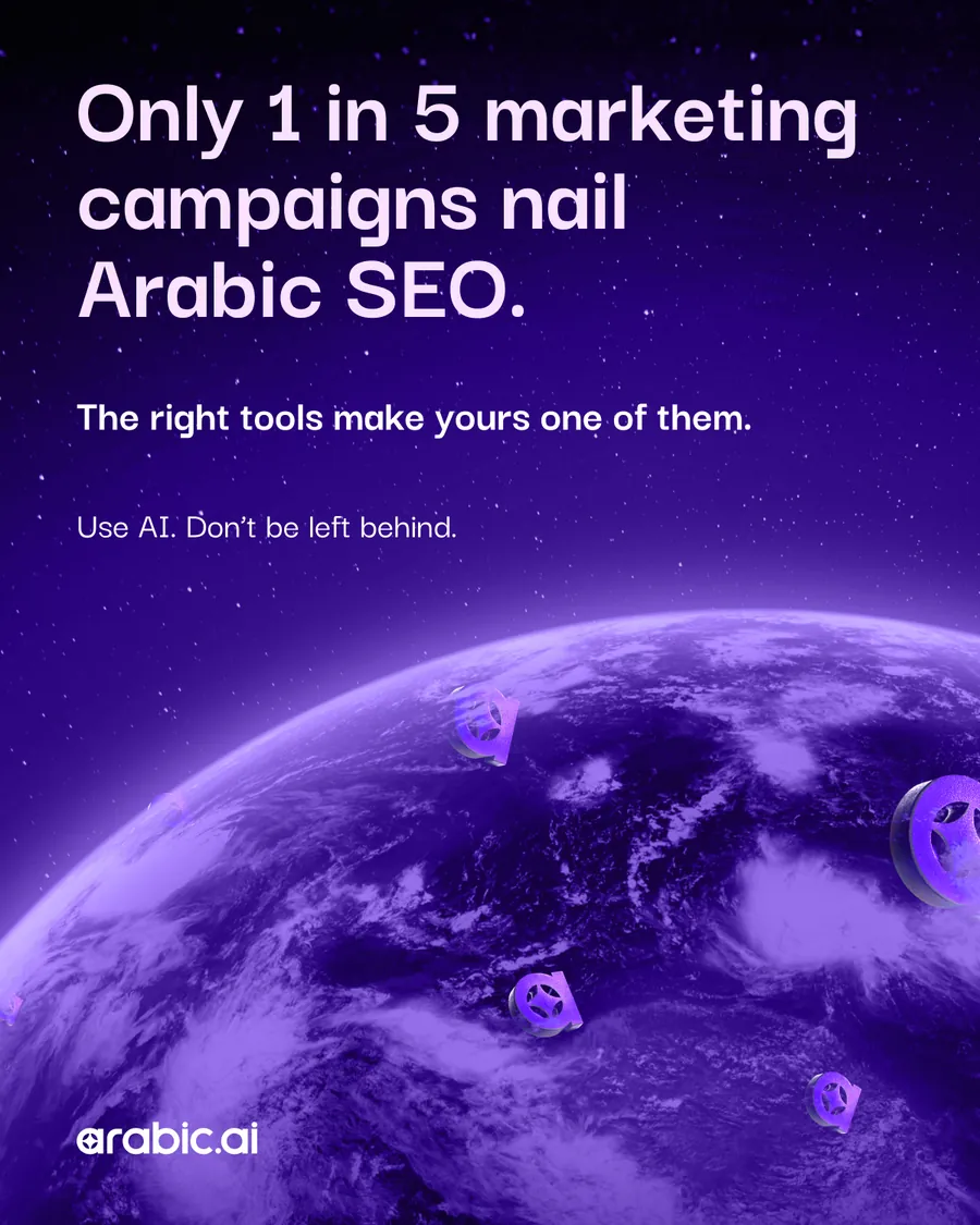
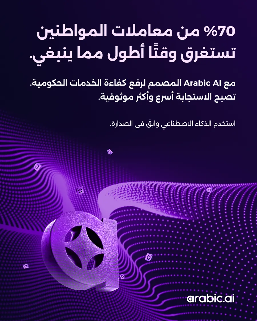
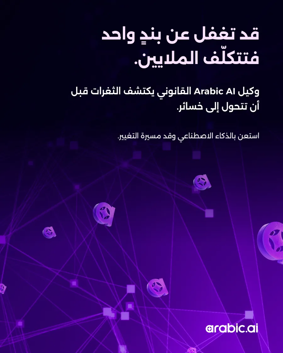
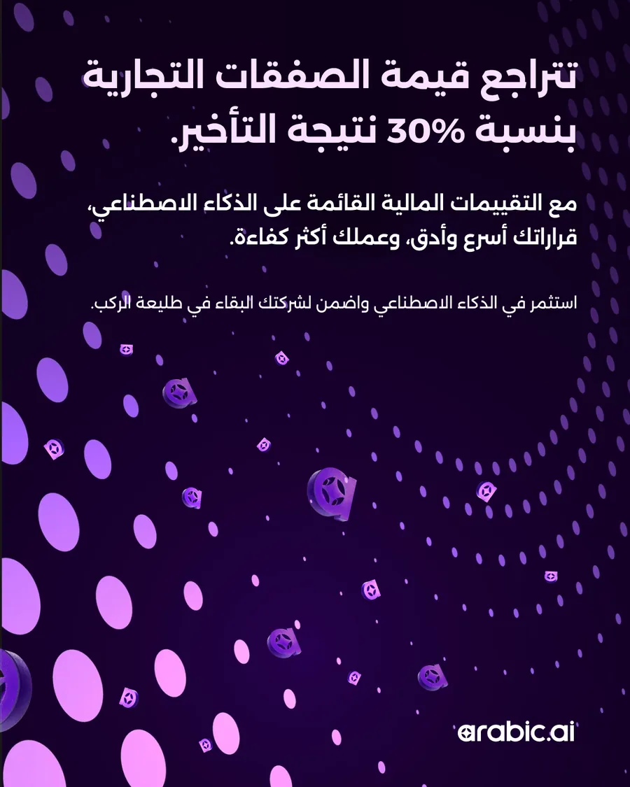
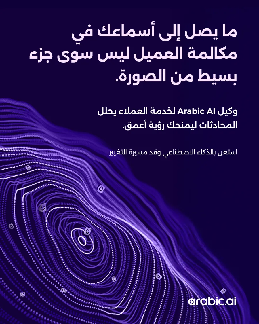
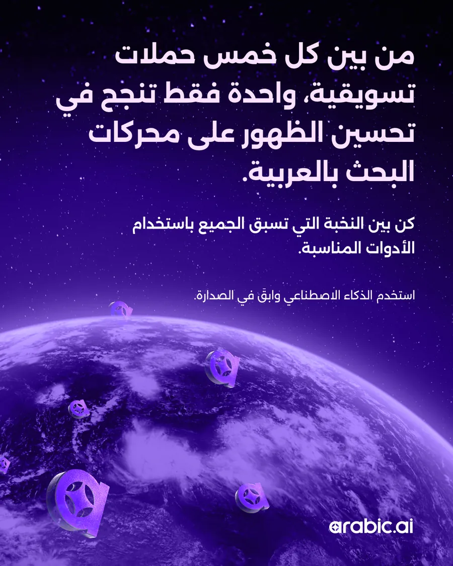
The number posts, the English row then the Arabic. A statistic is the one thing that survives being seen for a second and a half, so the figure is set as large as the frame allows and everything else is a caption under it — 70% of citizen requests face delays, one missed clause costs millions, only one in five marketing campaigns nails Arabic SEO.
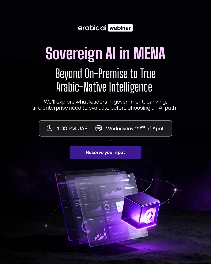
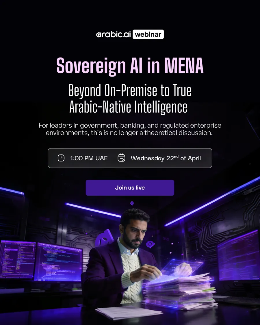
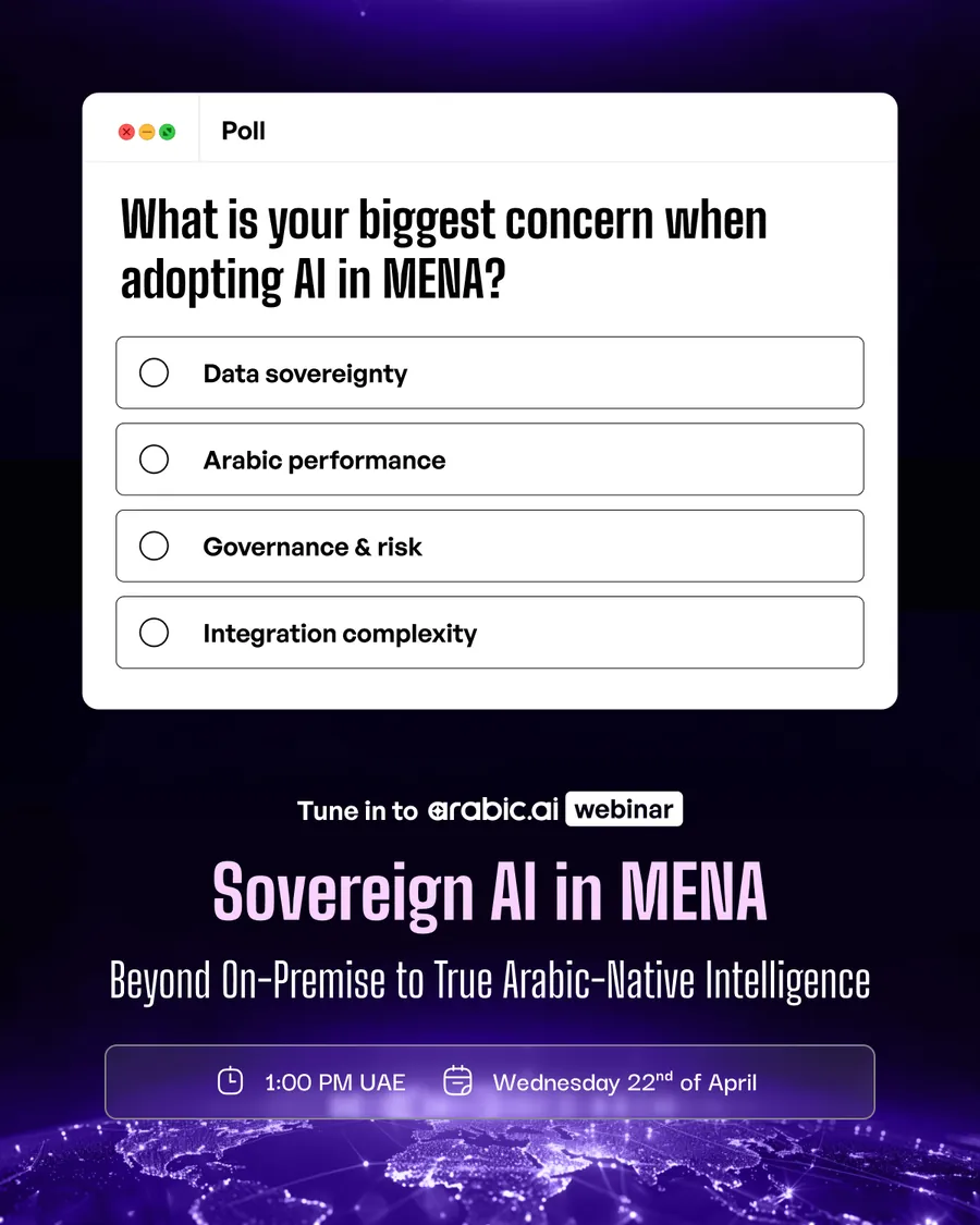
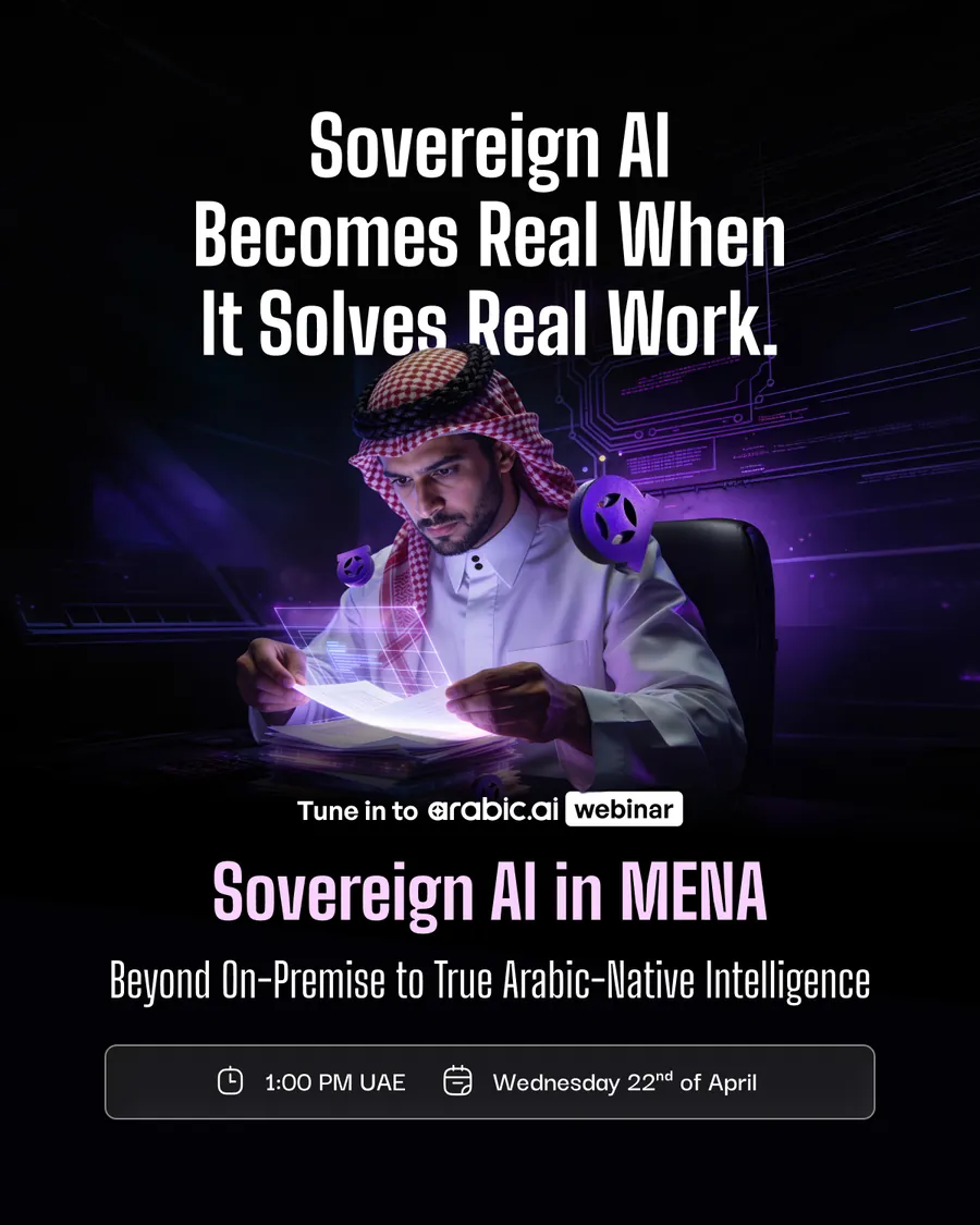
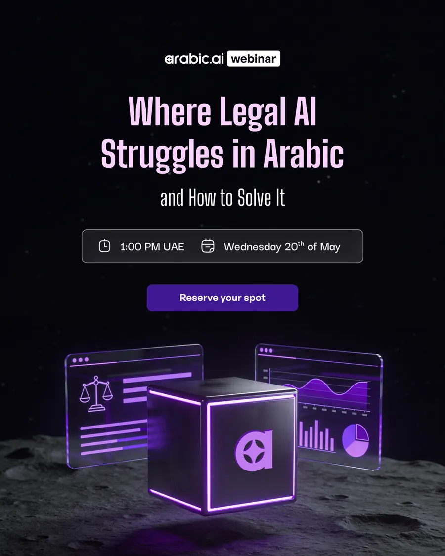
The webinar run, built the way a webinar actually sells: two posts that state the problem, then the date card, then the same card again with the button changed from Reserve your spot to Join us live. Nothing new gets designed on the day. The last one is a second webinar on the same chassis.
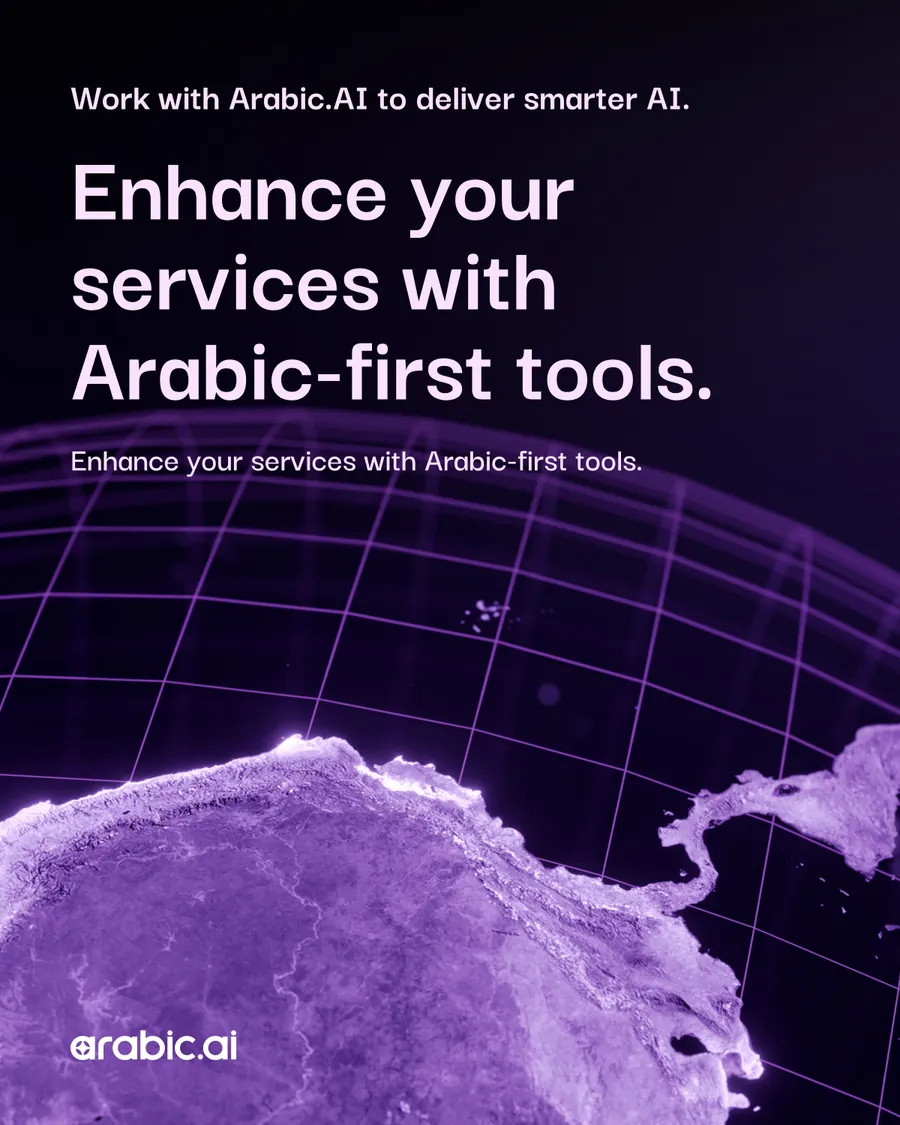
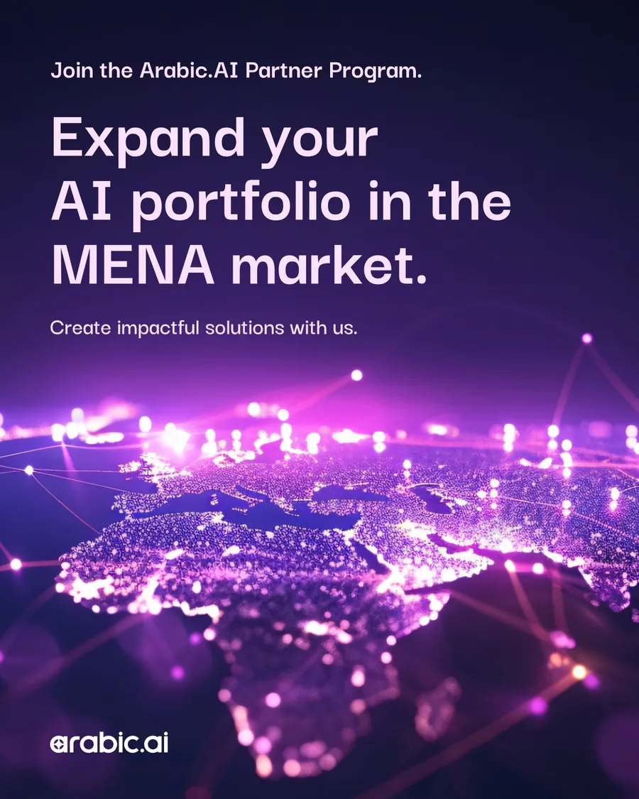
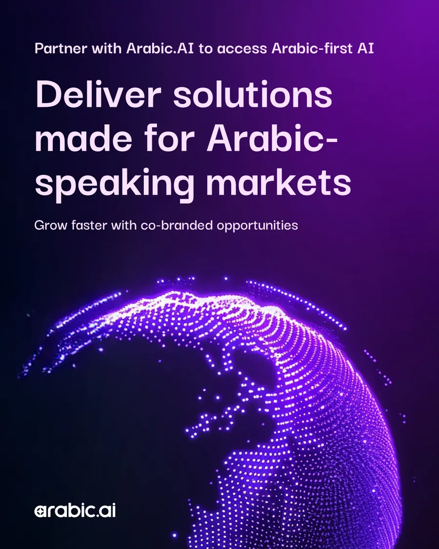
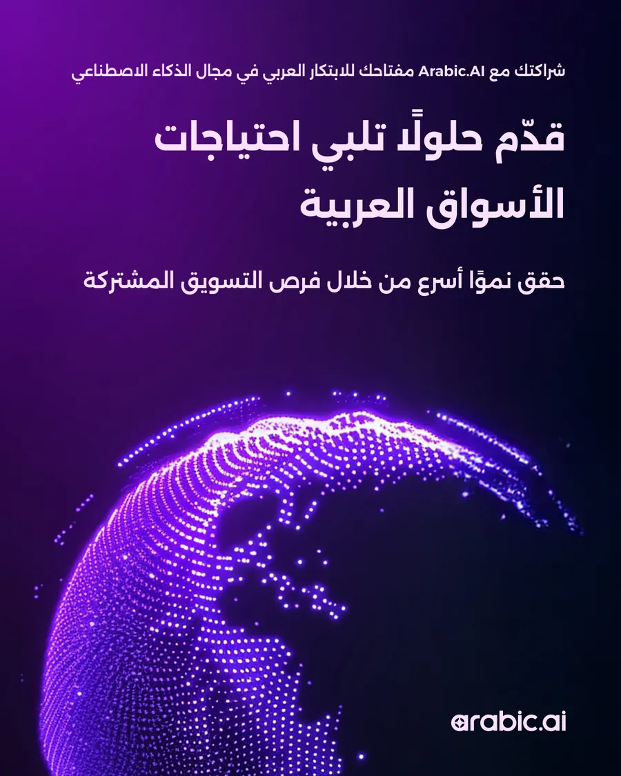
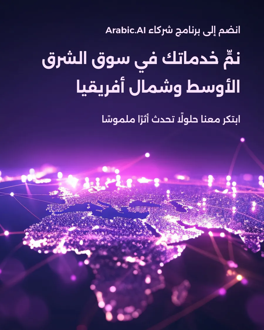
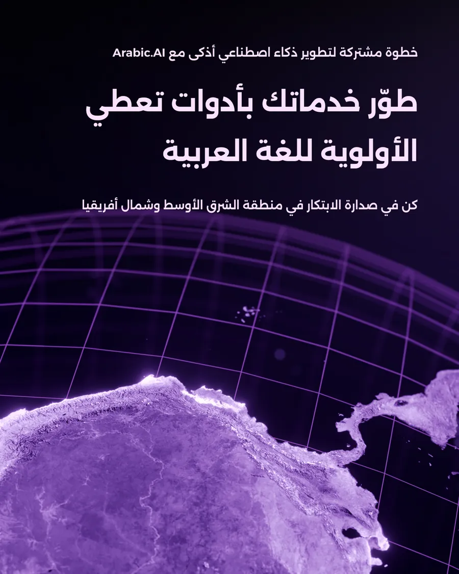
The partner programme, three posts and their Arabic cut. The hierarchy inverts here: the small line on top is the offer and the big line underneath is what the partner gets, because a partner is not reading an ad, they are checking whether there is anything in it for them.
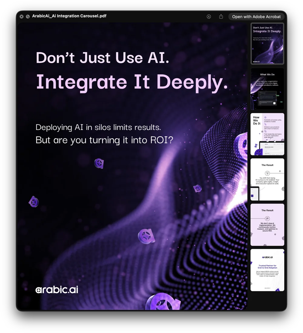
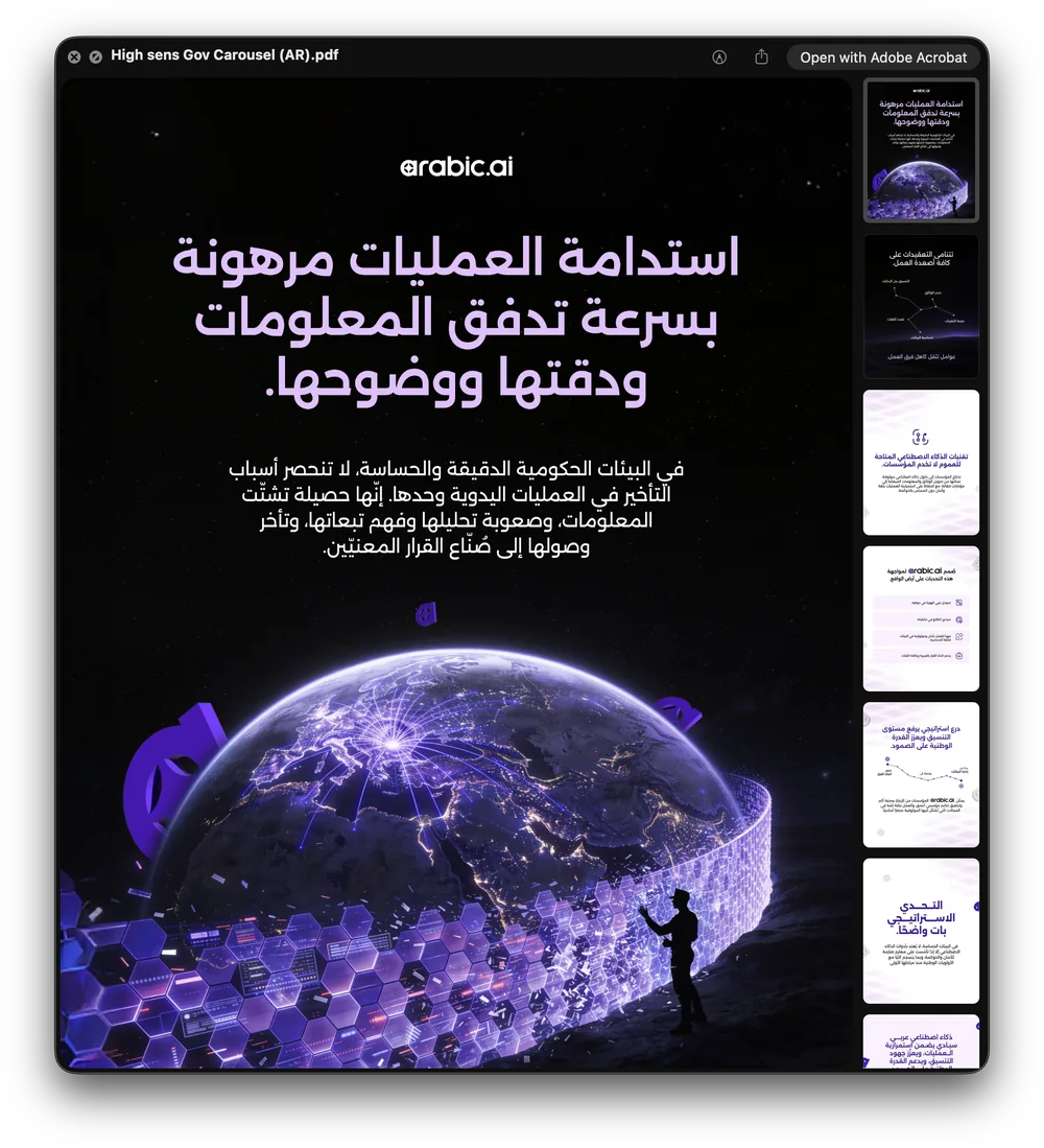
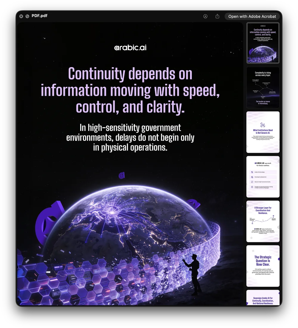
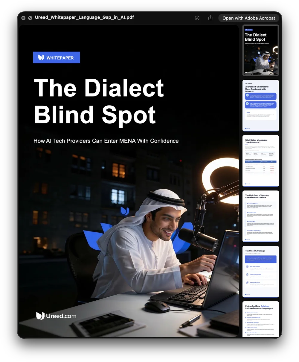
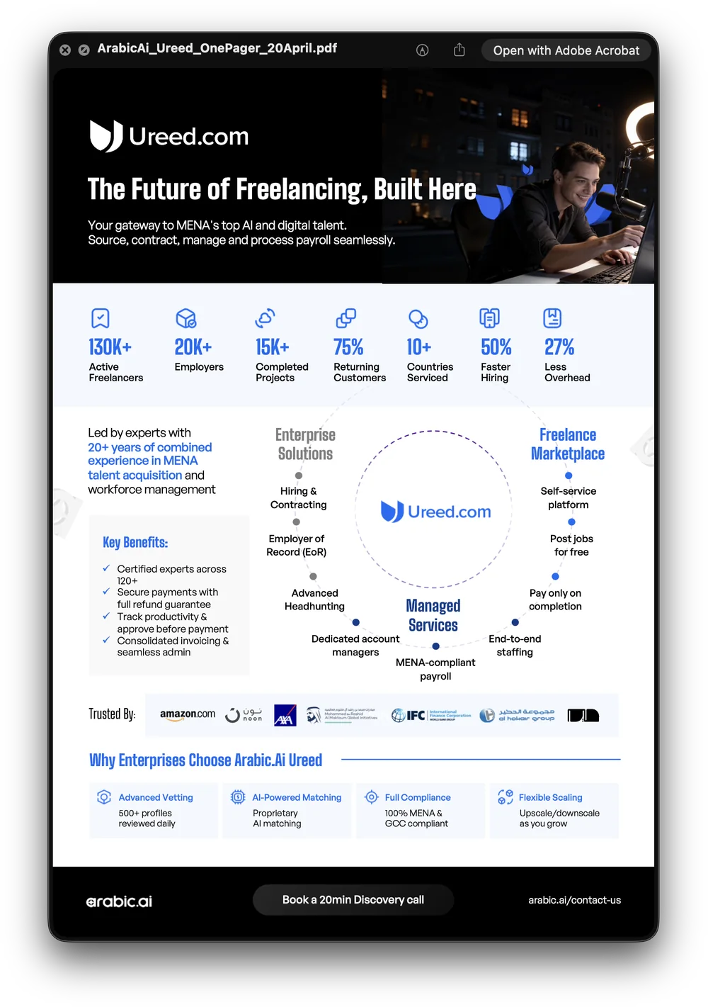
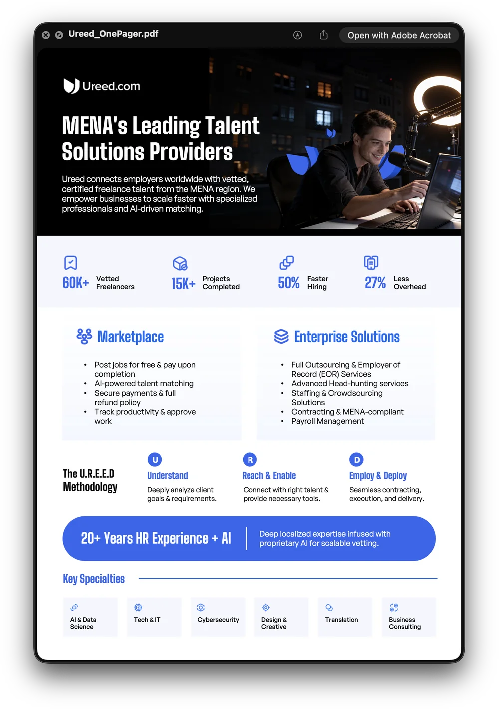
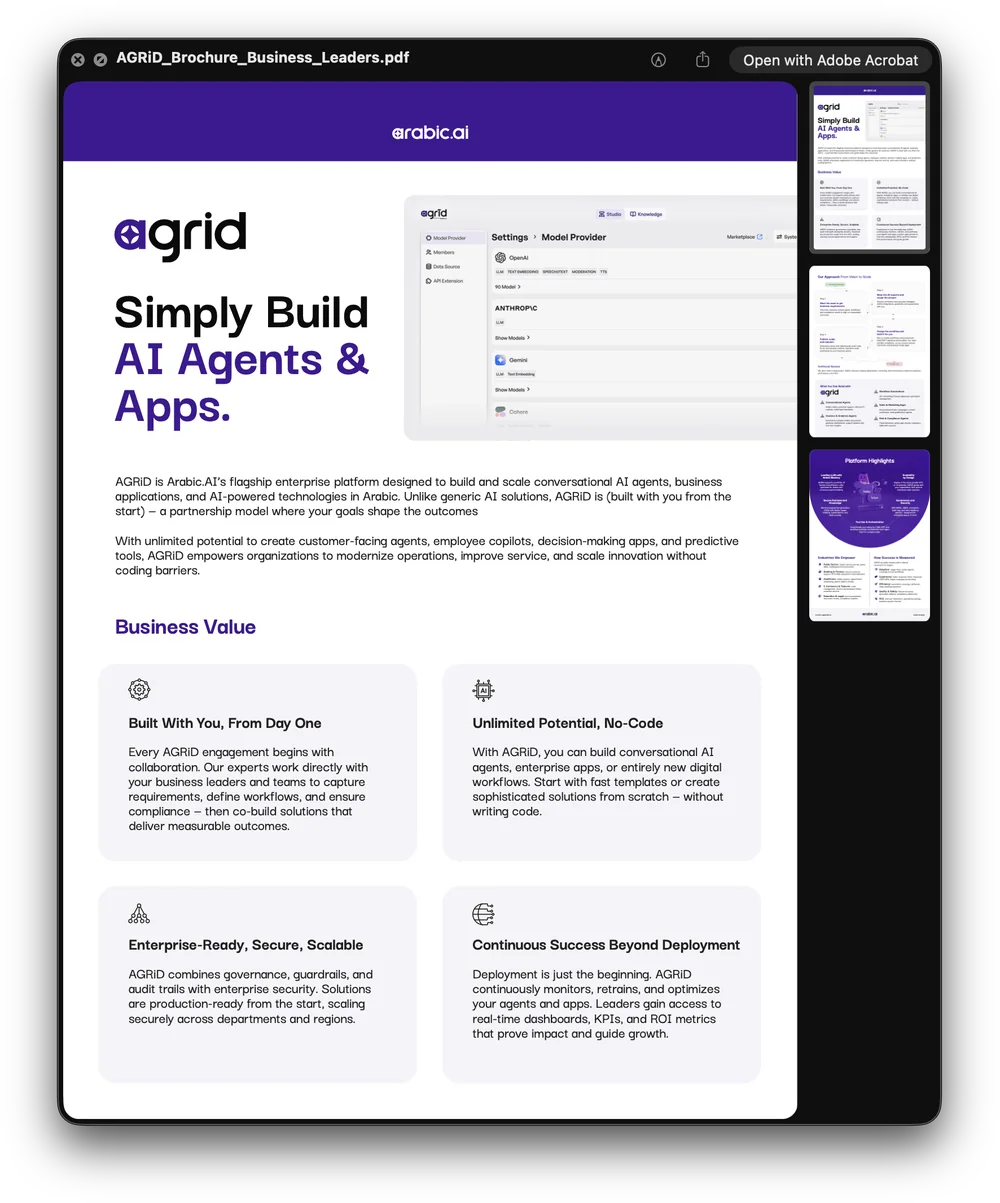
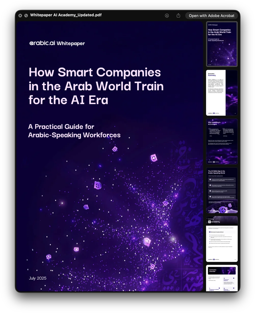
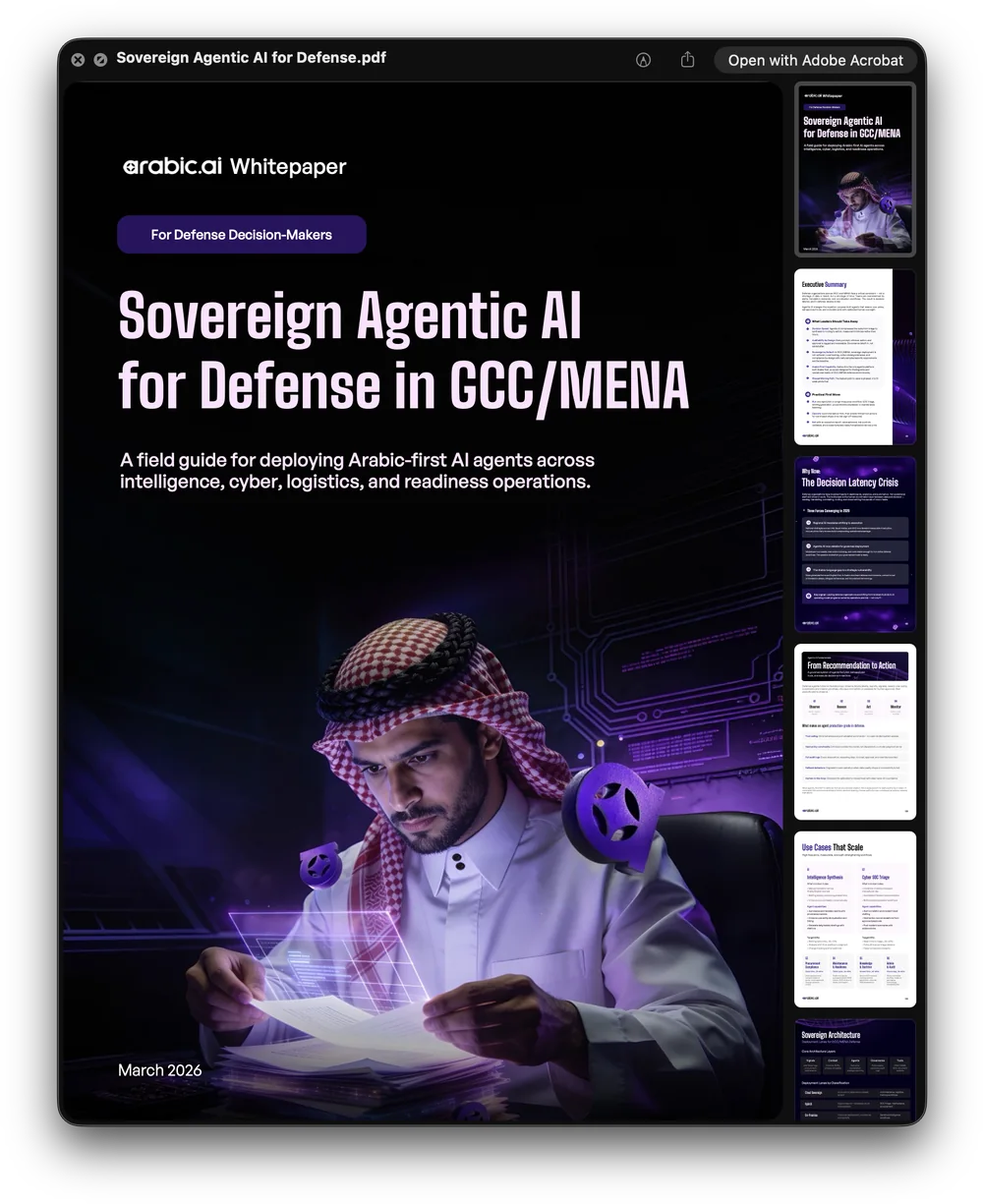
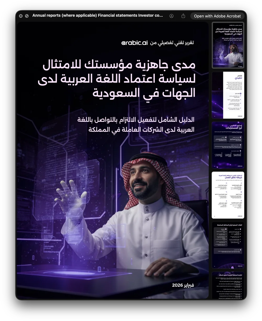
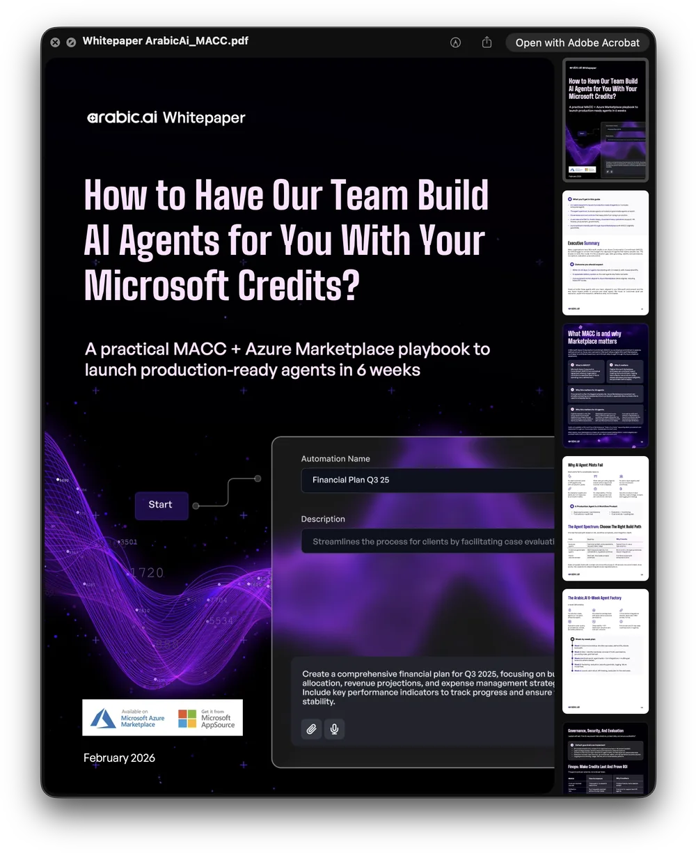
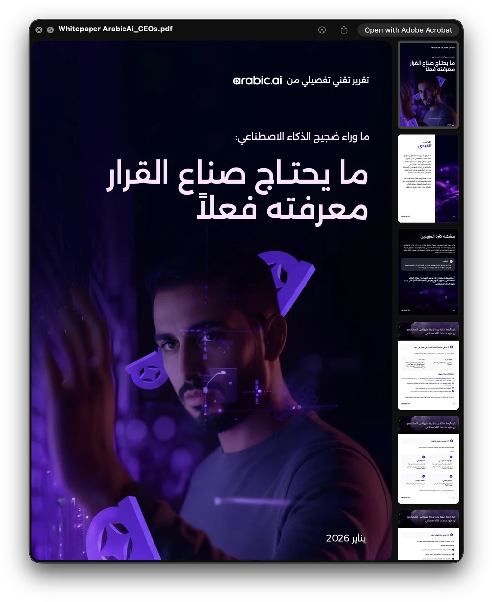
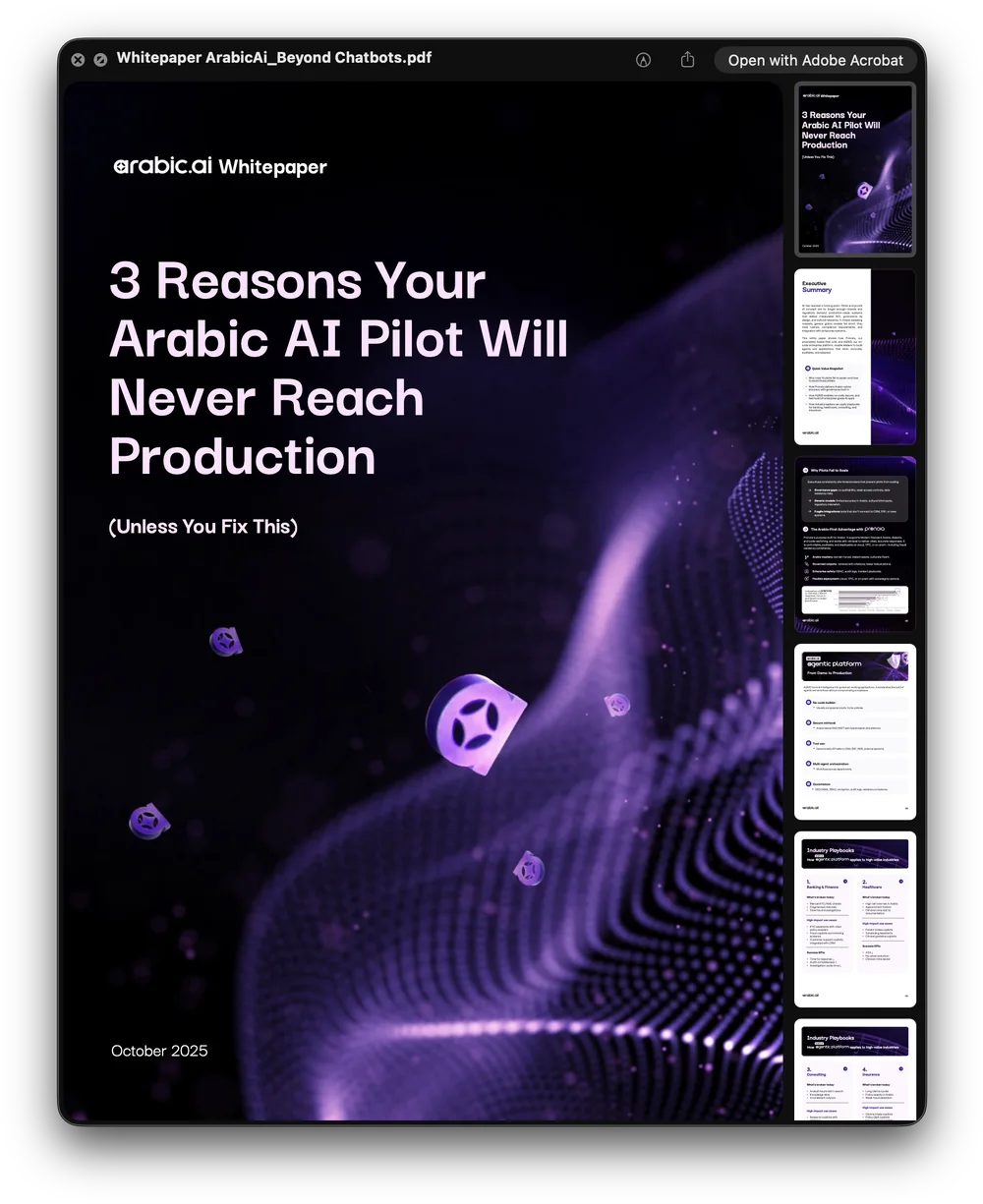
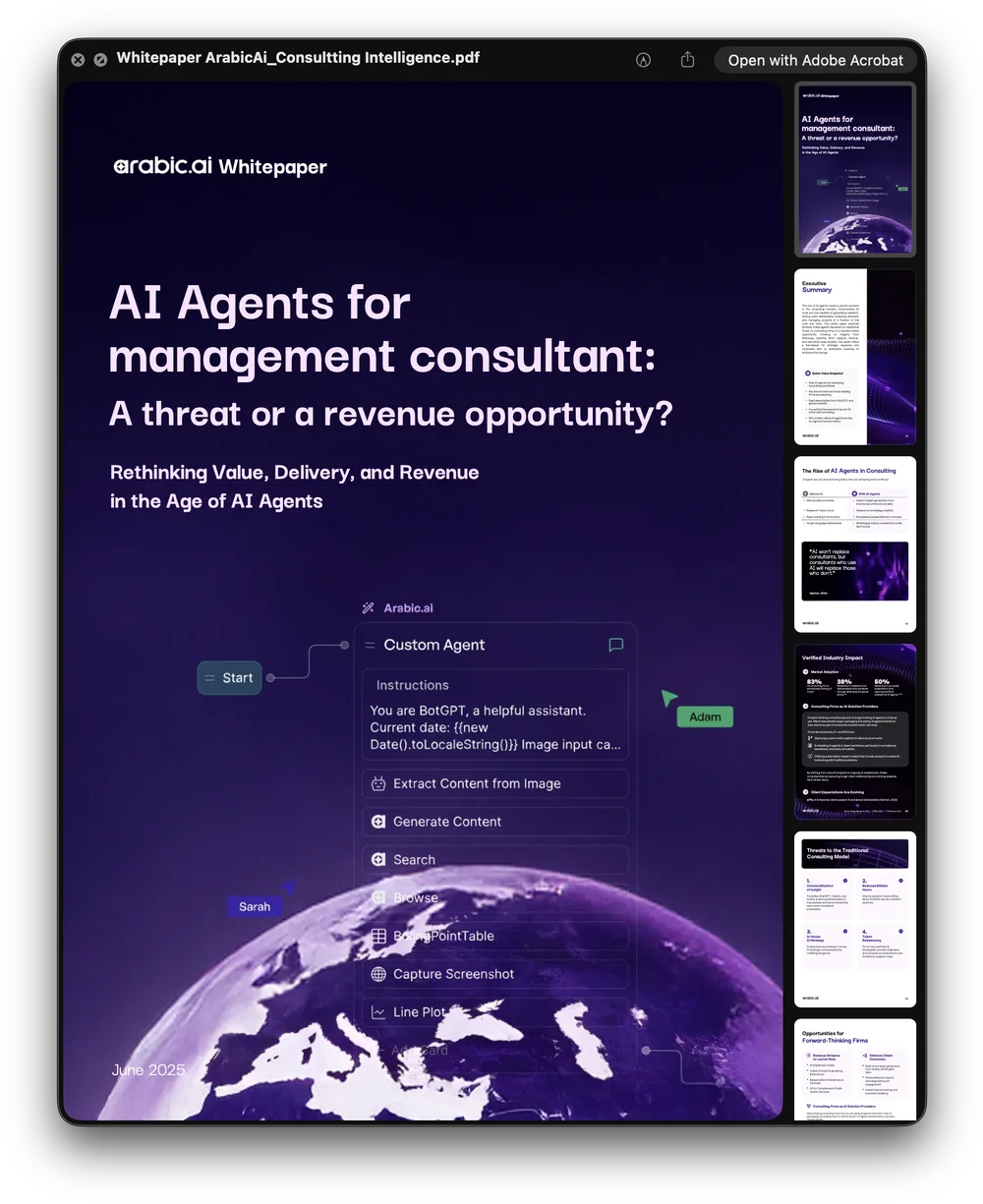
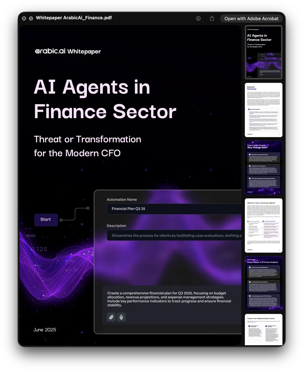
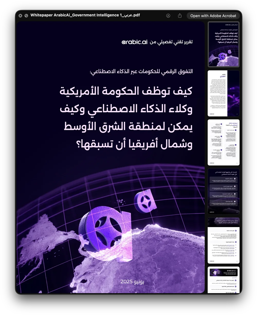
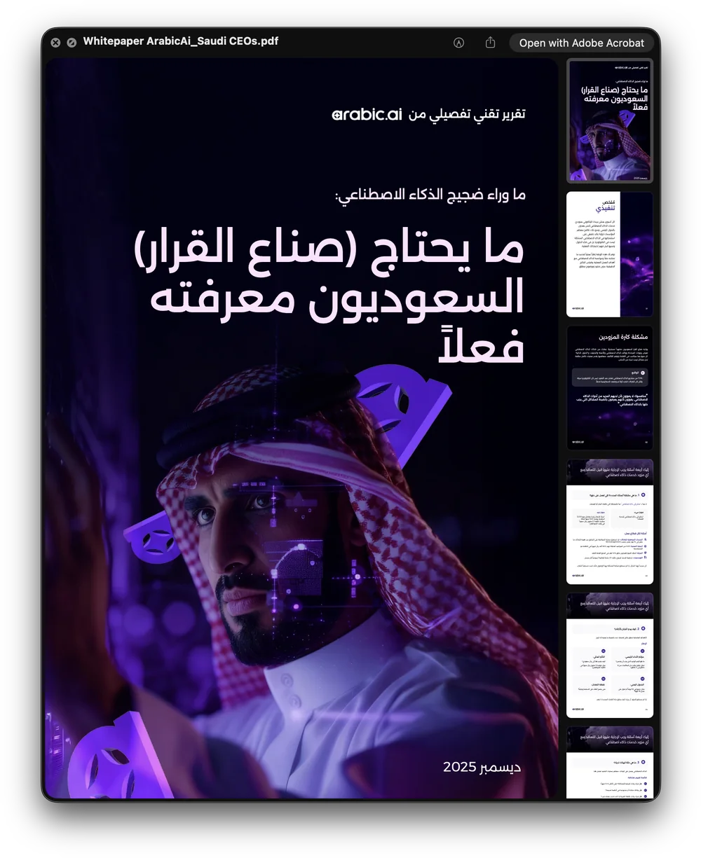
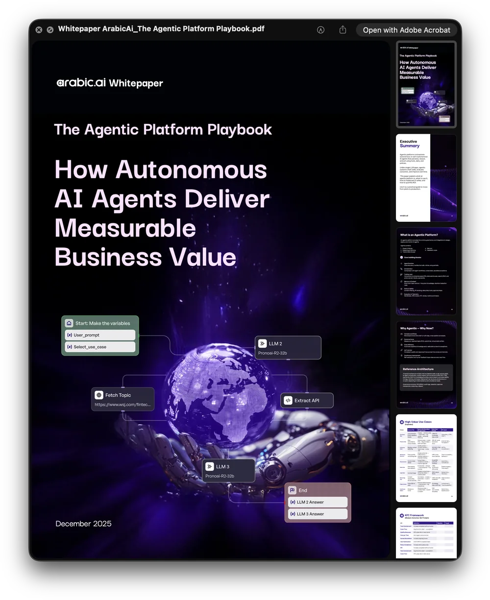
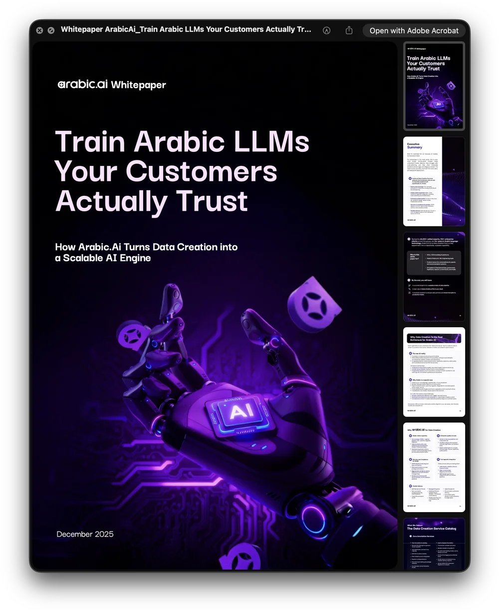
Then the long form, which is where this brand does its real selling: nineteen whitepapers, reports and one-pagers, each twenty to forty pages, each opening on a cover that has to be worth a download. Defence, finance, management consulting, education, government, Saudi CEOs — one house, one grid, and a cover image chosen per audience rather than per designer.
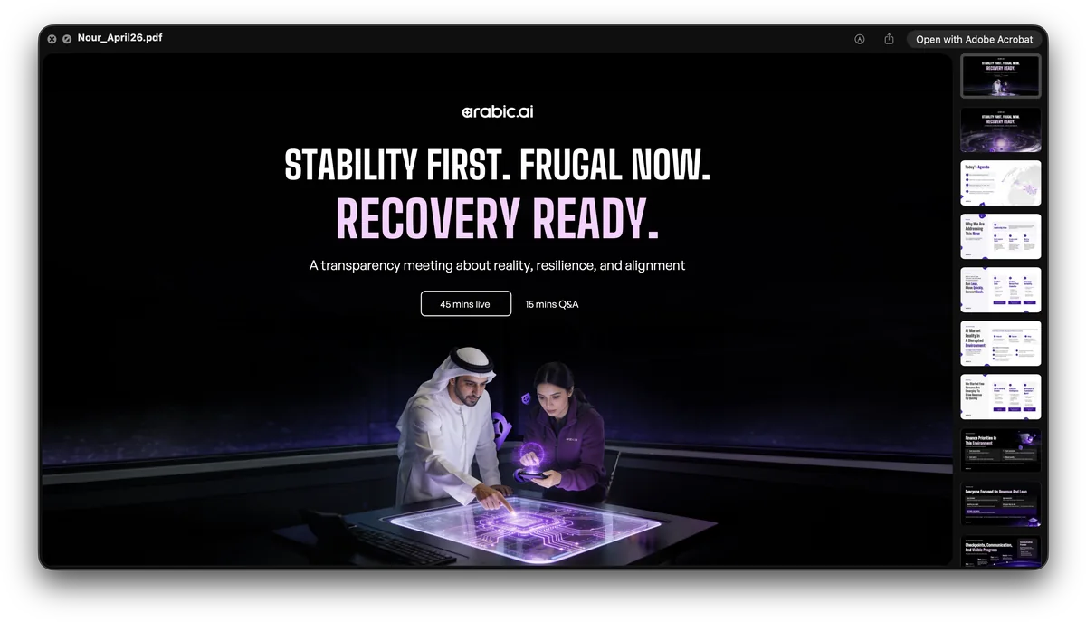
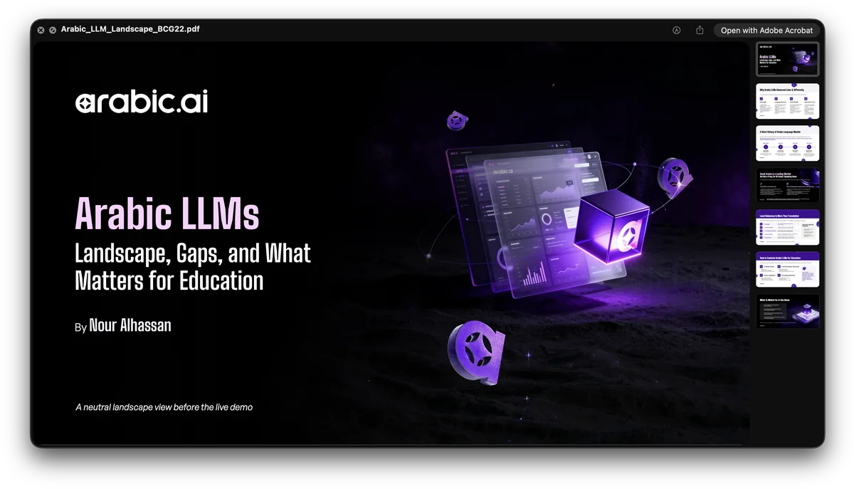
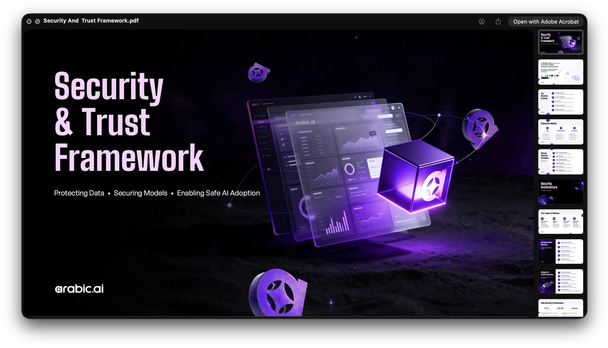
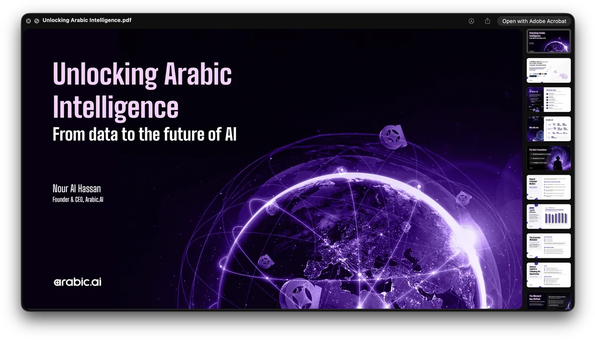
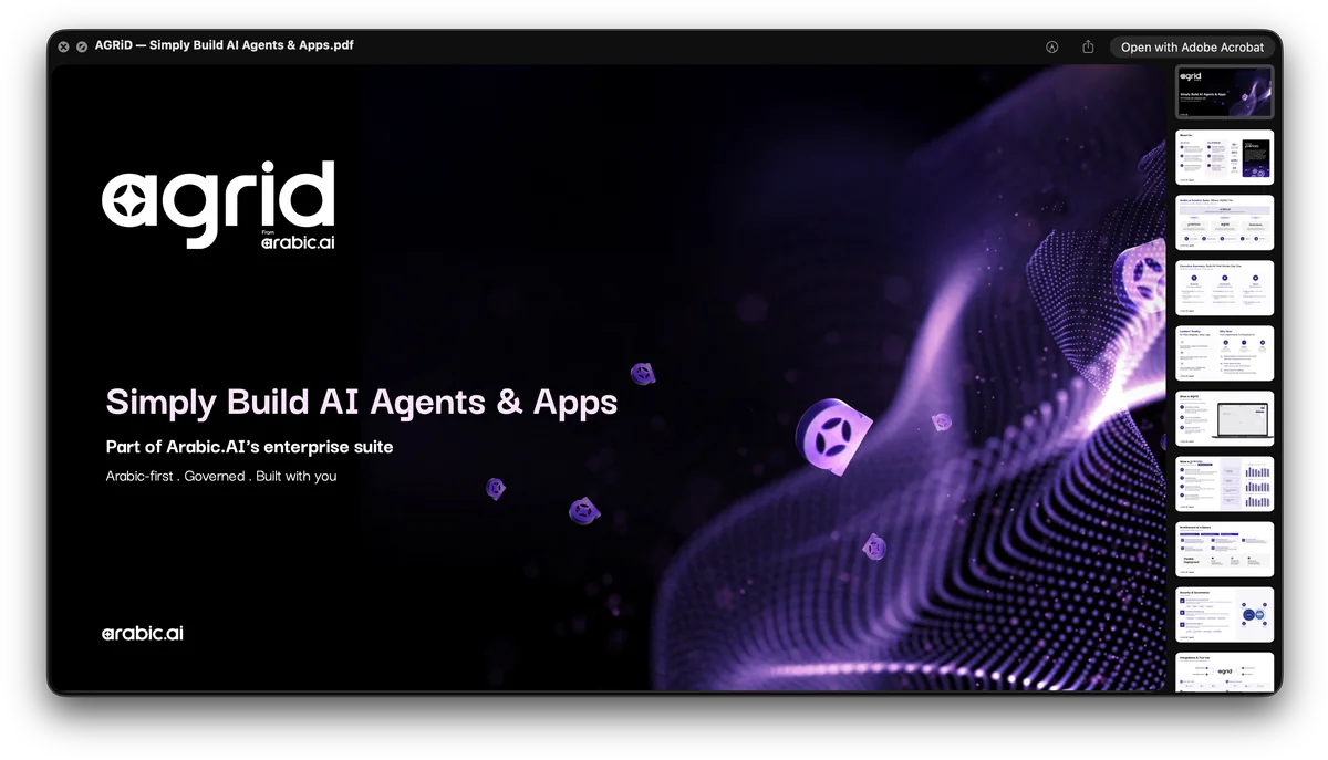
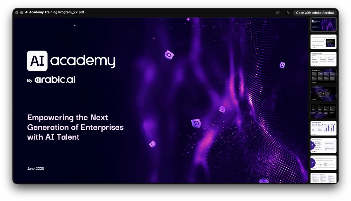
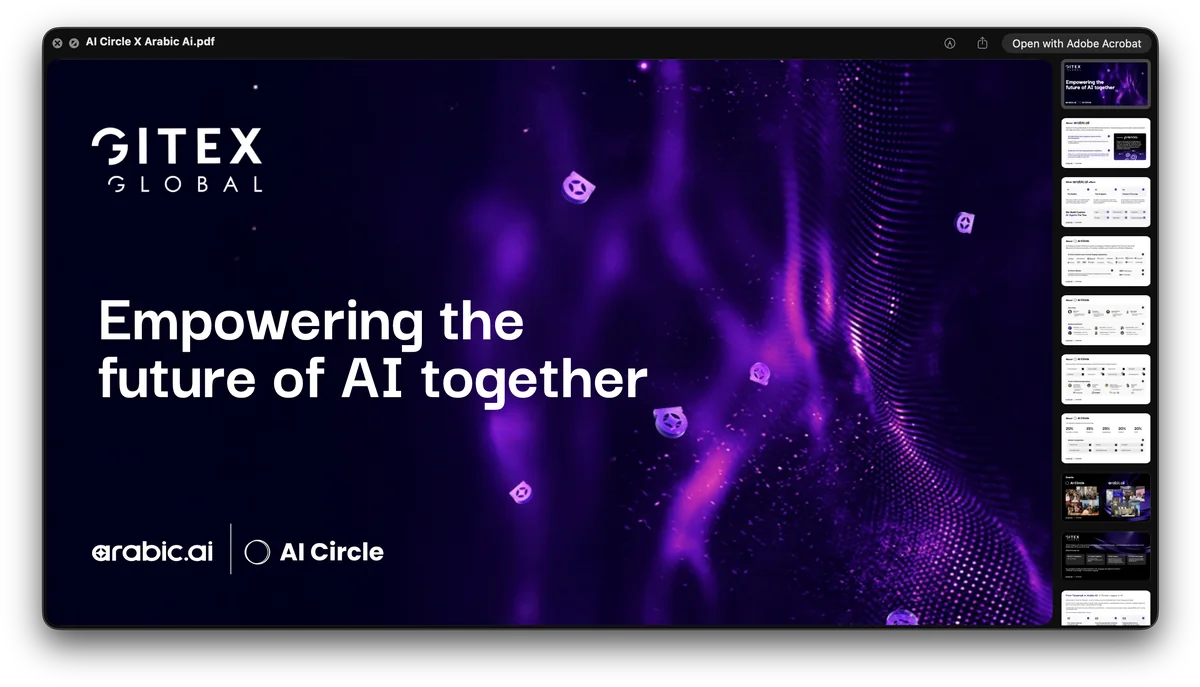
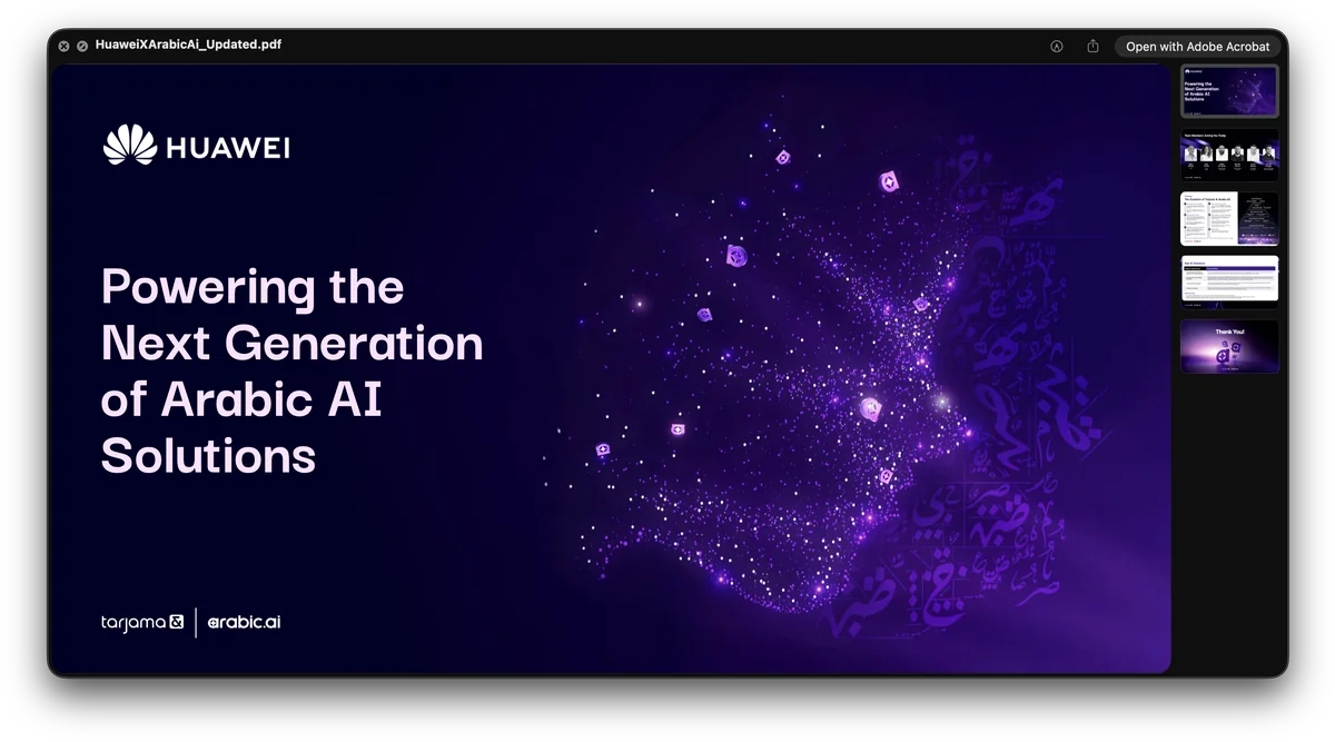
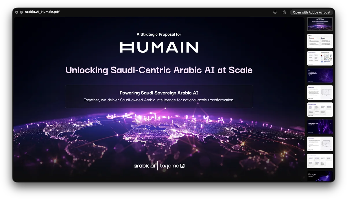
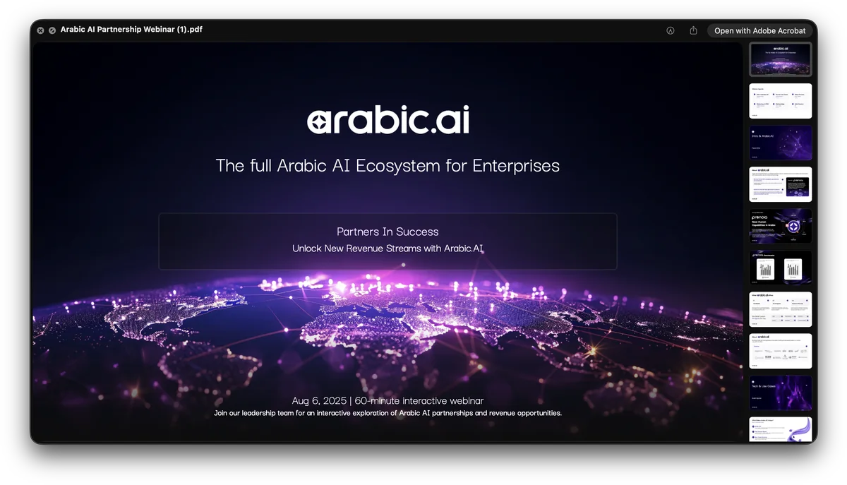
And the landscape half of the same programme: the decks and the proposals, including the ones with someone else’s logo at the top. Huawei, HUMAIN, GITEX, AI Circle — a partner deck is the hardest format in a brand system, because the kit has to stay recognisable while standing down to a bigger name on the same page.
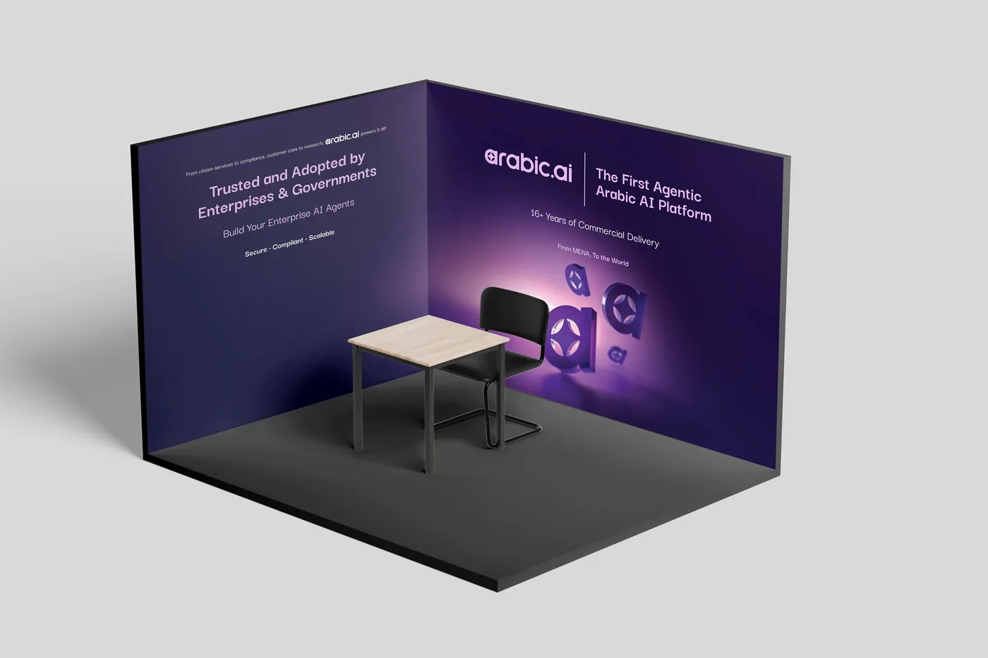
GITEX, where the brand stops being a file. The stand is one dark room with two walls of copy and nothing on the floor — at a show where every neighbour is a lit screen, the quiet booth is the one you notice.
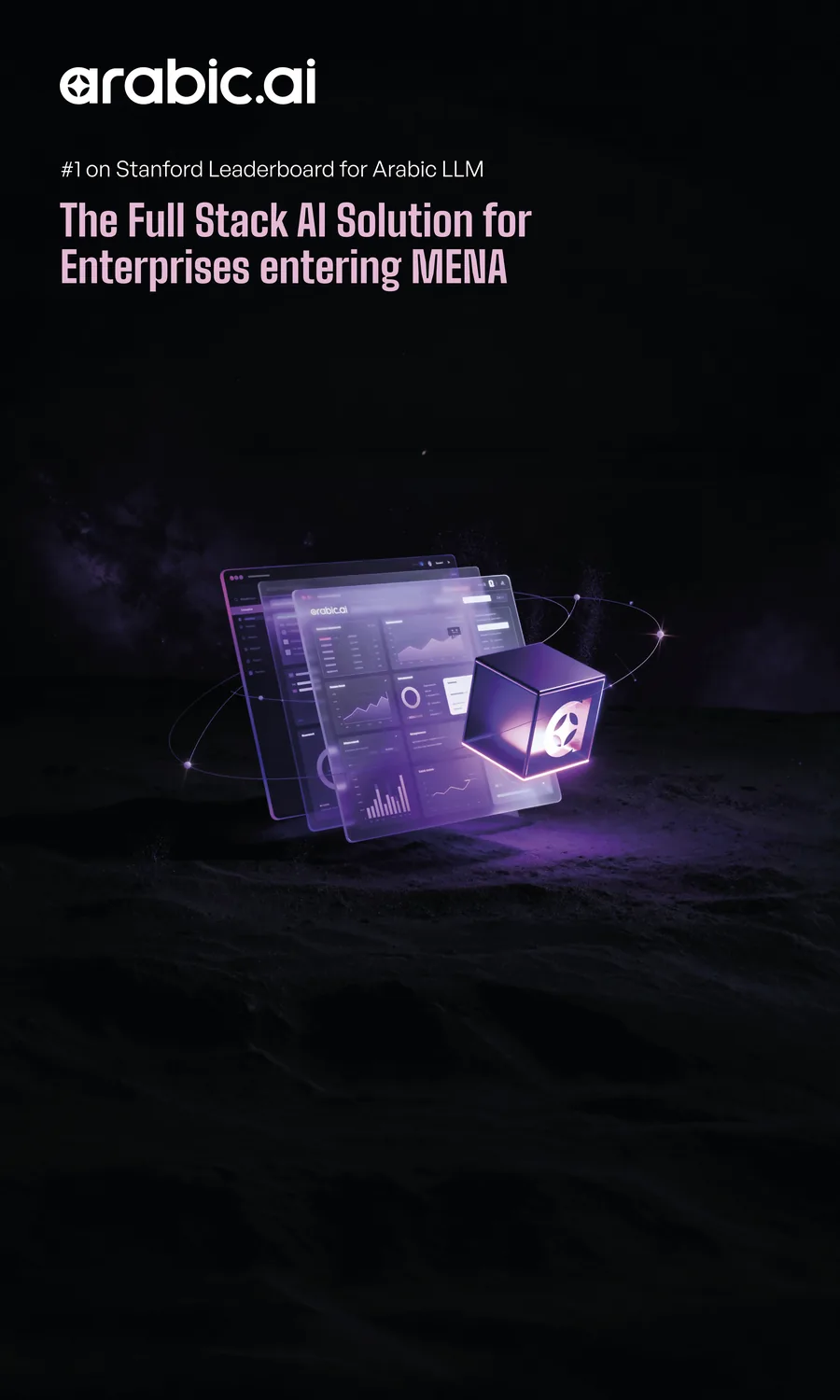
And the roll-up for NVIDIA GTC in Berlin, which is the whole proposition at two metres: the ranking, the claim and the product, in that order, legible from across an aisle.
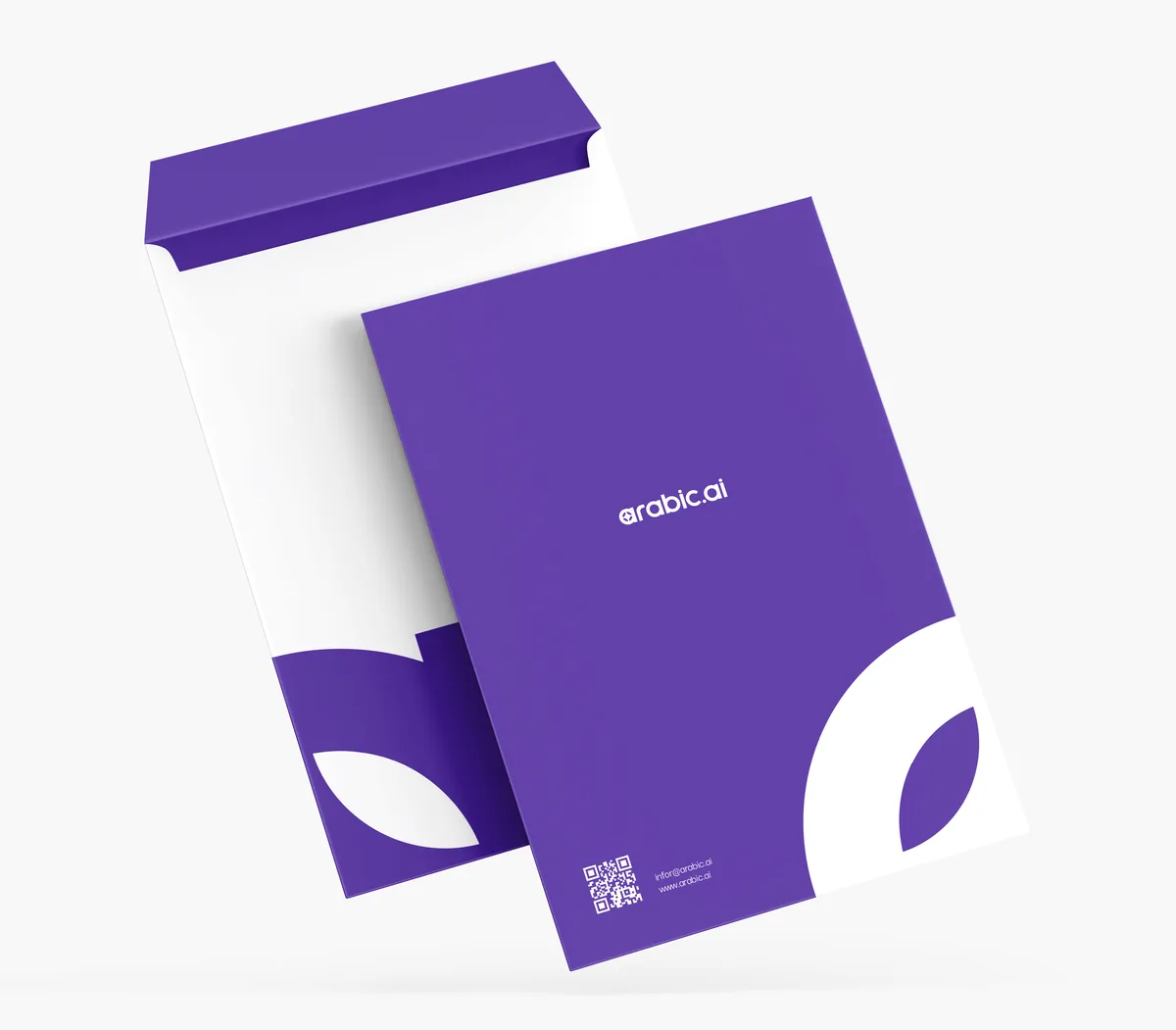
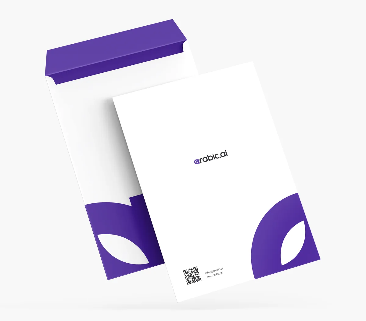
The stationery, where the mark has to work with no help at all. Two routes for the same envelope — the brand carried by the ground, or the brand carried by one shape in the corner. The second one is braver and the one worth printing.
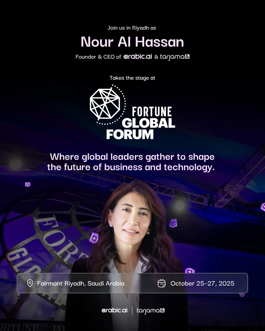
Nour Al Hassan at the Fortune Global Forum in Riyadh, under both marks — arabic.ai and tarjama — because the founder arrives as the group, not as one product.
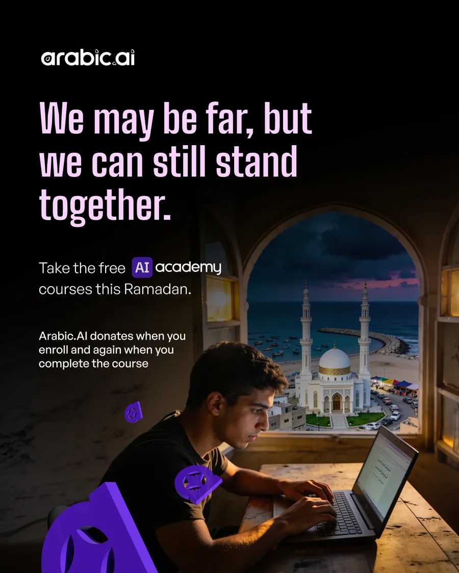
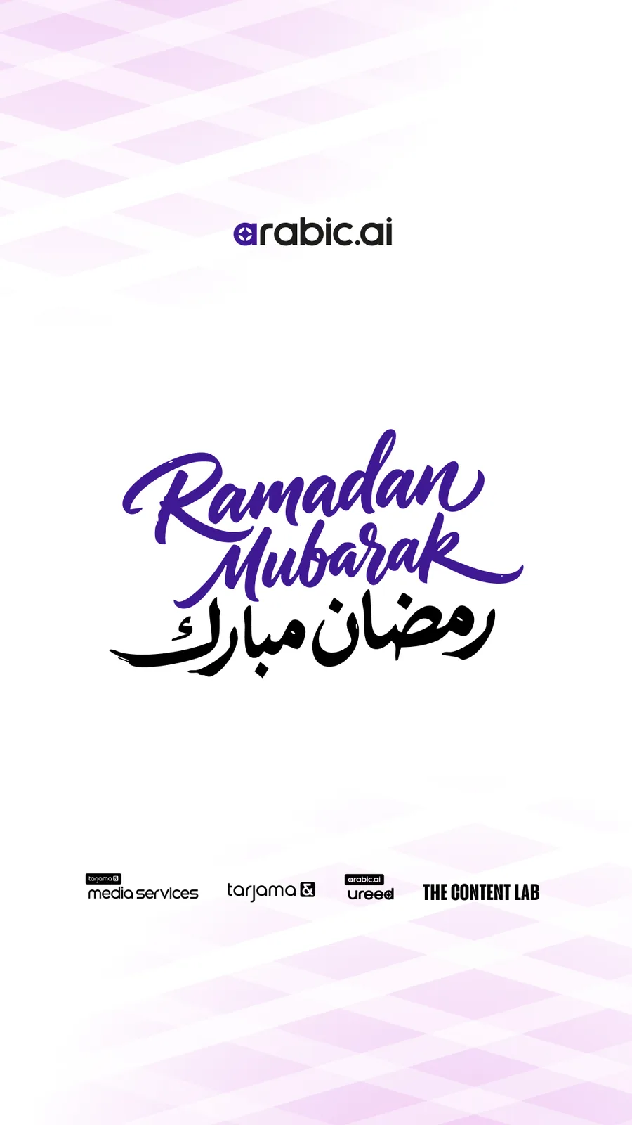
Ramadan, where the brand has to stop selling for a week. The post gives the AI Academy courses away and donates again when you finish one; the greeting beside it is lettered twice, once in each script, and sits under the whole family of marks.
Bilingual and hand-lettered rather than set.


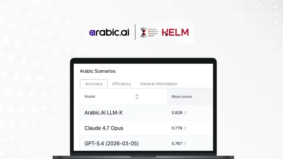
The editorial headers, where the type has to carry a page with no artwork under it. Two crops of the same article, and the HELM write-up with the leaderboard itself in the frame — the one screenshot in the whole system that is the argument rather than a picture of it.