


















Brand systems, every channel · United Kingdom, 2022–2025
Meddbase
Meddbase is the UK's top online EHR solution, offering healthcare professionals a secure, device-accessible practice management and patient record system.
The work ran across every channel the brand appears in — social, the exhibition floor, and the whole document and presentation library — so one system had to hold from a phone screen to a three-metre stand.

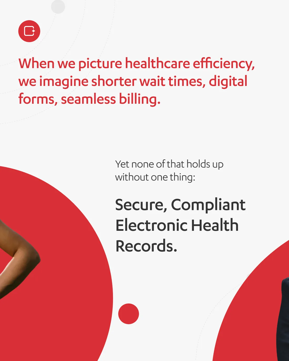
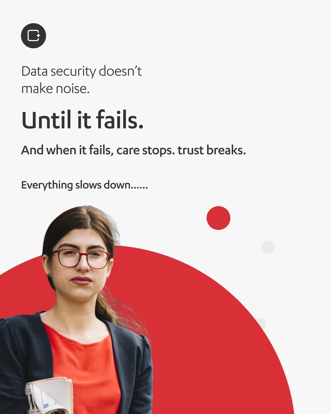
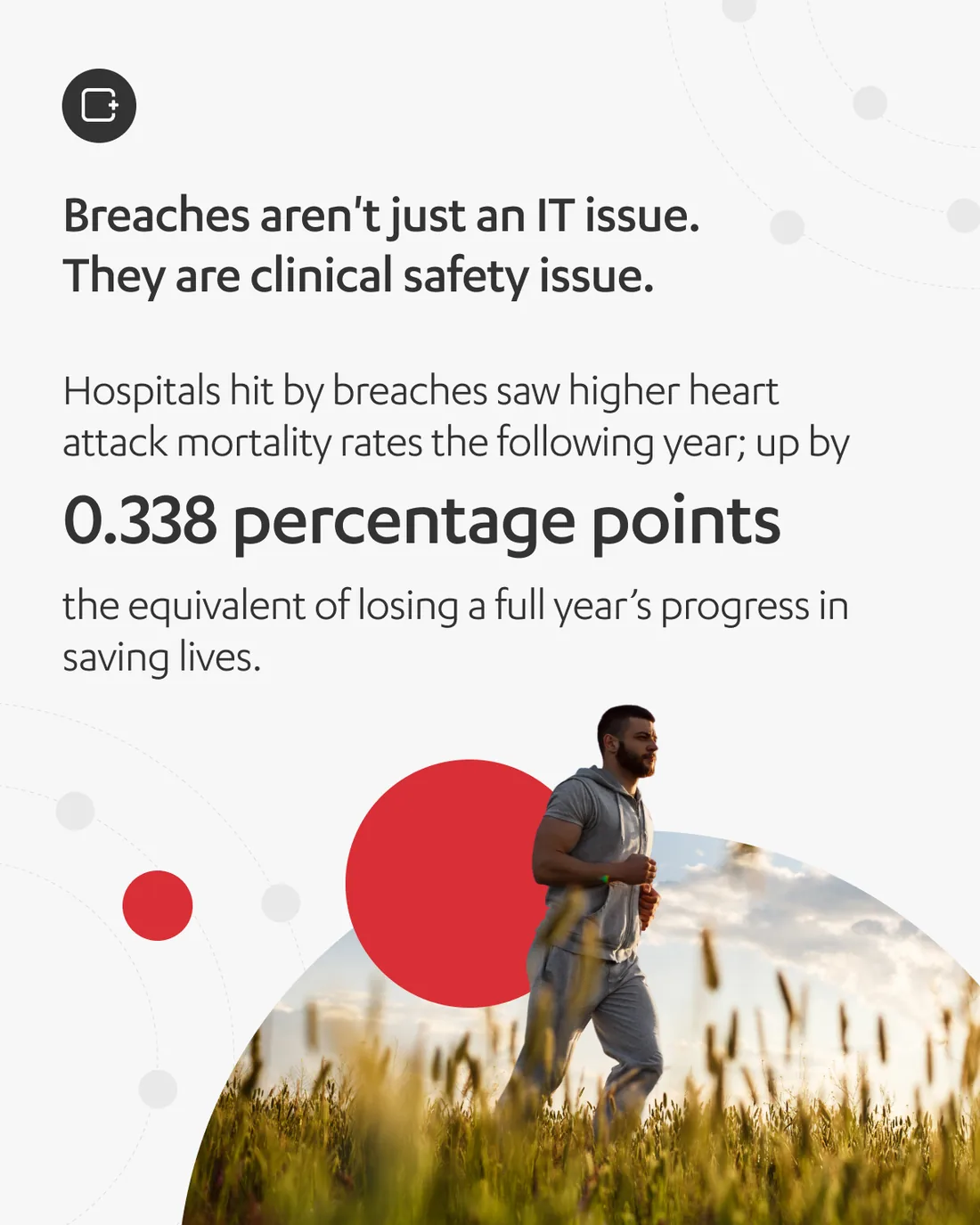
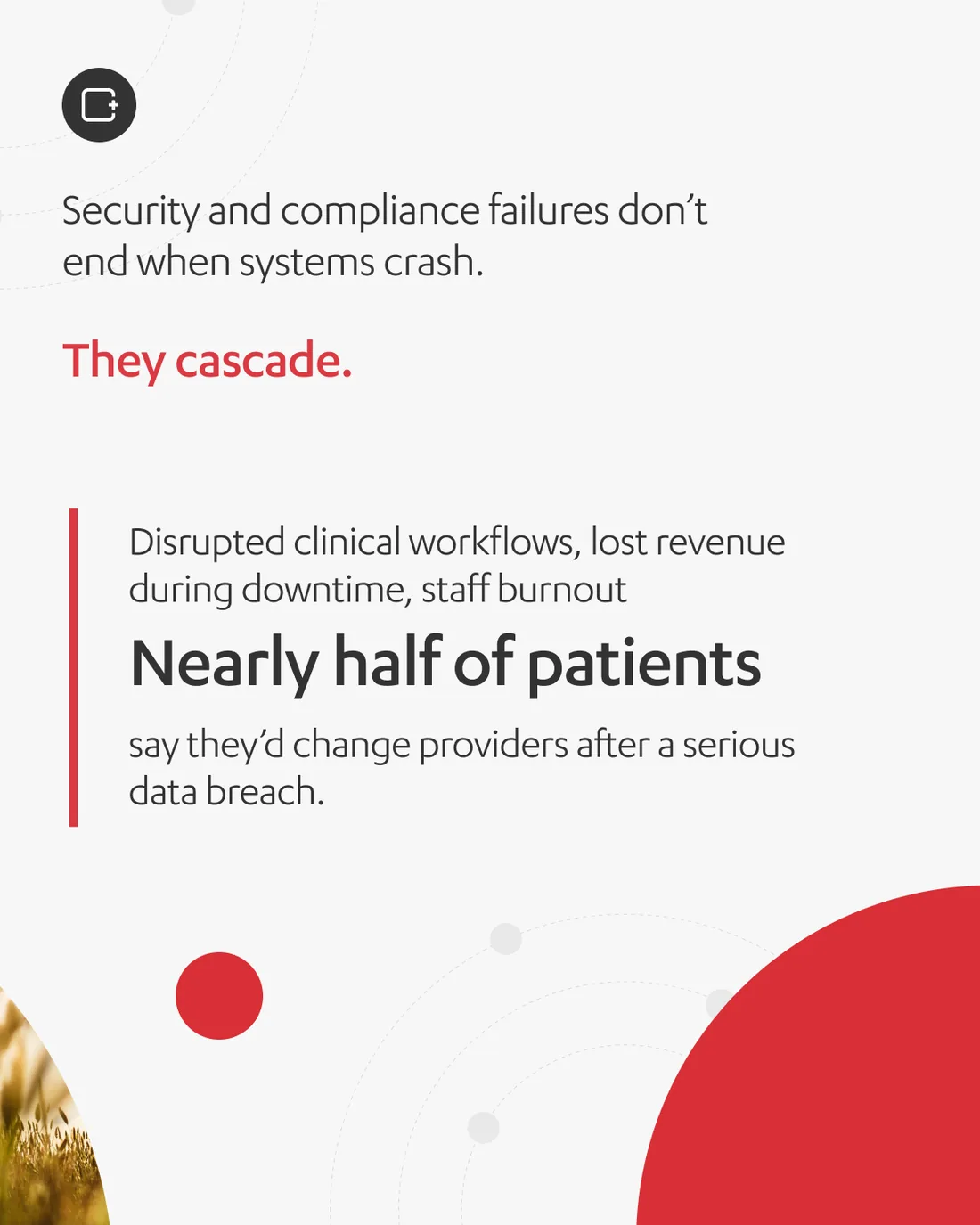
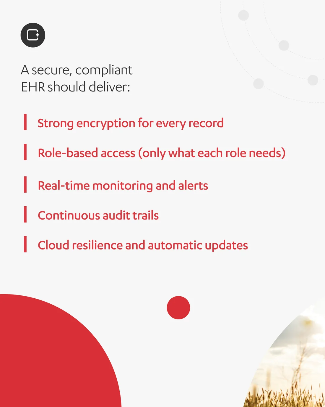
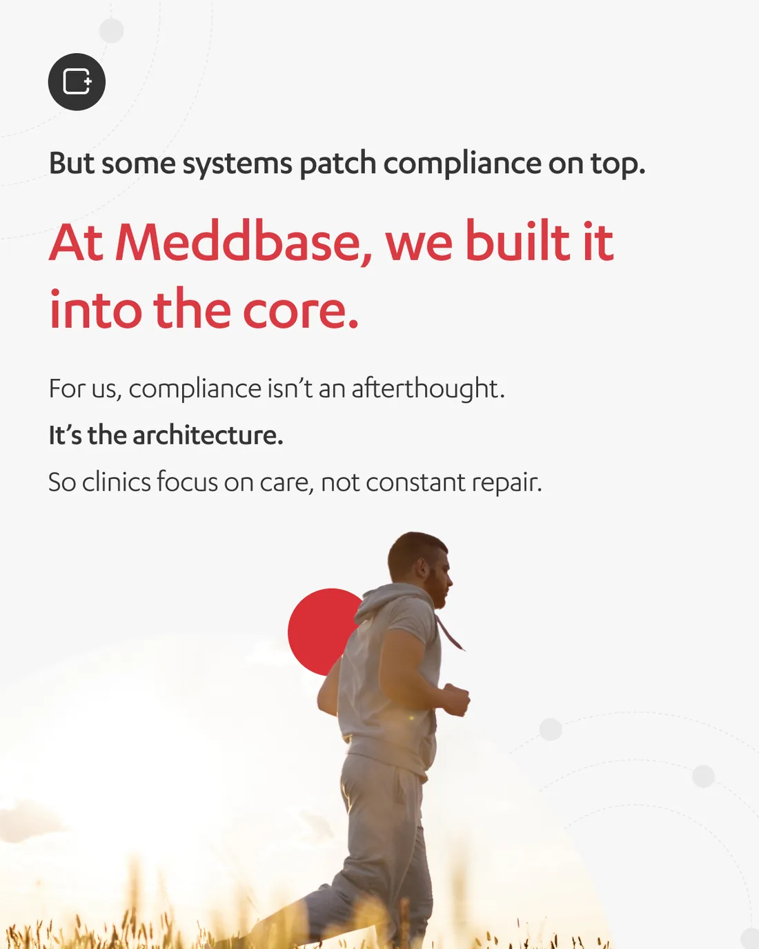
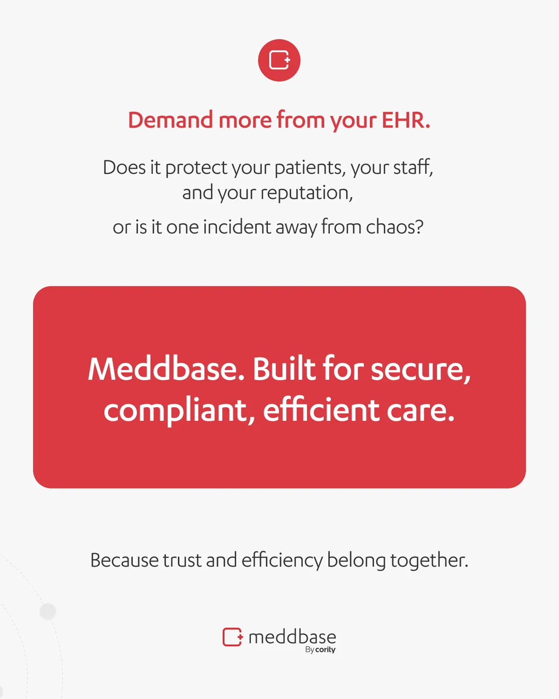
The most recent of it, and the sharpest: an eight-slide argument that data security is a clinical safety issue, not an IT one — built on the finding that hospitals hit by a breach see heart-attack mortality rise the following year.
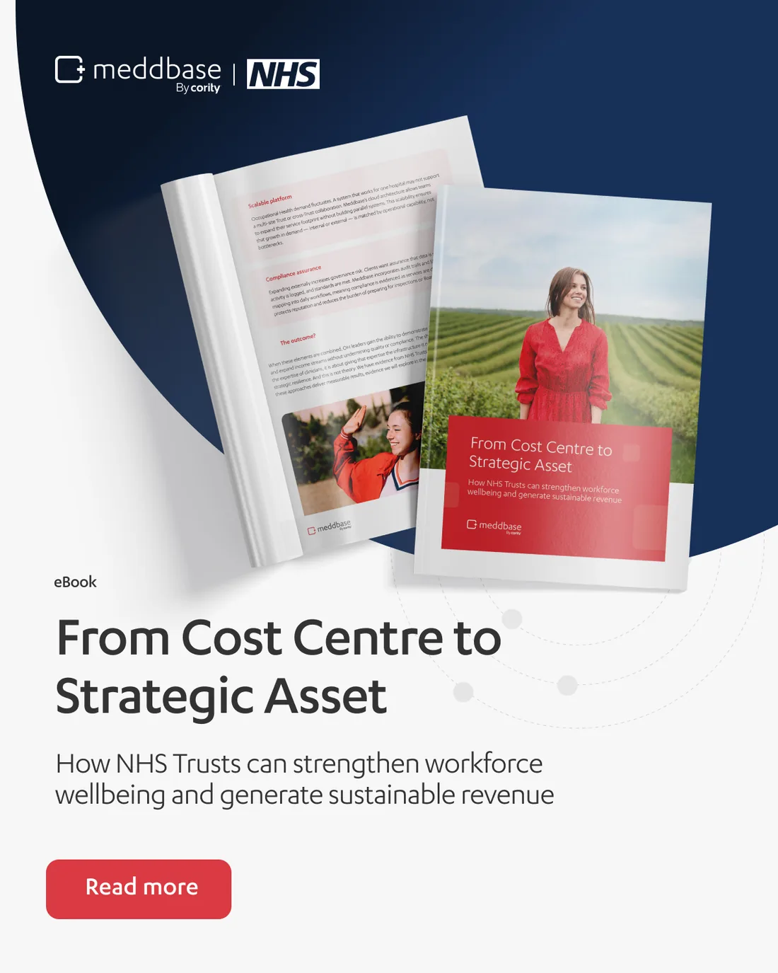


Around it the single posts, in the same system under the Cority signature: the NHS eBook, promoted on its own cover.
The year, counted.
And the one post a year that is allowed to be made of nothing but boxes.

And the channel itself, dressed: the header the whole feed sits under.

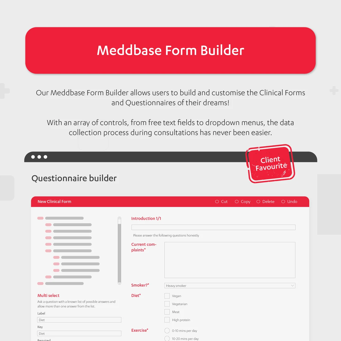
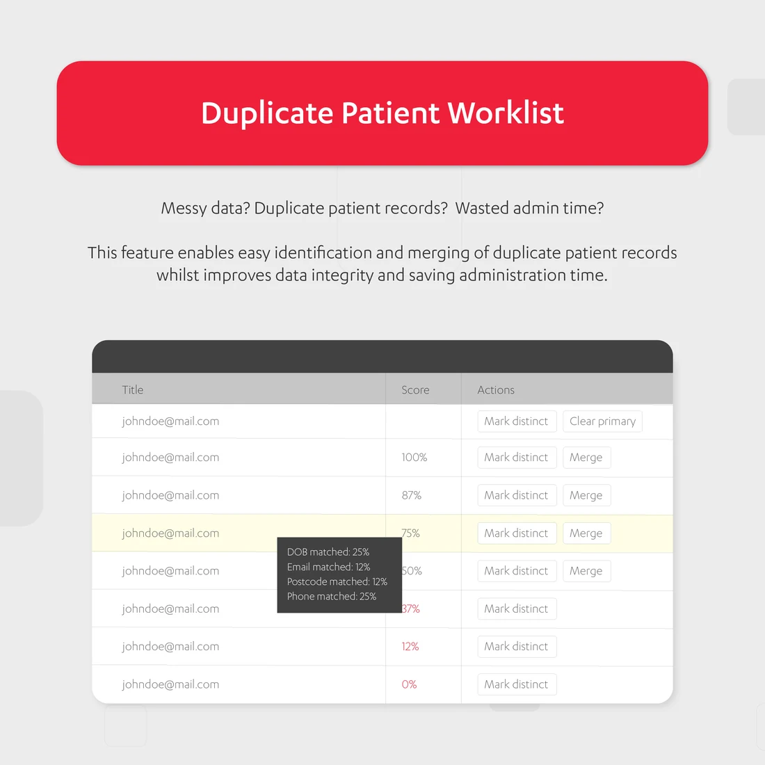
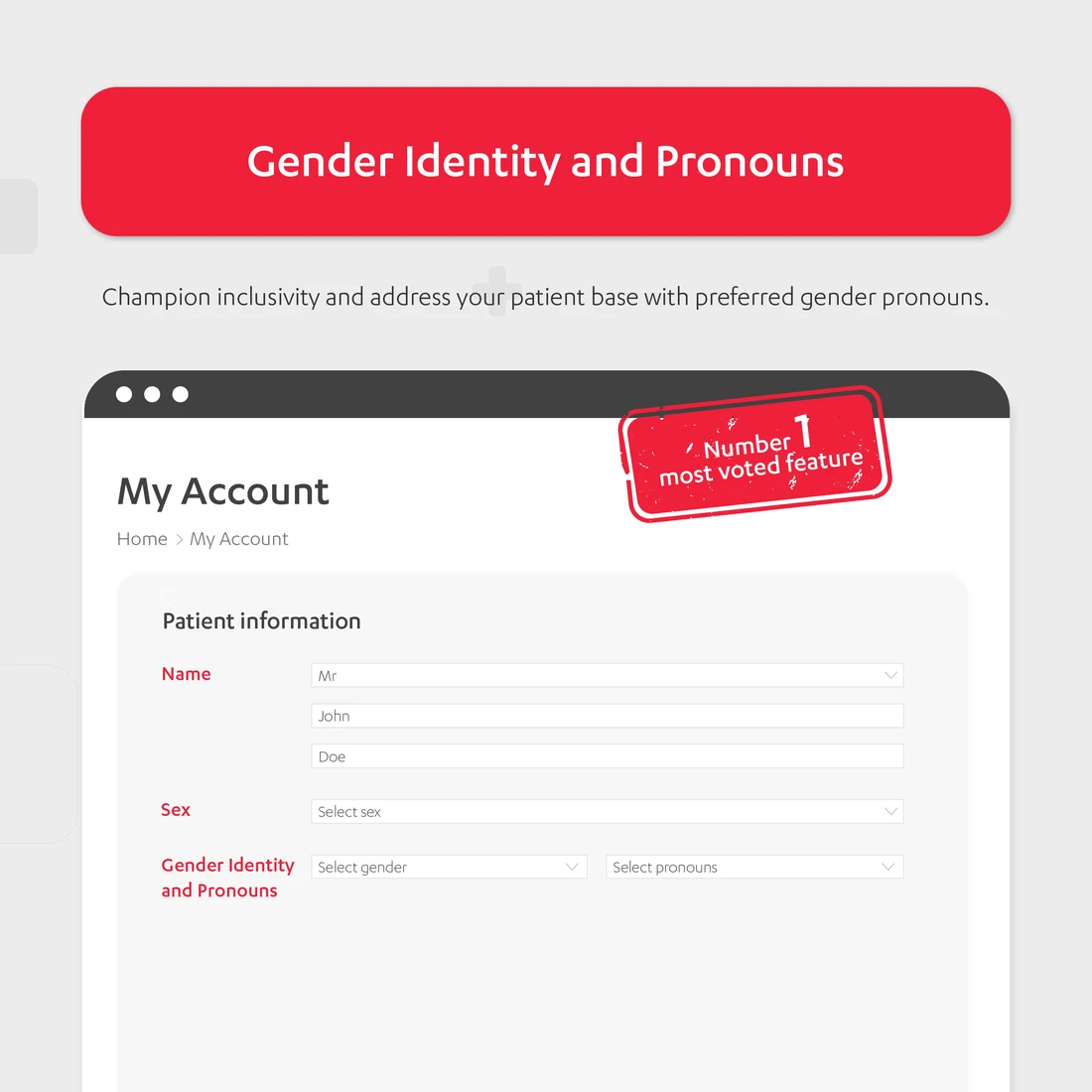
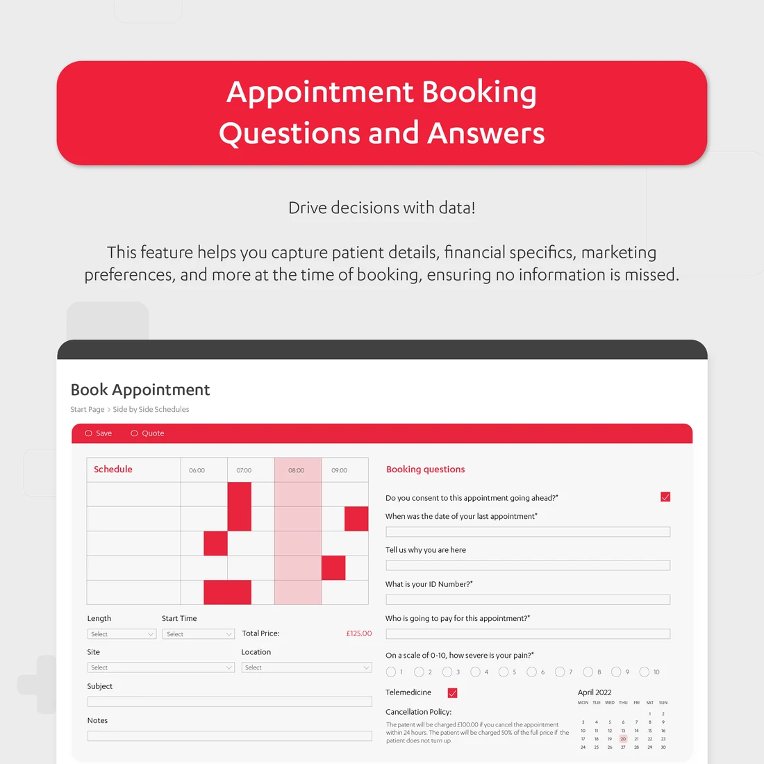
Social had to stay solid, engaging and visually spectacular week after week, not once. The feature carousels do the explaining: one idea a slide, the product itself as the evidence.

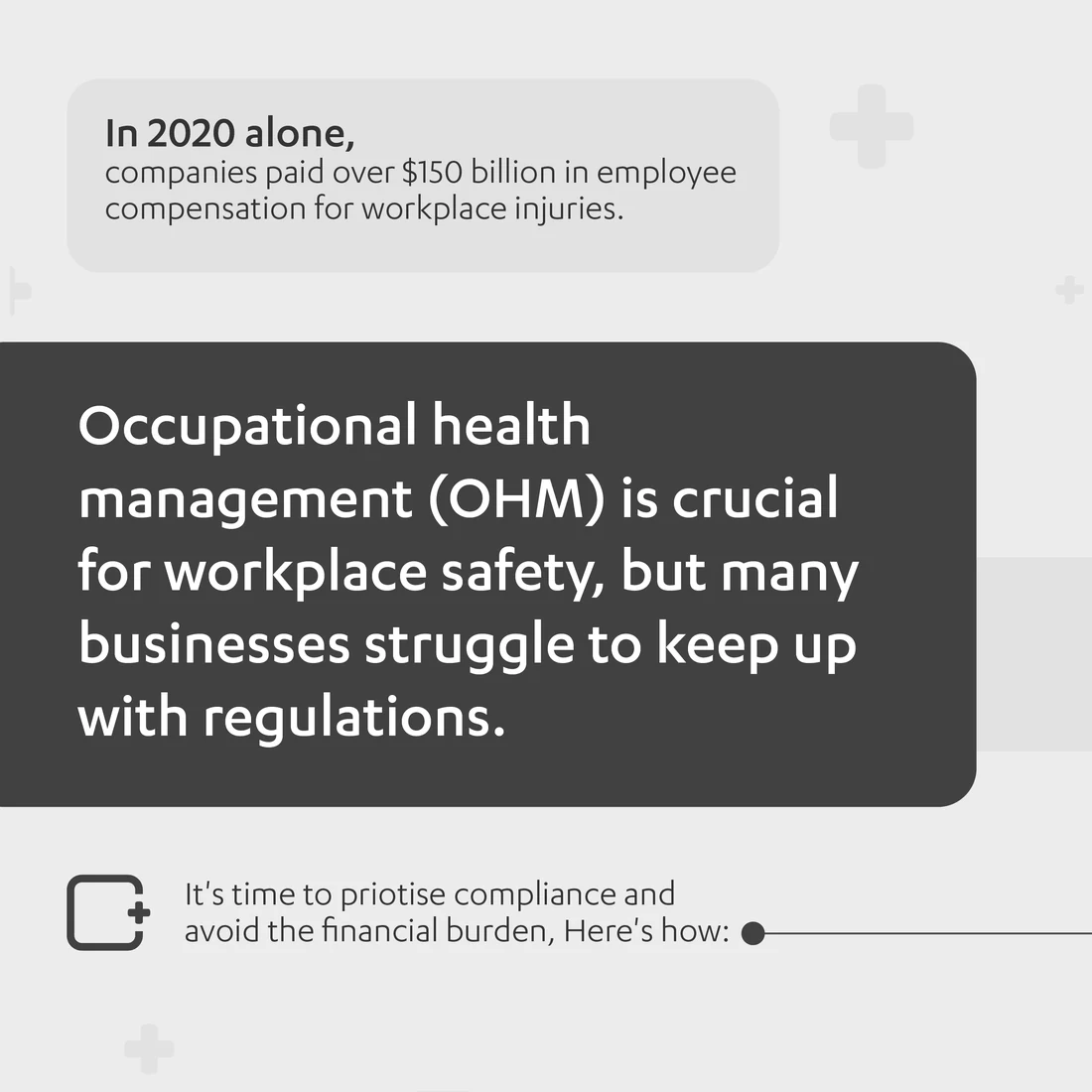
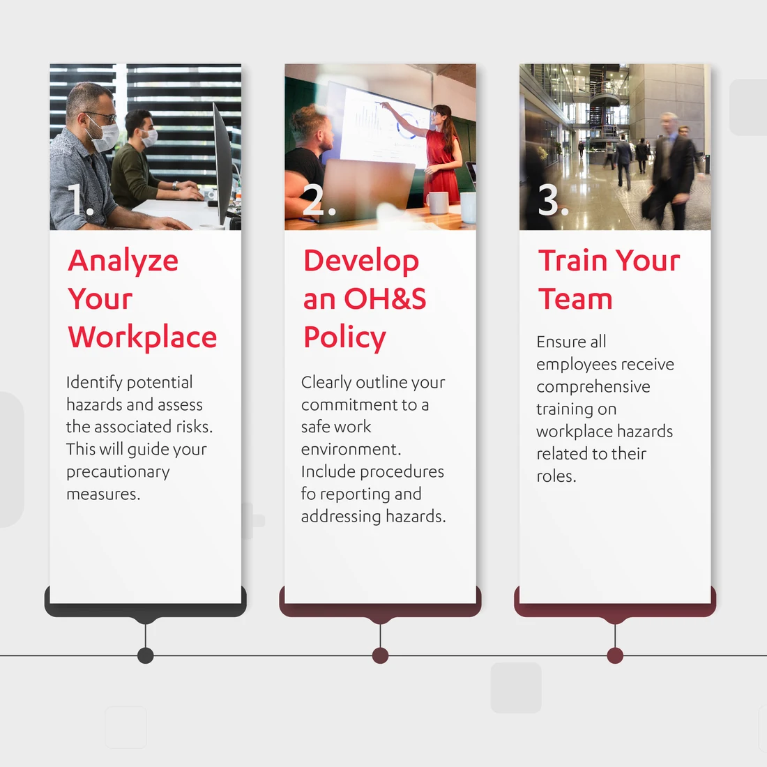
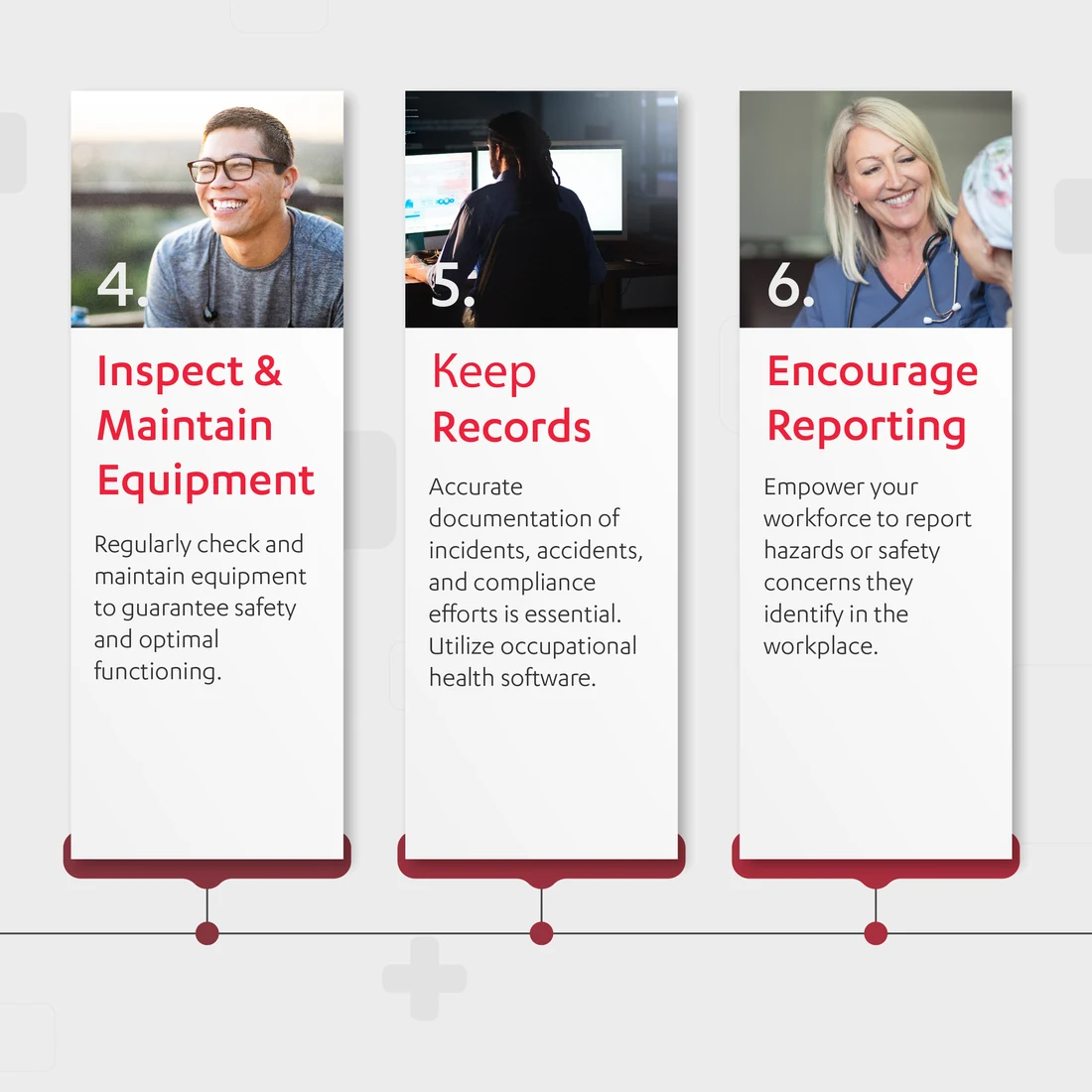
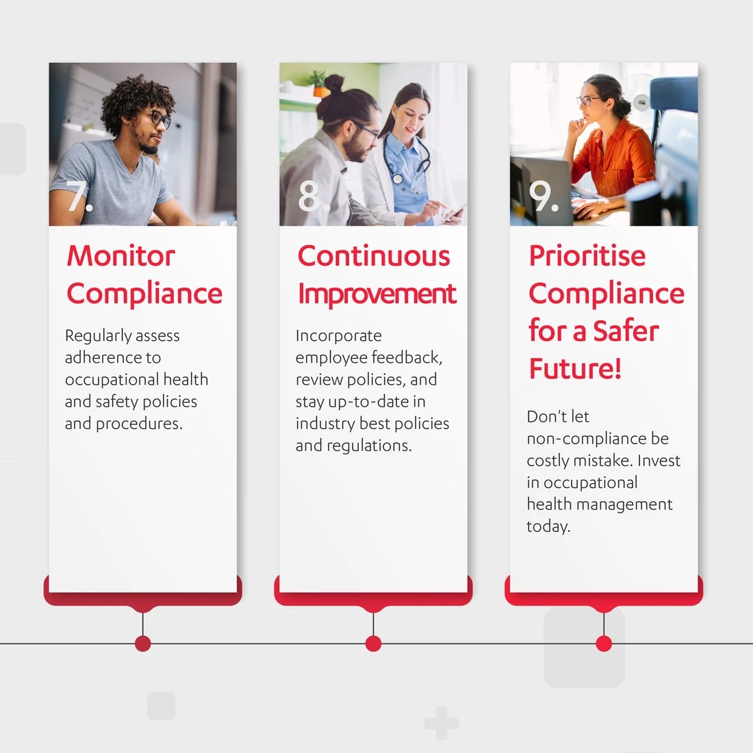

Occupational health is a category most people have to be taught before they can be sold to. Six slides to take a reader from the problem to the platform.

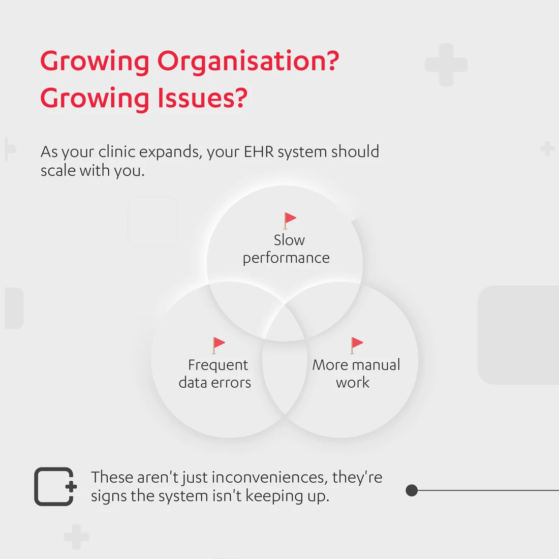
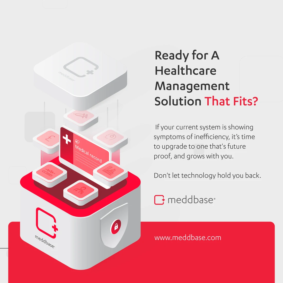
And the one that names the reader's problem out loud: you have outgrown your system. A carousel that argues rather than announces.
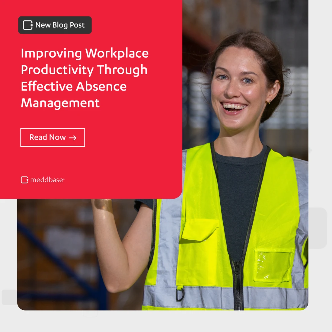
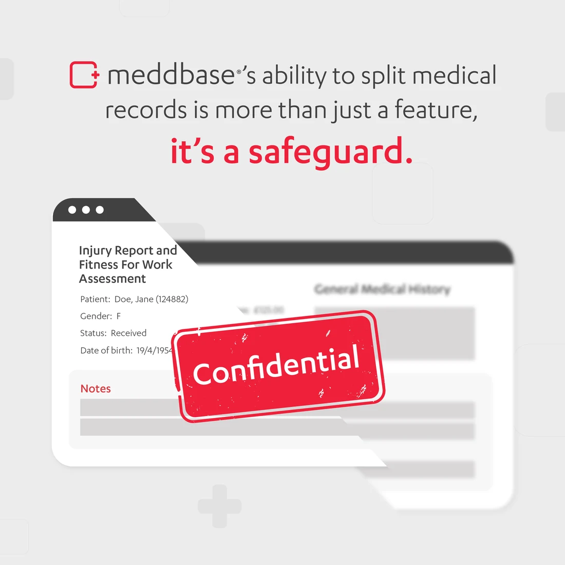
Around the campaigns, the everyday feed. A blog trail on absence management, with the reader’s own workplace in the picture.
And one that argues a feature is really a safeguard — the split medical record, shown as the thing it protects.
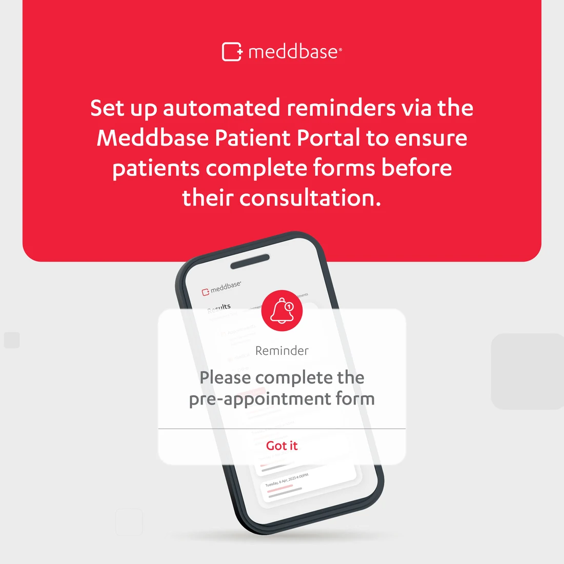

The product explainer keeps the same structure: one claim, then the screen that proves it.
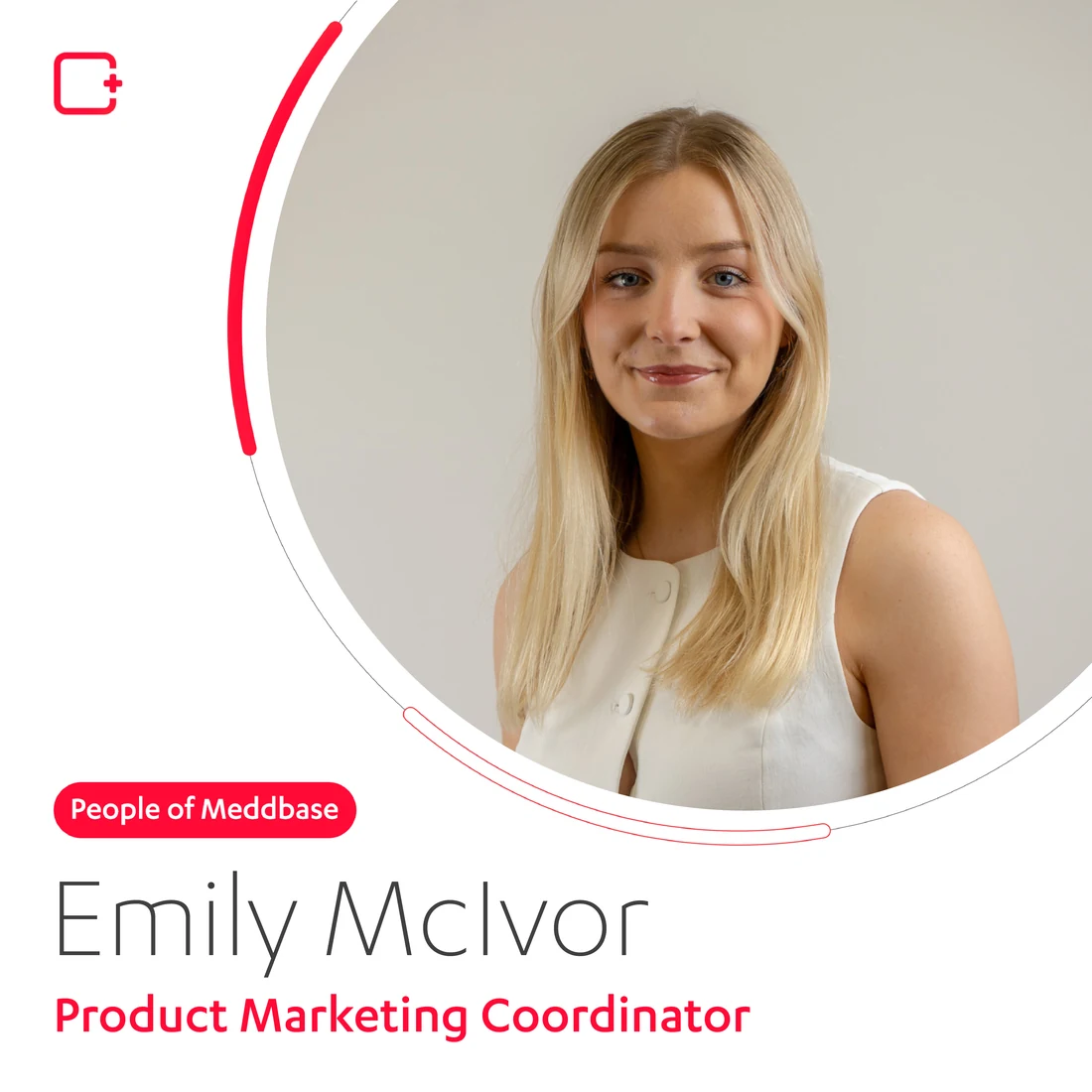
People of Meddbase turns the system on the company itself — same red, same arc, a colleague in the frame.
Once a year the brand is allowed to have a drink: the Christmas invitation, in the house red and nothing else.
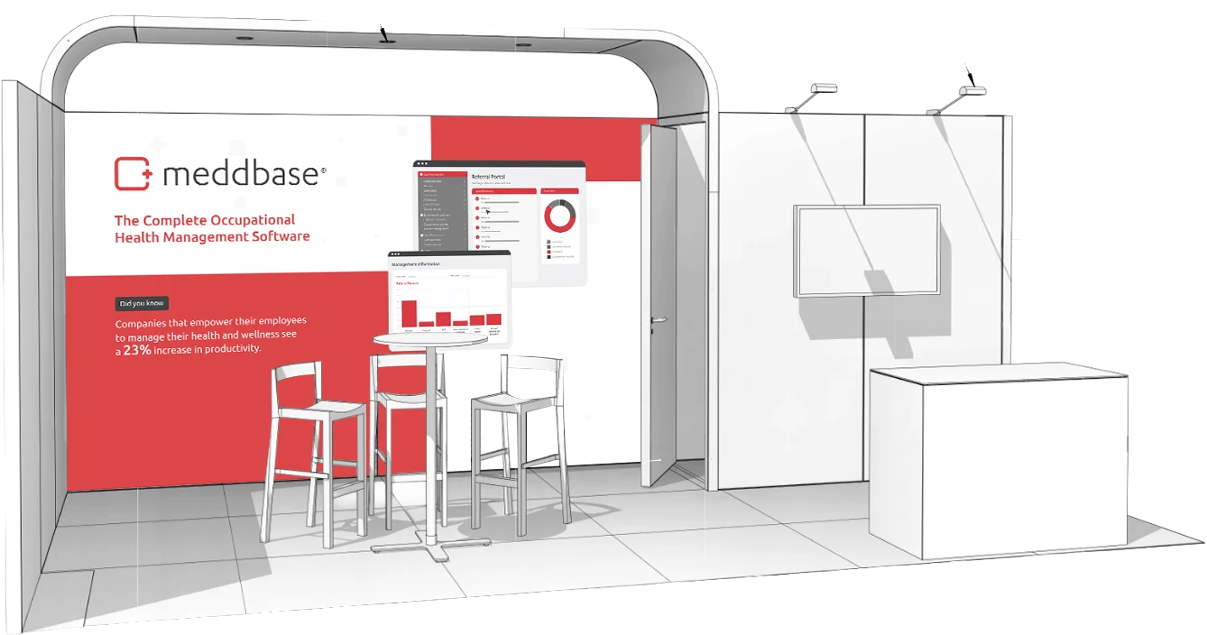
Then the floor. A stand is the one touchpoint people walk around, and it has to say what the product is from across a hall.
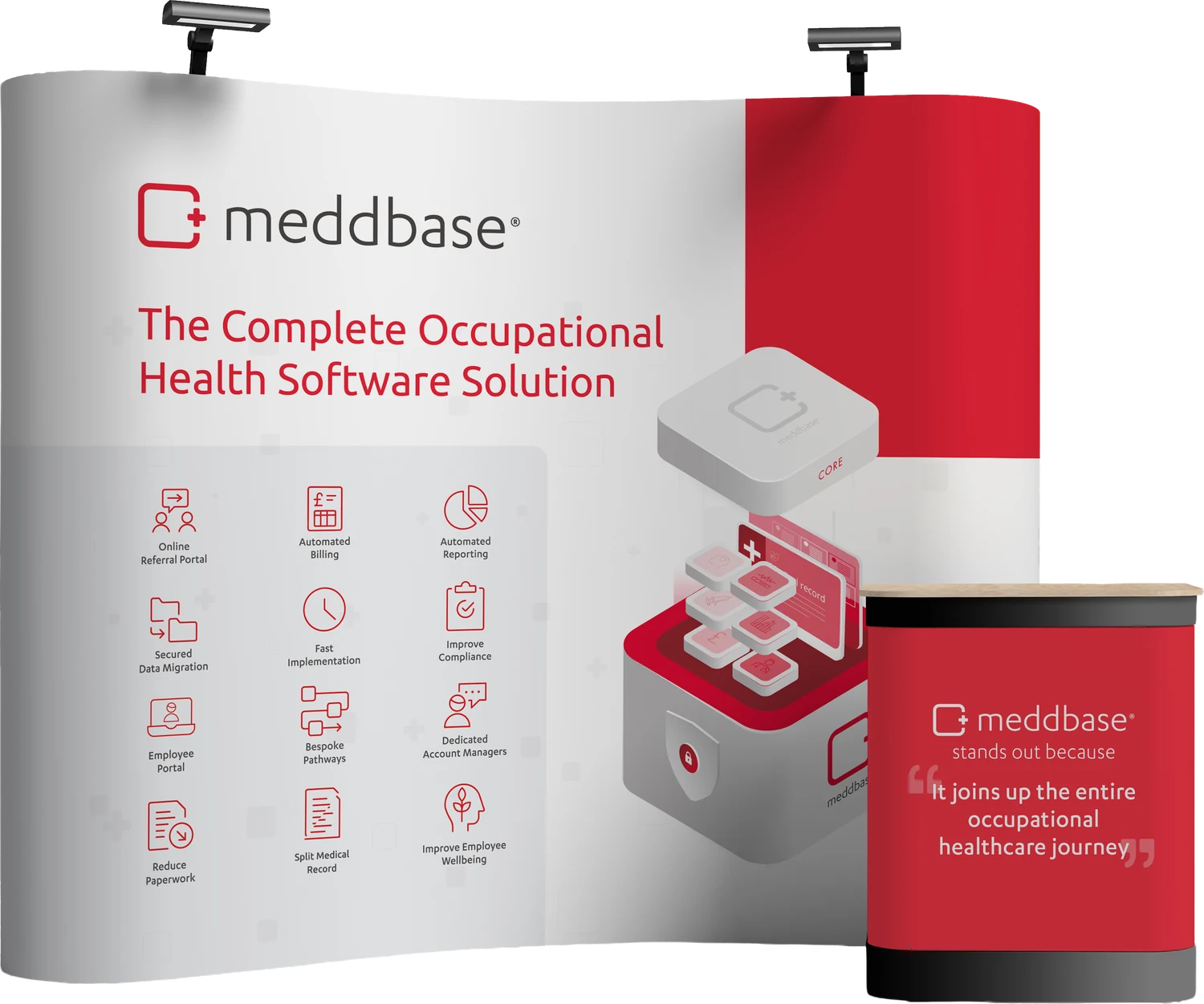
Built to travel and to scale — the same wall as a pop-up banner with its own branded counter.
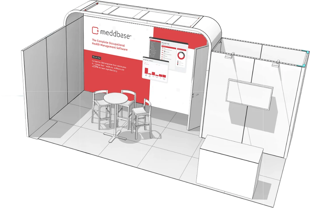
And in its compact configuration, for the smaller shows.
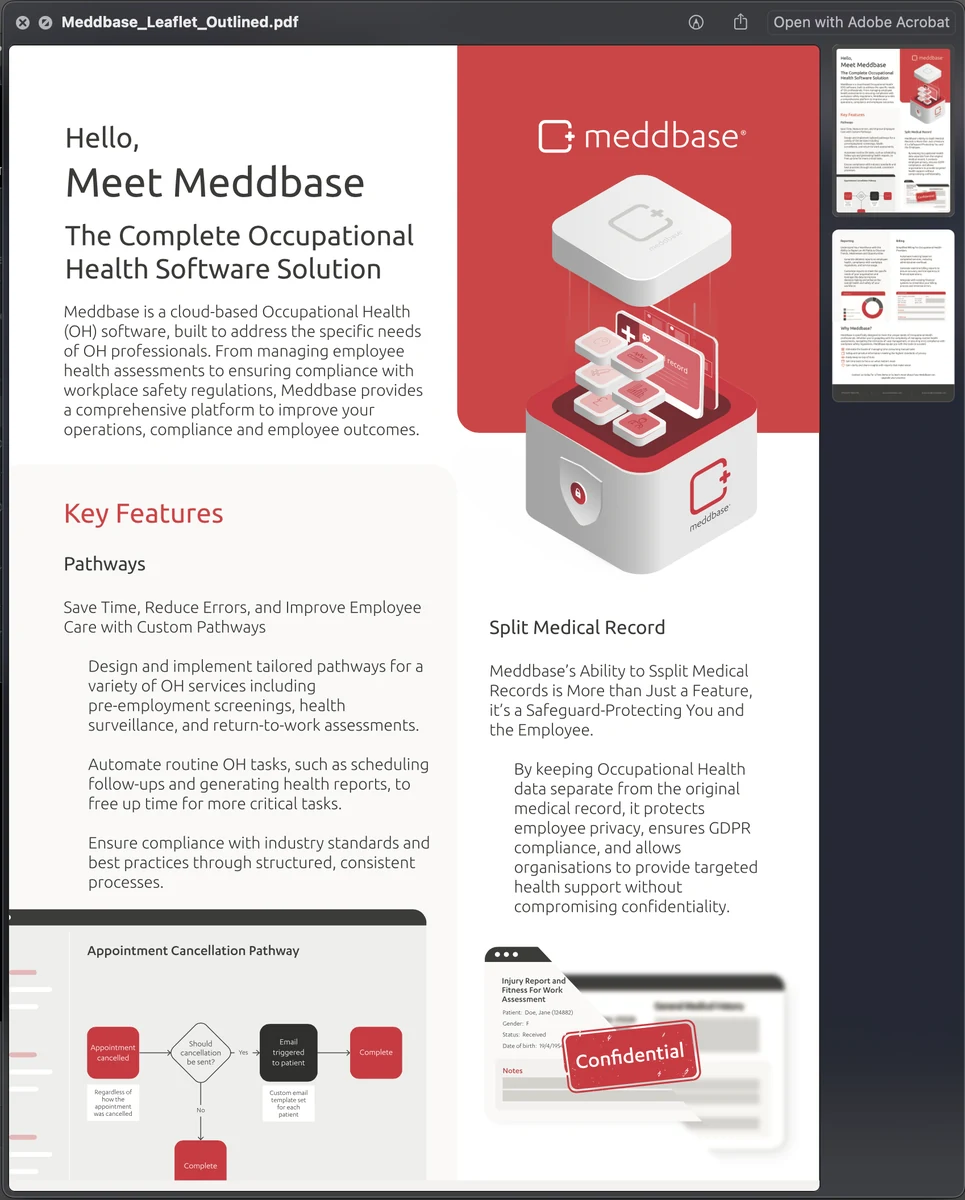
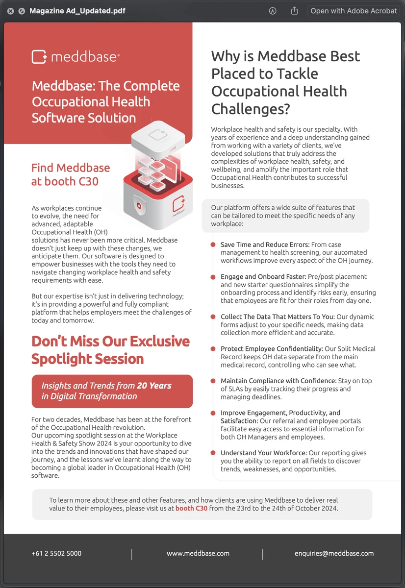
Behind all of it, the library. The leaflet is the introduction — what the platform is, in one fold — and the trade advertisement is the same argument at a glance.
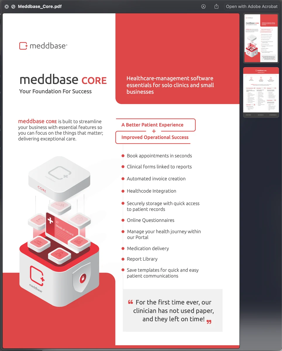
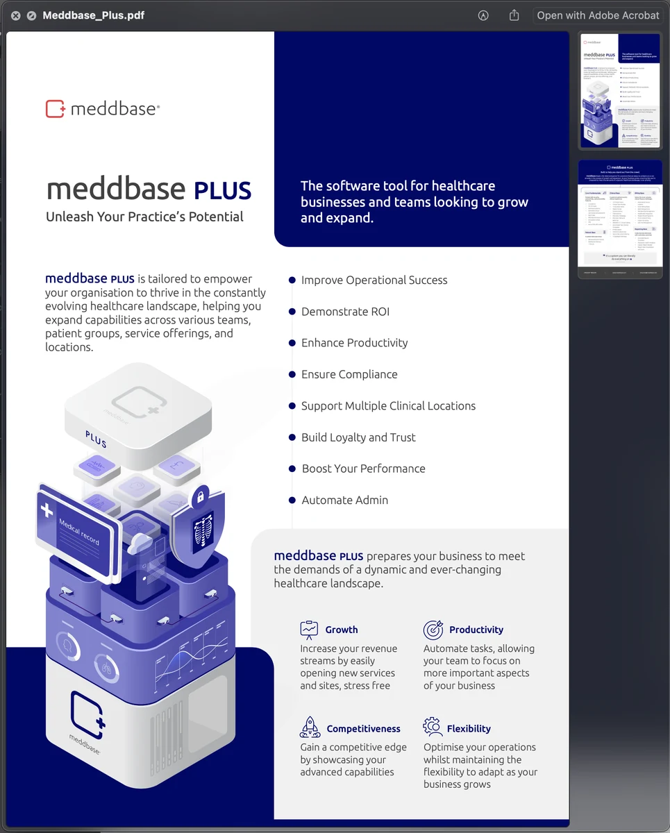
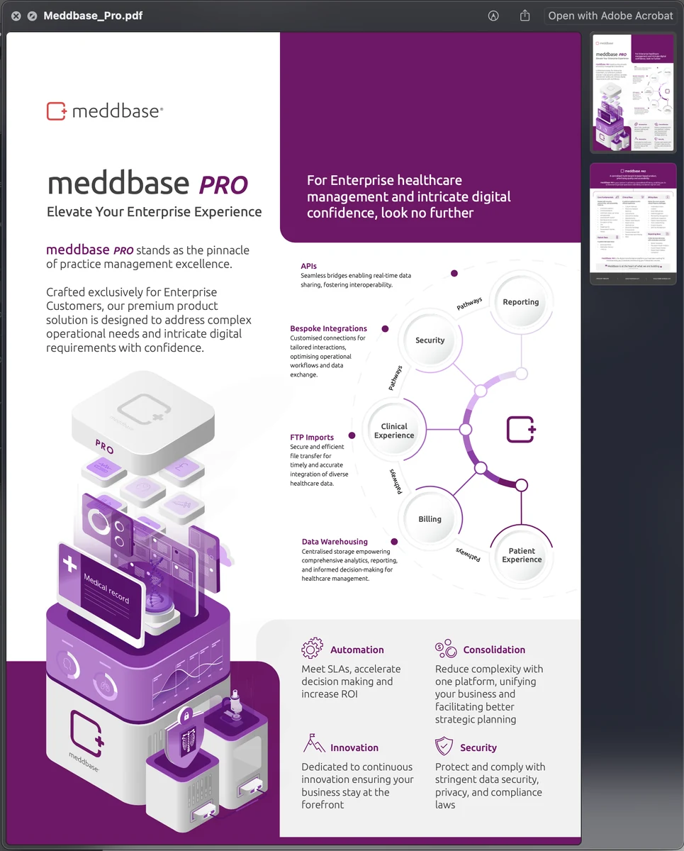
Three tiers, one grid: Core, Plus and Pro each get their own colour and their own illustration, and none of them has to be redrawn to sit beside the other two.
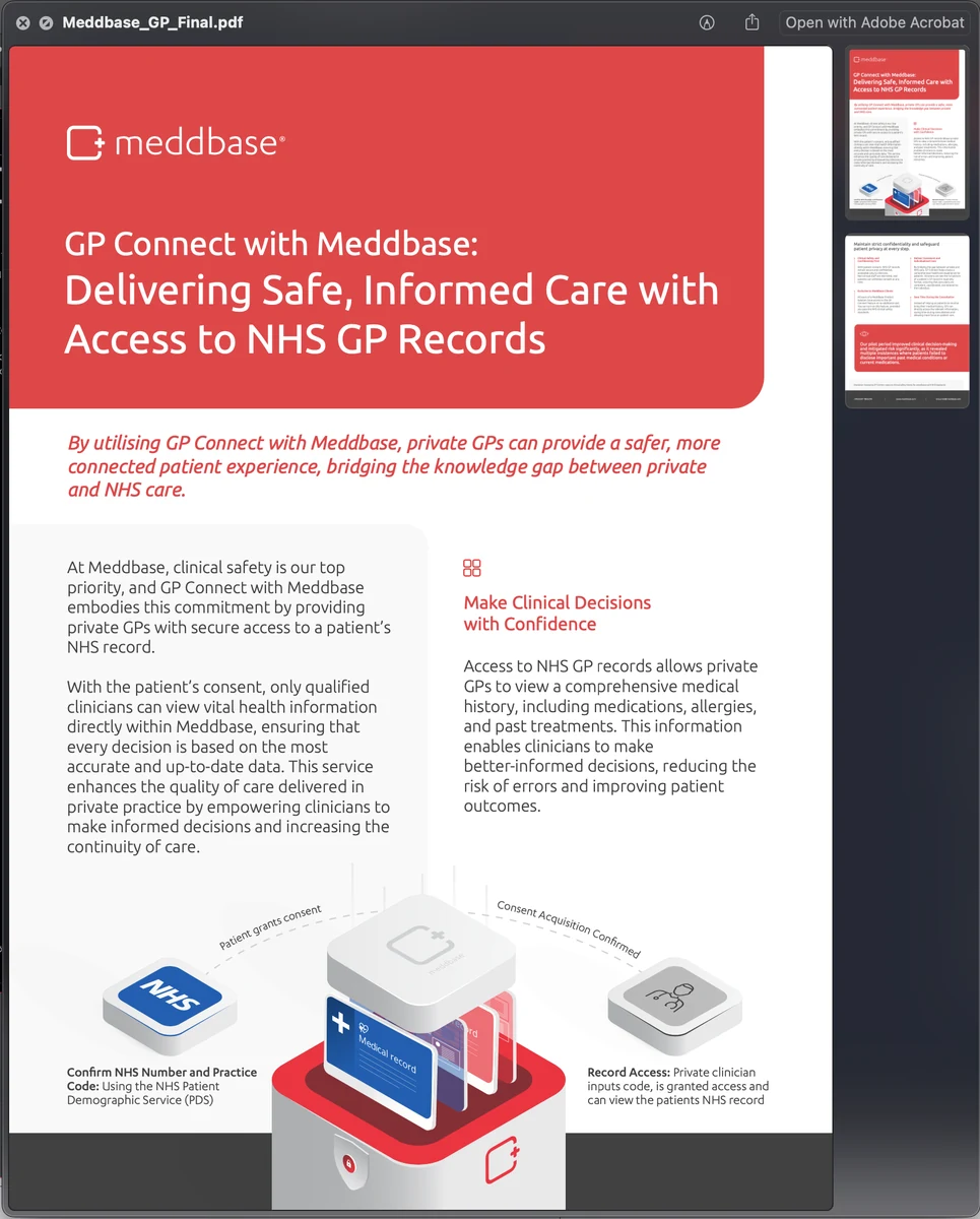
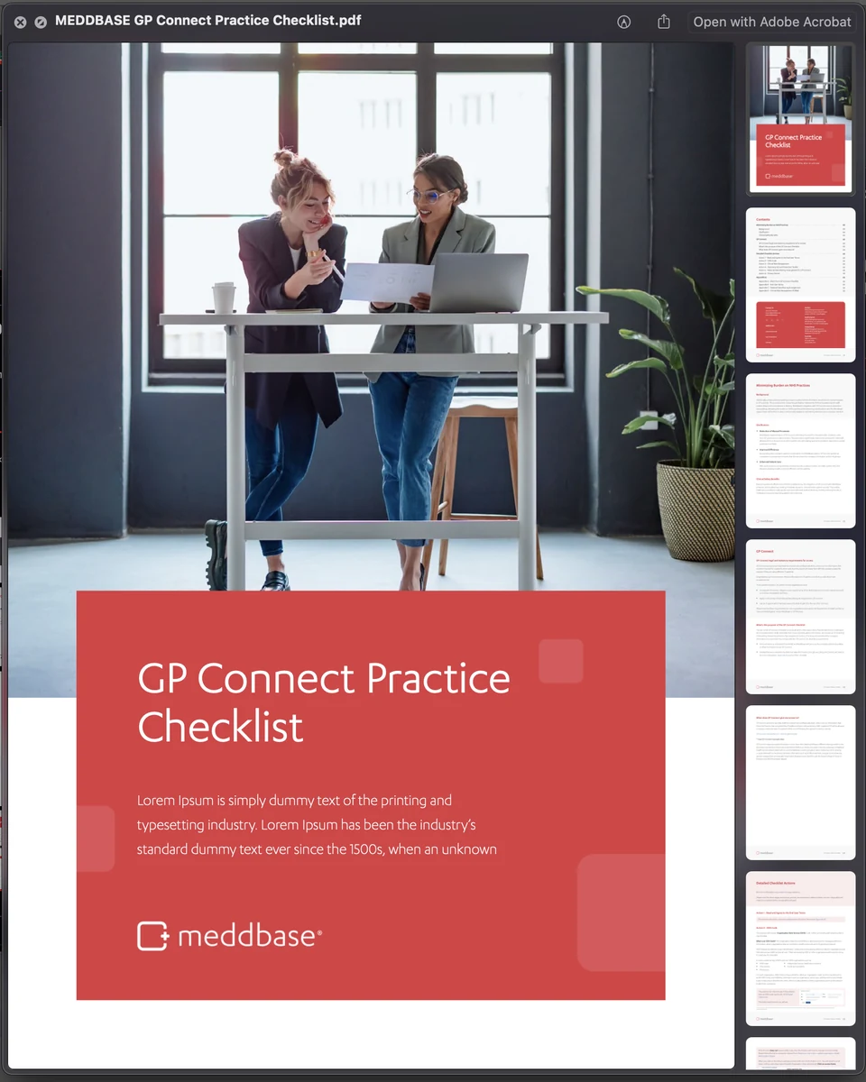
GP Connect had to be explained to two audiences at once — the paper that makes the case, and the checklist a practice actually works from.
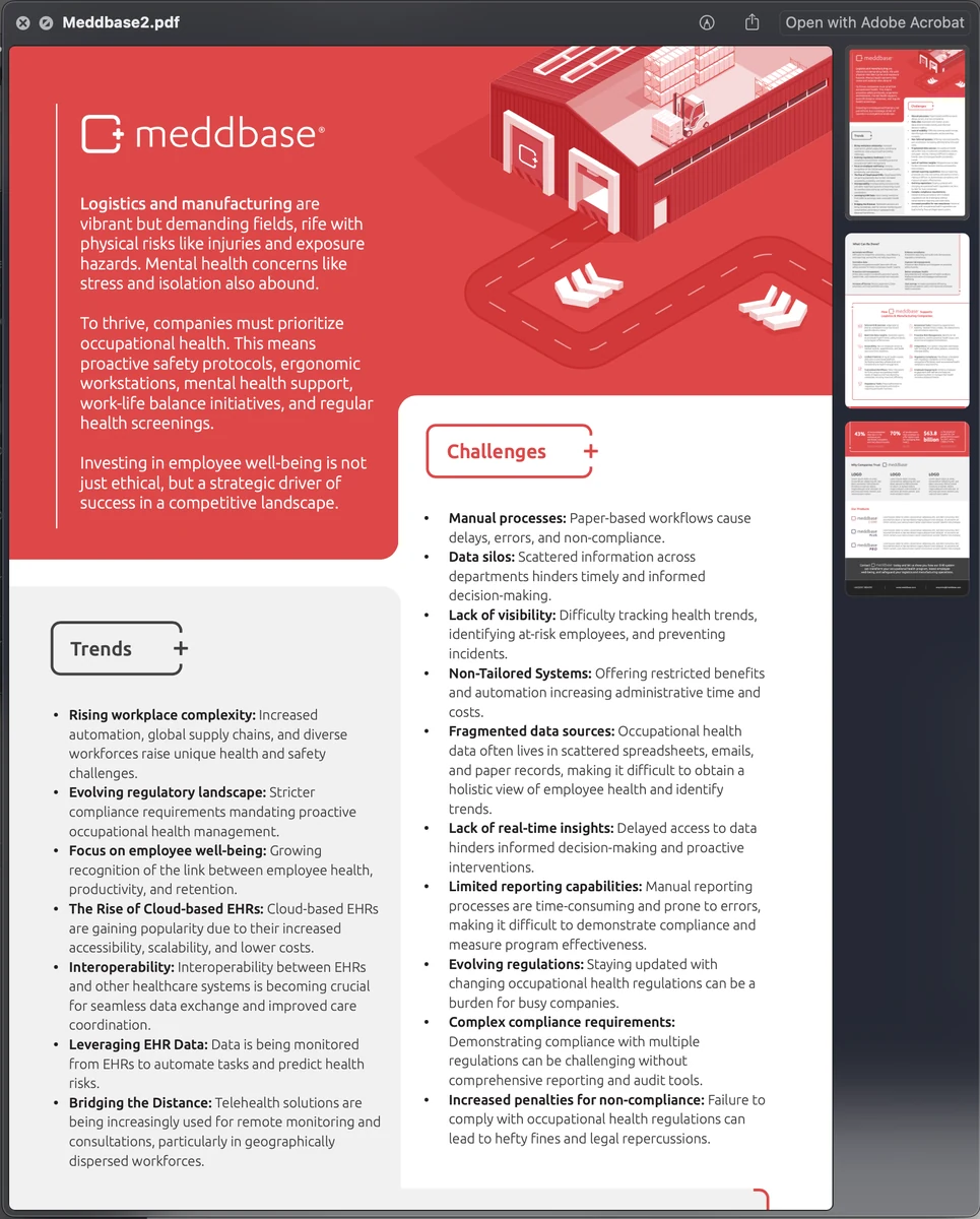
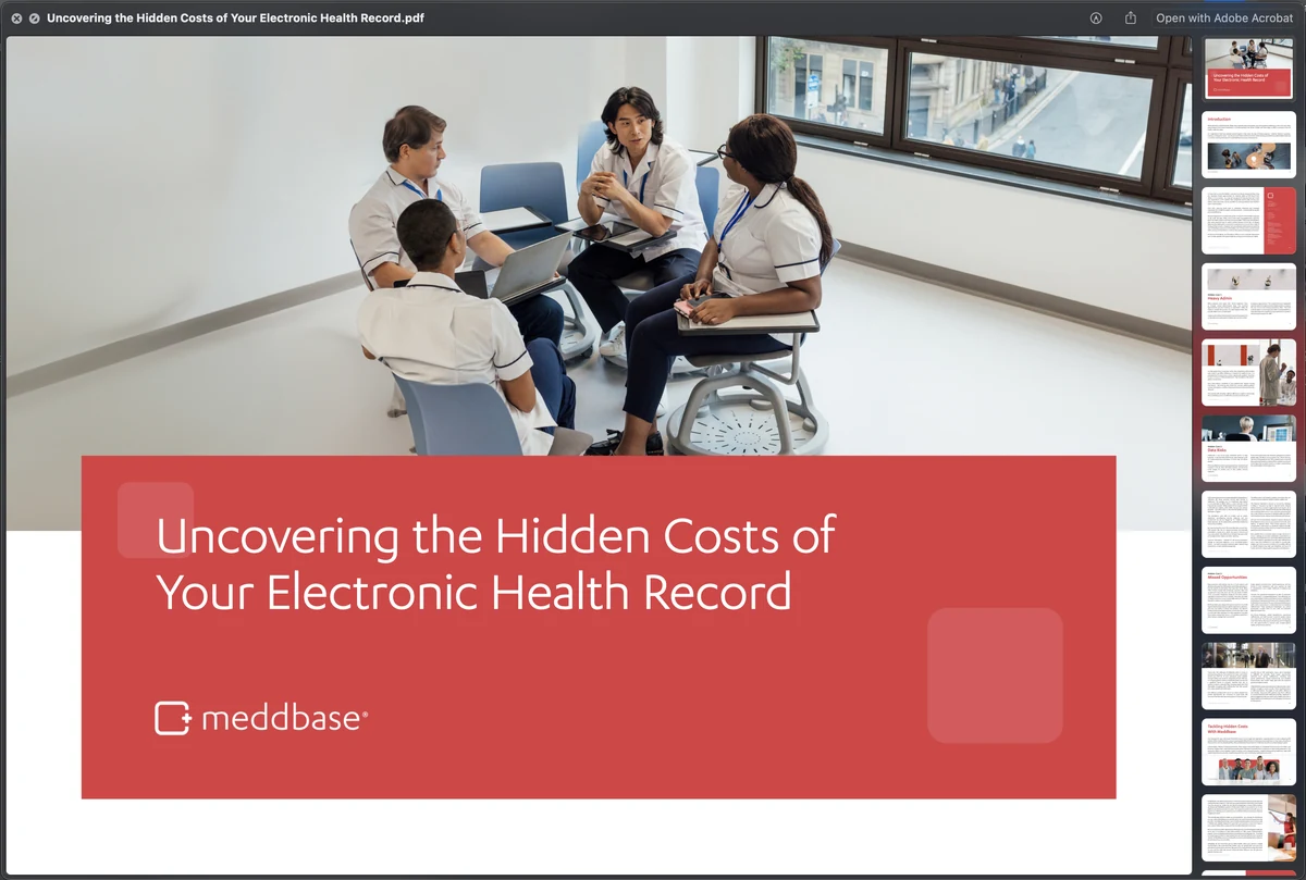
And the long-form end of it: a sector paper written for logistics and manufacturing, and a webinar deck on the hidden costs of an electronic health record. Interactive or printed, anyone could pick one up and still be on brand.