

















Digital and marketing design, every surface · United Kingdom & Denmark, 2026
Liva Healthcare
Liva runs digital chronic-care programmes — diabetes, obesity, prevention — through human coaches rather than an app that nags you. The NHS buys it, so do insurers, employers and health ministries, and none of them buy on adjectives.
Which settles the design problem before it is asked: every surface has to be able to carry a number without flinching. A figure is the loudest thing on most of these pages, the photography is warm but never the argument, and the arc — the one graphic device the brand owns — does the work of a decoration that is also a diagram.
The work runs from the website through a library of market papers, programme sheets and decks, into the feed, the leaflet and the exhibition stand. One system, four audiences, five countries.
The site, live in the frame — and the whole of it is one window away.

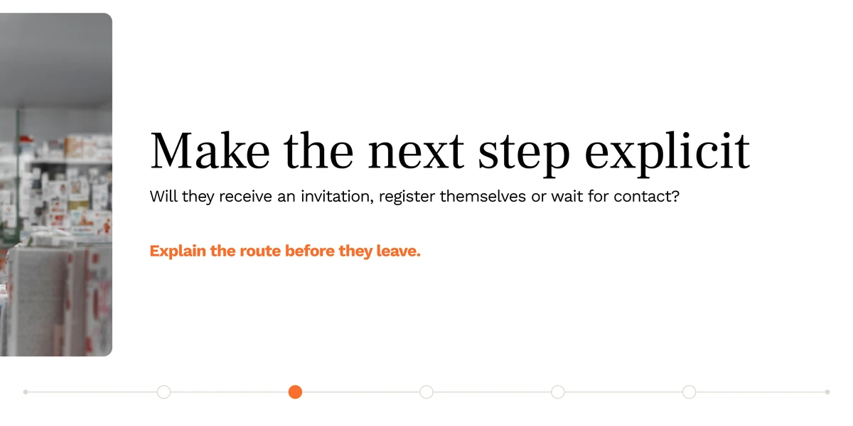

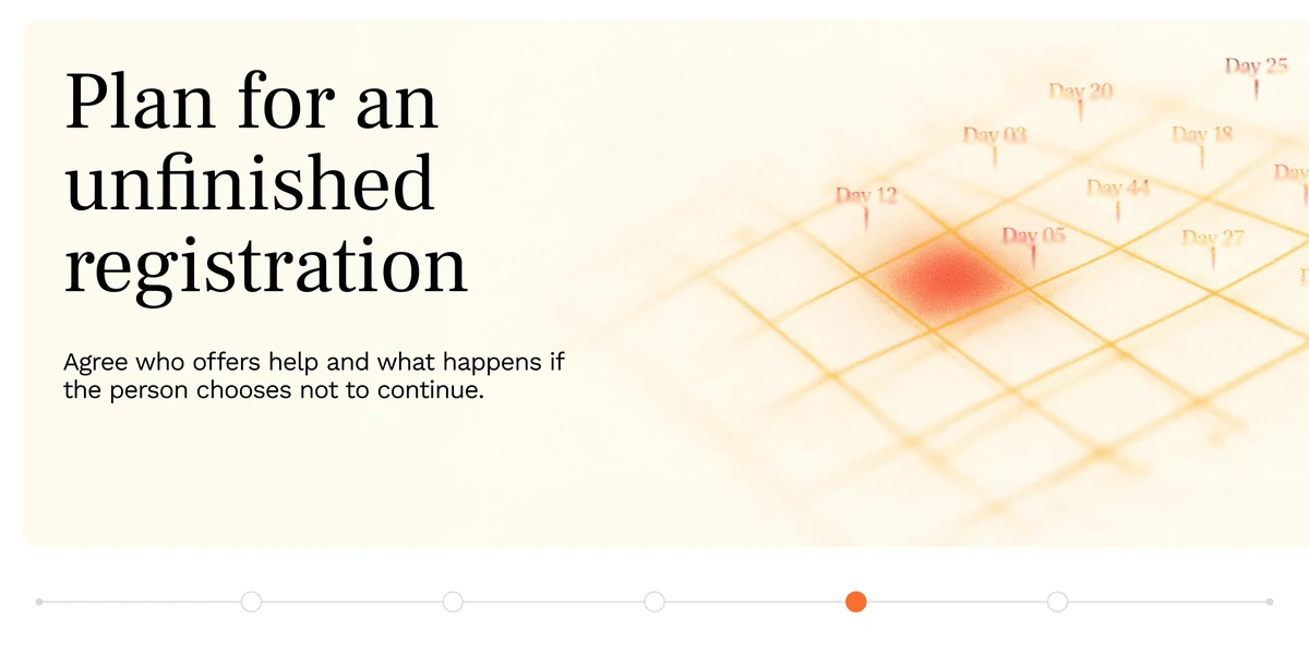
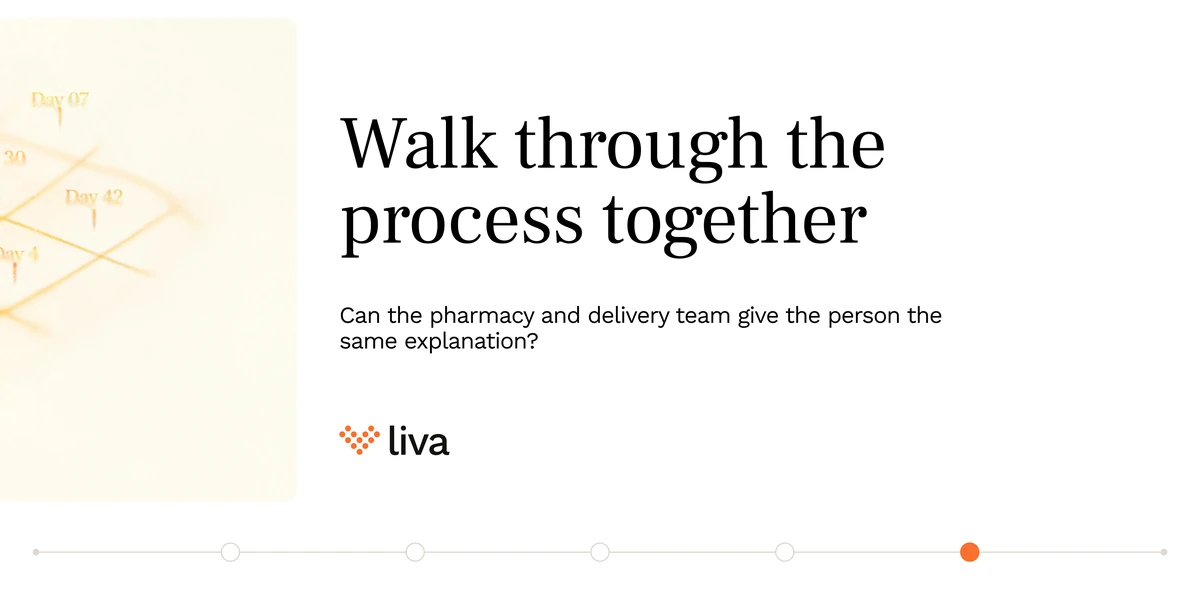
The newest run, and a different job from the rest of the feed: not a case for the programme but the questions a buyer should settle before one goes live. Each post opens on the sentence a real person says — here, a patient who agreed in the pharmacy — and then works through what the service has to have decided in advance. The rail of dots along the foot is the series’ own device: a post that is explicitly a process, numbered as one.
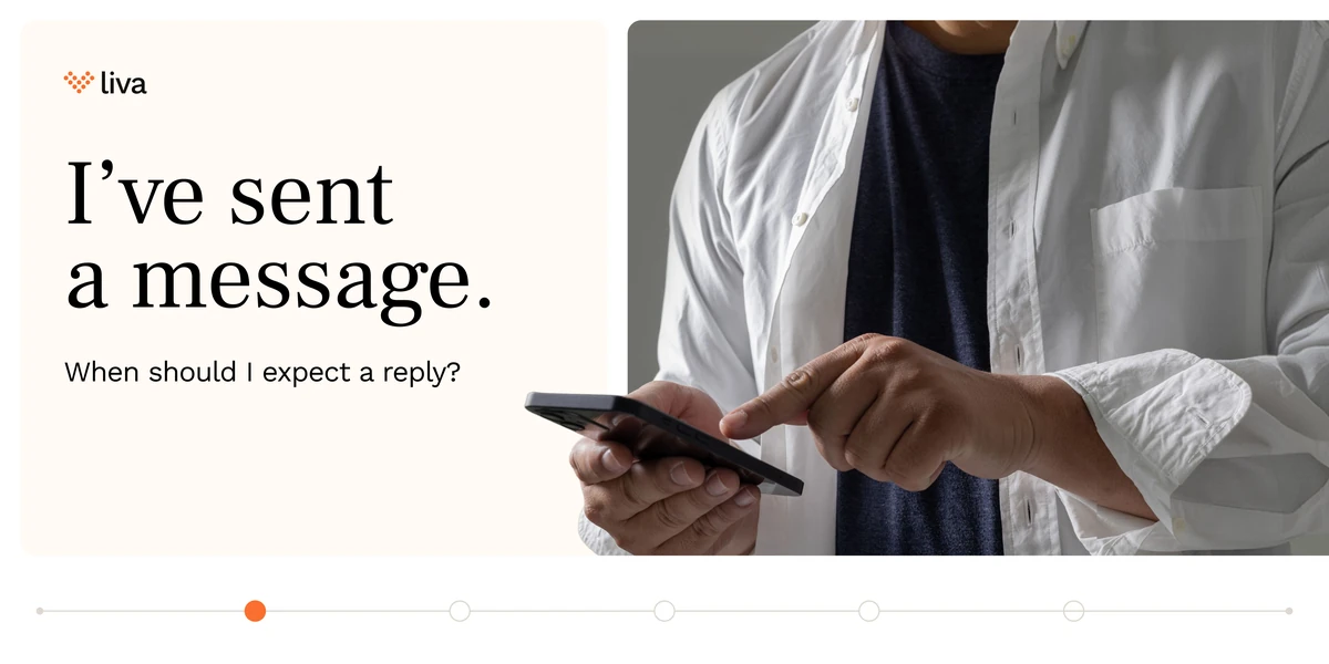

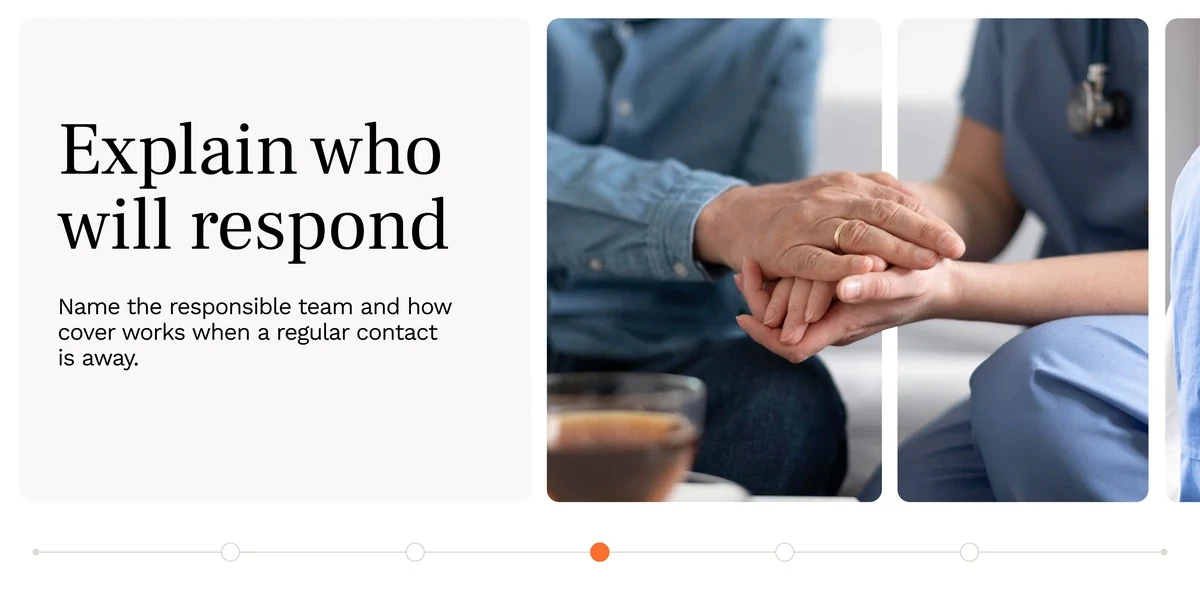
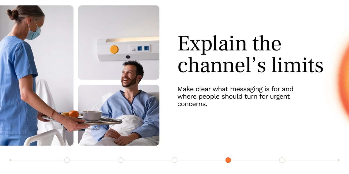
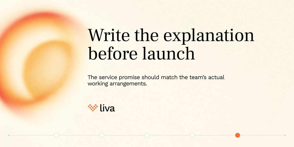
Its pair, on the thing a messaging channel quietly promises the moment you switch it on. Four slides, four things to say out loud — when the service is monitored, who answers, what it is not for, and that the promise has to match the rota behind it.
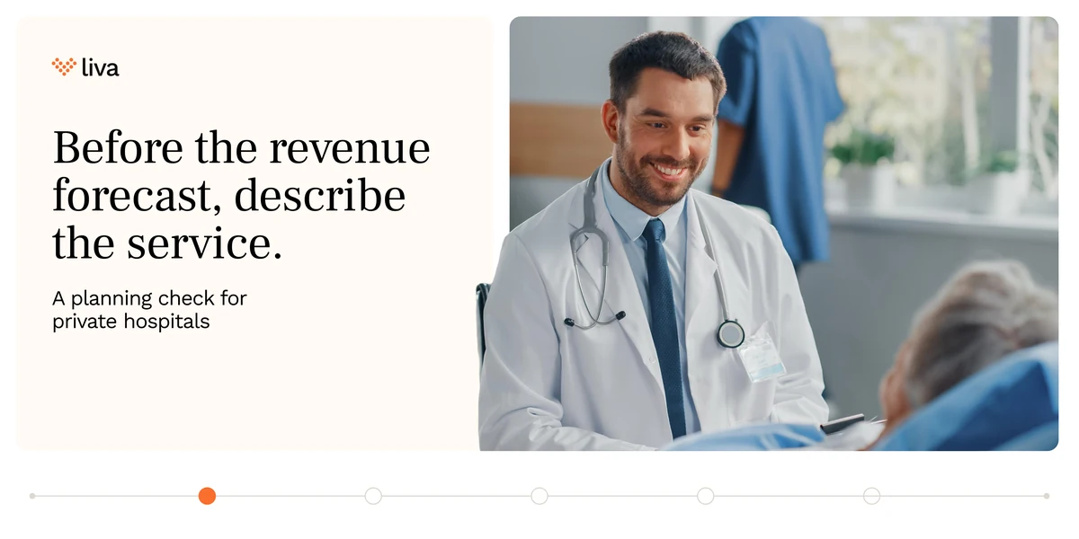
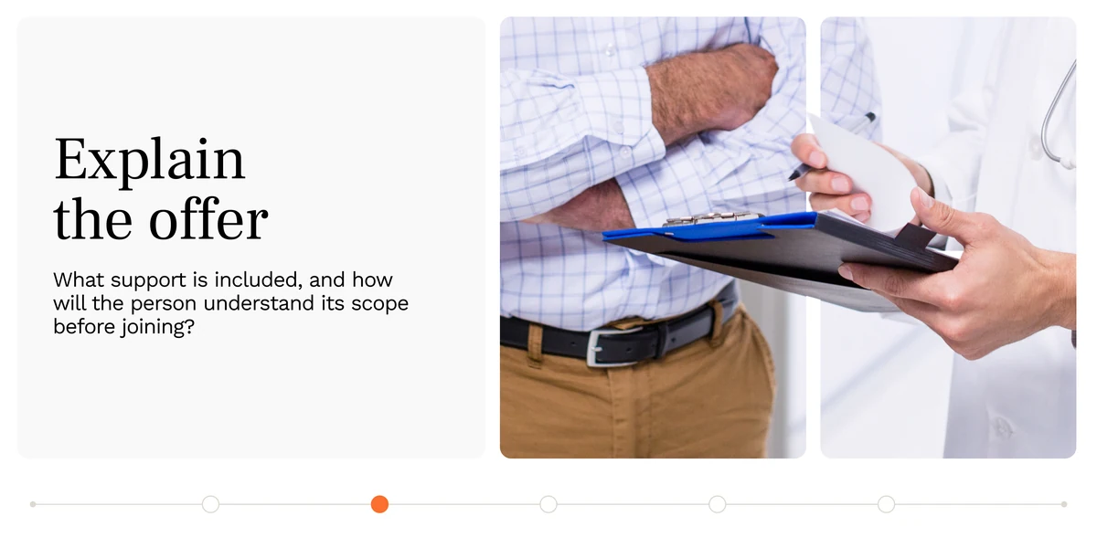

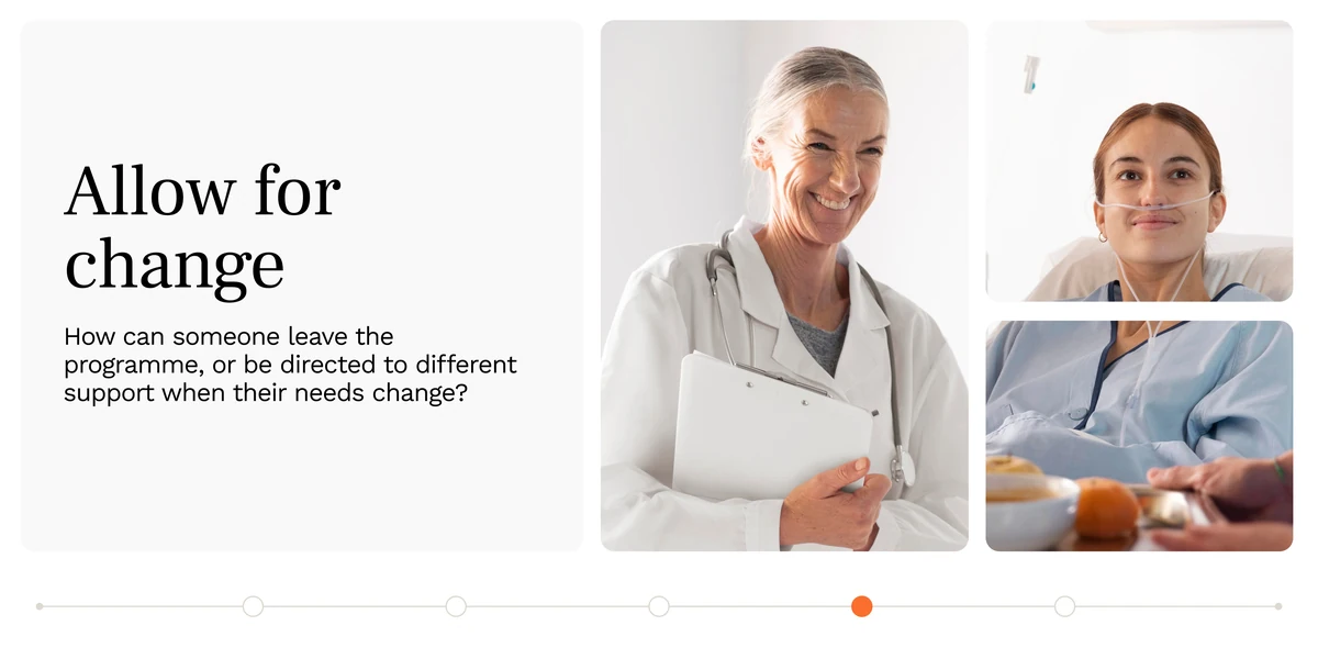
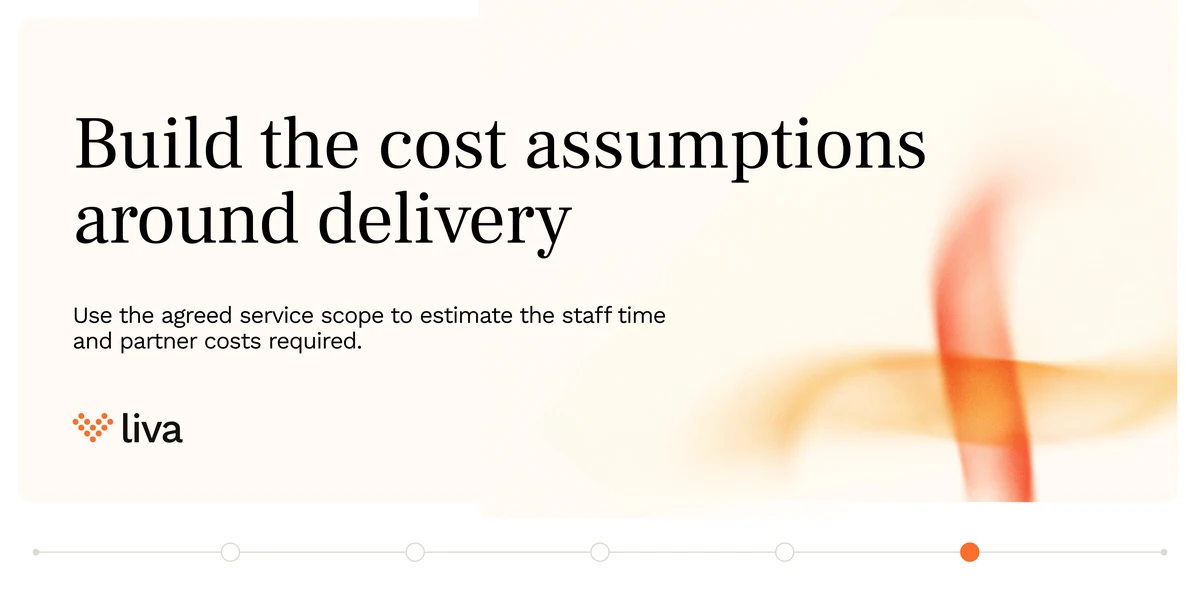
The third in the run, and the one that puts the series where the money is. A private hospital builds a revenue forecast for a service it has not finished describing, so the post refuses to talk about numbers for four slides — what is included, who hands over, what happens when the need changes — and only then says build the cost assumptions around delivery. The order is the argument.
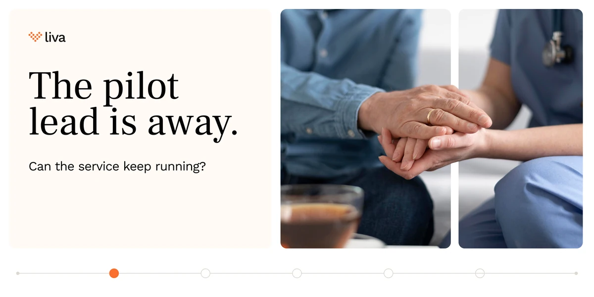


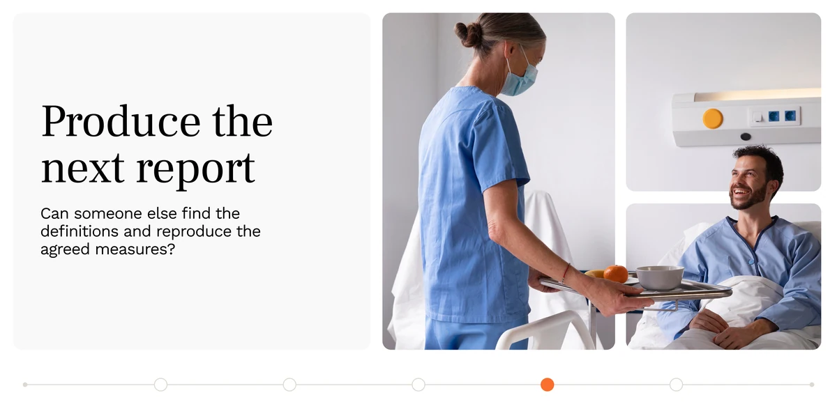
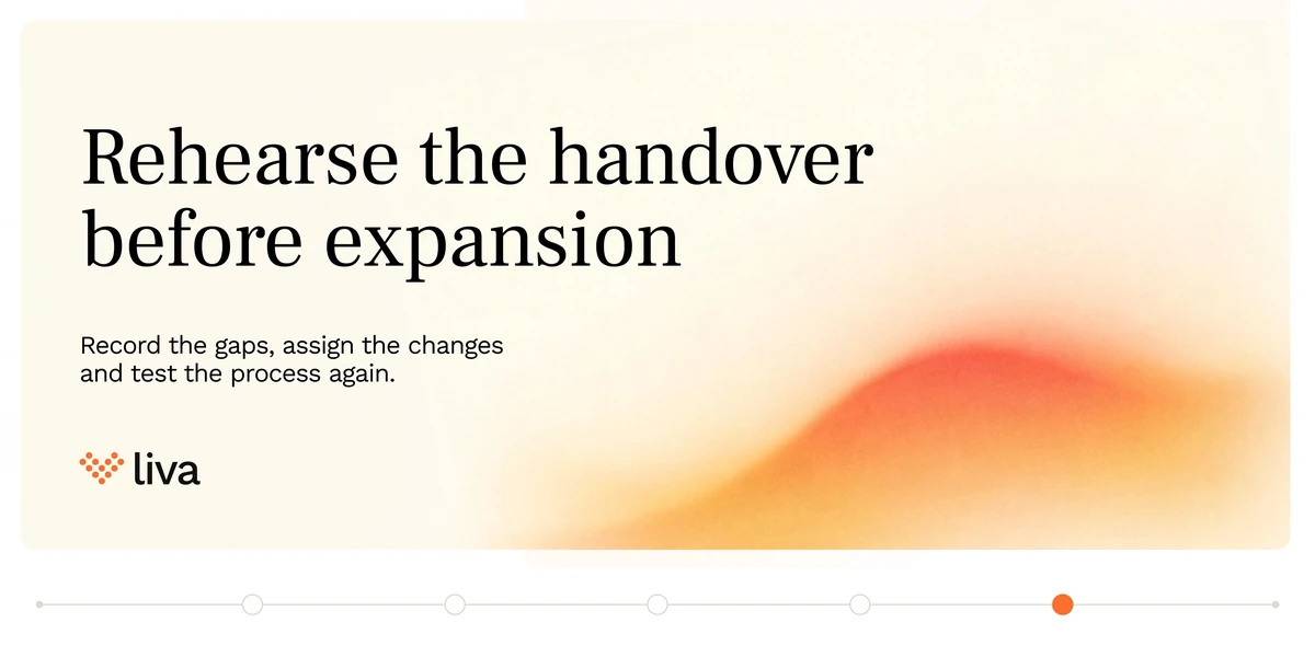
And the fourth, on the failure every pilot has and nobody writes down: the person who was holding it is away. Three ordinary Tuesdays — a new referral, an unresolved query, the monthly report — each asked as whether a colleague could do it without them. Rehearse the handover before expansion is the only line in the series that is an instruction rather than a question.
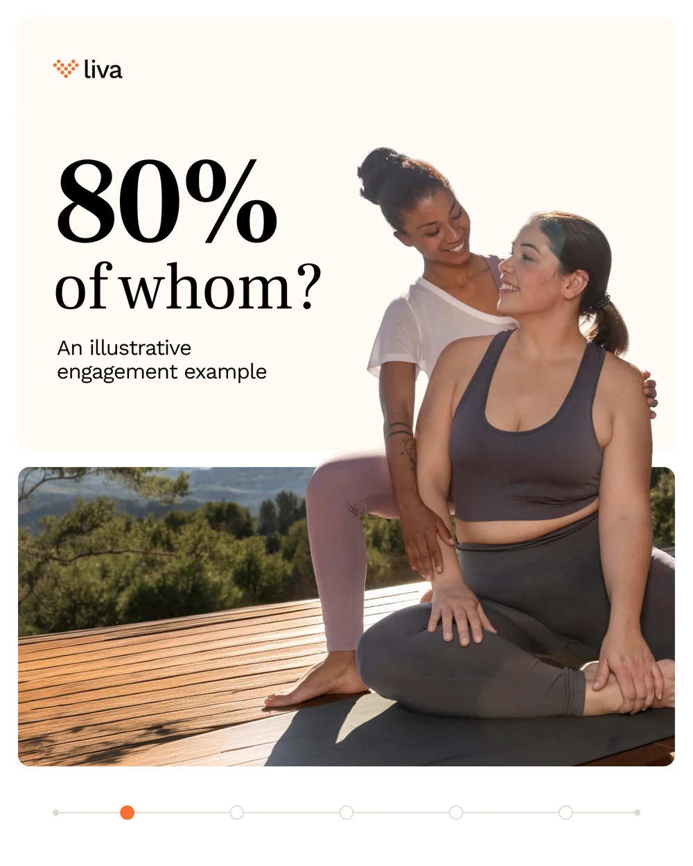
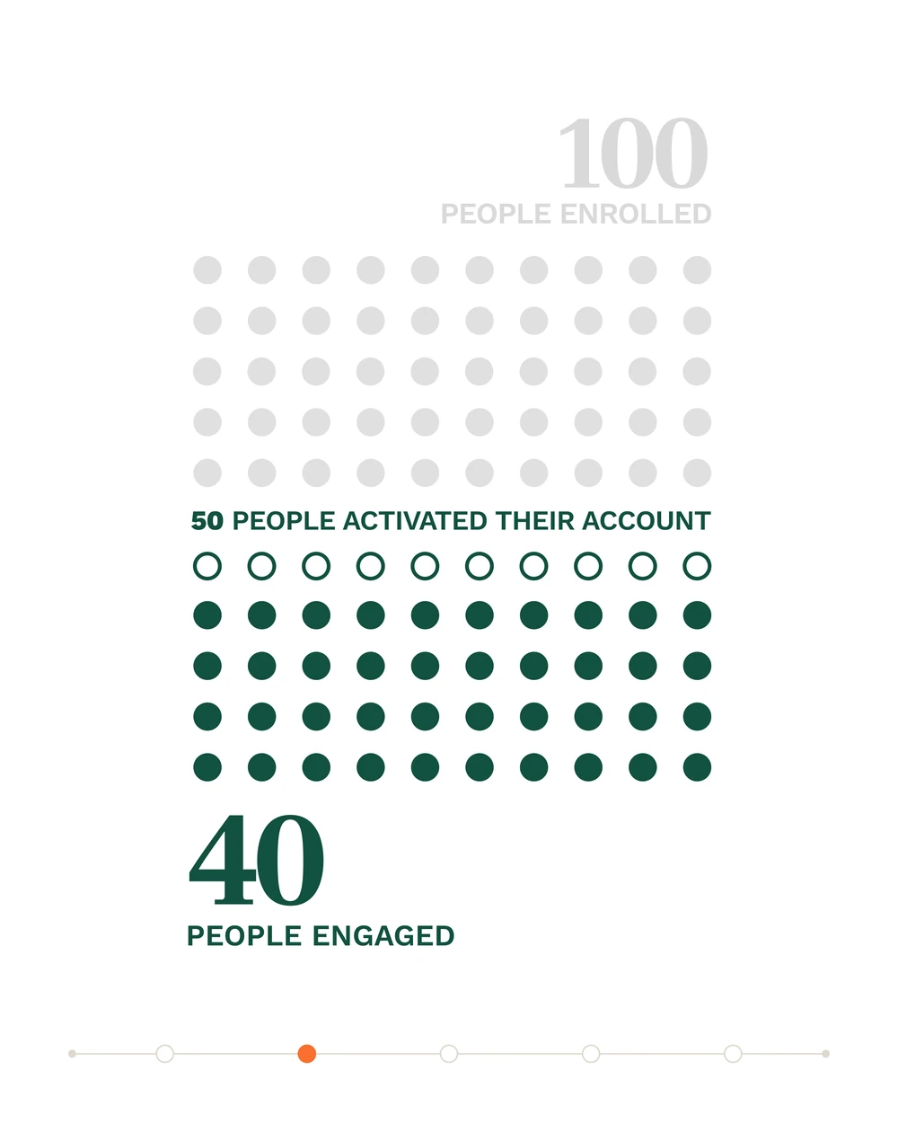
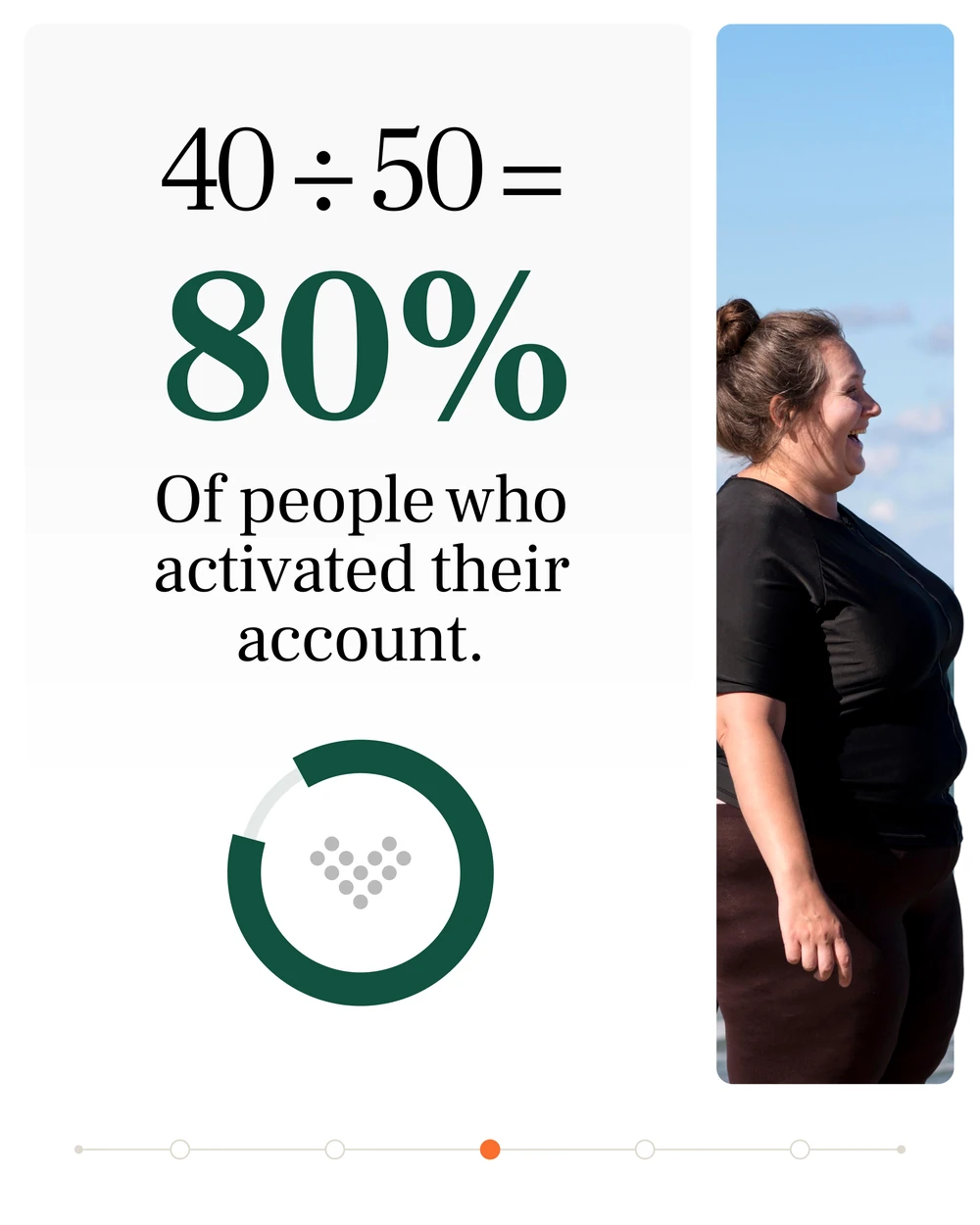
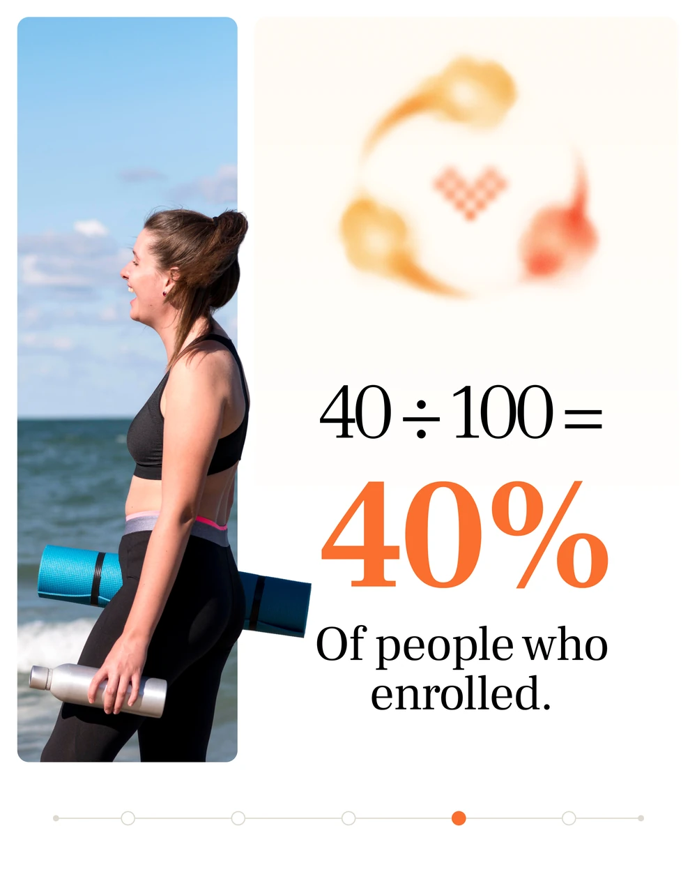
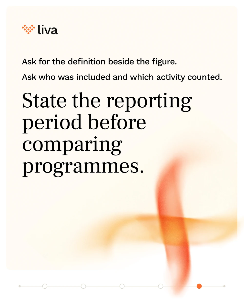
The same series in the portrait frame, doing the one thing the brand is built for: taking a number apart. An engagement rate of 80 per cent and one of 40 per cent are the same forty people — the difference is the denominator, and the post draws it as a hundred dots so the argument needs no arithmetic from the reader.
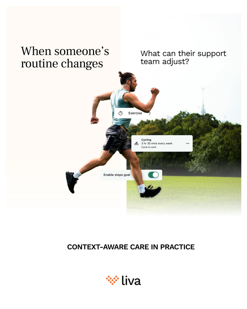
And the singles from the same run, where the question is the whole post. This one is the only place the product itself appears — the app’s own cards lifted out and set against the photograph, because “adjust the plan” means nothing until you can see the thing being adjusted.
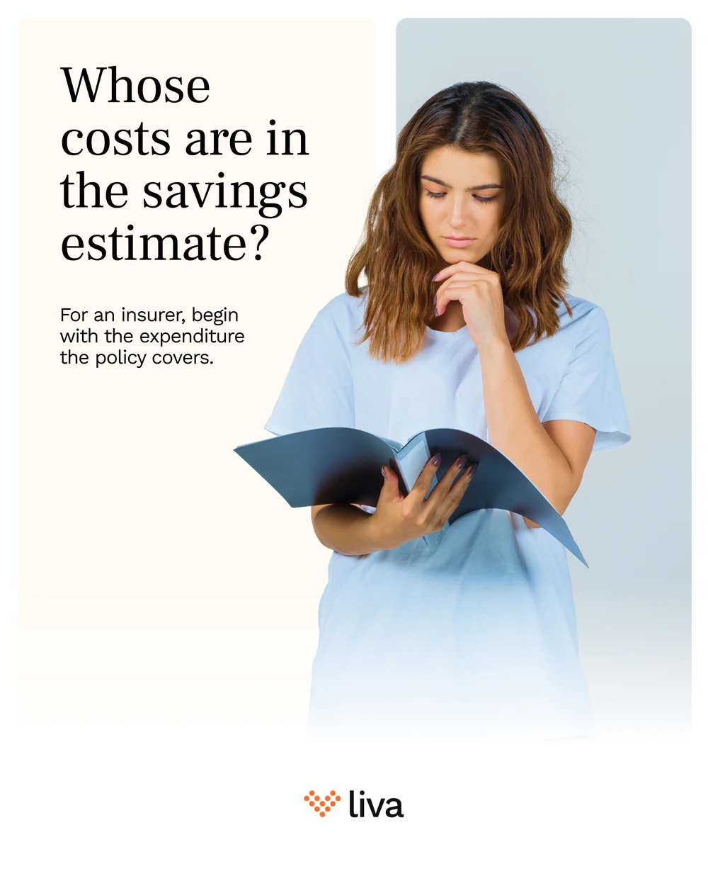
For the insurer, the same question pointed at the business case: a savings estimate is only as honest as the costs it was built from.

And the one a procurement team will recognise fastest — the work the quoted price does not take off your desk.
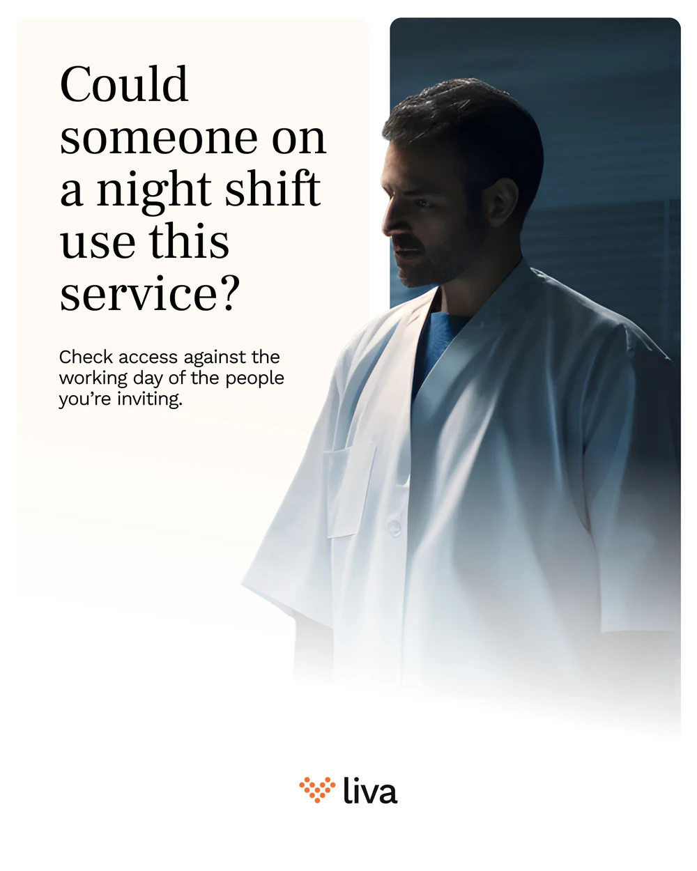
And the one the rest of the feed cannot say, because the rest of the feed is shot in daylight. A service designed around office hours is a service half the workforce cannot reach — so the photograph goes to the night shift, the warm ground drains to blue behind him, and the question is simply whether he could use the thing you are inviting him to.

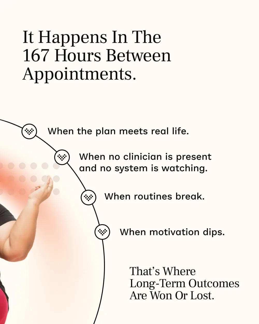
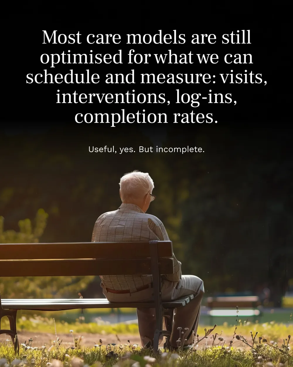
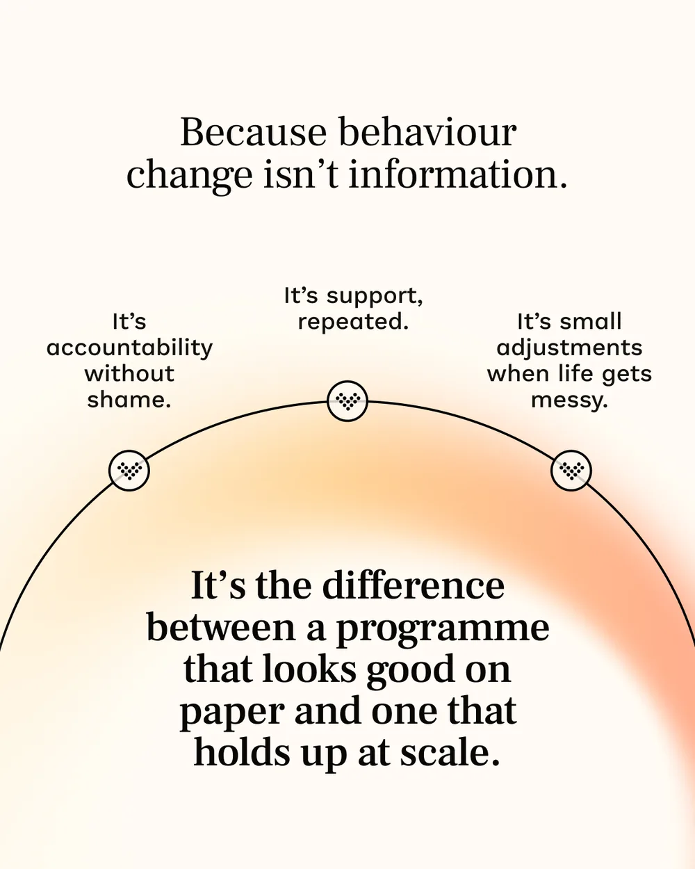
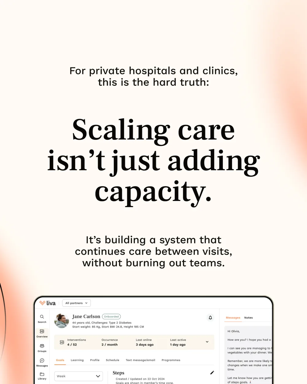
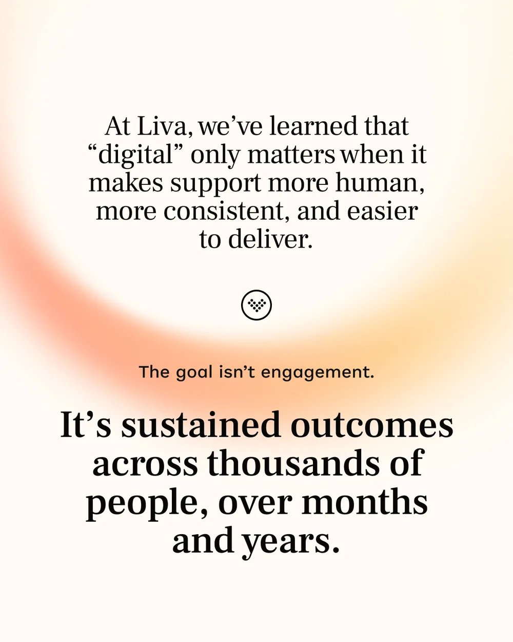
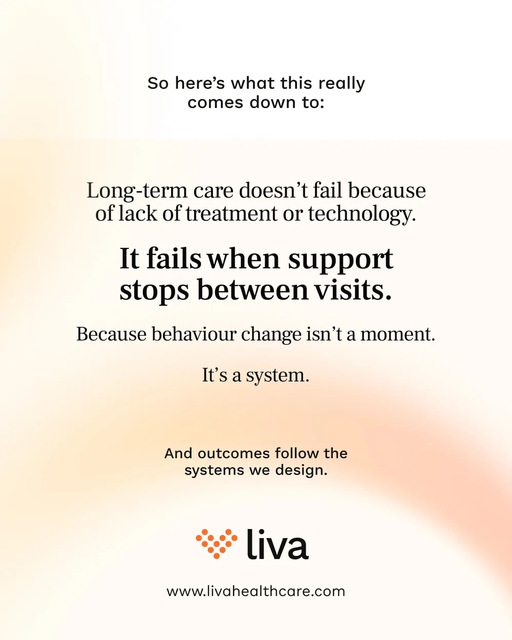
The argument the brand actually makes, in the place it makes it. Care is designed around appointments; the disease does not keep to them. Seven slides on the 167 hours between.

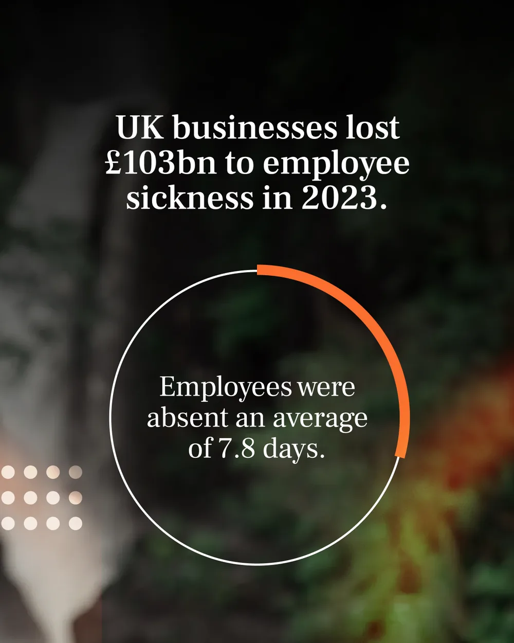
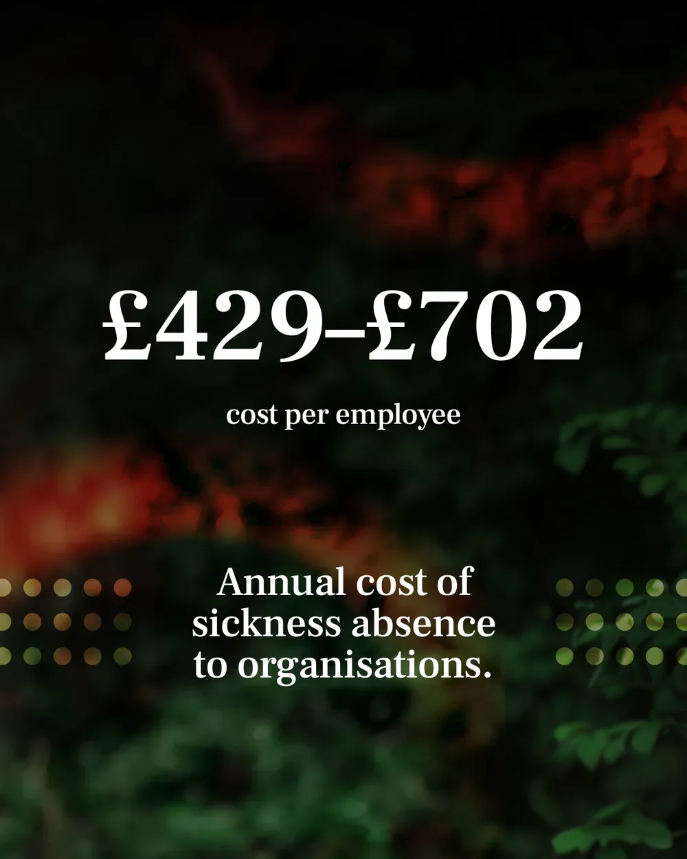
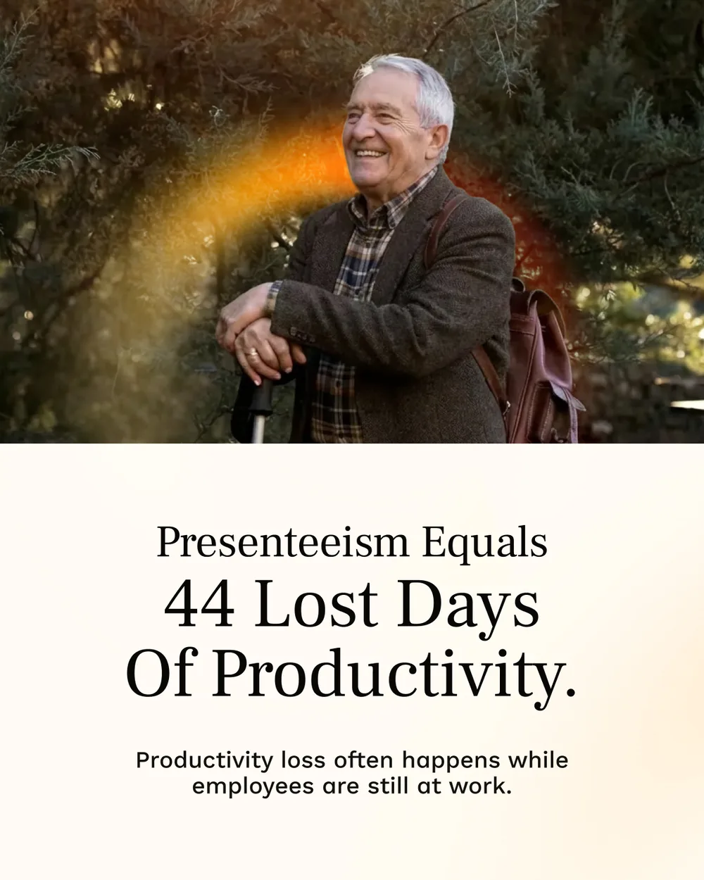
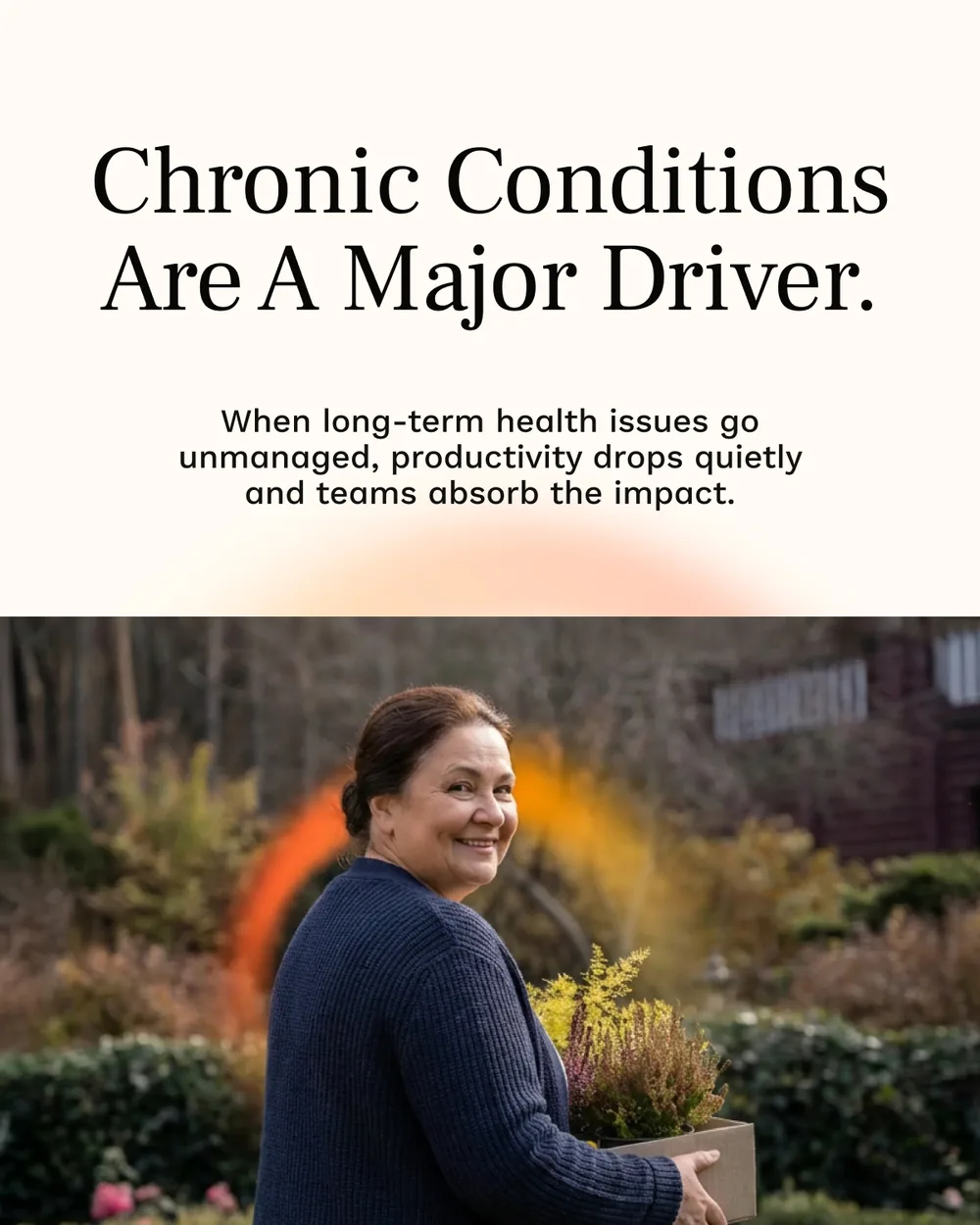
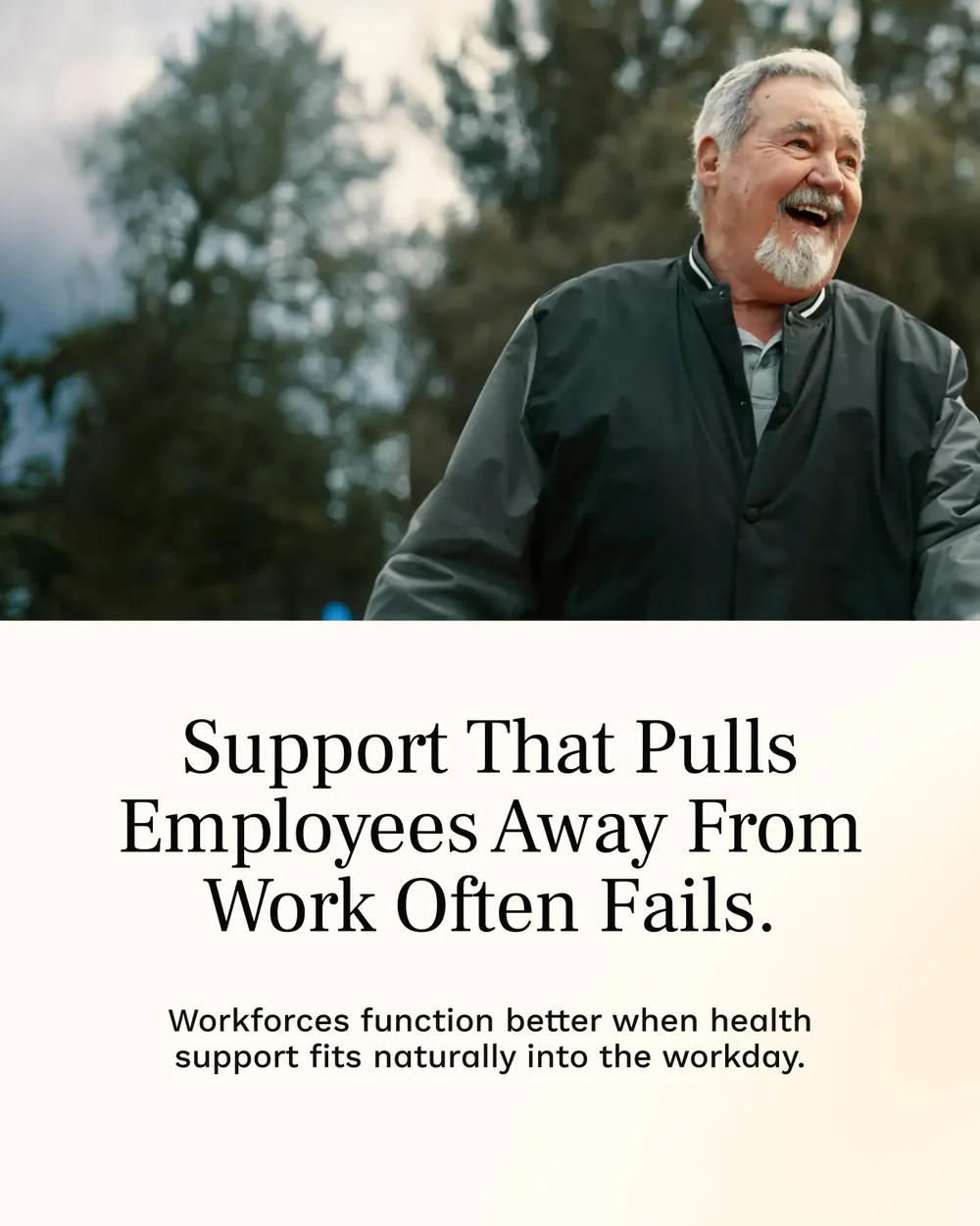
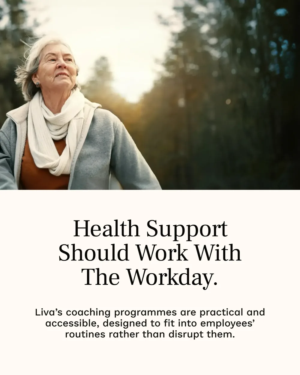
For the employer audience the same structure carries a bill: what sickness costs, what presenteeism costs, and why support that pulls people away from work fails.



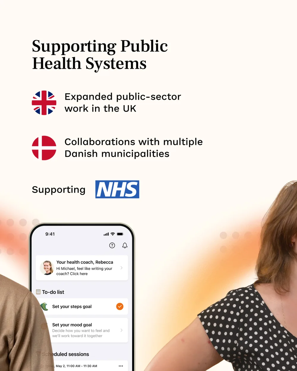
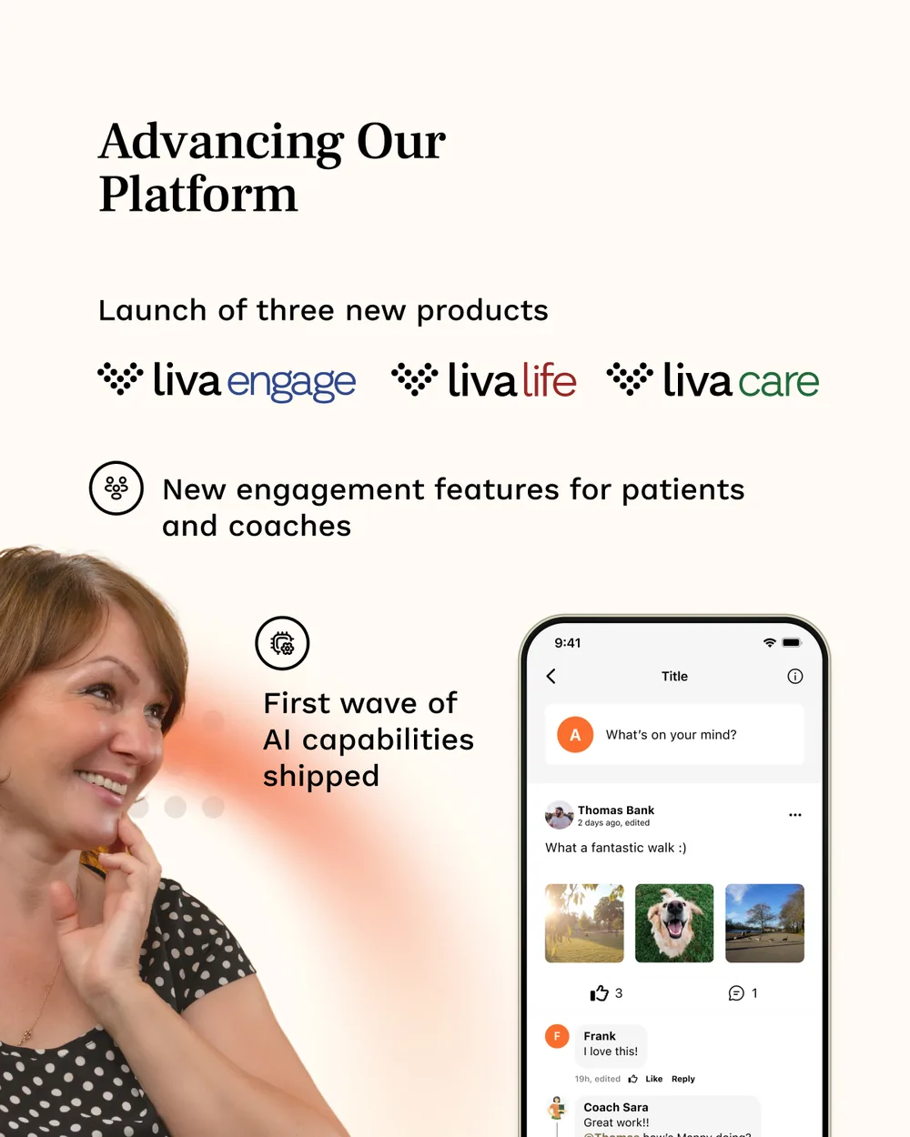

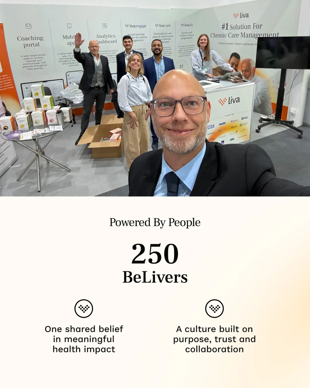
And once a year it has to do the other job: the review, where the numbers are the company’s own — markets entered, partnerships signed, products launched, people supported.
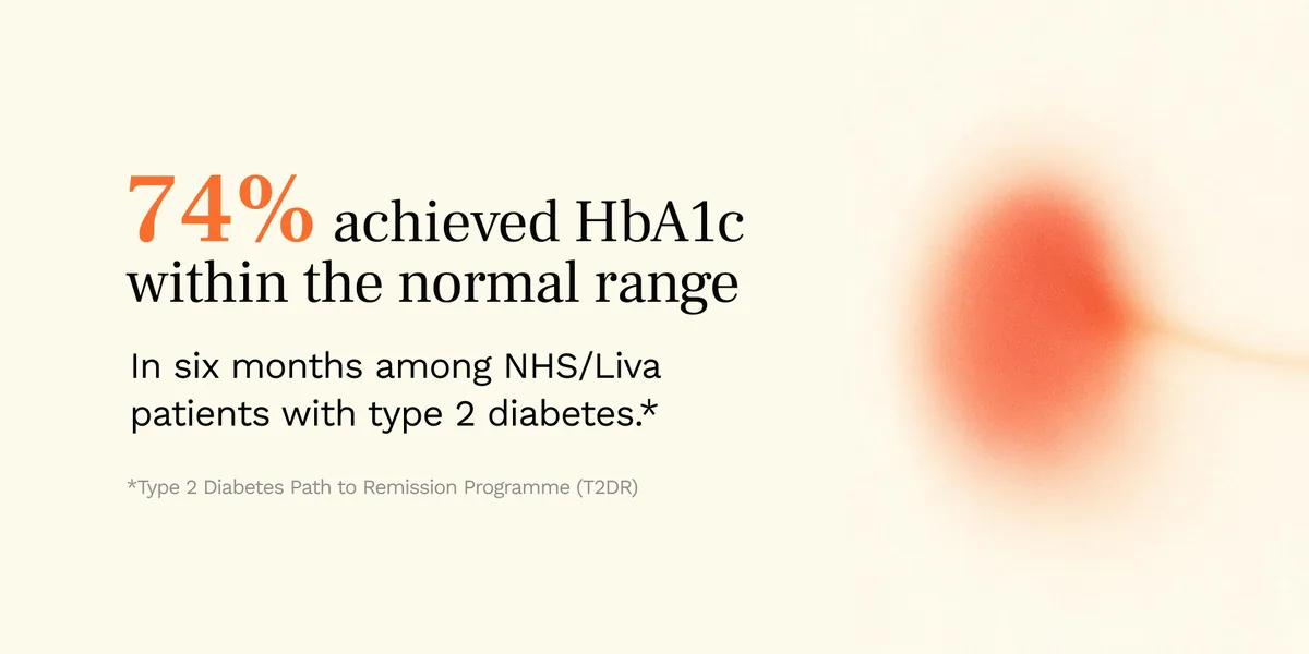
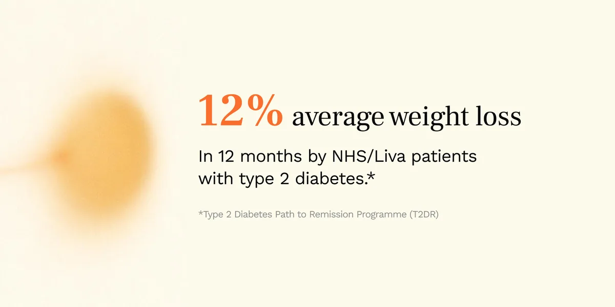
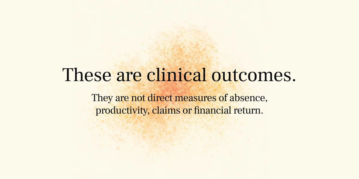
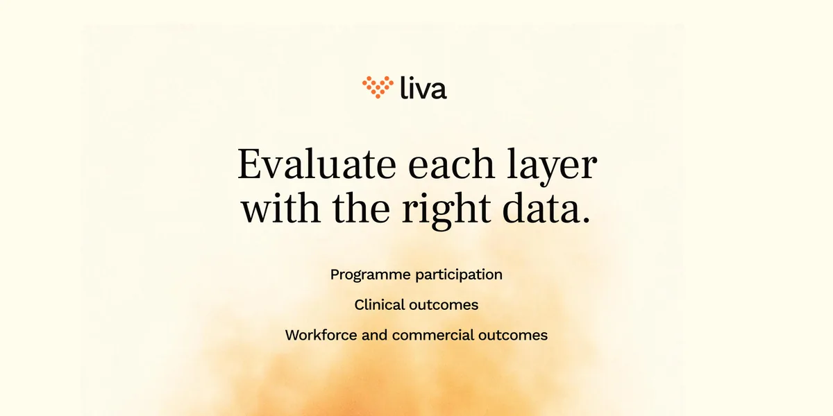
A second register for the enterprise side, drawn down to almost nothing: a wide frame, a serif line, and the arc reduced to a smudge of warmth behind it. No photograph, because an outcome is not a person you can cast.

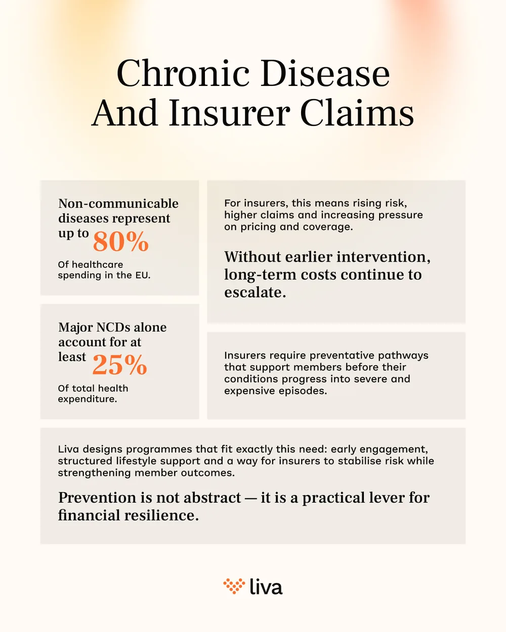
Singles, where one line has to hold the whole post.
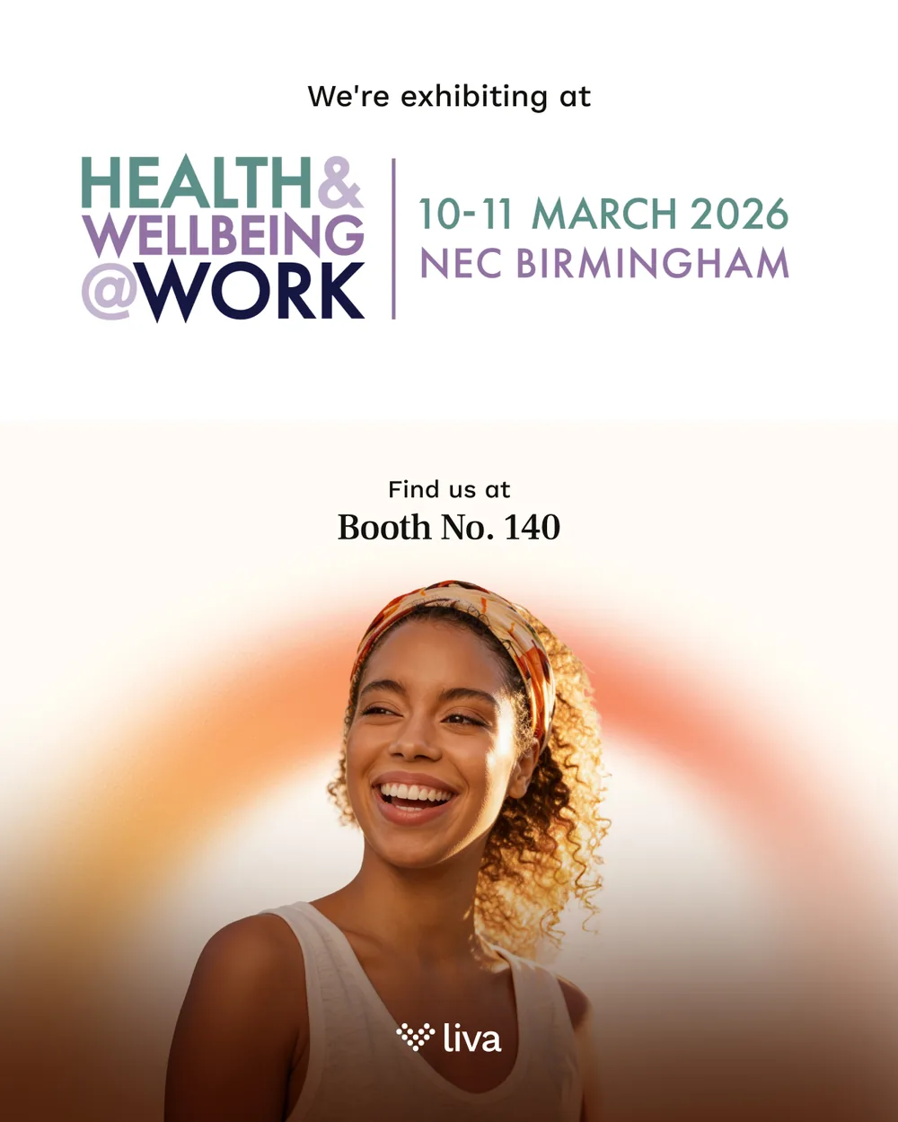

The two that are not selling anything: the stand invitation, and the one post a year that is allowed to be a bauble.
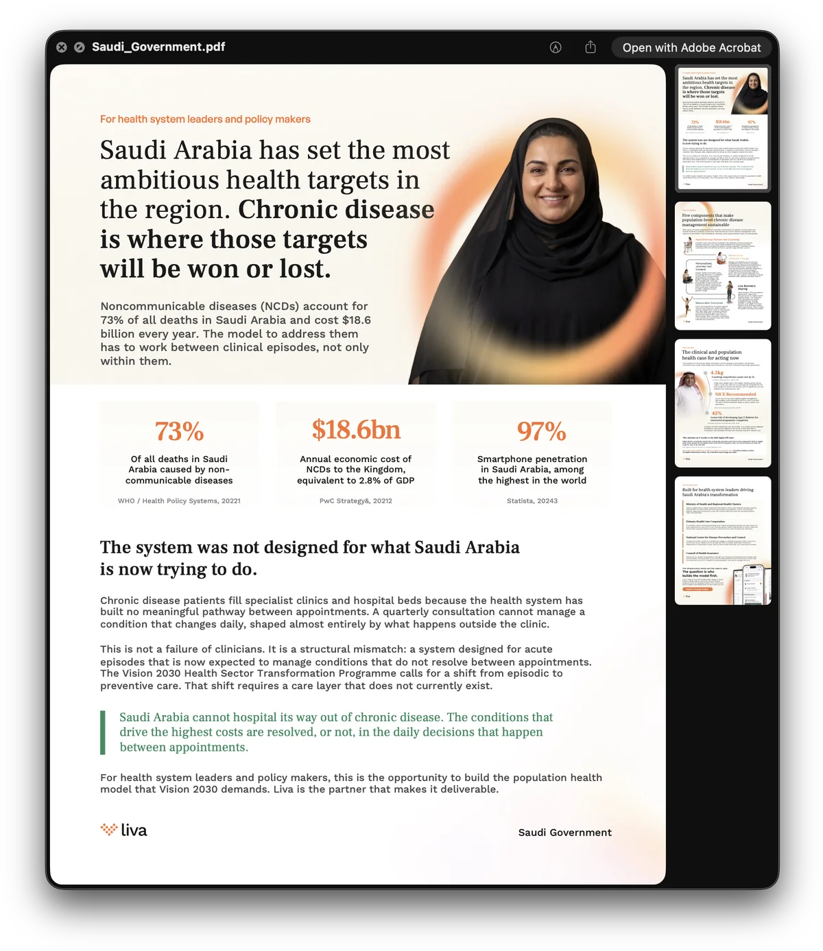
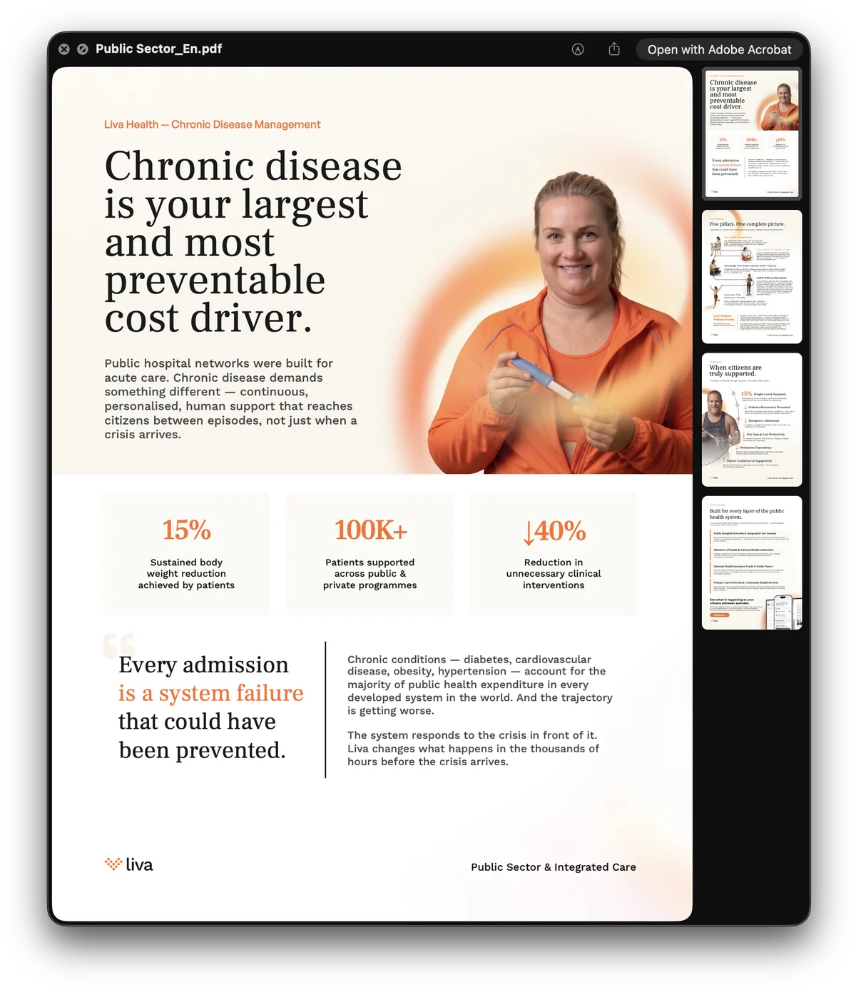
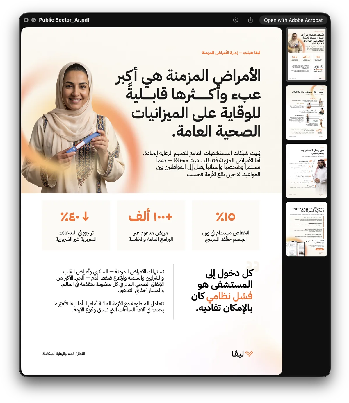
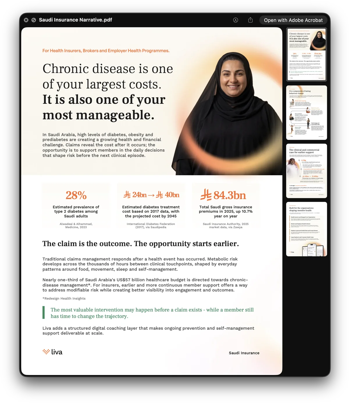
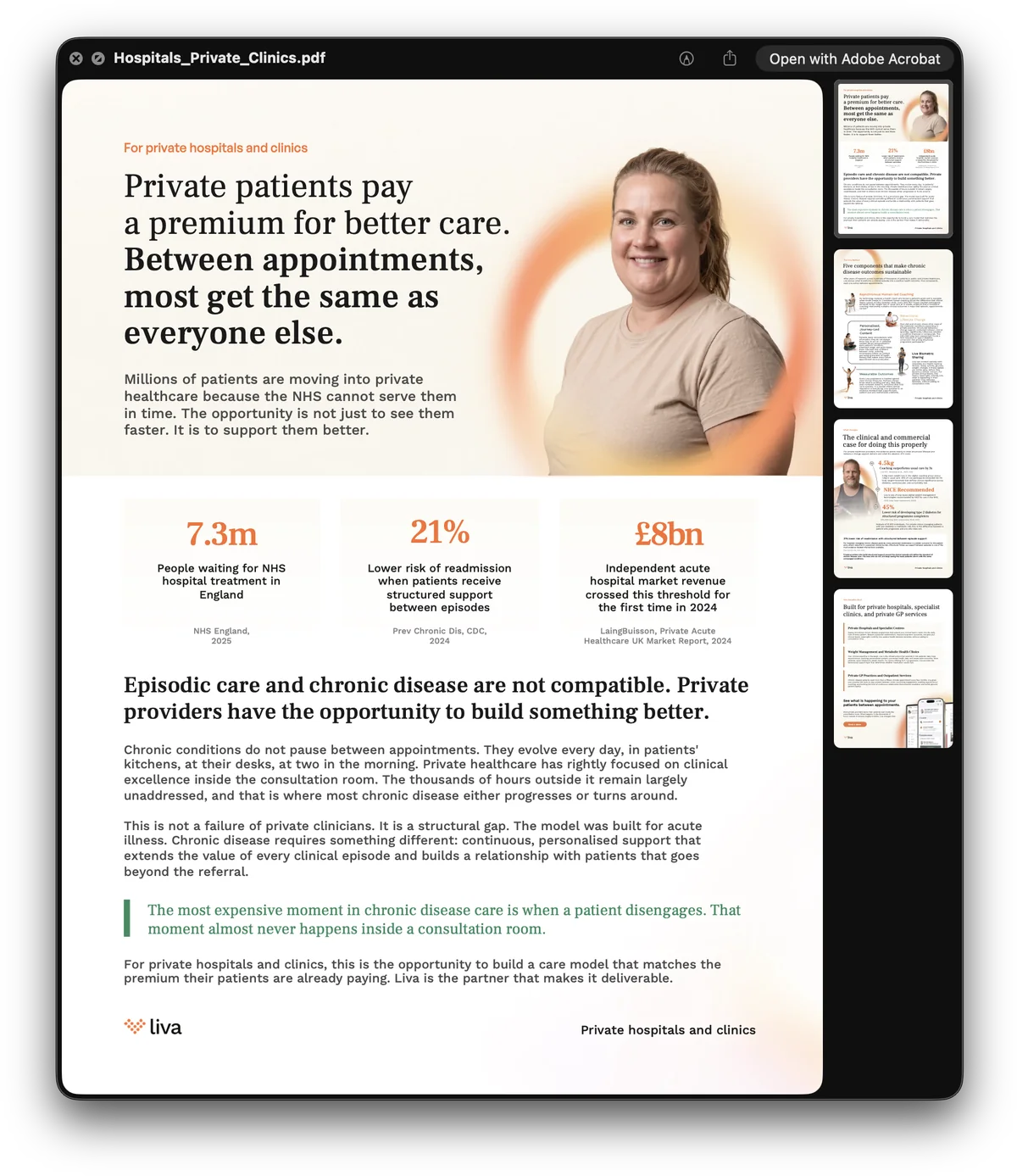
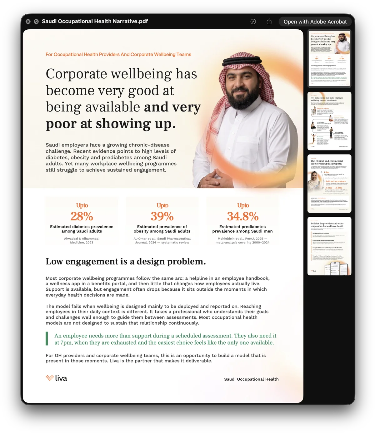
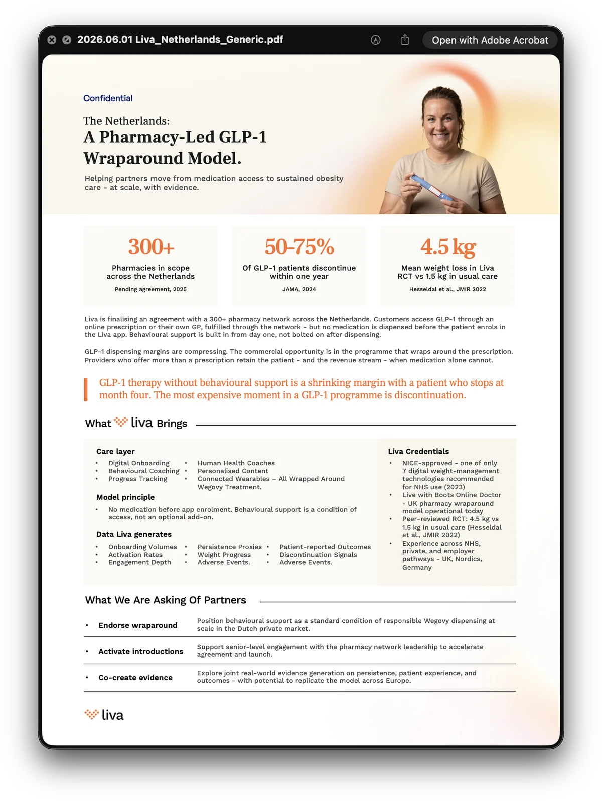
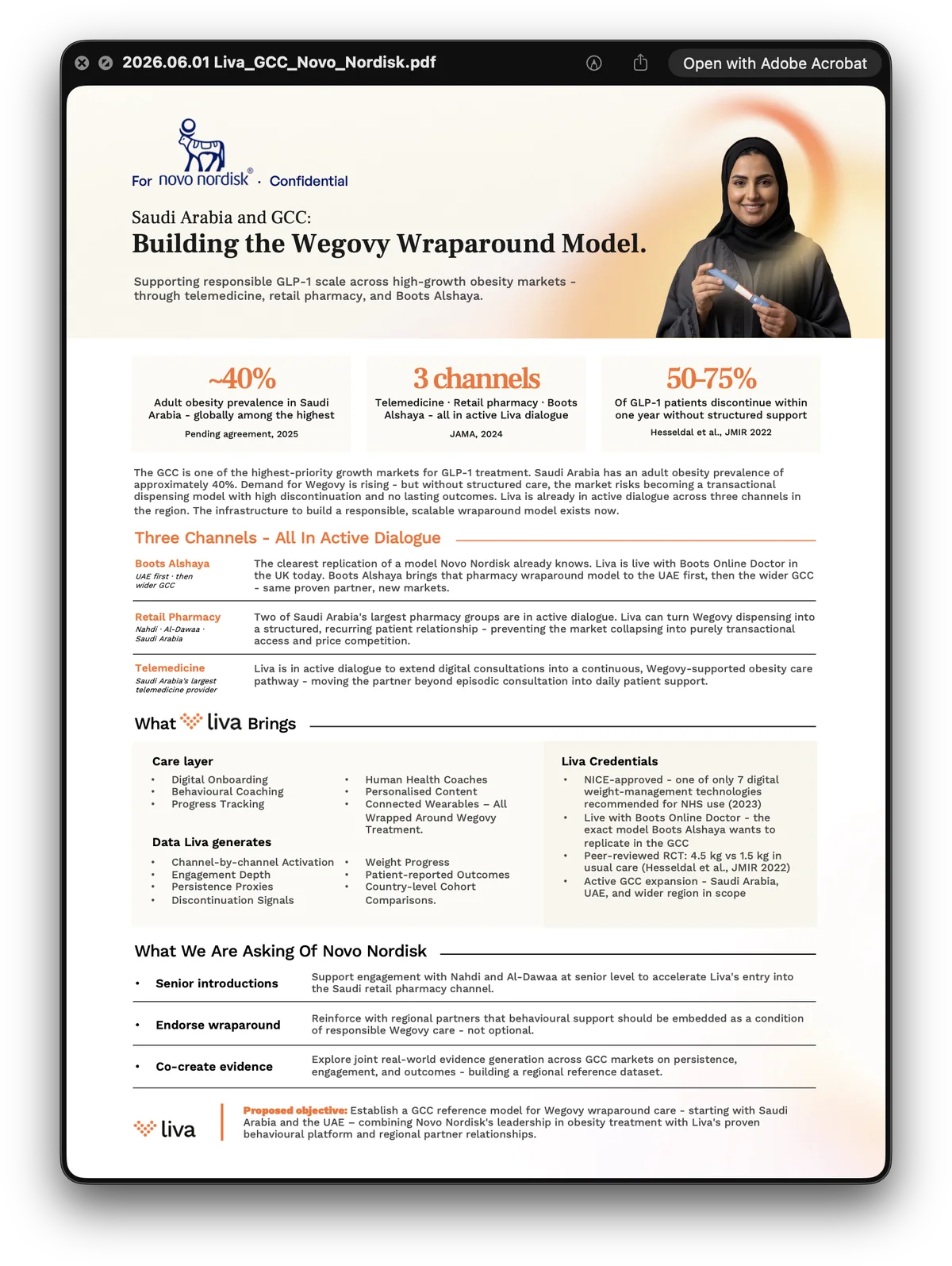
Under the feed, the library it is drawn from. A paper per market and per buyer — a health ministry, an insurer, a hospital group, an occupational-health team, a pharmacy chain, a pharmaceutical partner — each one built the same way: a claim you can argue with, three numbers that hold it up, and the offer at the end.
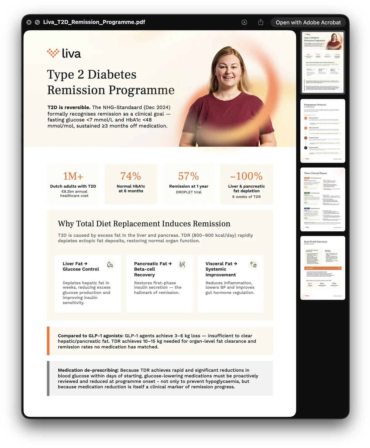
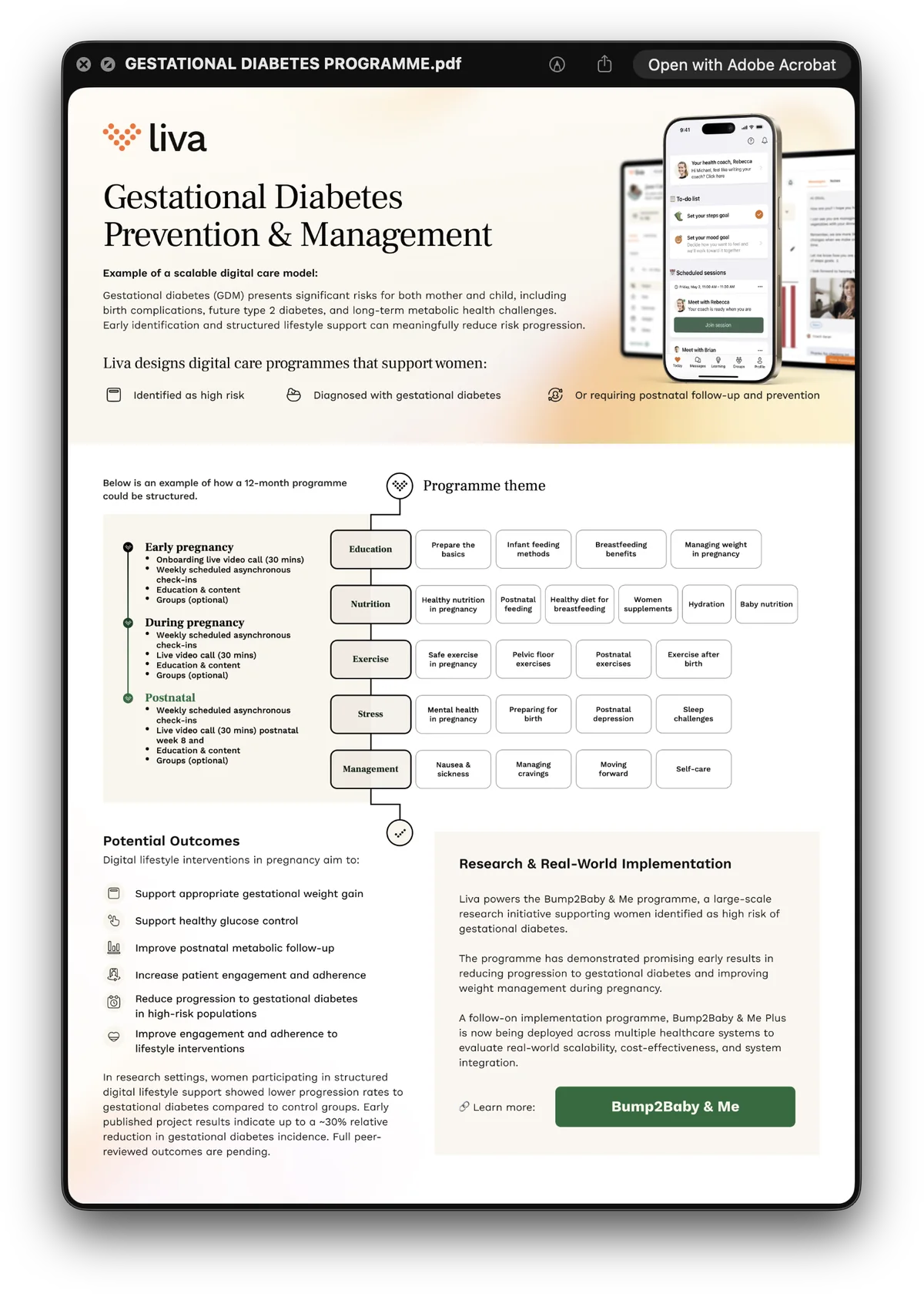
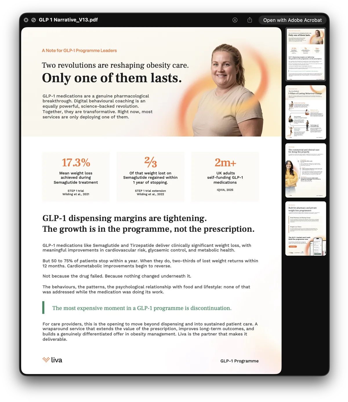
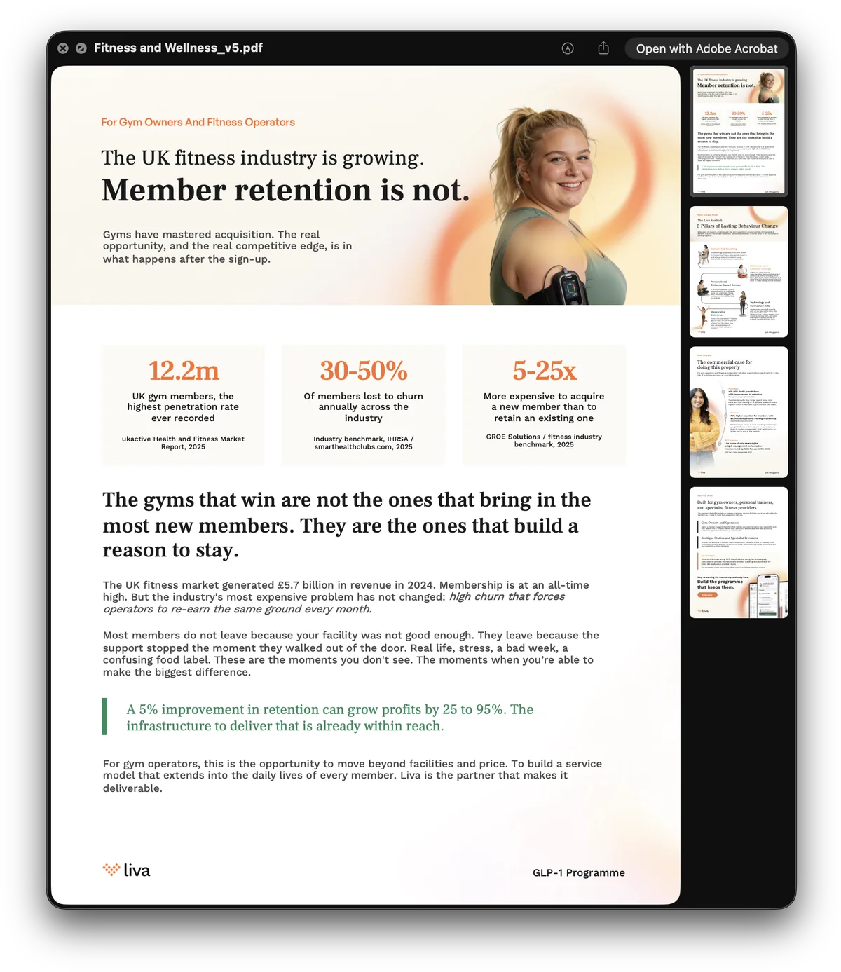
And the programme sheets under those: what is actually being sold, one condition at a time.
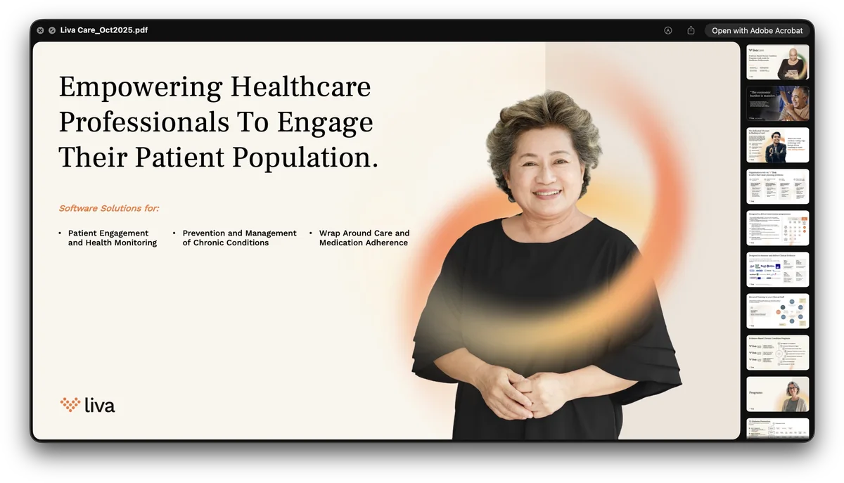
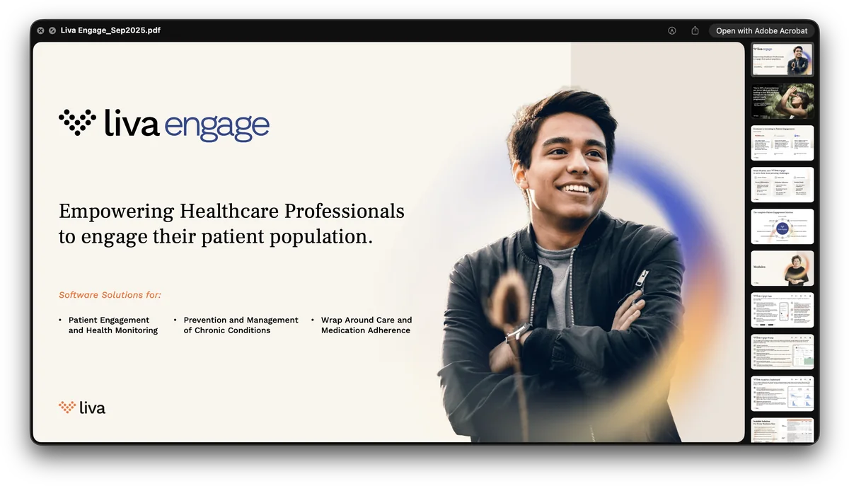
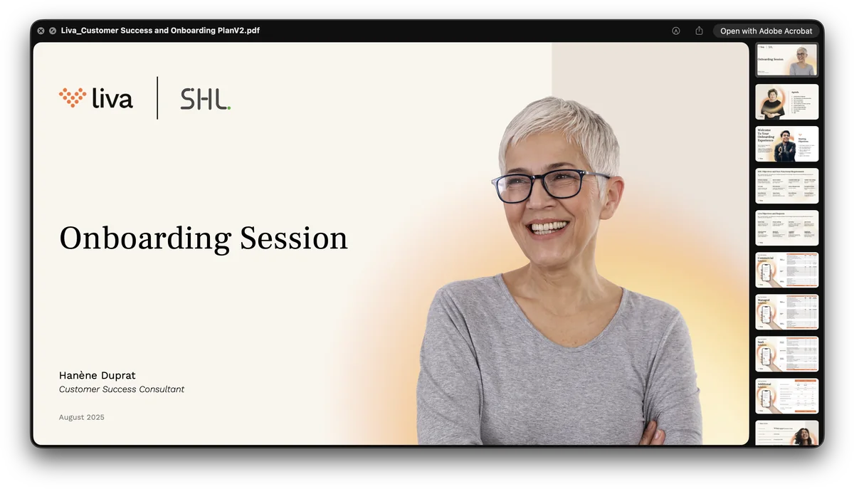
The decks the sales team opens with, in the two product voices — Liva Care and Liva Engage — and the onboarding session a new client gets afterwards.
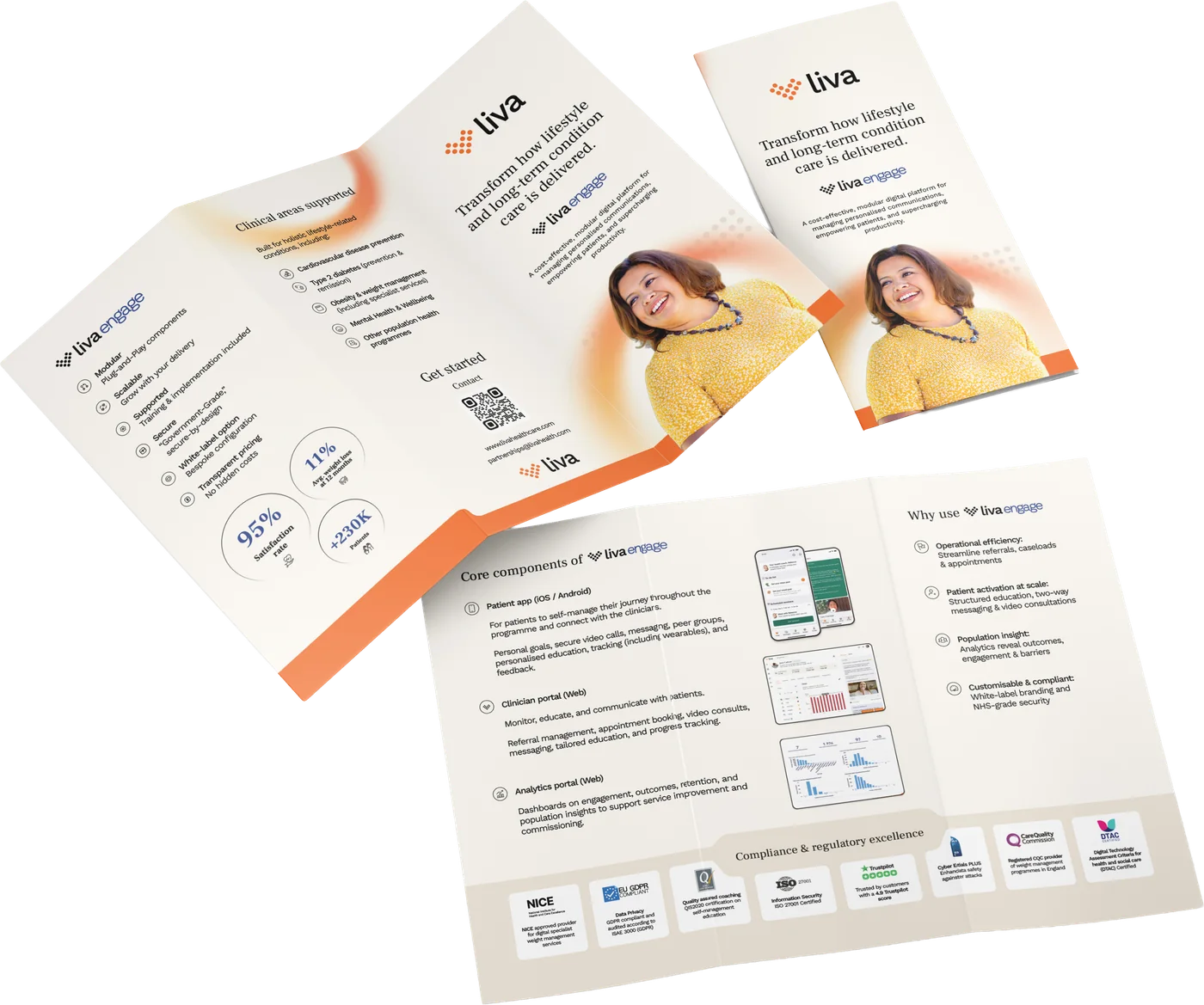
The leaflet, for the hand rather than the screen.
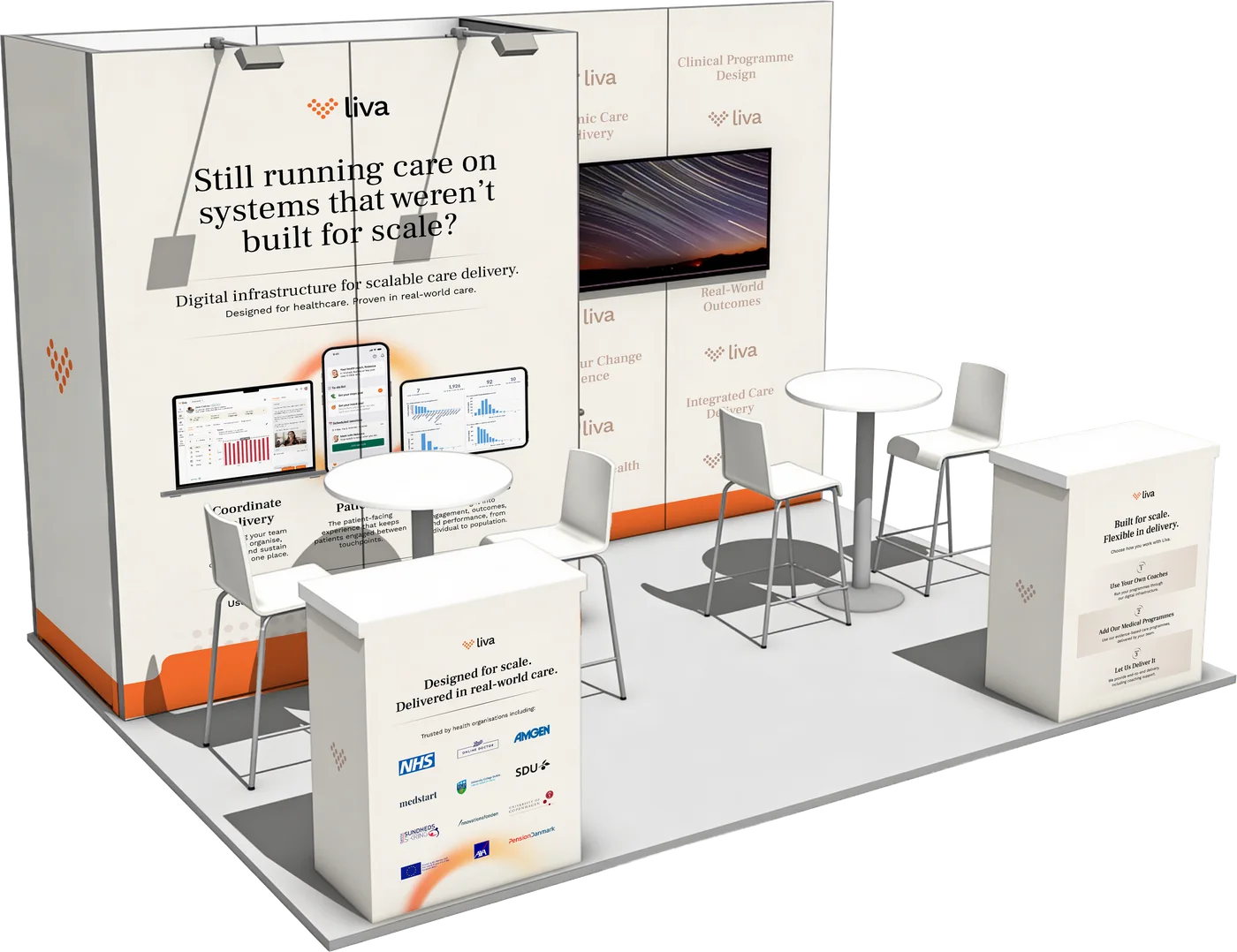
And onto the floor. A stand is the system at three metres, and it has to work as the claim across the wall, the numbers under it, and the arc big enough to be a room — this one for Health & Wellbeing at Work.
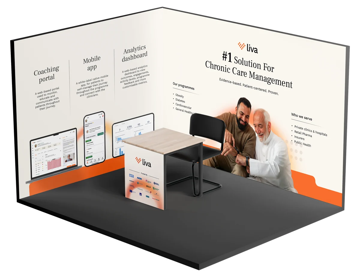
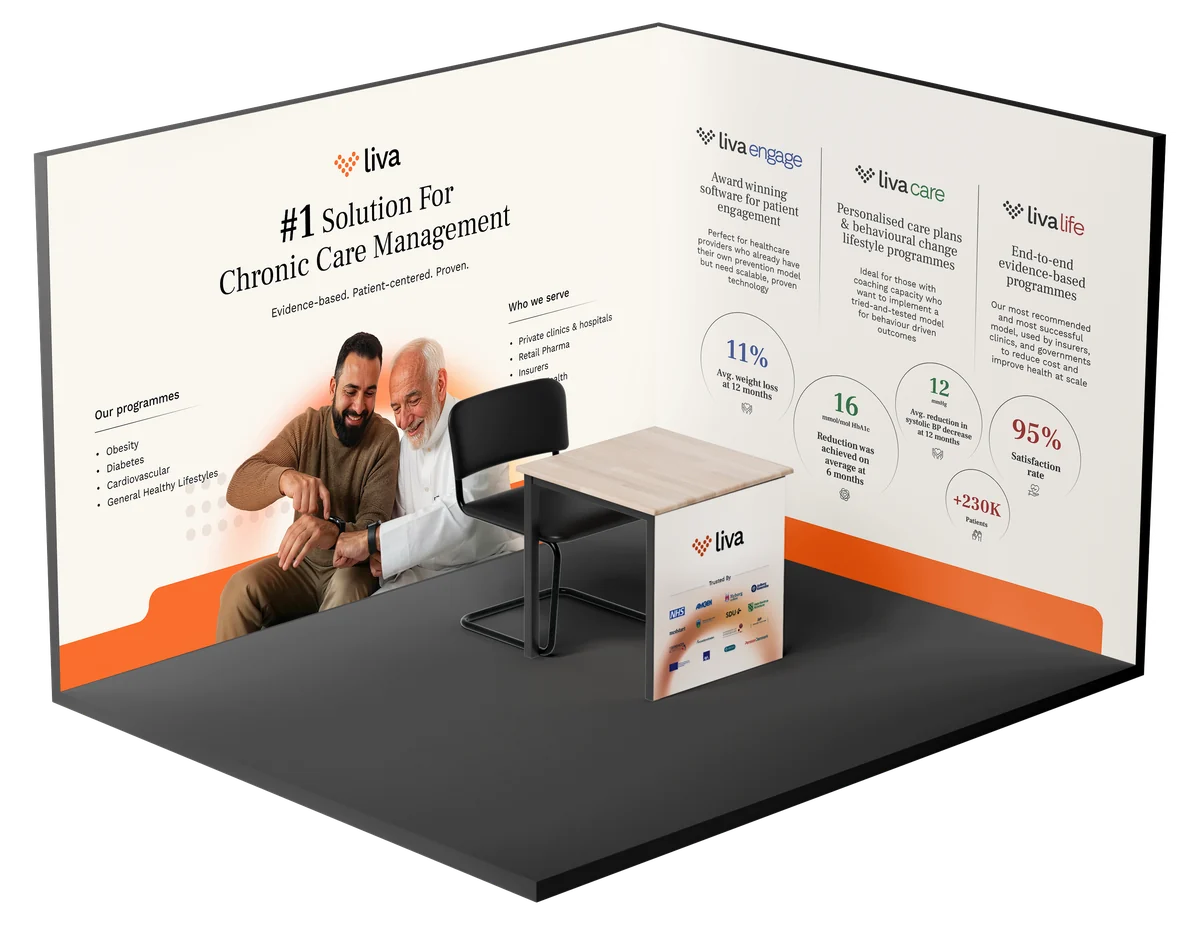
Two more stands for two other shows. Every event sells you a different floor and a different wall, so none of these is the last one rebuilt — what carries across is the argument and the system that sets it, not the furniture.