









Brand identity, bilingual · Qatar, 2022
Aqarco
Aqarco wanted to be read as a platform, not as another broker — a Middle Eastern property technology company that happens to sell houses, rather than an estate agent that happens to have an app.
Three things had to be true at once: speak directly to an Arabic audience while keeping a global presence in mind, feel reachable and friendly rather than institutional, and be bilingual from the first day, with room to expand.
The identity comes out of a single letter. ق is unusual in that it has a near-twin in English — Q — and drawing the connection between the two gave both versions the same vibe without either being a translation of the other.


The Arabic and the English are kept apart rather than fused into one bilingual lockup. Each is drawn on its own terms, which is what buys the premium feel; what holds them together is the letter they share.

And the mark that has to carry the brand without either of them. The ق becomes a house and its two dots become the windows — which is all a platform gets on a home screen.
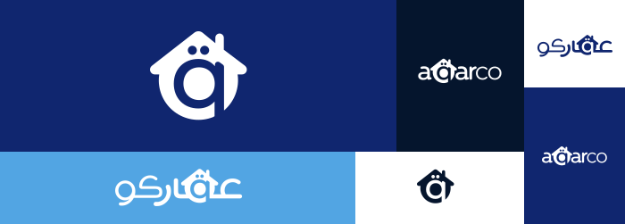
One mark, one colour, any ground. Printing is where identities usually break, so the single-ink version is specified before the colour one is allowed to get comfortable — light type on a dark ground, dark type on a light one, and nothing else.
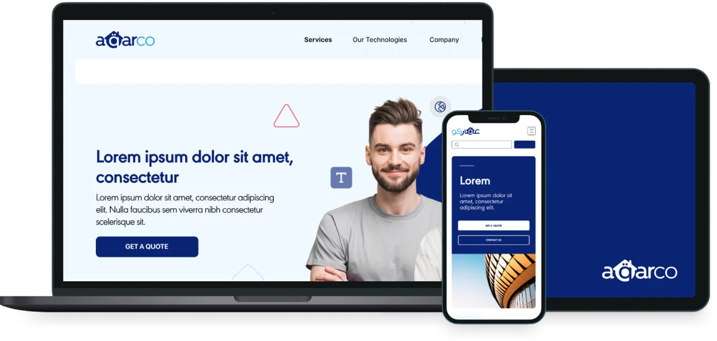
The site, kept to the two blues and a lot of white, so the listings are the only thing in it with colour.
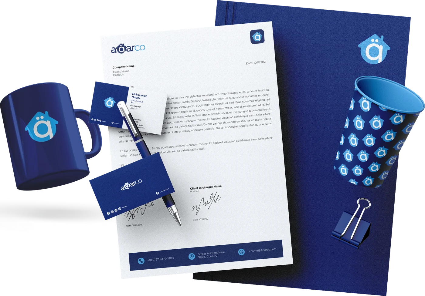
Then the things you can pick up. Cards, folder, letterhead, envelope, cup, pen and mug — property is still a business done across a desk, and the desk has to agree with the app.
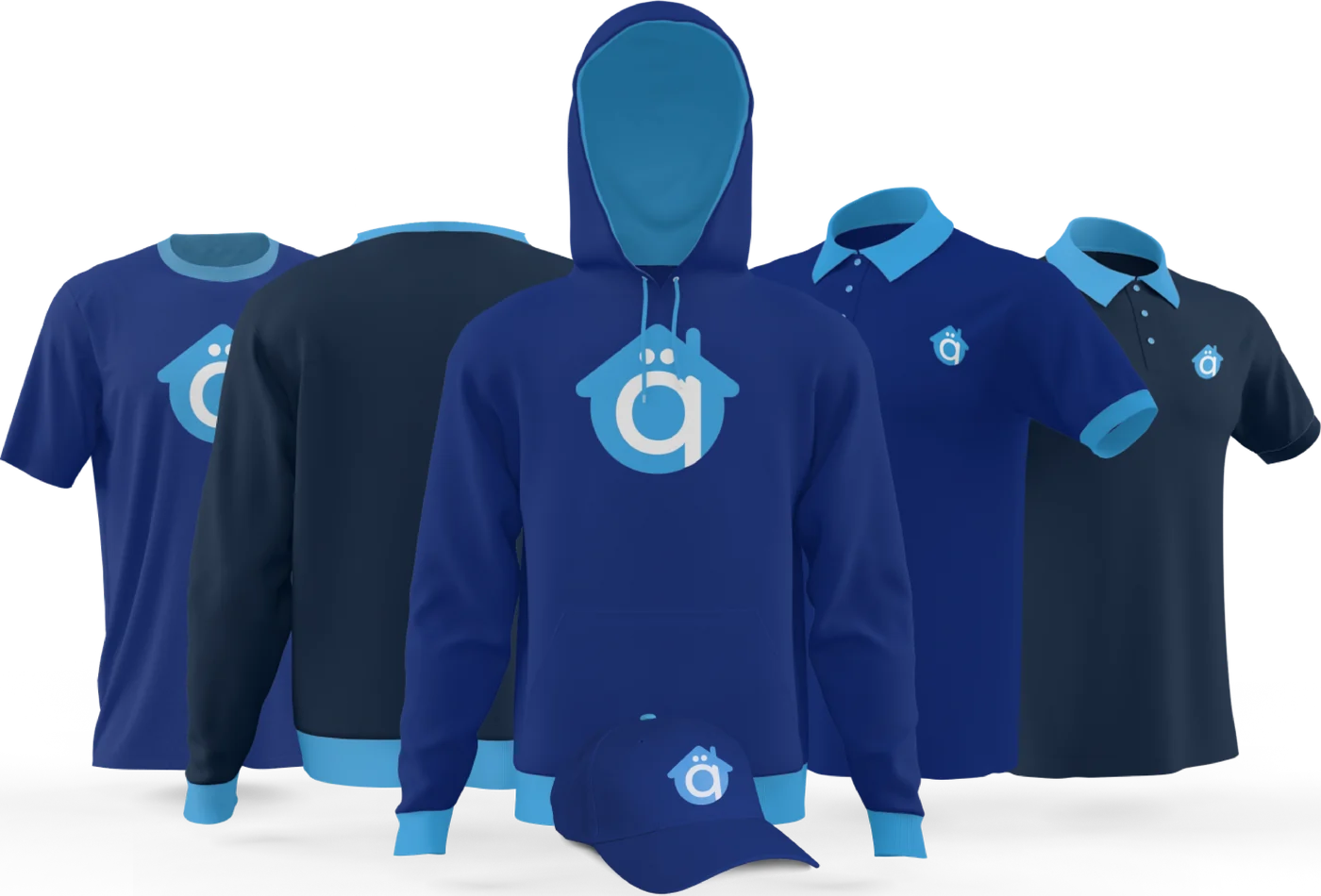
And the uniform, for the people who actually knock on the door.
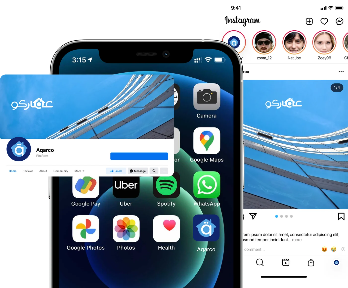
Where almost everybody meets it, last, because it is the one that has to hold all of the above at thumbnail size: the icon on a home screen, the feed, the cover.