


















Brand and product design · Romania, 2026
Flixier
Flixier edits video in a browser tab — no render farm, no download, no waiting — which is a genuinely hard thing to make a page believe.
The work covers the brand, the product UI and the campaign assets, and the marketing site was redesigned around the one claim the product can make that its competitors cannot: it is already running, in the tab you are in.
The redesigned site, live in the frame — and the whole of it is one window away.
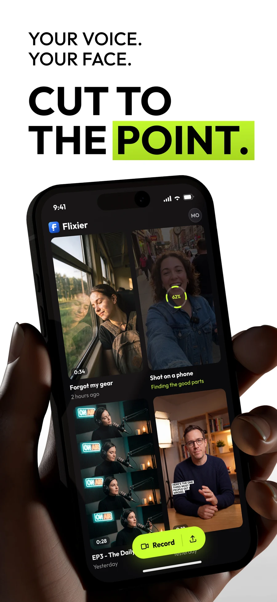
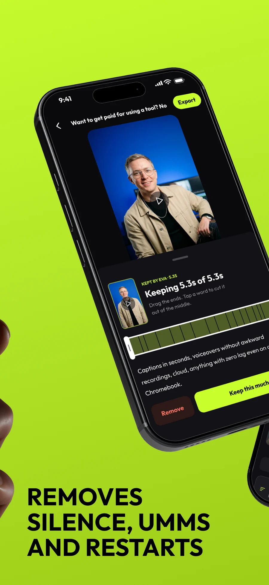
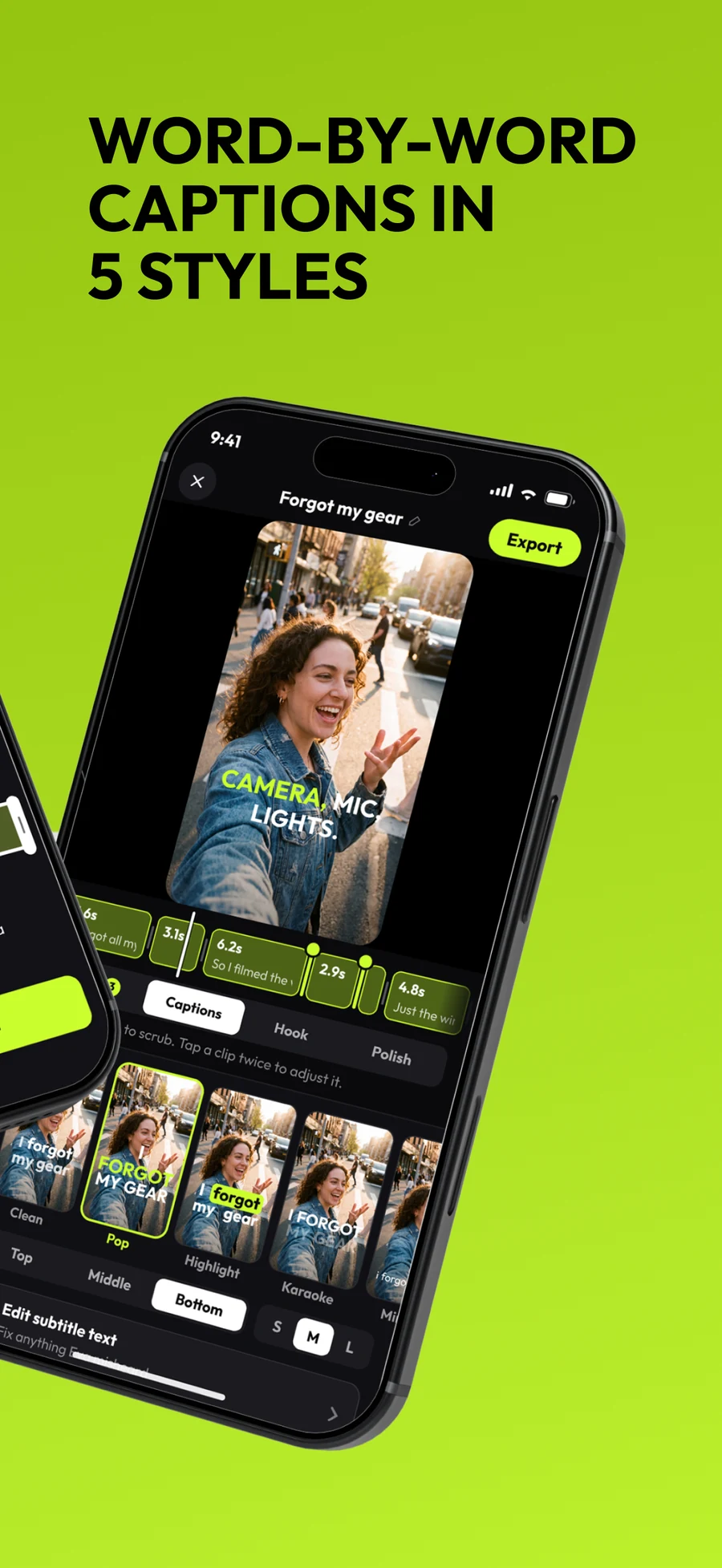
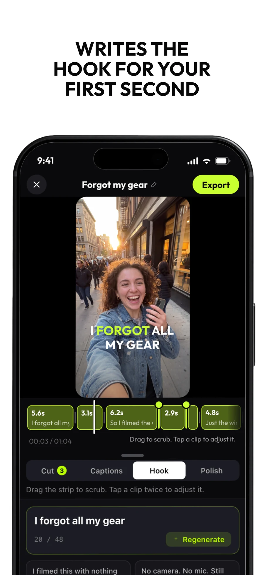
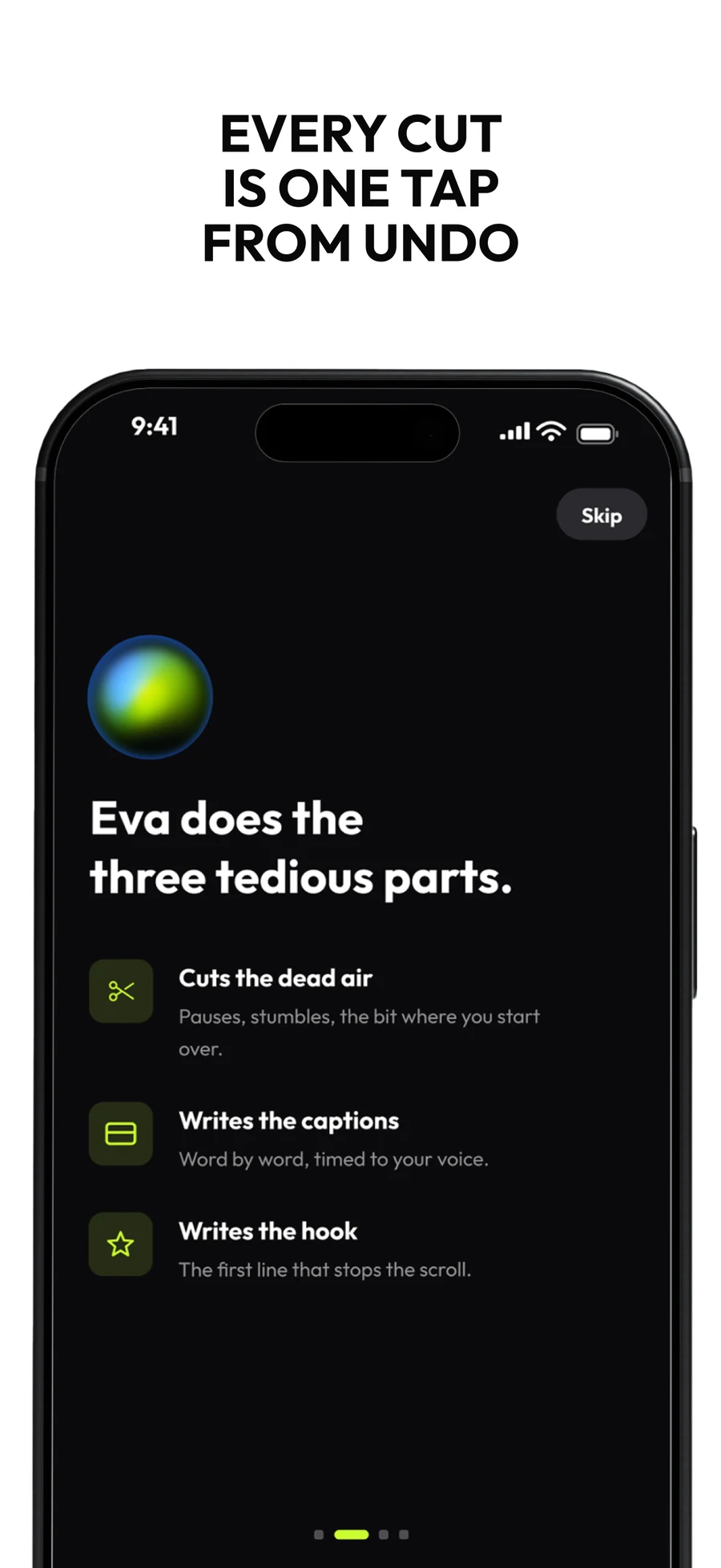
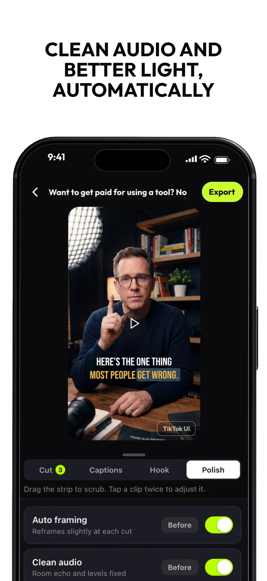
The App Store set, where the rules are someone else’s: six portraits, a headline that has to survive being seen at thumbnail size, and no room for an argument that takes more than one line. The lime moves from accent to full ground on the two that carry the feature nobody expects a browser editor to have.

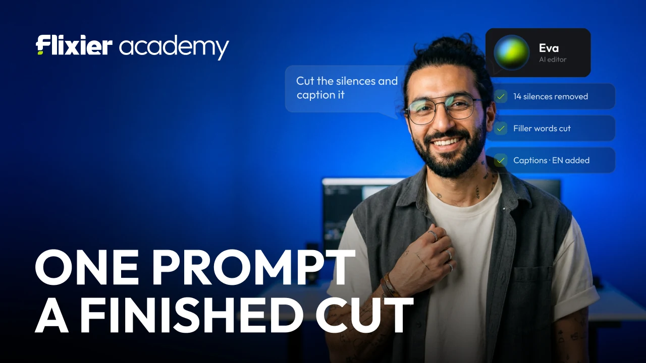
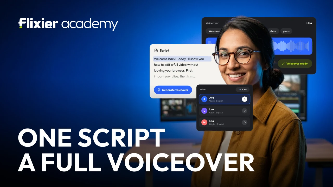




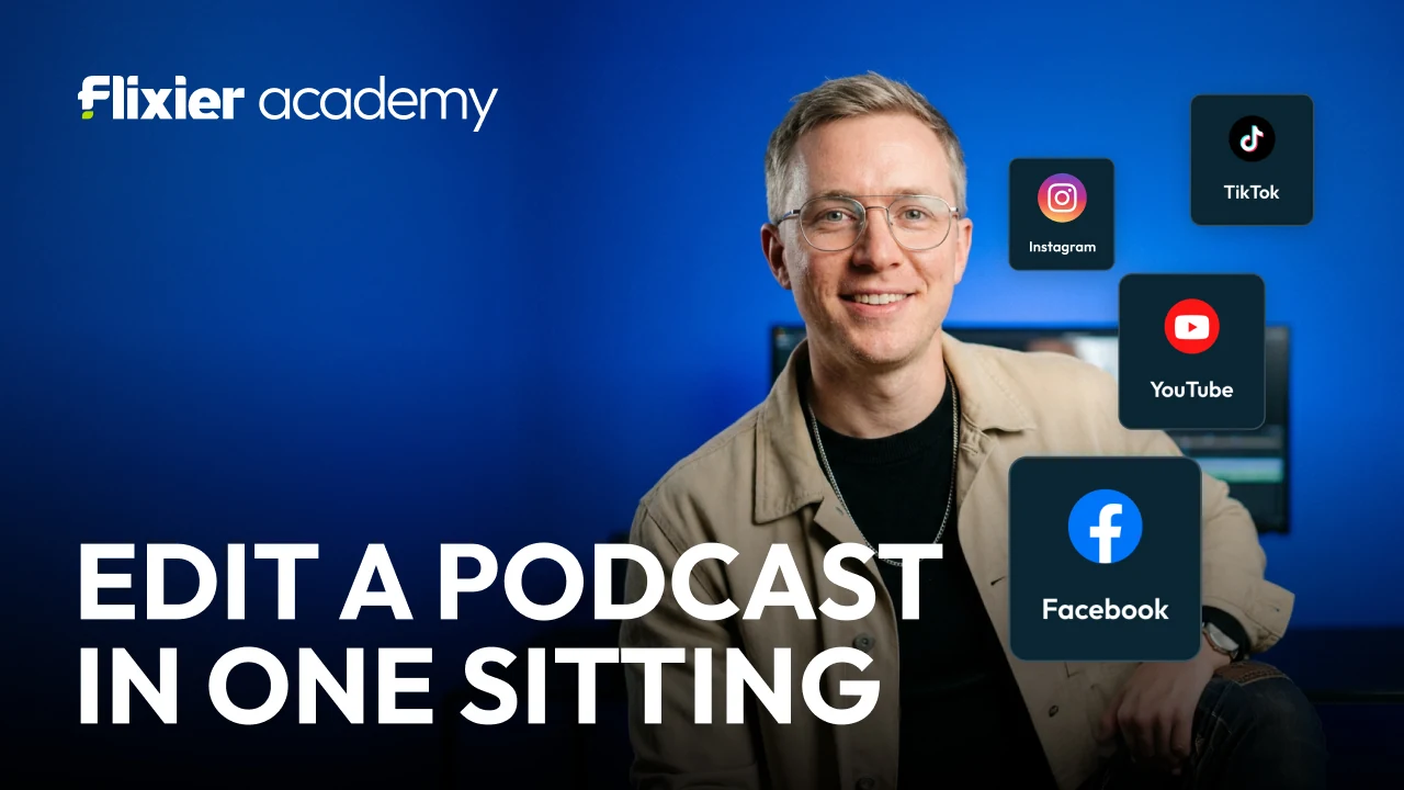
Thumbnails for the Academy, under its own lockup and its own sentence shape: a quantity, then what it becomes. One prompt, a finished cut. One voice, any language. Eight of them run the same construction, which is what turns a row of unrelated lessons into a series.
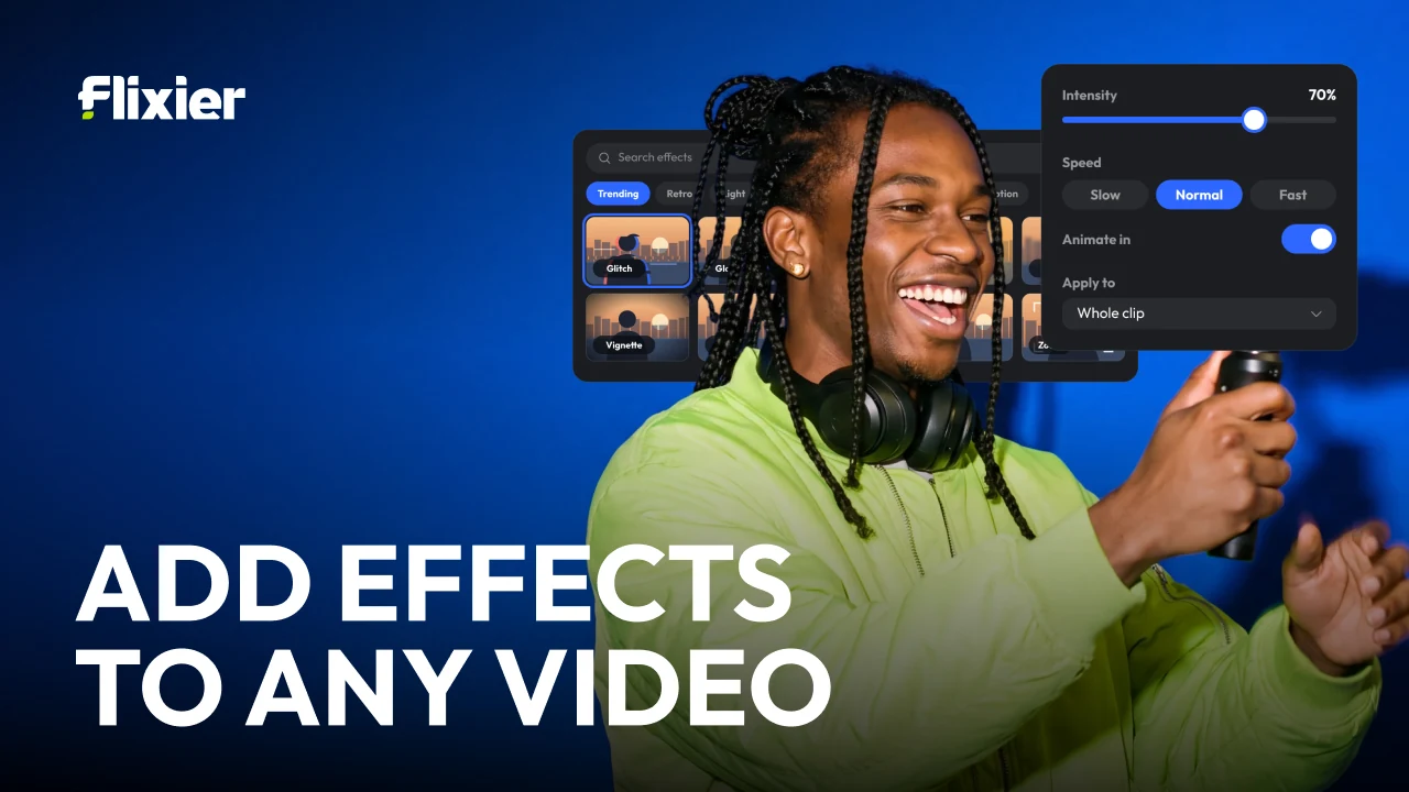
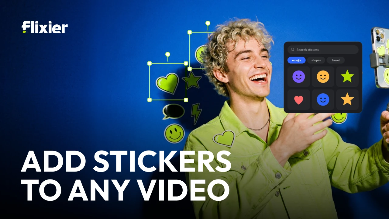
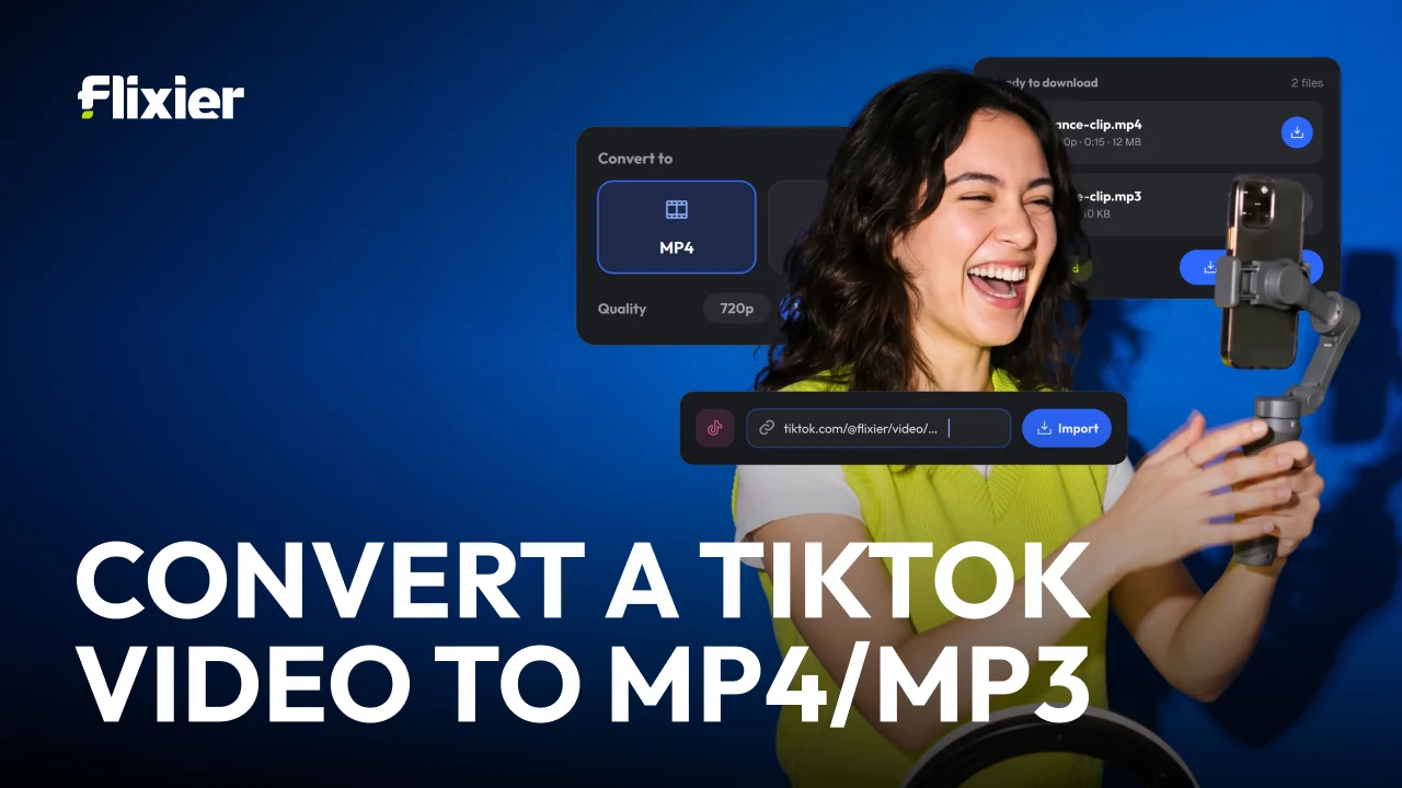
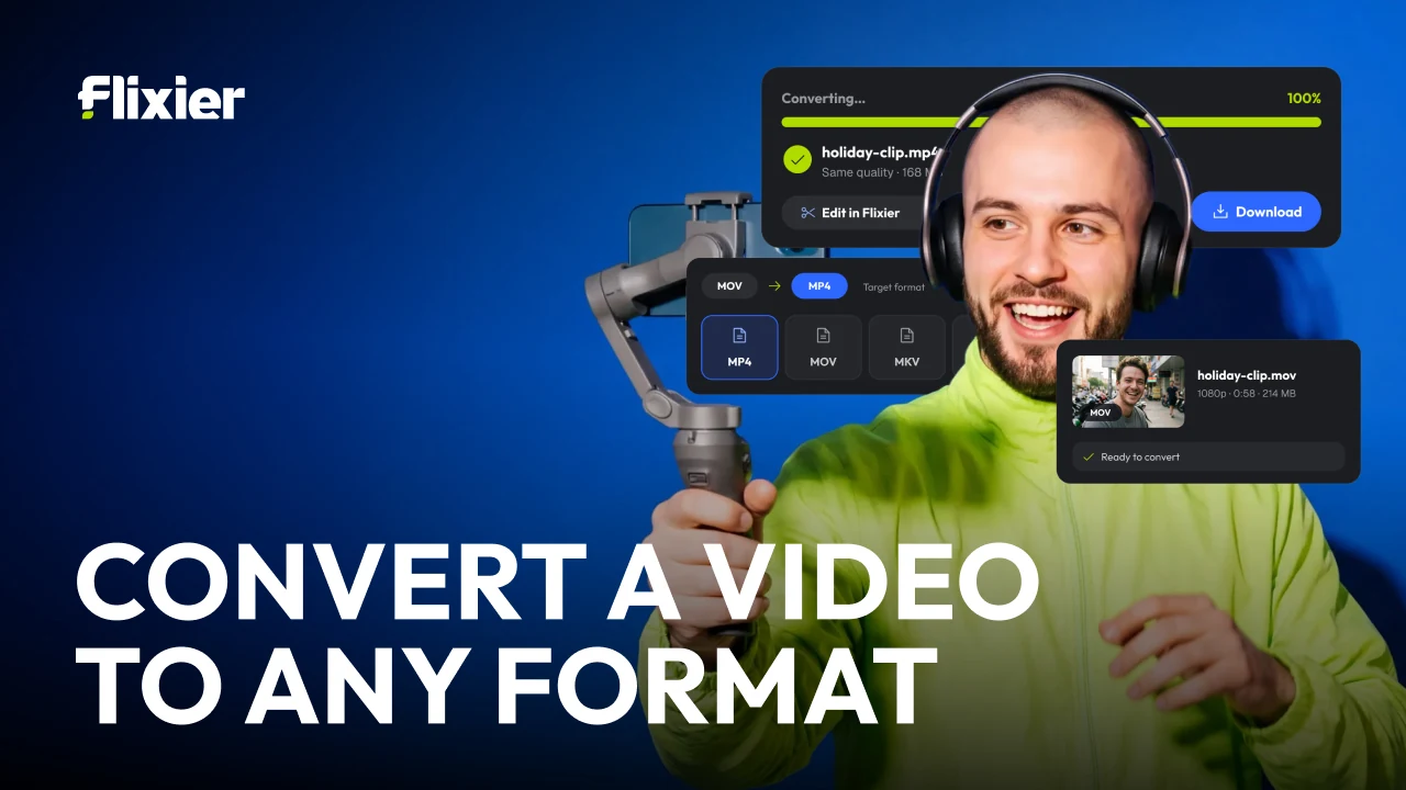
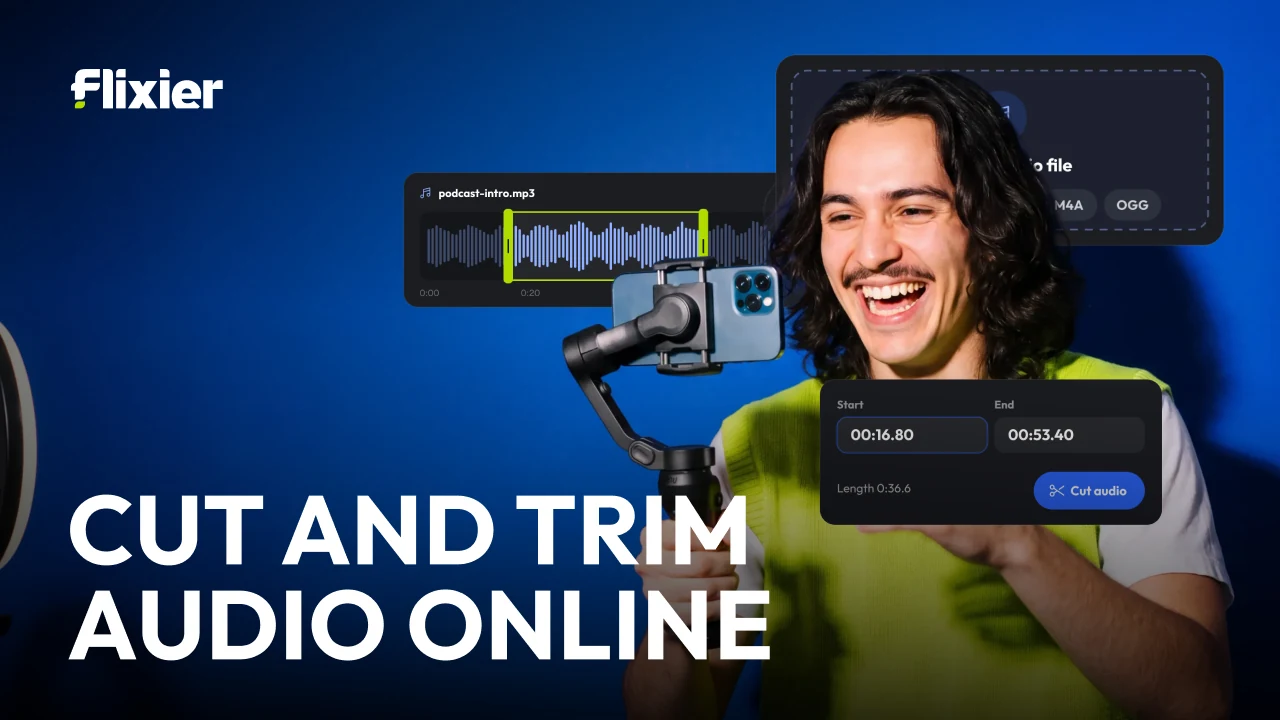
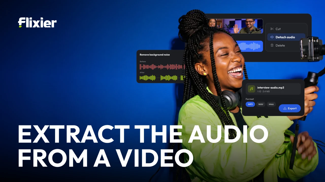

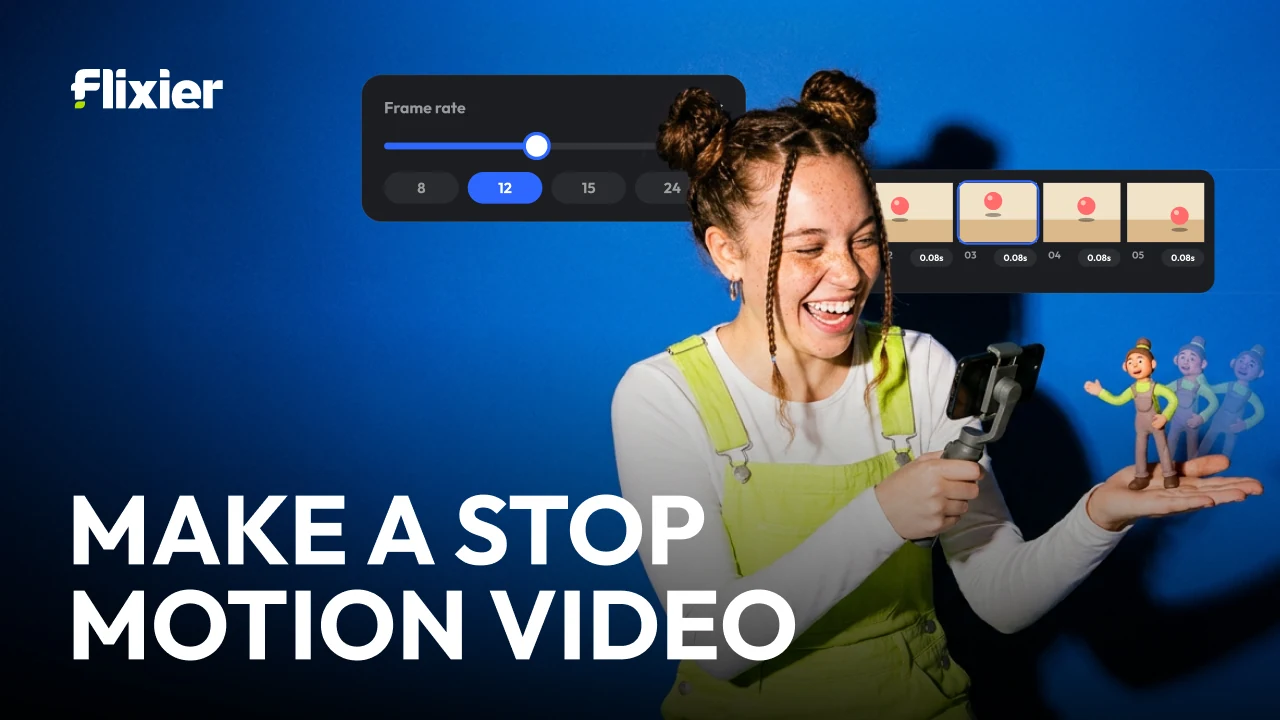
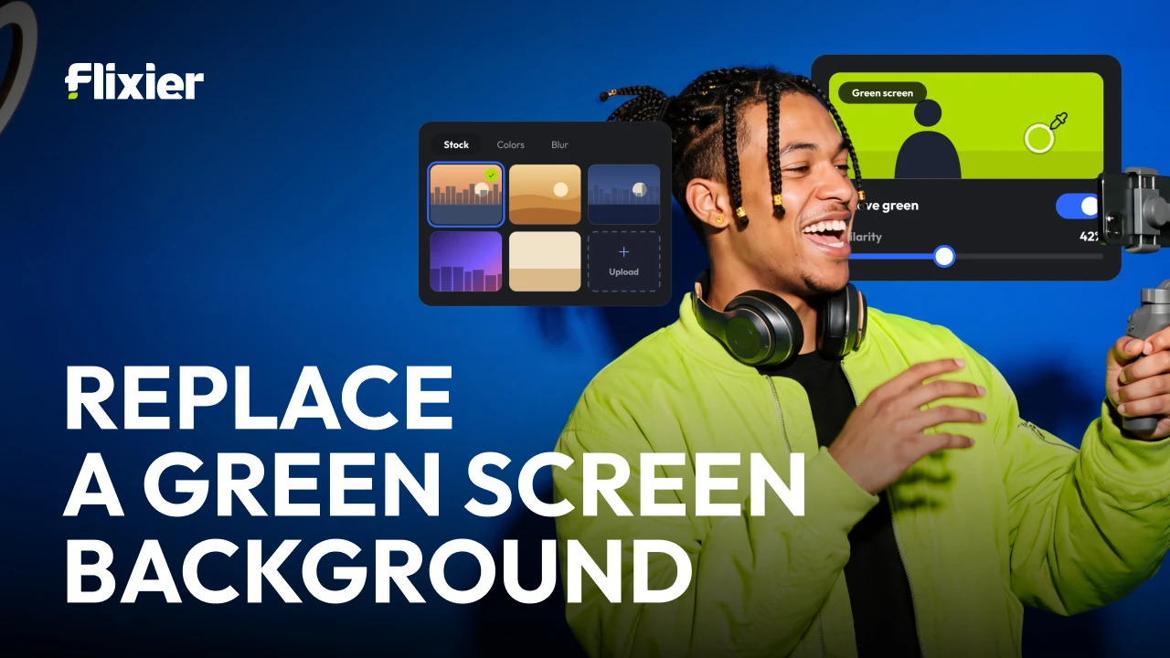


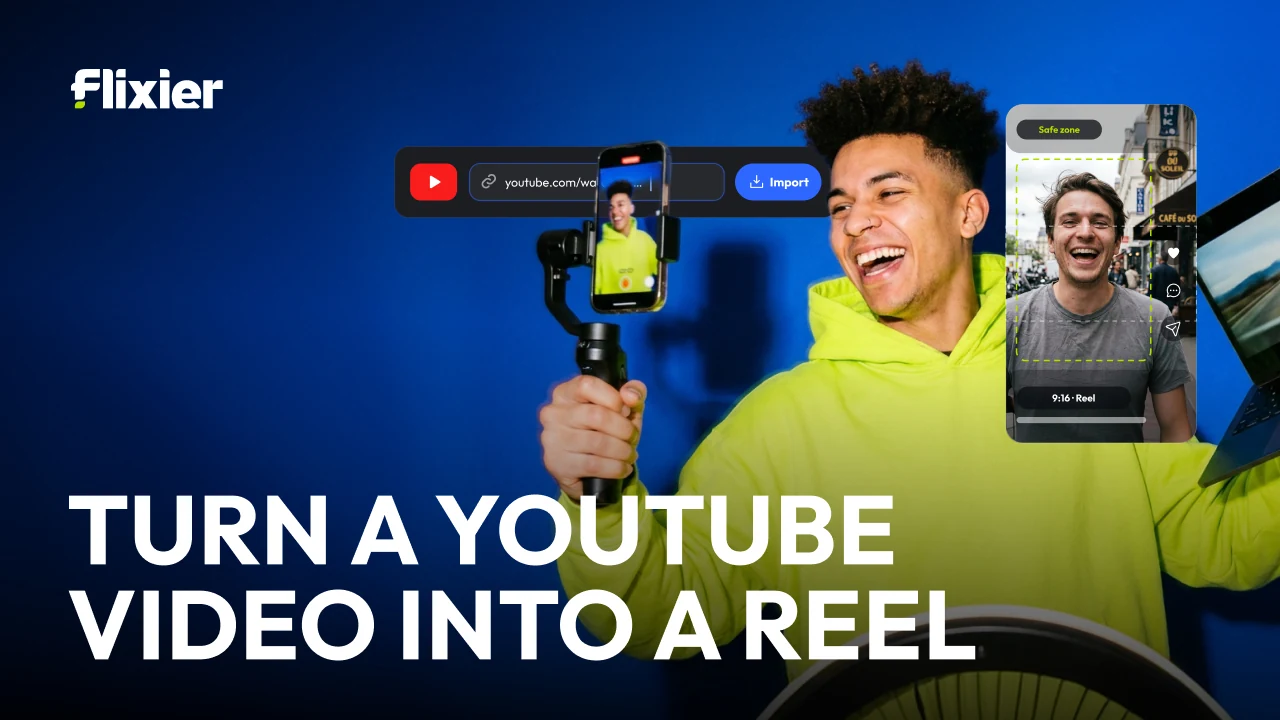
And the task thumbnails under the main mark, named for the search that finds them rather than for anything clever. Same stage, same lime jacket, same floating panel — a template strict enough that the twelfth one costs nothing to make and still looks like the first.
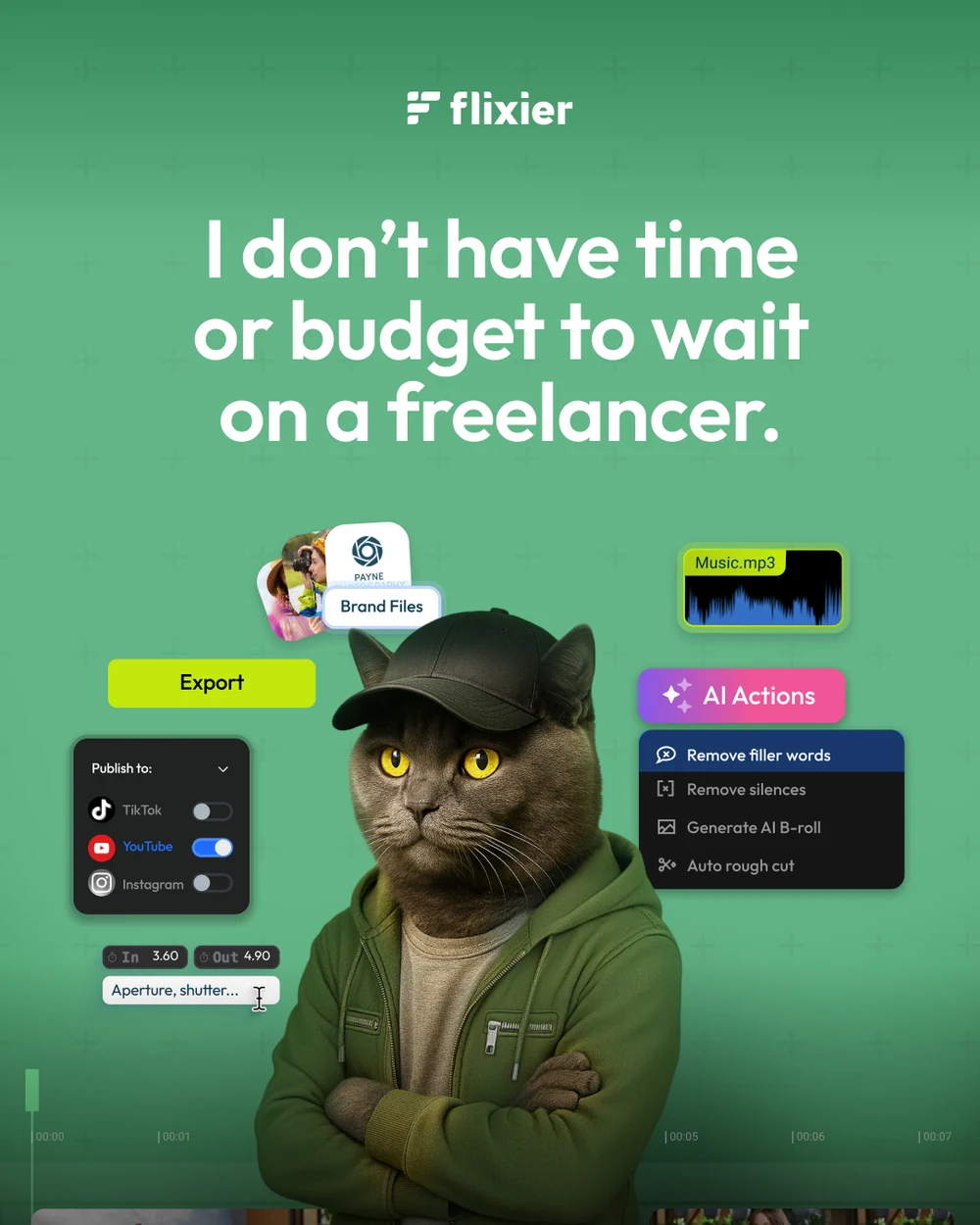
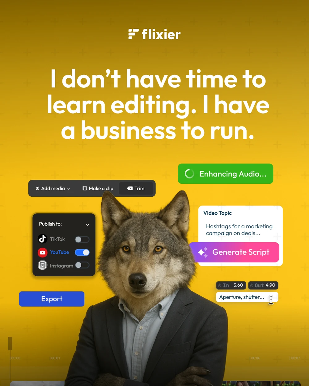

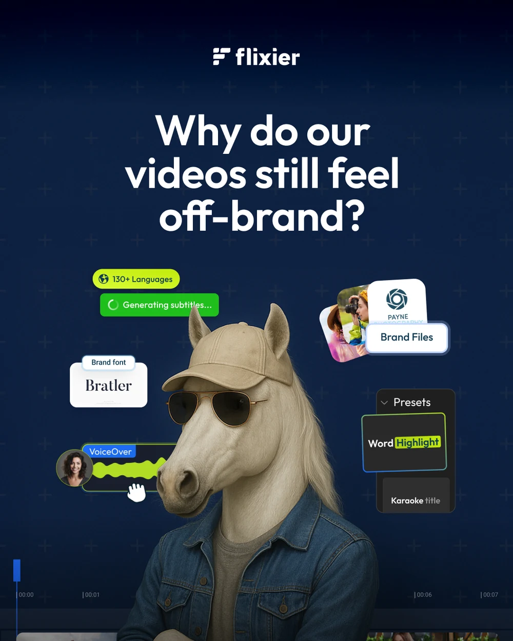
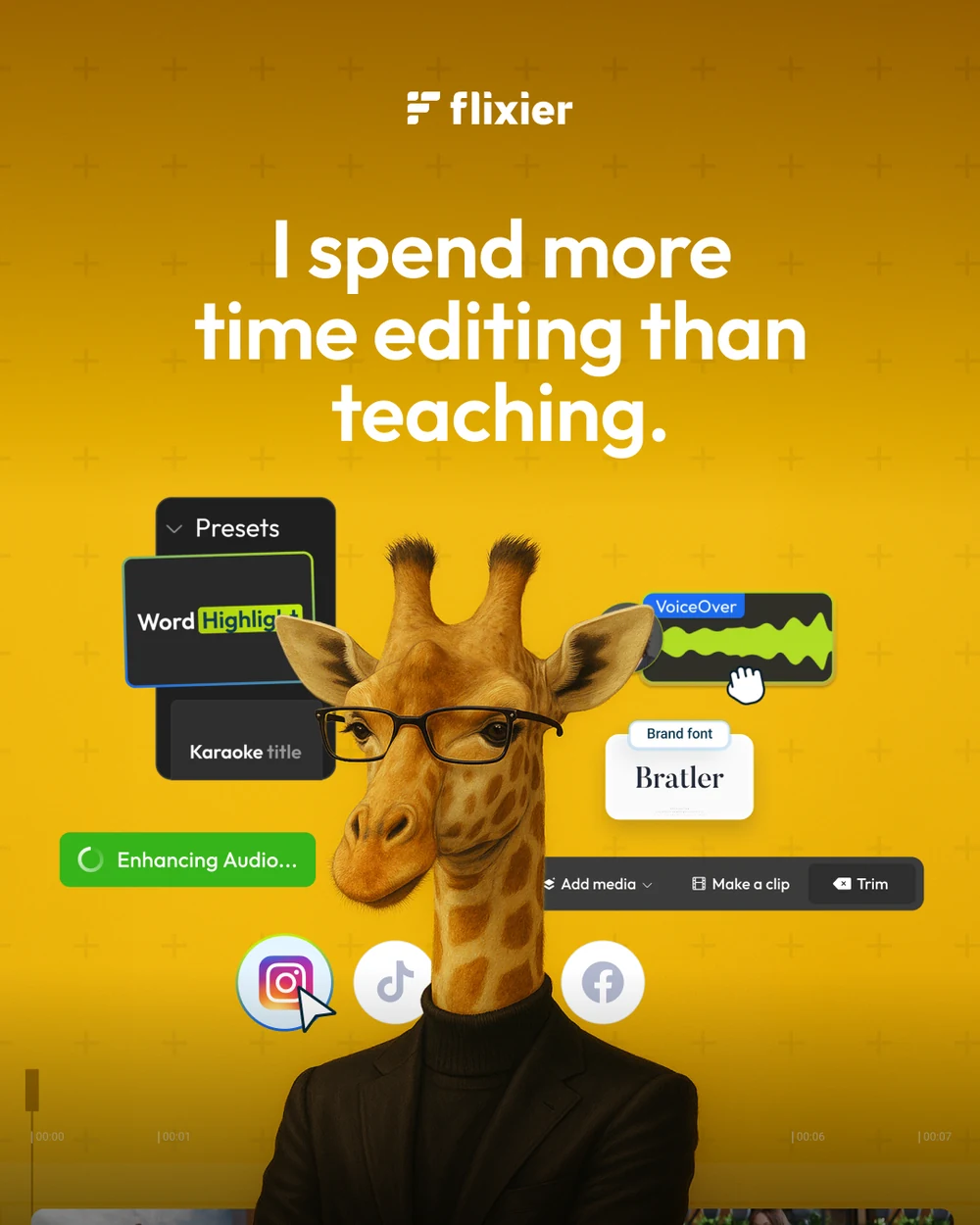

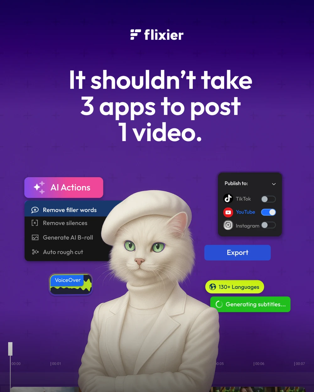
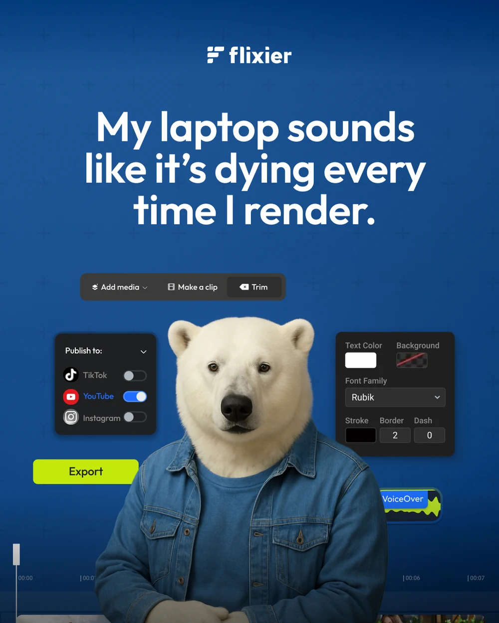
The feed campaign that does the most work for the least explanation: four audiences, each given an animal in a good jacket and a complaint in its own voice. The product is only ever the panels floating beside the portrait — the post is the sentence, and the sentence is the one the buyer has already said out loud.
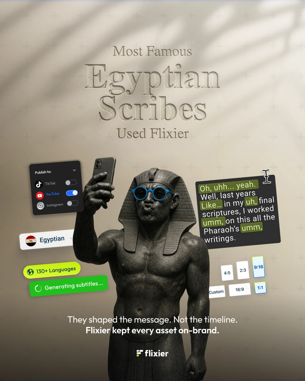
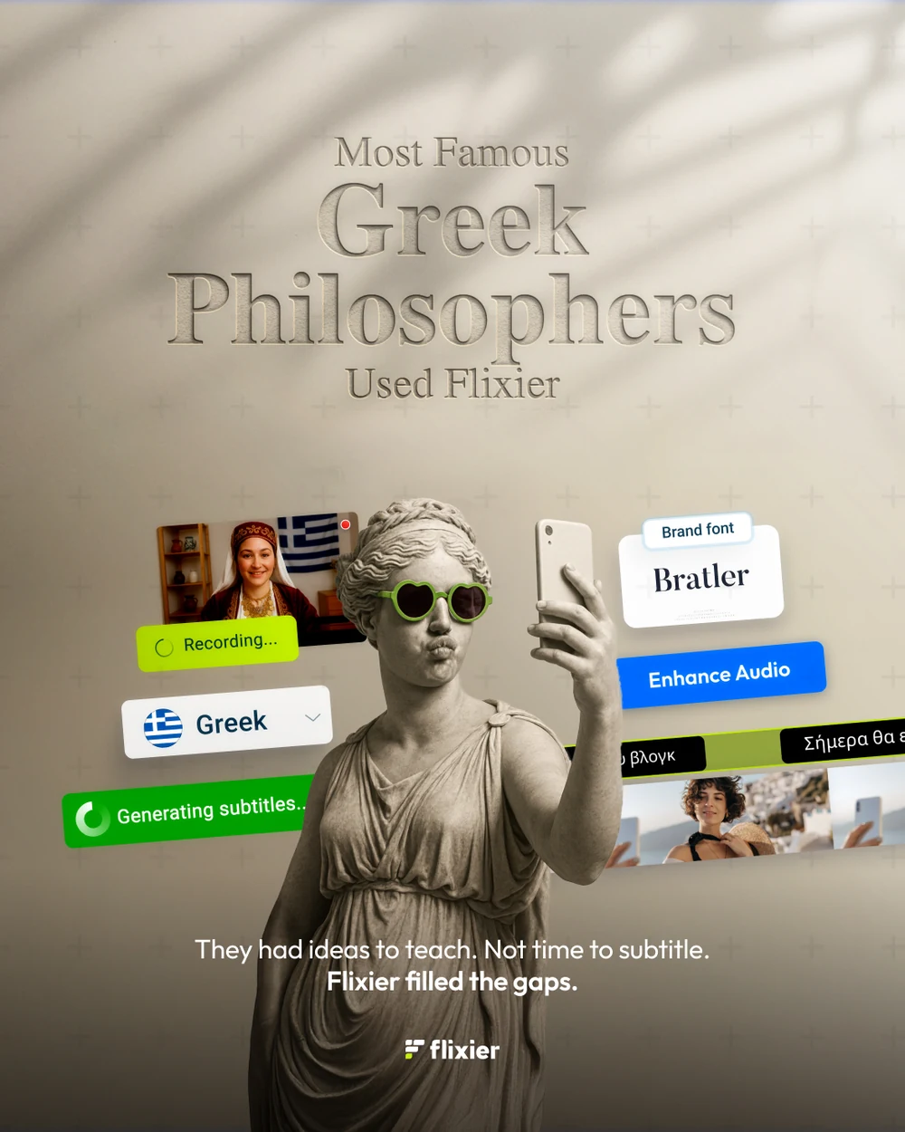
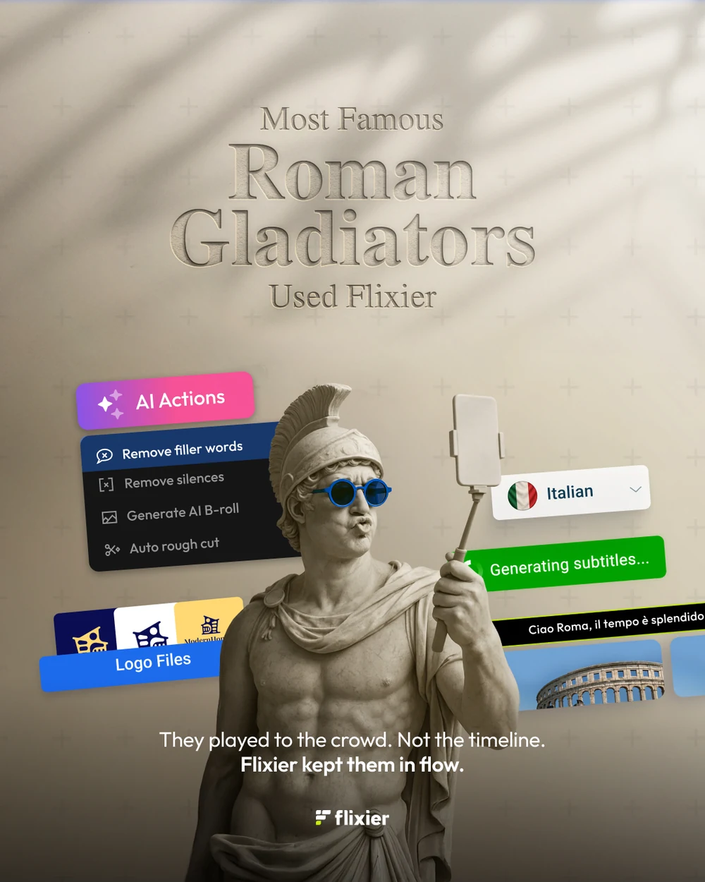
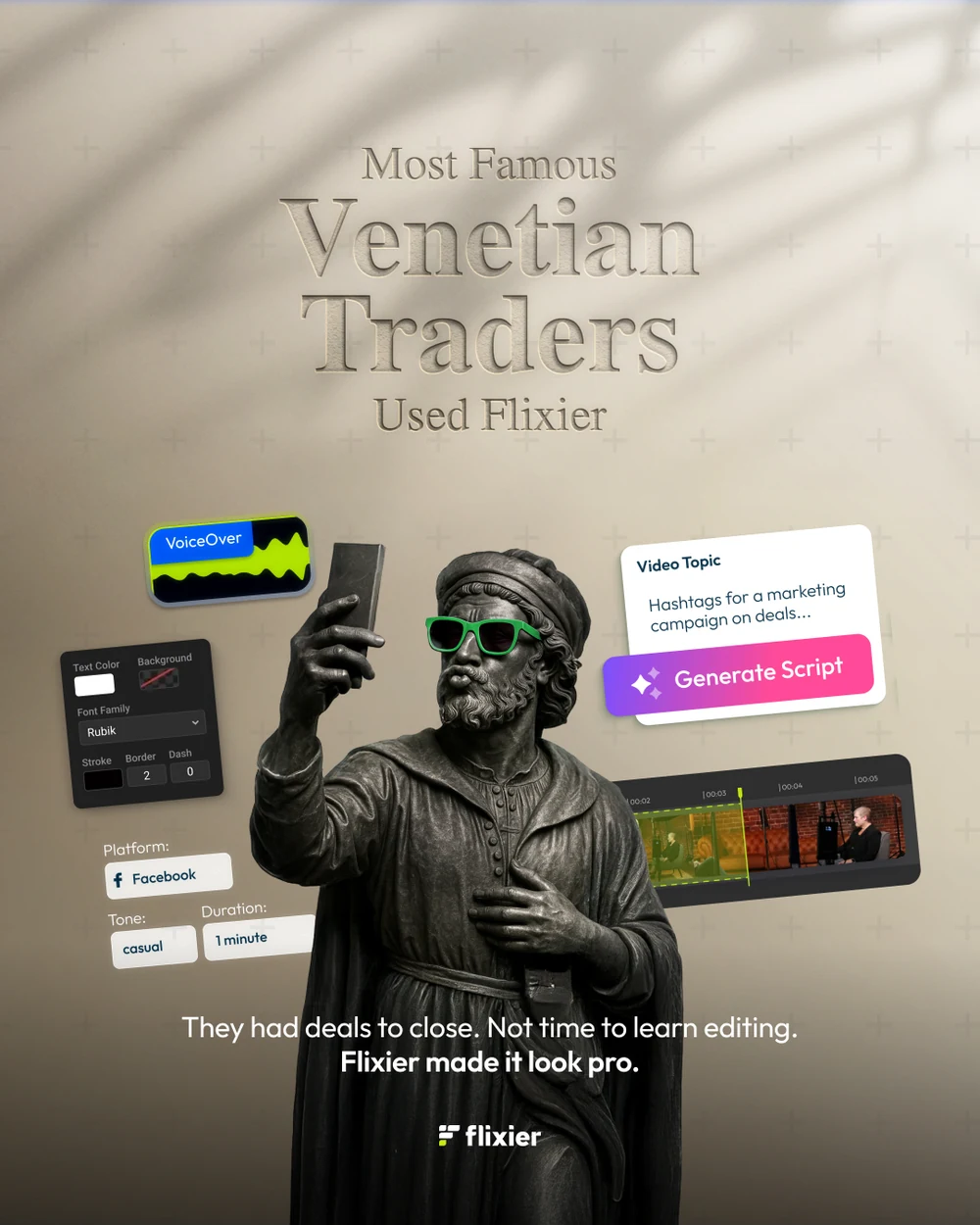
Borrowed fame, run twice. First as artefacts — a pharaoh, a kouros, a gladiator, a Venetian merchant, each handed a phone and a pair of sunglasses, under a line that is almost a historical claim and entirely a joke.
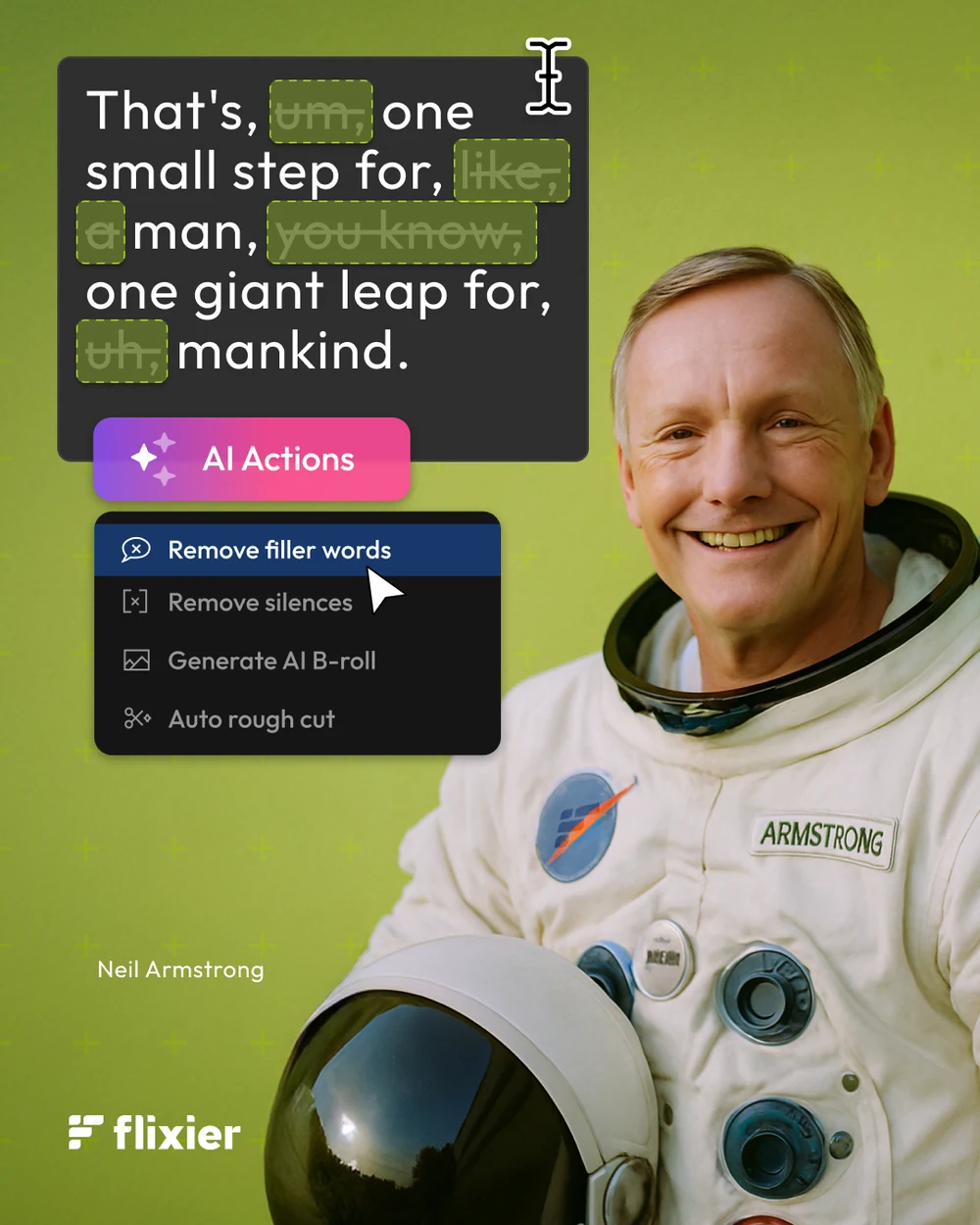
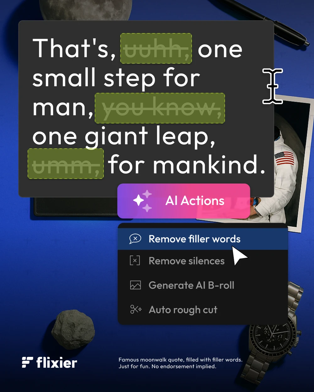
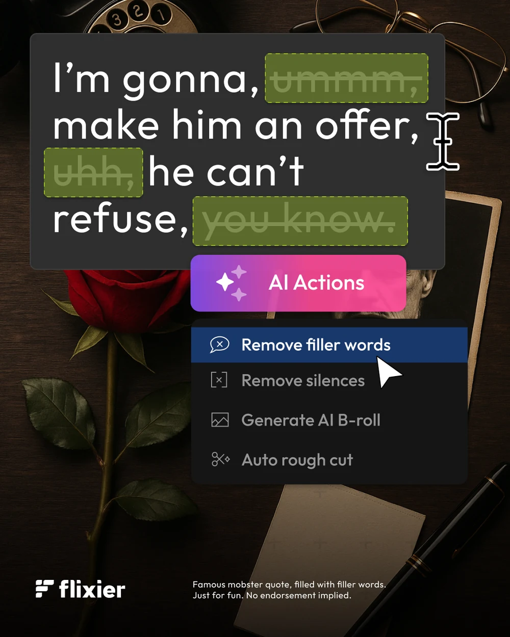


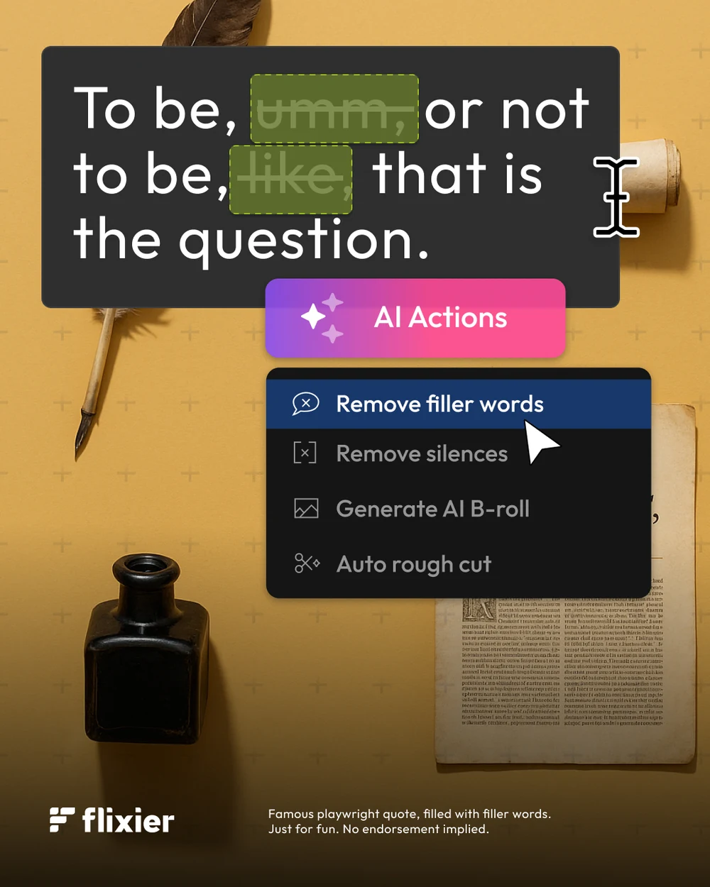
Then as people, for one feature only. Take a line everybody can finish from memory, fill it with ums and you-knows, and put the cursor on Remove filler words. The disclaimer sits in the corner where it has to: filled with filler words, just for fun, no endorsement implied.

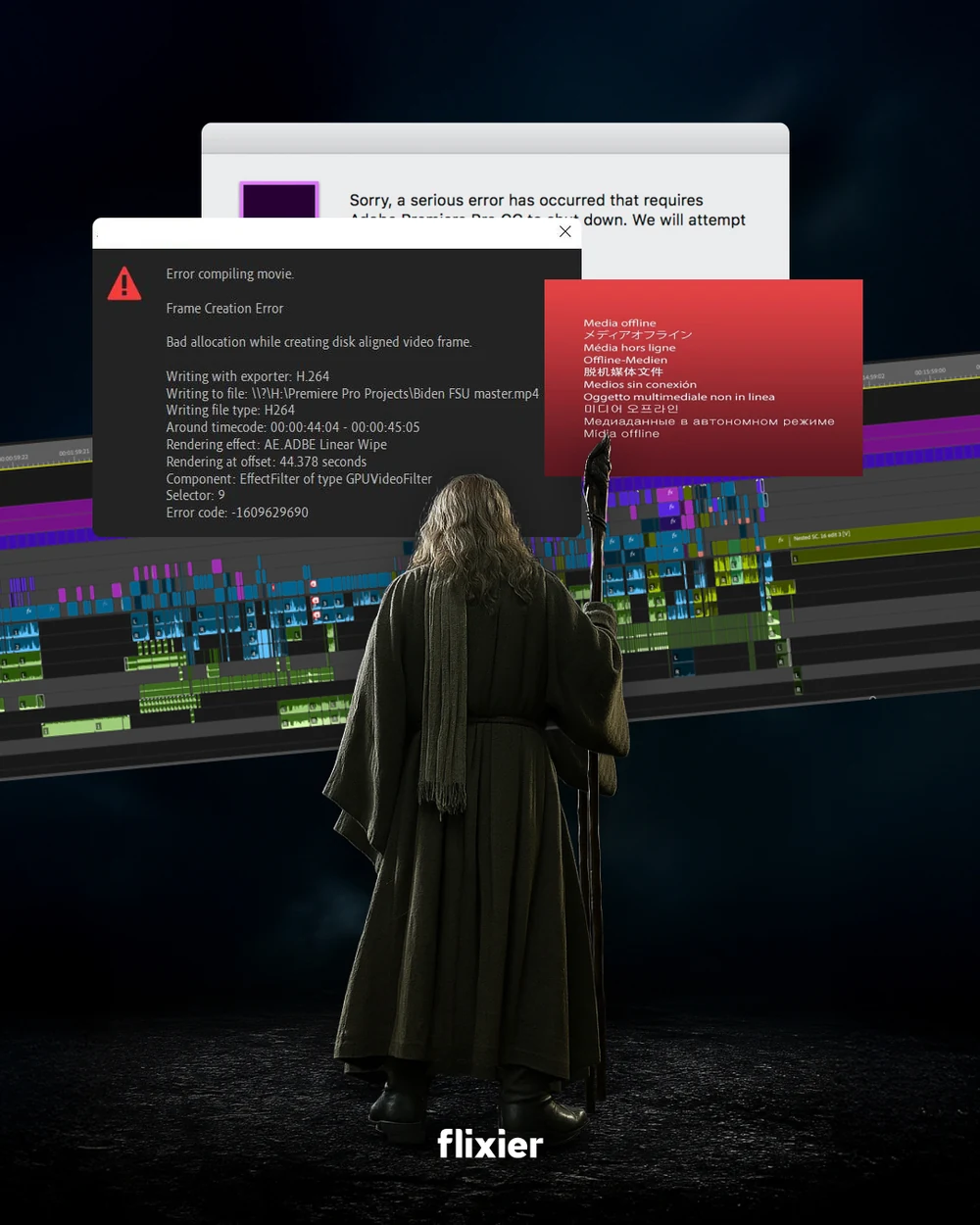
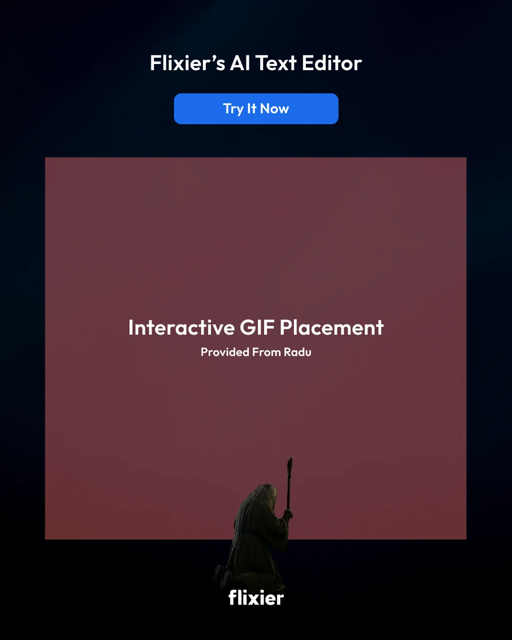
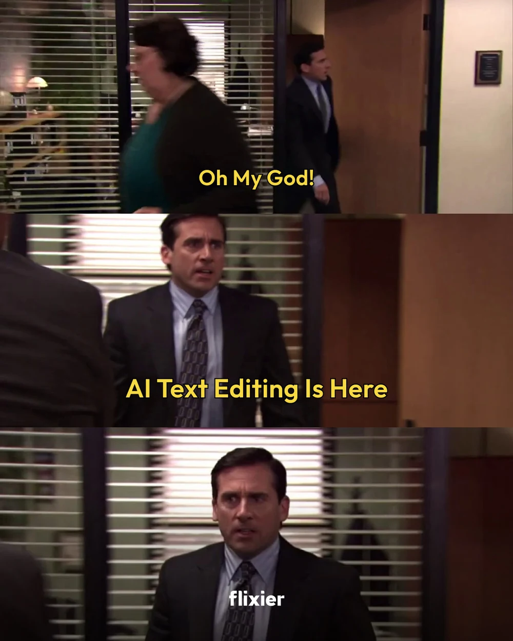
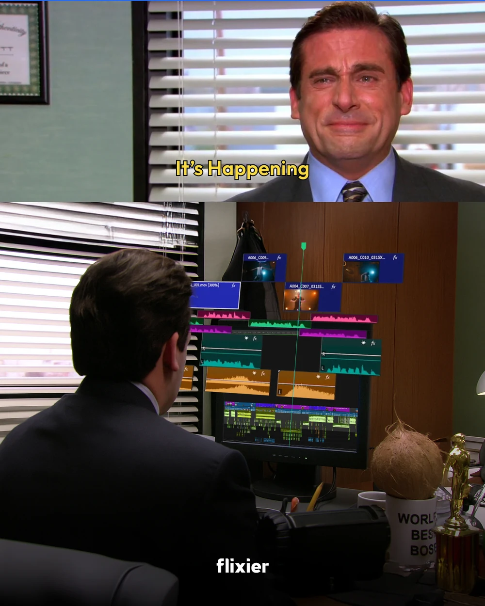
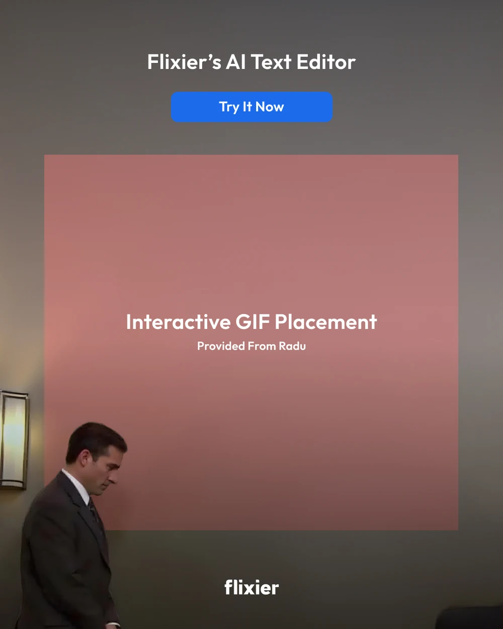
The reaction posts, which are the ones a feed actually stops for: an editor’s own griefs in borrowed footage — the render error wall, the scrub that will not land — and a grid that leaves a hole for a GIF to be dropped into on the way out.
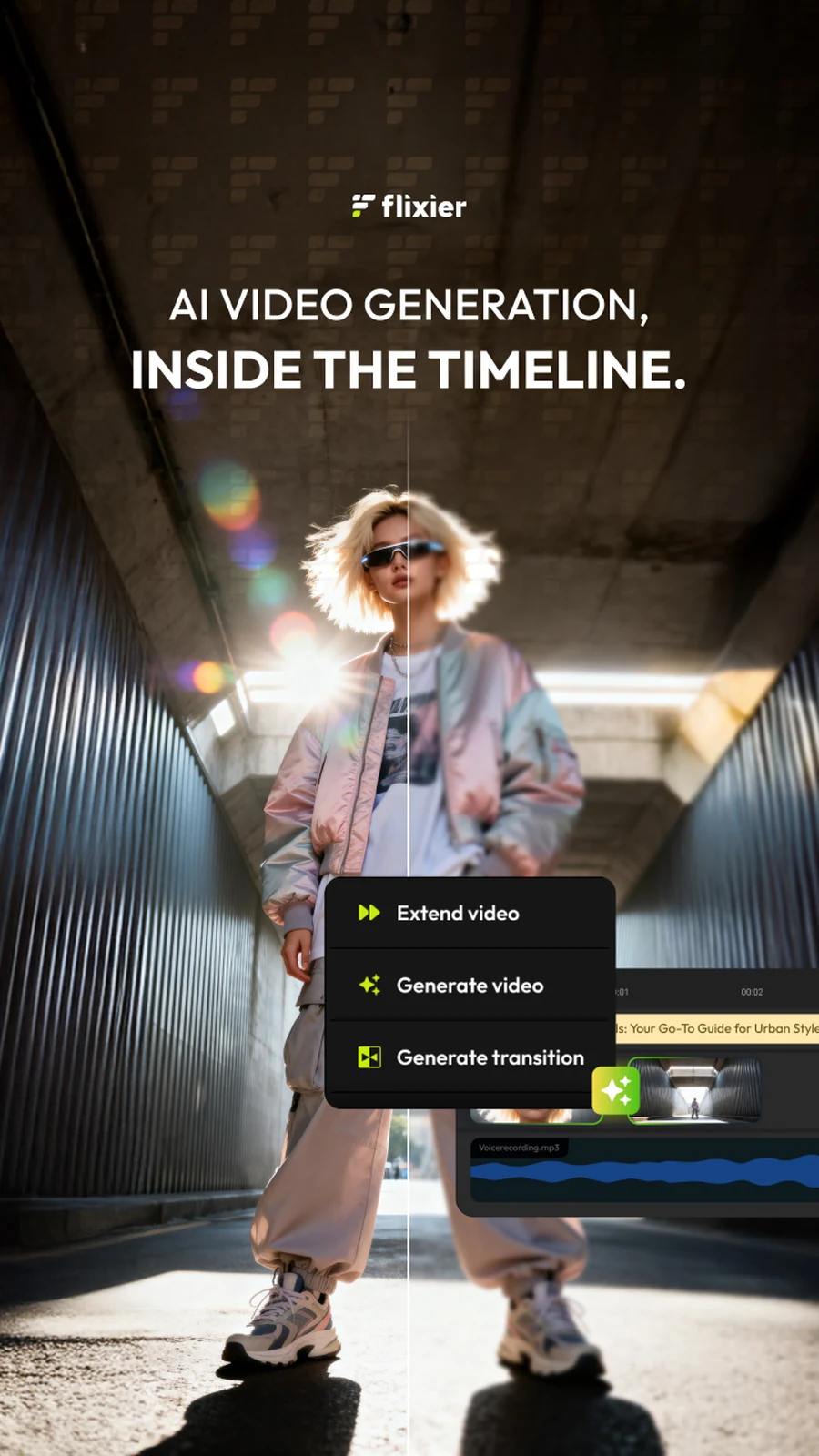
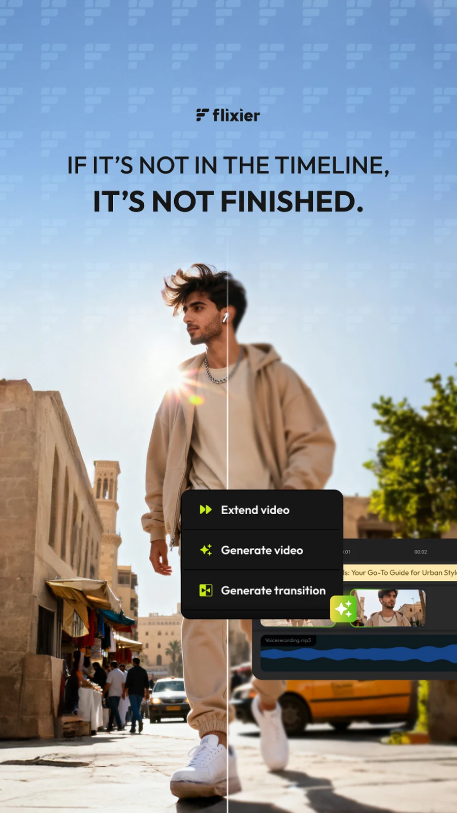
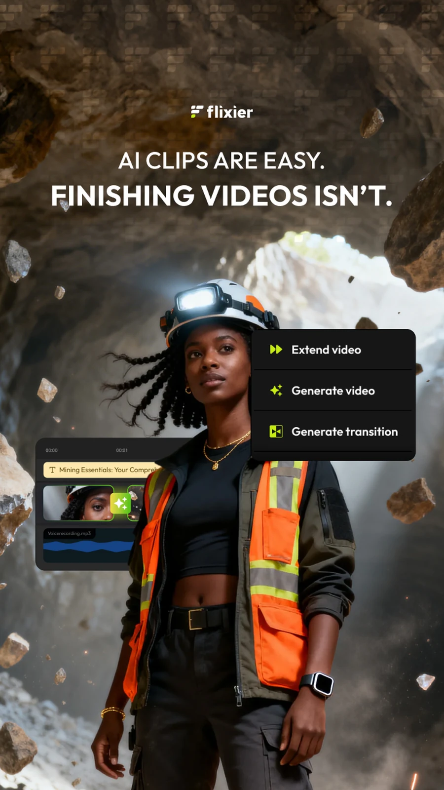
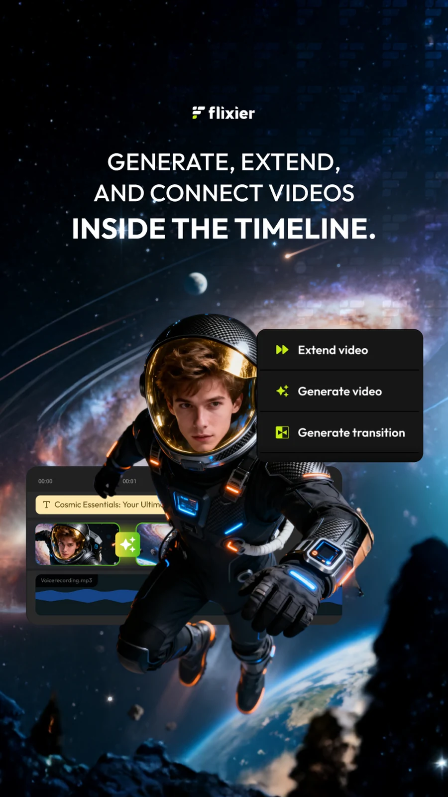

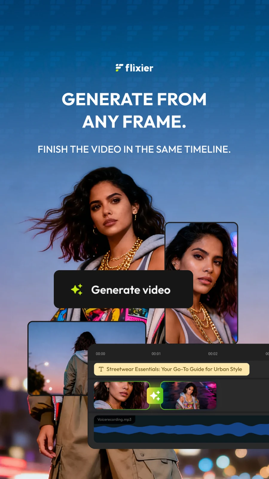
The vertical cut, for the places a post is a screen rather than a square: one claim across the top, the generation menu floating over a figure who is clearly somewhere the camera was not.
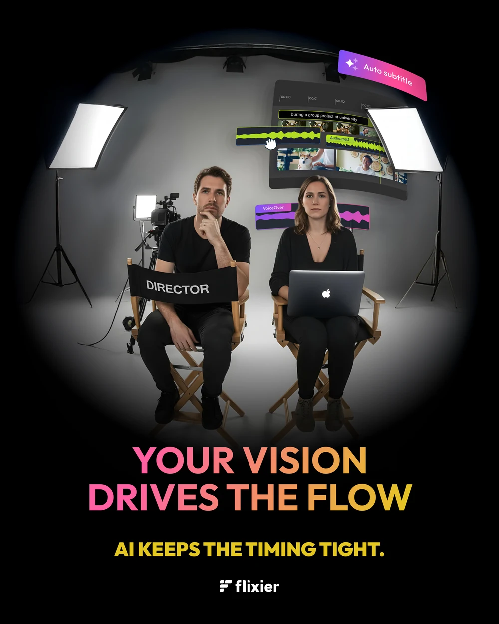
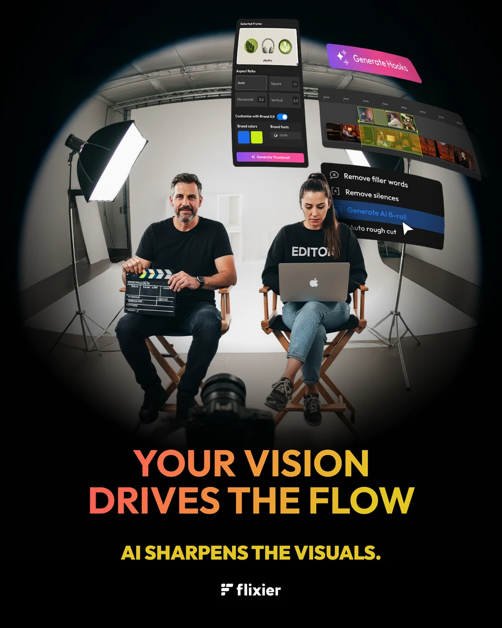

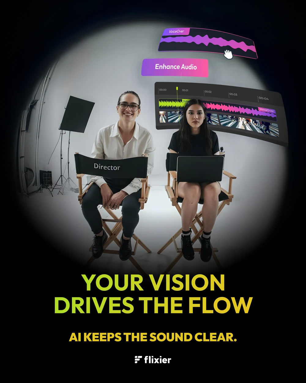
And the one that argues the opposite of everything above: a director and an editor in two chairs, shot through a fisheye so the room bends around them, and the line held steady while only the sub-line changes. Your vision drives the flow — the AI keeps the timing, sharpens the visuals, gives the story a voice, keeps the sound clear. Four posts to say the tool is not the author.
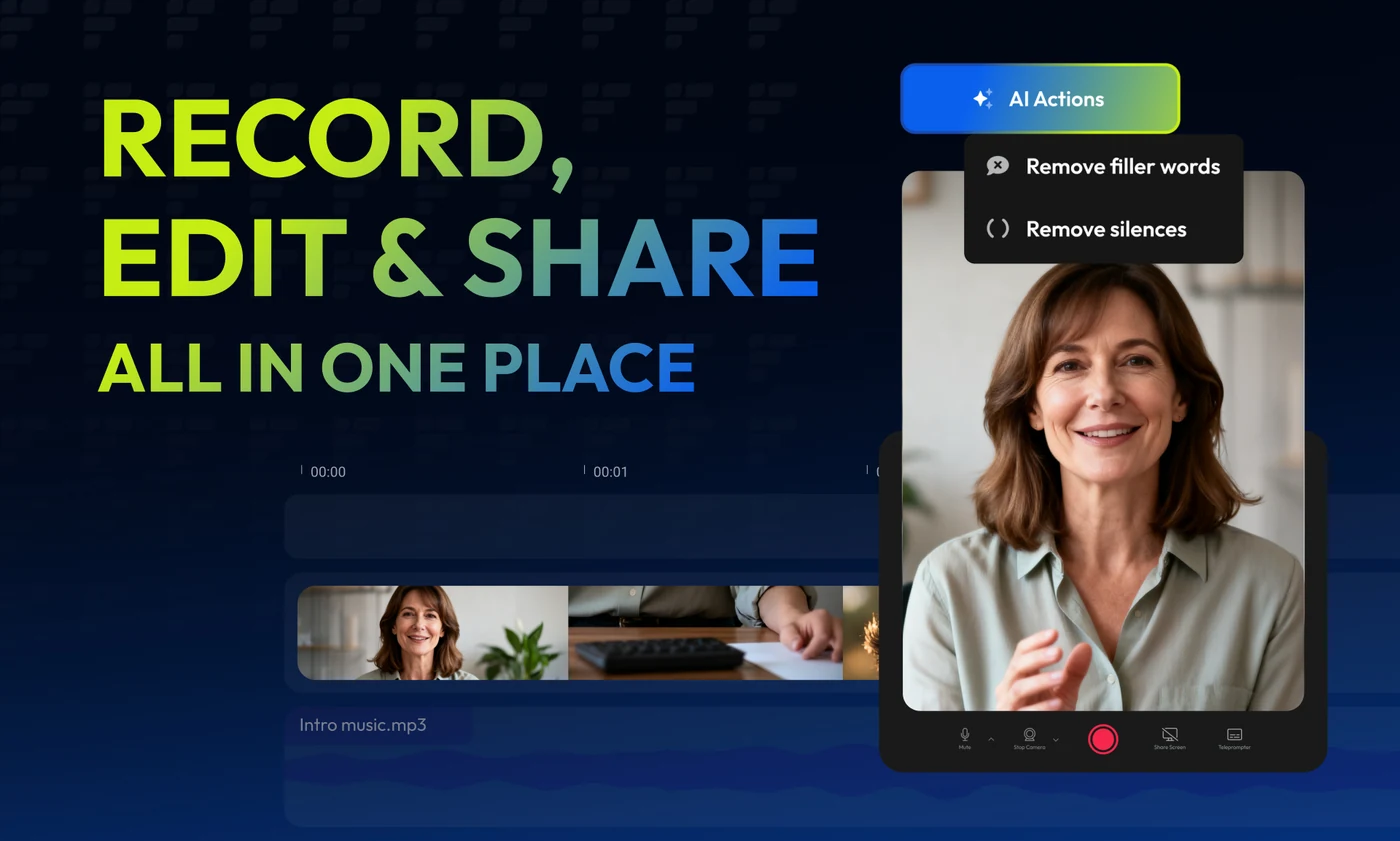
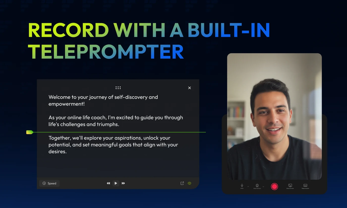
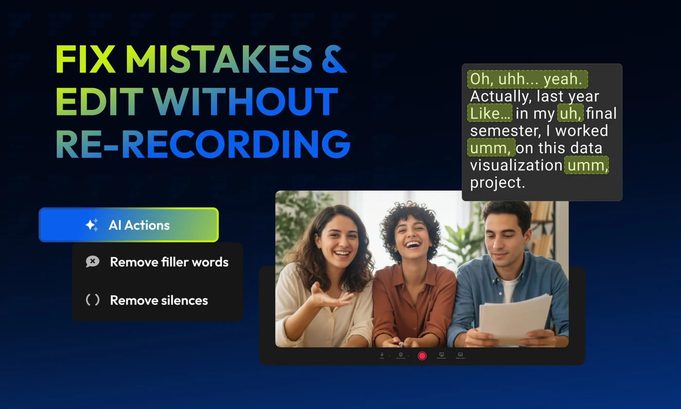
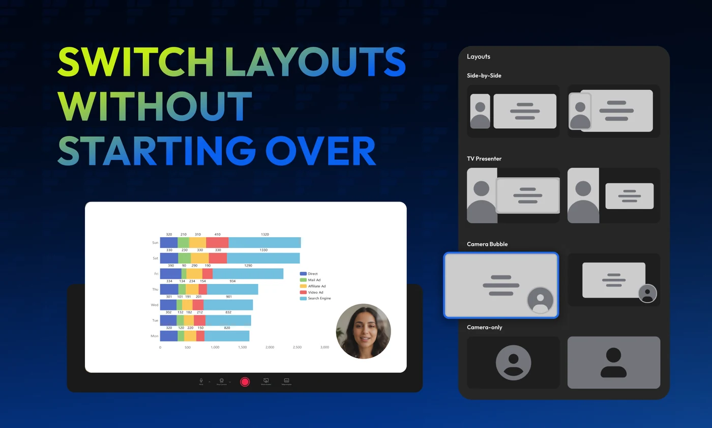
The Product Hunt launch, built as five short carousels rather than one long scroll — and the gradient is what tells them apart. Cobalt is the recording half: the lead card, then the teleprompter, the fix that saves a re-record, and the layout switch that does not cost you the edit.
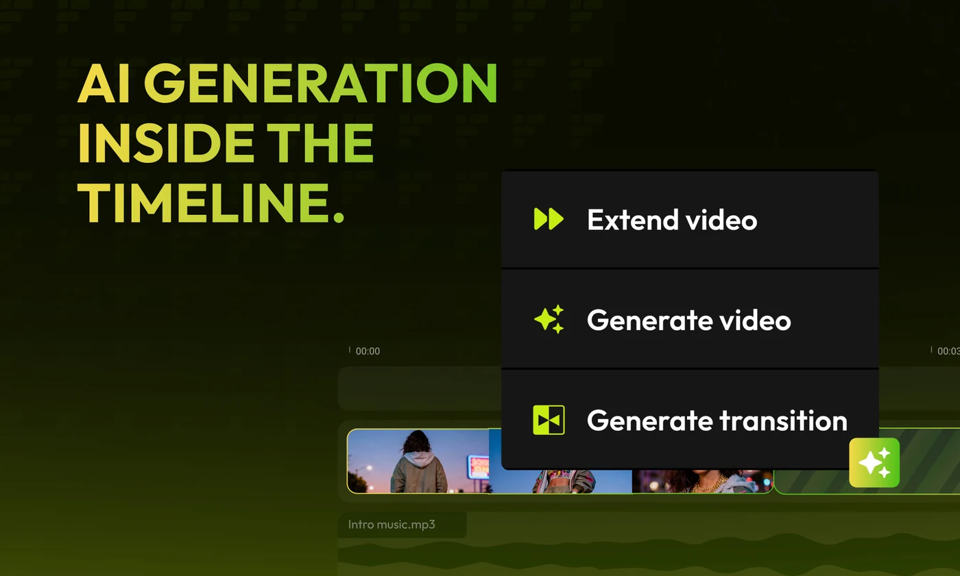
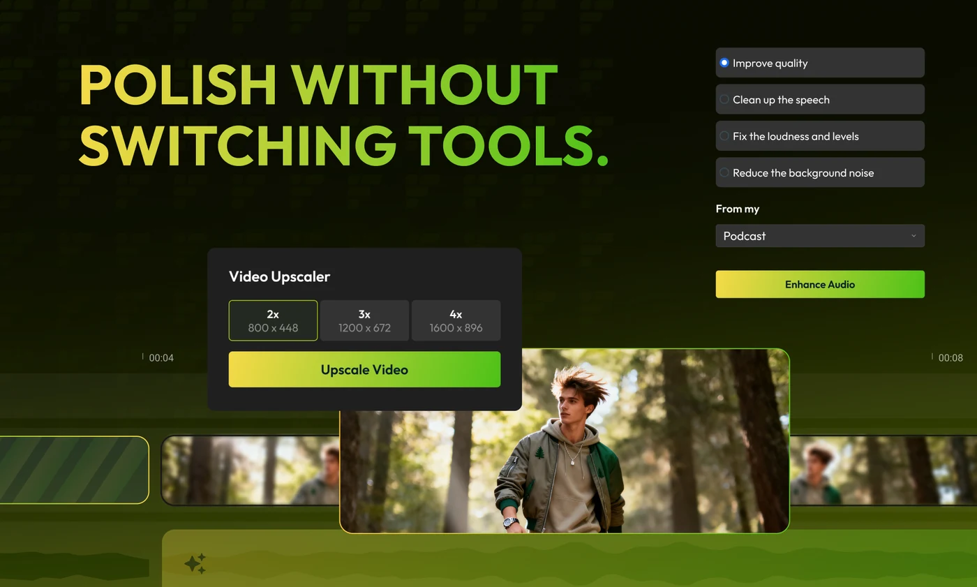
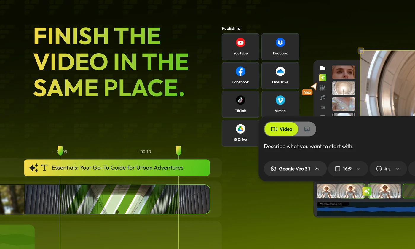
Lime is the finishing half — generation, polish and publishing, each one answering the same objection, that the browser is where the work stops being possible.
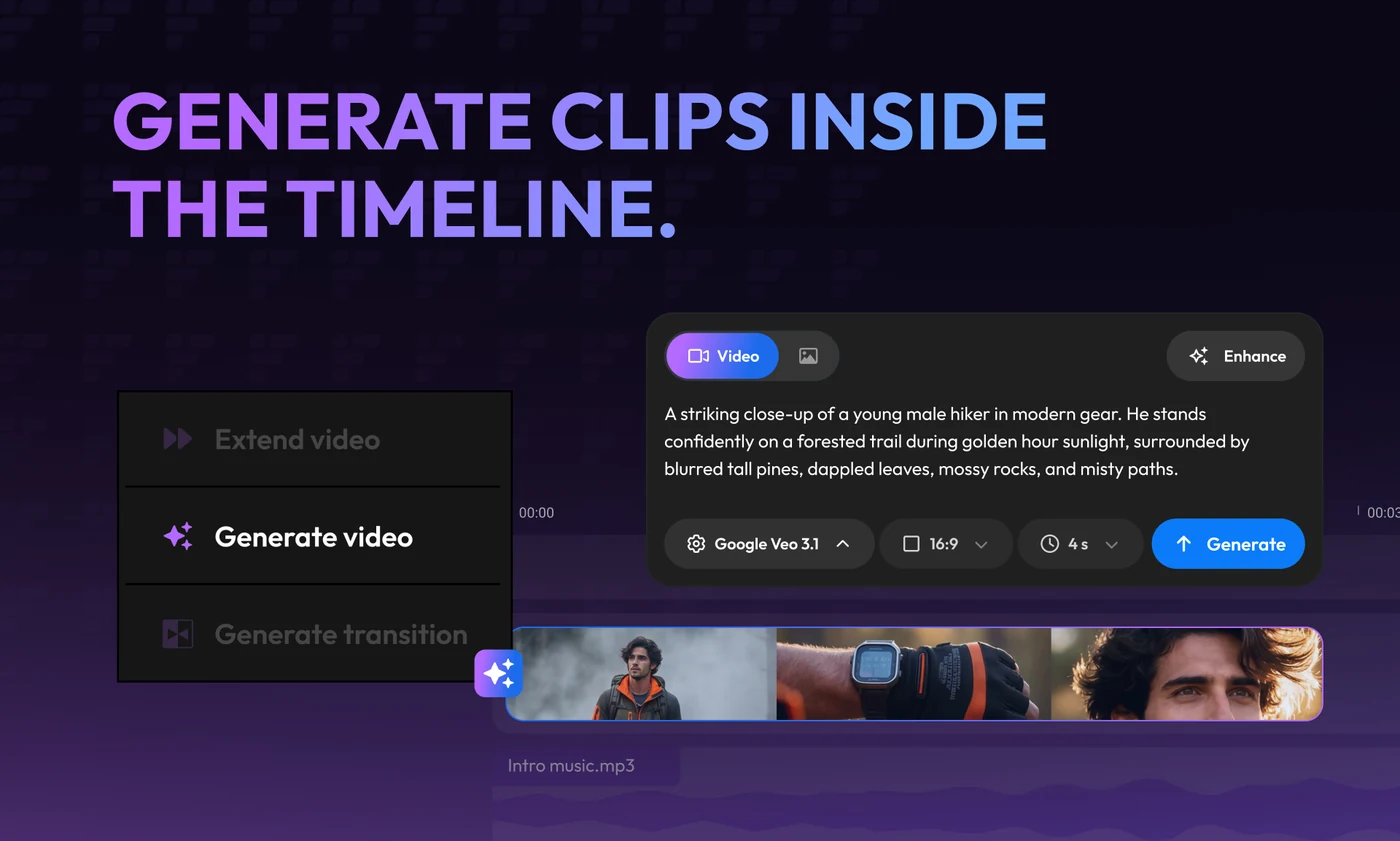
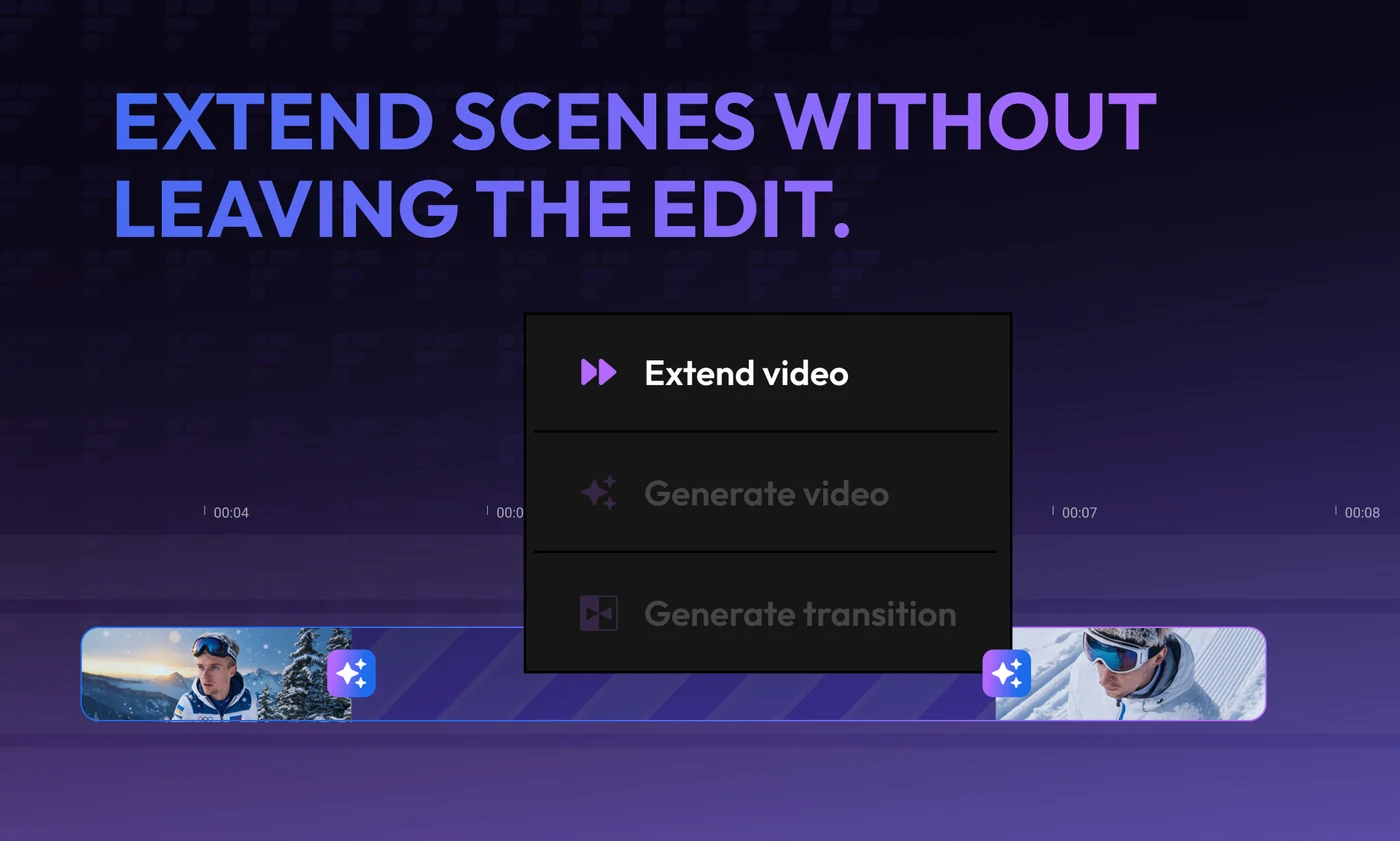
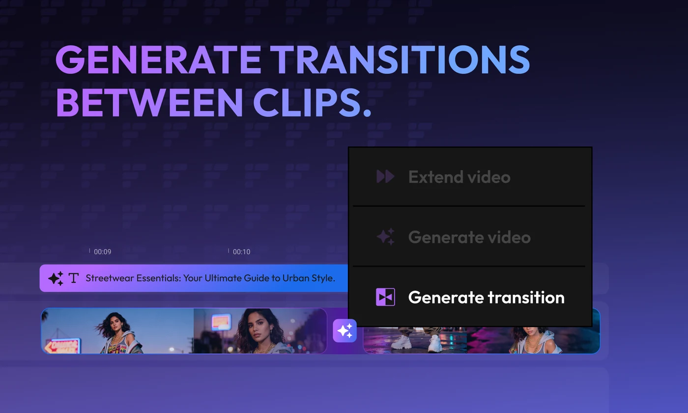
Violet takes the one feature that needs its own run: generating clips, extending scenes and building transitions without the timeline ever being left. The same menu appears on all three, with a different line lit each time — which is the whole argument, made by a highlight.
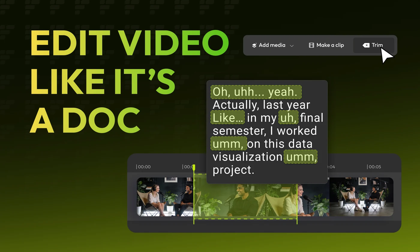
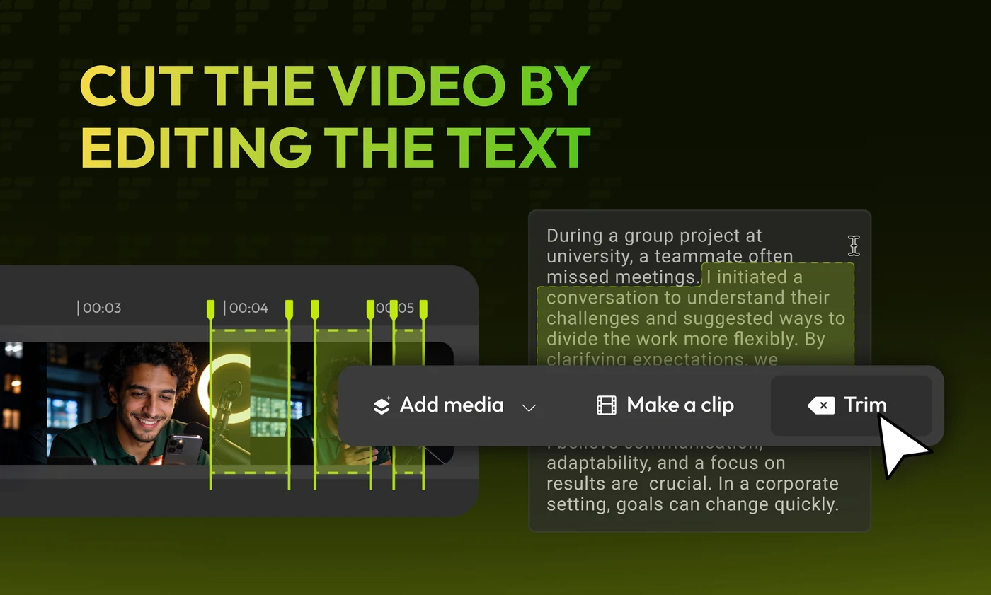
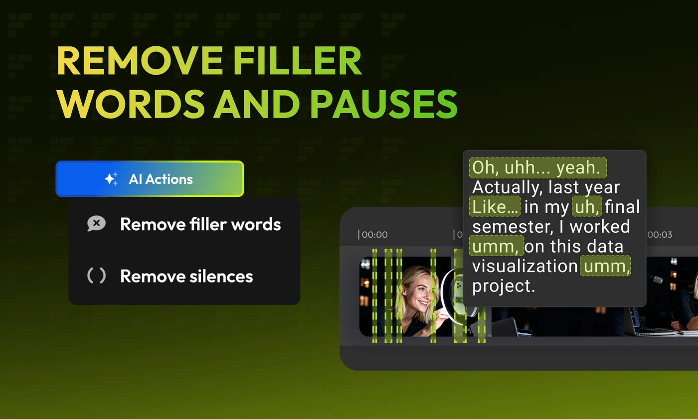
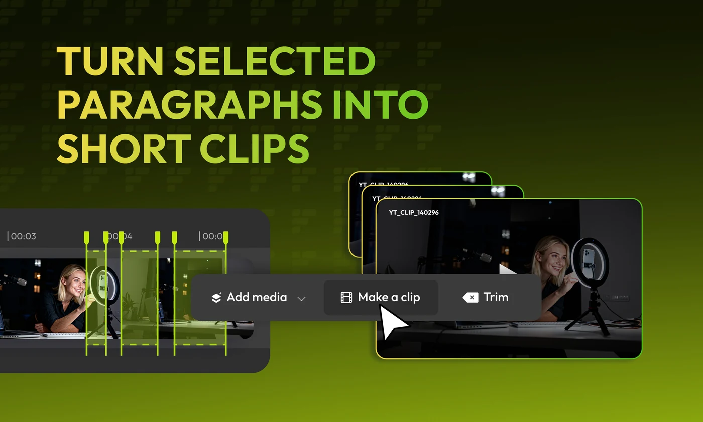
And the run that sells the idea the others only support: editing the video by editing its transcript. Four cards, each on a darker lime, each with the same paragraph of ums and uhs — struck through, then cut, then turned into clips.


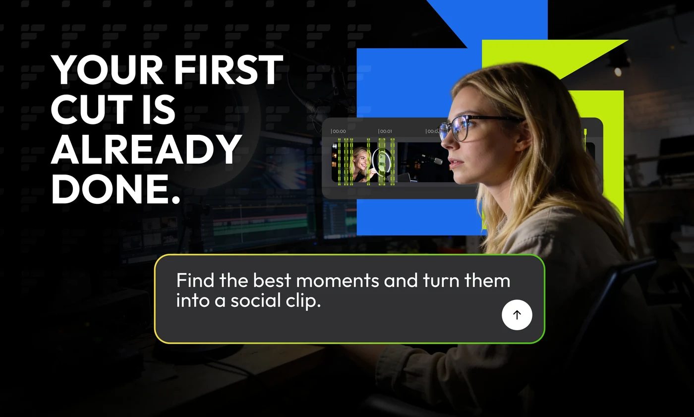
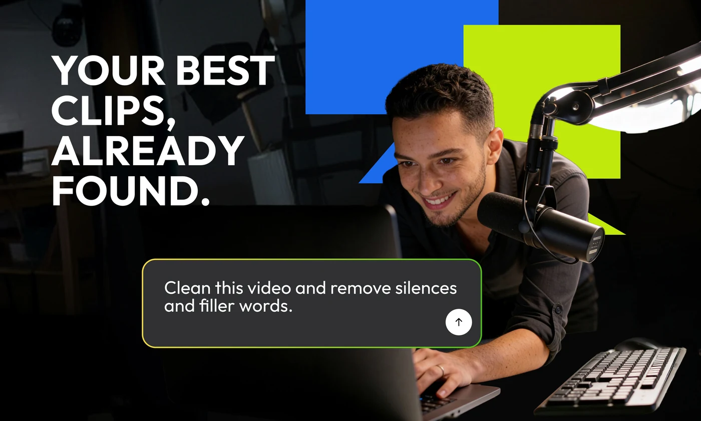
A second route at the same brief, and a harder one. The gradients go, the photography comes down to a lit face in a dark room, and the lime is rationed to the words that matter. Four claims, each answered underneath by the sentence a user would actually type.
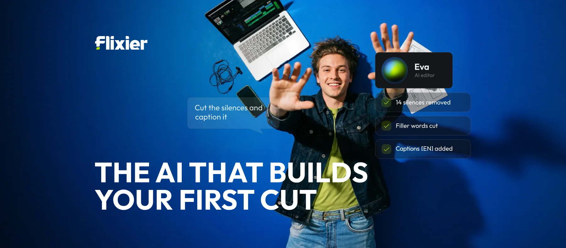
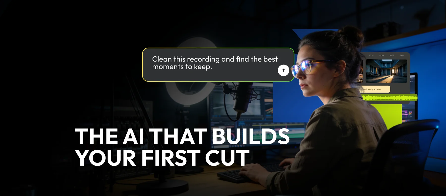
The same claim stretched to a Facebook cover, where the headline has to sit in the bottom-left corner and leave the middle clear for a profile picture to land on. Both routes make the width differently: cobalt opens the frame out and floats the checklist where the page fold would be, while the dark one keeps the room and lets the prompt do the talking.
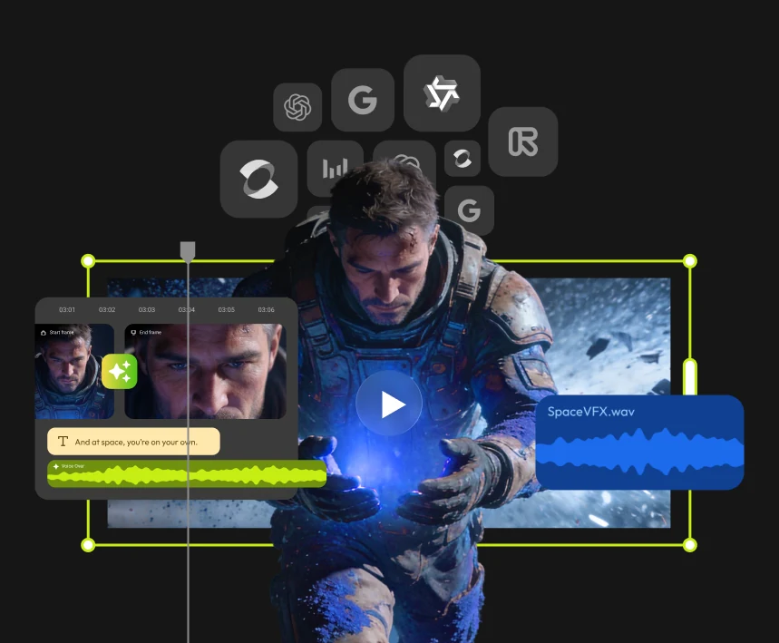
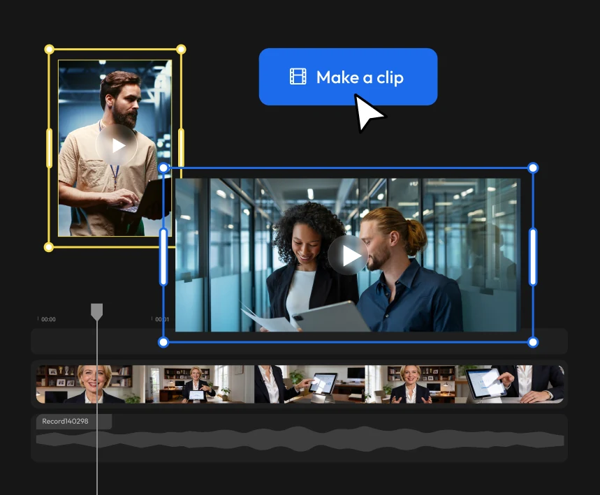
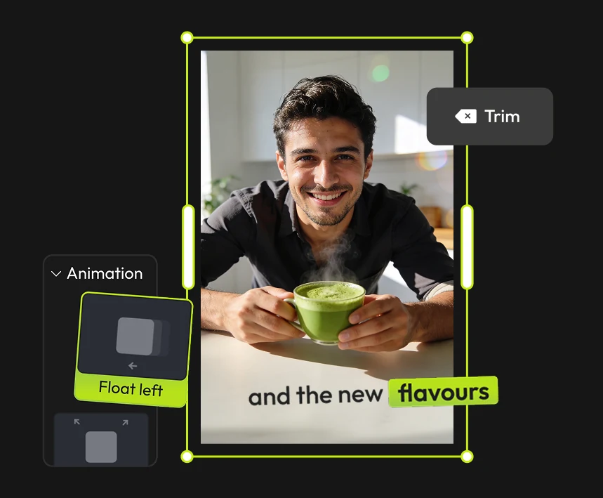
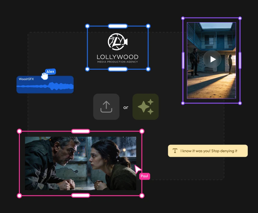
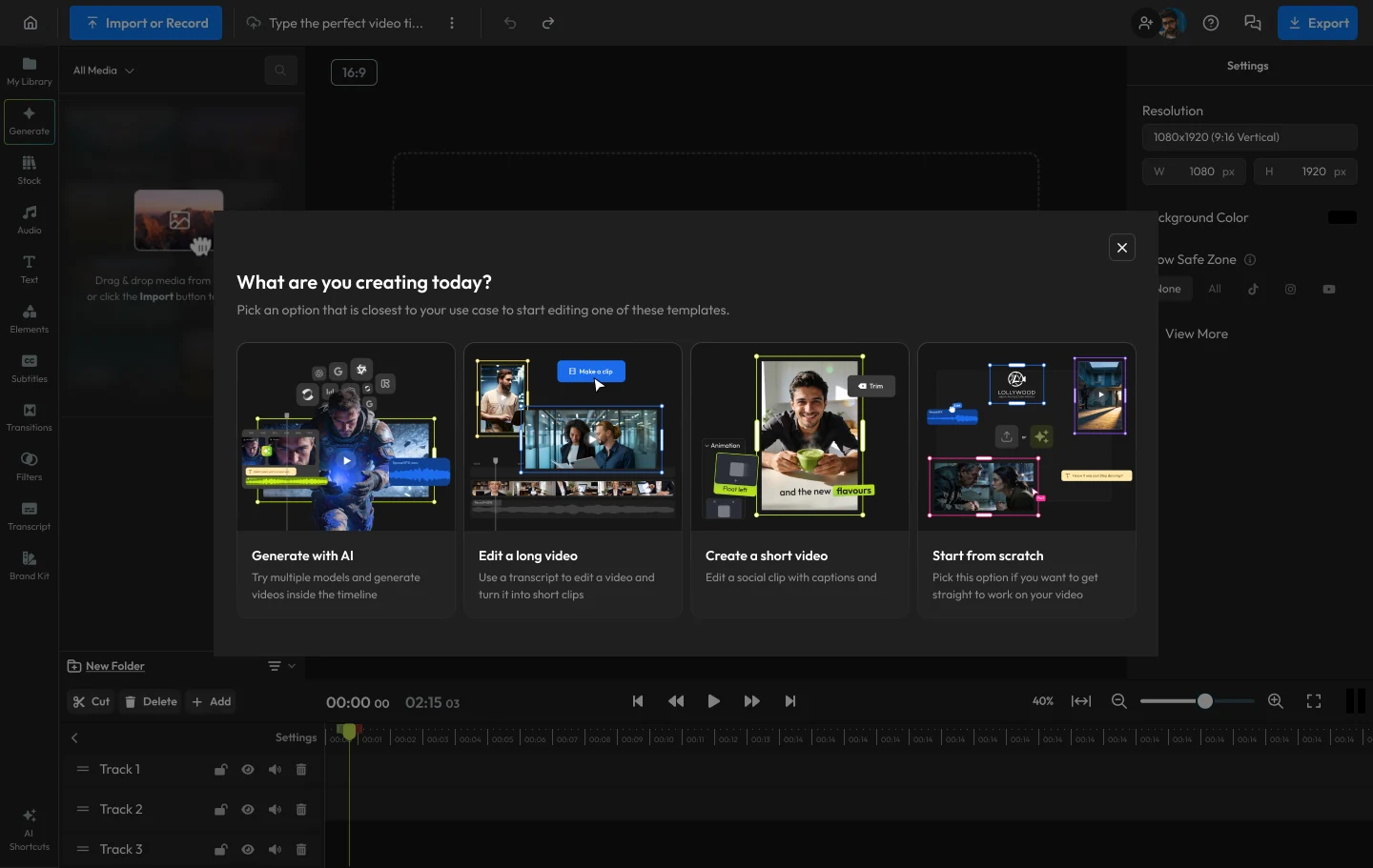
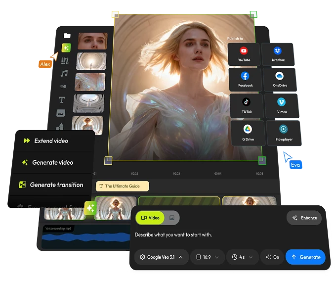
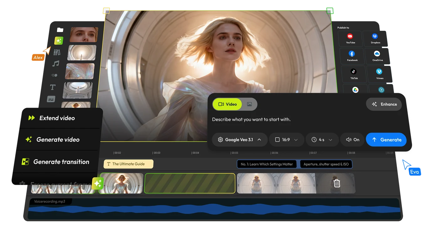
The surfaces all of that is selling. Each one is staged rather than screenshotted — the panel lifted off the timeline, the selection handles left on, the cursor caught mid-click — because a flat capture of an editor reads as a wall of grey and proves nothing.